
My Twitter feed has been full of people who are confused by the chart in the previous post showing rising incomes for everyone. Here's the explanation.
First off, here's data from the Census Bureau showing earnings growth since 2000 broken out by race and sex:
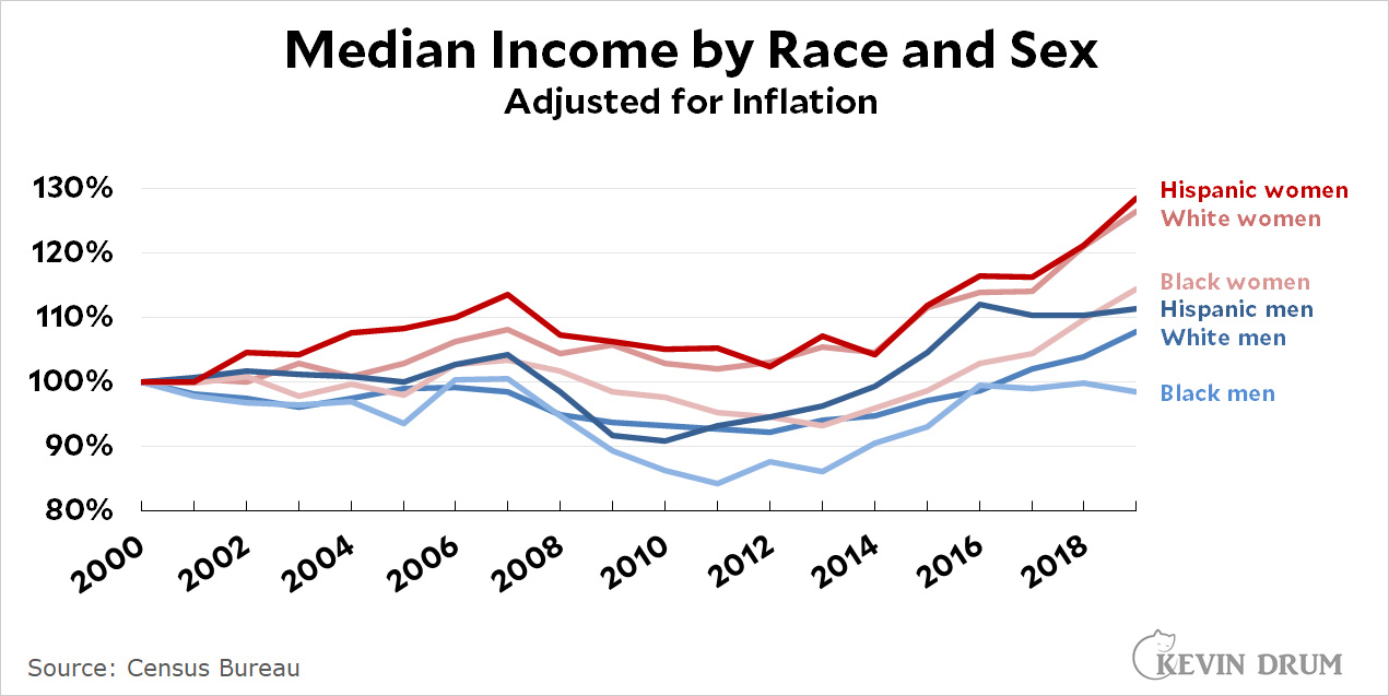
This is probably the most common income chart you'll see, and it shows that incomes have risen for men and women of all races since 2000. The only exception is Black men, who are stuck at their 2000 level.
There's nothing wrong with this data. However, it includes only wage income, and many households have other sources of income. For that reason, every year the Congressional Budget Office estimates total income, including wages, Social Security, business income, capital gains, and other market income.
It also estimates how much income is lost to taxes. In general, rich households lose more to taxes than poor households, and some households actually gain income from net tax refunds.
Finally, the CBO estimates income from government benefits. When you put this all together, you get this:
![]()
Since I was mostly interested in the period from 2000-2020, I took the CBO data and renormed it so that 2000 = 0. I also chose to show nominal numbers with a separate line for the inflation rate, instead of showing inflation-adjusted numbers. I didn't have any special reason for that. Just keeping everyone on their toes. In any case, when you do this, here's what you get in the more familiar form of inflation-adjusted numbers:
![]()
This is probably the most accurate assessment we have of actual disposable income across income classes. The chart in the previous post is exactly the same as this one except it shows nominal income compared to the inflation rate. They both mean the same thing.
Pingback: Here is the state of America circa 2021 – Kevin Drum
I always use inflation-adjusted numbers. It makes the figures directly comparable year to year, it removes a source of variation, and it maps more easily to notions of income and wealth not as numbers on a sheet but actual stuff and living standard.
(And just to be pedantic, it's cumulative income growth over year-2000.)
All of those are inflation-adjusted numbers, surely. Or else nobody in the US has seen any real income growth. Kevin doesn't label the cumulative chart as being inflation-adjusted (the other two are), but it would have to be (prices have gone up more than 120% since 1980, right?). And if the middle quintiles have only seen a 40% nominal gain in post-tax/transfer income since 1980, we're in a lot more trouble than I'd thought.
That's not annual income growth, though. It's income growth.
Well, hard to believe you'd fuck up the numbers. But this pair of speeches today from Gavin Newsom (embattled governor of CA) and Good Old Joe (president at long last) it really good: https://www.youtube.com/watch?v=SMso-qc4sYU&ab_channel=ForbesBreakingNews.
I'll venture to guess that a lot of the wealth transfer to the poor involves health care. That is great--but it's not "take home pay" type of benefit. And will be expected, therefore forgotten. The refundable child tax credit, however, is cash on hand--which will make most people feel a bit more secure.
Not just poor. Old people. And younger, non-poor folks, too. The question of what healthcare benefits are worth to people is an interesting one. On the one hand, there's no doubt they're worth more than ever before. On the other hand, if a person goes through a period of time when they make little or no use of the healthcare system, the main benefit they experience is the "condition of being covered." Which isn't palpably different (again, for healthy people) than it was fifty years ago.
Anyway, just a follow up: if healthcare benefits account for a large(ish) portion of "income" growth, this dynamic would, indeed (I'd argue) have a tendency to exaggerate income growth.
My sense is it's a complex issue involving some value judgments and subtleties, because, again, medical technology has improved — so it's not like this increase in value has zero impact on (non-cash) income. But having coverage that gives one access to much better treatments than 1980's technology doesn't help pay the rent!
Elderly would end up in nursing homes on Medicaid--but a number of states have stopped that because it's very expensive.
I repeat that throughout US history up to around 1970 wages kept up with GDP/capita, not just inflation. Since then, there has been little real-wage growth. Here is a plot of a wage index from the Economic History project:
http://www.skeptometrics.org/WageIndex.png
The more recent wage data, and in many other like diagrams that I and others have shown, come from the BLS. Why should wage-earners be content only to keep up with inflation, when the economy overall grows much faster - and higher incomes are getting the benefit? There are issues about what the inflations indexes are actually measuring, but the growth of inequality which is indicated by this comparison - among many other statistics - is very real.
I am not sure Kevin is really aware of this problem. In any case he has completely avoided mentioning it. There are no excuses for that if he expects to be regarded as credible on economic matters such as wage growth.
Here is another view of percentiles of family income - from the Census - which seems to be quite different from what Kevin shows:
http://www.skeptometrics.org/FamilyIncomepctiles.png
Again this shows that lower incomes have been flat since around 1970, while the benefit of economic growth has gone to higher incomes.
I don't know why Kevin gets such different results. I don't know if I will do the detective work to find out - nobody is paying me for this and Kevin has a habit of ignoring anything which conflicts with his interpretations. In fact he ignores many presentations of the data which show that those at the bottom have lagged behind.
Lower inflation rates. Census uses improper inflation, which was overstated until 1983.
Thanks for your comments here. Kevin is an interesting case. He was once a strong voice warning about growing inequality. Just one random example here. I would bet he was posting similar data a decade earlier too, before the GFC and Occupy brought more attention to the issue. Back in the day (as I recall) inequality was regular item on his blog. Now, not so much. Has the wealth gap been narrowed in any meaningful way? No. Does Kevin even mention it in his trends for America in the past 20-40 years? No. Can a survey of trends for past few decades omit all mention of the growing wealth gap and be considered fair and honest? No.
It's telling. Kevin is trying to fairly assess the situation. He is making an argument. He has a narrative to push. There's nothing inherently wrong with that, but it's important to understand it. Kevin's m.o. is that he's like a jury weighing the evidence, though more often he is the lawyer in the courtroom making the case for one side and against the other. His charts and data may feel like objective facts, but the bias is all in the selection -- what to show, what to leave out.
I'm not against the idea that life is generally getting better for many as we wend our way through the decades. I believe that and I've made the argument many times myself. I'm no fan of those who think life is all doom and gloom.
But Kevin has the opposite tic. The views he puts out tend to gloss over real problems and threats we face. His work often comes across as p.r. for comfortable class. He can be oblivious.
In his State of America post, his only look at inequality is regarding income, not wealth (adding capital gains income hardly gets to the problem). His only mention of politics is increasing political polarization (which doesn't address the transformation of the GOP from a neo-liberal establishment party to a clown car of bonkers neo-fascist wannabes). He pretends to take an all-encompassing look at the good and the bad, but his blind spots are a mile wide and earn him some justifiable derision.
Why does he do that? I can only speculate, but my guess is Kevin (in his mind) has a different audience than the one he had years ago. Back in the day, he may have been arguing against the GOP neo-liberal case. There is no GOP worth arguing against anymore. Now he argues against the left. That's the subtext of most of what he does now. He is clearly out of sync with many Democrats now being more vocal on a host of issues (some of which he used to argue for himself). Often in politics, it's not about the facts. It's who you're arguing against that determines how you see the facts. You define yourself by those you oppose.
2nd graf: "Kevin is NOT trying to fairly assess the situation."
Kevin makes a valid point in that many things have improved for most people. The inflation indexes (CPI and PCE) are based on a "basket" of items but many of the items are much better than they were, for example cars and electronic items. But aside from ignoring what was happening before around 1970, when inequality was actually decreasing, his income groups are not chosen in a way that shows the inequality. Actually most of the income gains since 1970 have gone to the top 1% or even the top 0.1%.
Kevin also chooses to use the PCE for this exercise rather than the PCI, although he uses the PCI at other times. The PCE usually gives lower inflation, and for that reason it is preferred by people who want to cut Social Security. It is probably also preferred by the Fed because it has less inflation in the 70's and makes them look less bad - although either by the PCI or the PCE the Fed failed to prevent inflation at that time. The choice of indexes is subjective.
minimum wage increases?
Federal minimum wage went up in '90 and '91 (and loopholes closed in '89)
https://www.dol.gov/agencies/whd/minimum-wage/history
And there were a number of state level referndums in '96, '06 and '14-'16.
https://ballotpedia.org/Minimum_wage_on_the_ballot#By_year
States passed them without referendums too.
A few last things,
The starting year, 2000, is after the "end of welfare as we know it". The lowest group has gone up faster than the middle--but I don't know if that is just making up for lost ground.
Wage pressure on manufacturing jobs keeps pay low (or they'll move overseas) Service work can not be exported.
https://slate.com/business/2021/09/supply-chain-issues-covid-manufacturing-factories-jobs-labor-shortage.html
Given all this, Joe Manchin is correct. What we have today is fine. It is good enough. Additional government spending on social welfare programs is not necessary. Infrastructure spending is not necessary. I'd add that defense spending is also not necessary but that just CRAZY to suggest... because our adversaries the chinese and muslim devils, as roaring lions, walketh about, seeking whom they may devour.
The so called progressive factions need to sit down and shut up.
This is the logical conclusion one should draw from the posts on this topic. So... Mr. Drum, is that the right conclusion?
How are Americans (or citizens of any country) doing, in economic terms? This question can’t be answered in two or three charts. Are individual incomes up? If this is because people are working longer hours, are they really “better off”? If household income is up only because the number of workers per household is up, is that better for them? Others have noted that wealth needs to be considered, and that data for more quantiles is available (quintiles or deciles, or …). We could also look at expenditures: what proportion of income is spent on food, housing, health, etc. and how much is ‘disposable’? There is a lot of gray in classifying expenditures as necessities or ‘luxuries’, and the classifications for cities, suburbs and rural areas will differ, as also for household composition. But it doesn’t seem like an insurmountable problem to define measures that can be tracked over time.
Not everyone's income has gone up.
If you work in an industry that has been globalized, such as myself, your income has probably gone down. In my case over 40% since 2002. On top of that my job has become essentially part time to boot making it even more fun to pay for essentials in 2021 dollars with a mid 90's part time income.
I'm pretty much with the Joseph Harbin comment at 11:22 am. Before reading any comments, my initial reaction to Kevin's post was: Why are you looking only at percentage growth over time?
a) If your quintile's income is the only one that is way lower than it ought to be, then justice would be: this quintile deserves higher percentage growth than other quintiles. This demonstrates how looking at percentage growth without context really doesn't tell us anything valid.
b) In my opinion, for an individual or household earning $40K/yr, 5% growth is not going to make much of an impact, notwithstanding the fact that 5% growth is better than 1%. For an individual or household earning $10,000,000/yr, I don't think 0% growth hurts them at all.
Let's get real.
Inequality, both income and wealth, when it get's extreme is dangerous.