
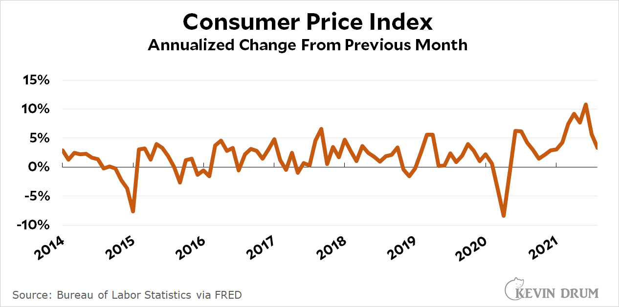
The headline CPI index in August clocked in 0.27% higher than the previous month, an annualized rate of 3.3%. This is quite a bit lower than the 9%, 7%, 10%, and 5% rates of April through July.
Core CPI, which excludes food and energy, came in at 1.2%. Since the headline number usually follows the core number, this suggests that inflation is likely to head even lower over the next few months.
Compared to 12 months ago, the inflation rate for food was up a bit to 2.9%. That's not outrageous, but it's been rising for the past three months and is starting to get a little peaky. The inflation rate for used cars softened a bit but is still running at an astonishing 32%.
NOTE: Normally I focus on CPI as measured compared to the previous year. However, right now we're in a volatile period and are interested in how inflation is doing right this moment. For that, it's best to look at the increase from the previous month and then multiply by 12 (more or less) to get an annualized rate.
Refine the talking point: Inflation is up--look at food!!!. Then move the comparison point to the pandemic recession low point for rest of Biden's term.
It's what the chicken little party does all the time...
You got it.
Sounds like an example of "nutpicking". Or at least, cherry picking.
Not that there is much in the actual "headline" at the link: https://www.bls.gov/news.release/cpi.nr0.htm but the first paragraph reads:
It would seem to offer one at least two or three numbers from which to pick. Which brings to mind:
Which Kevin seems to have done for the "core" CPI, but then when he talks about food:
So why doesn't that also get the multiply-by-twelve treatment to become 4.8%?
Not sure if it will transfer well, but here is the full contents of the first table:
Table A. Percent changes in CPI for All Urban Consumers (CPI-U): U.S. city average
Seasonally adjusted changes from
preceding month
Un-
adjusted
12-mos.
Feb. Mar. Apr. May June July Aug. ended
2021 2021 2021 2021 2021 2021 2021 Aug.
2021
All items.................. .4 .6 .8 .6 .9 .5 .3 5.3
Food...................... .2 .1 .4 .4 .8 .7 .4 3.7
Food at home............. .3 .1 .4 .4 .8 .7 .4 3.0
Food away from home (1).. .1 .1 .3 .6 .7 .8 .4 4.7
Energy.................... 3.9 5.0 -.1 .0 1.5 1.6 2.0 25.0
Energy commodities....... 6.6 8.9 -1.4 -.6 2.6 2.3 2.7 41.9
Gasoline (all types).... 6.4 9.1 -1.4 -.7 2.5 2.4 2.8 42.7
Fuel oil (1)............ 9.9 3.2 -3.2 2.1 2.9 .6 -2.1 33.2
Energy services.......... .9 .6 1.5 .7 .2 .8 1.1 8.6
Electricity............. .7 .0 1.2 .3 -.3 .4 1.0 5.2
Utility (piped) gas
service.............. 1.6 2.5 2.4 1.7 1.7 2.2 1.6 21.1
All items less food and
energy................. .1 .3 .9 .7 .9 .3 .1 4.0
Commodities less food and
energy commodities.... -.2 .1 2.0 1.8 2.2 .5 .3 7.7
New vehicles............ .0 .0 .5 1.6 2.0 1.7 1.2 7.6
Used cars and trucks.... -.9 .5 10.0 7.3 10.5 .2 -1.5 31.9
Apparel................. -.7 -.3 .3 1.2 .7 .0 .4 4.2
Medical care
commodities (1)...... -.7 .1 .6 .0 -.4 .2 -.2 -2.5
Services less energy
services.............. .2 .4 .5 .4 .4 .3 .0 2.7
Shelter................. .2 .3 .4 .3 .5 .4 .2 2.8
Transportation services -.1 1.8 2.9 1.5 1.5 -1.1 -2.3 4.6
Medical care services... .5 .1 .0 -.1 .0 .3 .3 1.0
1 Not seasonally adjusted.
My attempt to use "pre" markup appears to have been unsuccessful...
Multiplying a volatile component's one-month change by 12 would be a poor way to look at the situation. That could be why Kevin didn't do that for food.
Still made me wince to read that 32%. I assume the rental car places are finally stocked up and no longer competing with everyone else for cars, but there's persistence supply chain problems with those accursed chips (it's even finally getting to Toyota, who was the most resilient against it for the longest).
Stick with trimmed mean PCE: https://fred.stlouisfed.org/graph/?g=GMM6
As you can see with trimmed mean PCE, inflation is not spiraling out of control.