
I have two questions for the statistically savvy hive mind.
First: Suppose I have a comparison of two groups that shows one group differing from another by 0.3 standard deviations. Obviously normal people have no idea what this means, or whether 0.3 SDs is a lot or a little. What's the best analogy to make this comprehensible?
In the past I've used IQ because it's one of the few scales that's familiar to most people. So 0.3 SDs would be "about equivalent to four or five IQ points." Unfortunately, this can be confusing if it seems like I'm literally bringing IQ into the conversation for no particular reason. So what's a better way?
Second, take a look at this chart that I posted yesterday:
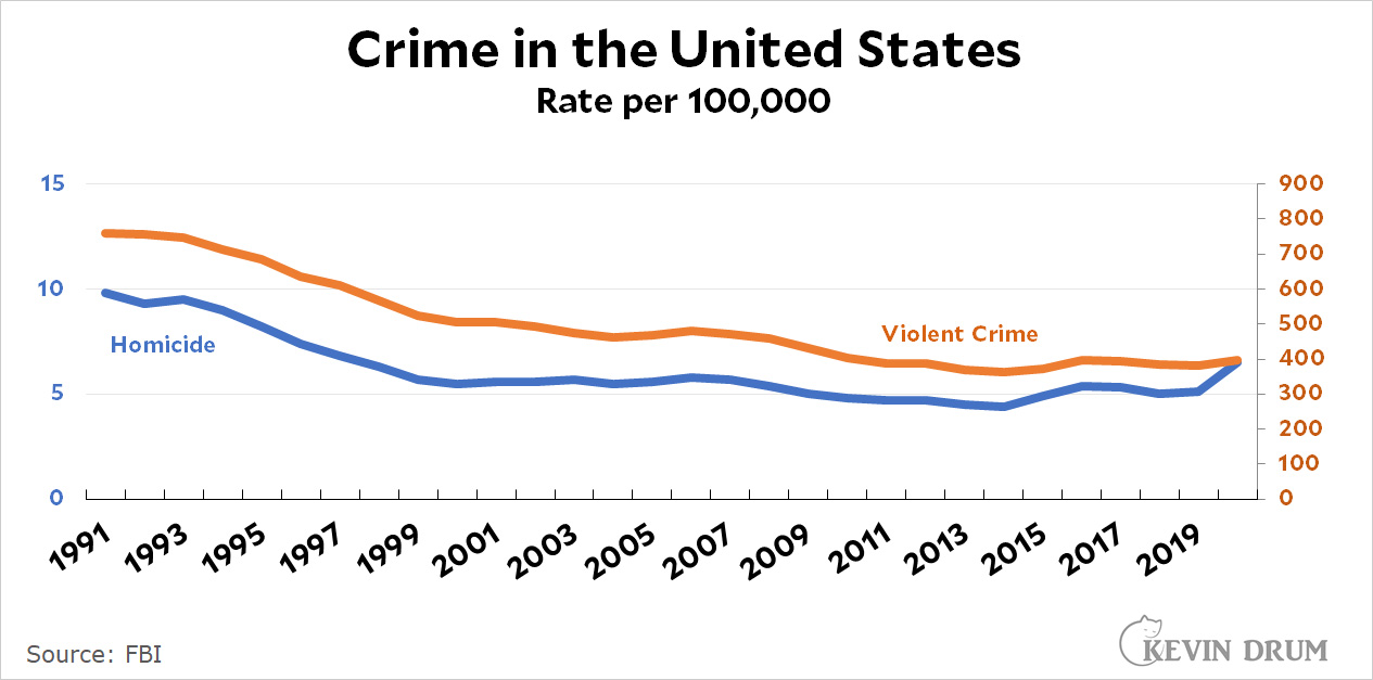
The point of this chart is to show that homicide and violent crime generally move in tandem. However, they have very different scales (0-15 for homicide, 0-900 for violent crime) so I made the chart with dual scales.
This has never been a well-loved solution, and there's no question that it confuses some people. I have several thoughts:
- Just ignore the complaints. There aren't really very many of them.
- Use some other way of displaying different scales, such as percent growth rates. Like this:
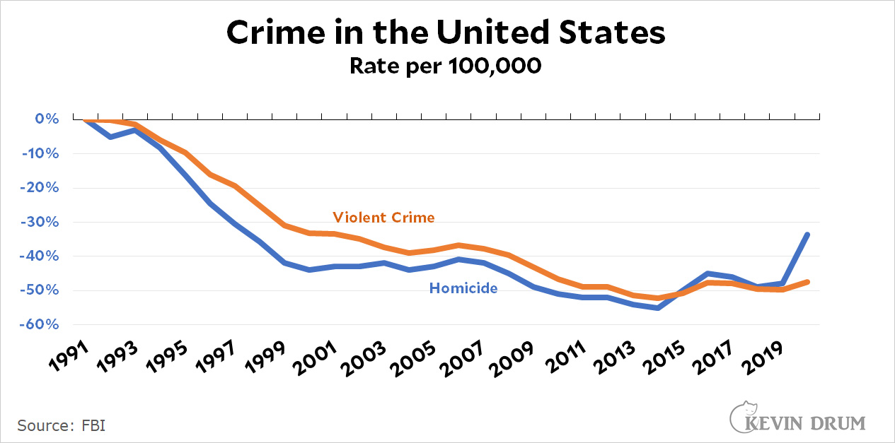 The obvious problem with this is that you lose the absolute numbers, which are often handy to have. But perhaps you gain clarity?
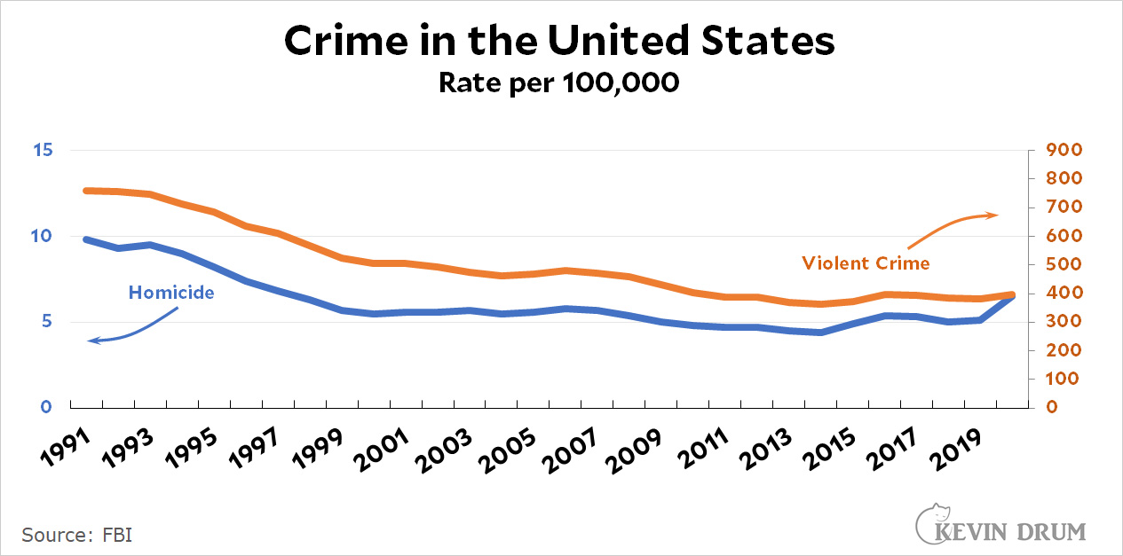
 - Add some annotation to make everything crystal clear. It's a little clunky, but it's best to be clear even if Edward Tufte wouldn't like it.
Any preferences? Or other ideas? Remember, the idea behind both of these questions is to keep things as clear as possible for people who aren't especially savvy about statistics.
UPDATE: A reader suggests using height to illustrate standard deviation. In the US, the mean height for men is 70 inches with a standard deviation of 3 inches. So 0.3 SDs would equal about one inch in height—the difference between 5'9" and 5'10". This probably gets the point across fairly well: namely that 0.3 SDs is noticeable but not huge.
Percent growth can be misleading because the magnitude of change differs across time when the base changes. Thus, the spike in Figure 2 looks bigger than it is.
I'd consider normalizing the two variables. Normalized = (X - Xmin) / (Xmax - Xmin). That will spit out a new variable between 0 and 1 for each variable. You lose the substantive interpretation, but gain comparability. Then add a second figure to show absolute levels (which you already have).
Re graphs, for "non-savvy" audience my vote is door 3, arrows pointing to the scales. Sometimes you have to be obvious.
On standard deviations, that's hard. But in theory everybody's familiar with getting grades in school, and in theory each full step in a grade is supposed to represent a standard deviation better or worse performance vs the mean, right? So a full deviation is the difference between C and B, or B and A, half a deviation is the difference between C and C+, B and B+, something like that? Anyway, maybe a start . . .
Actually, I think a grade half-step is 1/3 deviation, so you go from C to C+ to B- to B, three steps to the theoretical full deviation.
Oh, that's good!
Pointing to the different scales is also easier on people who are color-blind.
For the issue of illustrating 0.3 SD - I suggest using household income if that works. O.3 SD would be a difference of $ nnn in household income.
As for the overlayed trendlines with different scales - definitely keep absolute number - percent change is confusing for us mortals. So I recommend option 3 - specifically calling attention to the different metrics being used.
Two scales + annotation. One thing I learned in my career, when you are trying to communicate, you can never be too obvious. My own personal obsession with plots is that all axis clearly labeled.
Yes, a label on each vertical axis would be nice.
Basically when state health departments went wild with lockdowns, black gangs opened up turf wars as drug use skyrocketed. There it is. It's trending down heavily now, as some after effects are still felt. By 2022, the normal pace will reemerge.
& now that there's a vaccine, they aren't getting that either!
All deaths are the responsibility of The Blacks.
I agree that the arrows are good (in fact, I was thinking about arrows even before I had scrolled down far enough to see that you had given an example with them). But the arrows should be straight, horizontal lines extending a short distance from the word(s) towards the scale (i.e., not all of the way to the scale). Curved arrows and arrows that go all of the way to the scale are more easily misconstrued as pointing to a particular point on the scale, rather than at the scale as a whole.
An alternative is to place the root of the arrow directly on the curve itself, which works as long as the curve isn't too flat.
I don't think there's a universal analogy that works for 0.3 SD. It depends too much on what it is that's being measured.
There's really no 3rd factor that you can use to explain 0.3 SD to people because it depends on the spread of the data. 0.3 SD is smaller if there is less variance and larger if there is more variance. So you can't use IQ points unless you know how much crime varies relative to IQ.
I would go with absolute difference on the percent scale. It's the only way to really do a 1:1 comparison of changes in two different outcomes with different base rates. The problem with the dual Y axis chart is that the interpretation can be easily manipulated by changing the scale of either axis. You want it to look like murder fell a LOT and overall violent crime fell a little? Make the murder axis run from 4 to 10 and the violent crime axis run from 0 to 1000. Want to make it look like murder didn't fall much while violent crime fell a lot? Make the murder axis run from 0 to 20 and the violent crime axis run from 300 to 800.
Yes, the absolute size of an SD depends on the variance, but the amount of space an SD occupies on the cumulative probability distribution doesn't change much--that's why God and Karl Pierson gave us standard deviations in the first place. The whole idea is to make disparate data sets more comparable.
Right! I understand! But I don't think it clarifies anything to say "It's as big a drop in crime as 10 IQ points."
Yeah, I think that's why Kevin asked the question in the first place. That analogy is more confusing than helpful. I like Altoid's suggestion using C+ versus B-. How much of a change is 0.3 SD? Well, it's like the difference between these grades. It's a small change, but a noticeable and potentially meaningful one.
"The point of this chart is to show that homicide and violent crime generally move in tandem."
If you want to showe that two variables "move in tandem," use correlation, not a graph. The statistical significance of the correlation coefficient will tell you whether the differences are meaningful or not.
This may be worse for clarity of units, but better for clarity of change:
what about ratio of murder/all violent crime?
yeah, probably a chart only a nerd could love
I'm not even sure what the question means. Does it mean that the mean of one group is 0.3 SD different from the mean of another group with the same variance? Or does it mean that the SD of one group is 30% larger than the SD of another group with the same mean? Or ... ??
As for your graphs, my official answer is "Ignore the complaints," and stick to dual scales. Absolute numbers are needed if you're dealing with data that isn't familiar to your audience. If you want to put different types of data on a comparative graph AND retain absolute numbers, I don't see any better way.
As absolute and Tuftian as that may make me sound, I'd cut a little slack on labelling. If you were presenting a graph in front of an audience, you could use a pointer to draw attention to a scale or an inflection point. Since you can't do that on a blog screen, I don't think intrusive labels are a giant crime. Now if you were preparing the graph for a formal paper or to be saved as an official record? OK, arrows and labels look a bit sloppy.
Why not use height as the standard distribution analogy? 0.3 SD is about an inch in US men's heights. That seems like an easy thing for people to work with.
For the charts what about anchoring the ends of both lines with the exact value at that point, in the color of that line? That's information I often want anyway, since the end is usually not that close to an axis tick mark, and it makes it clear that *this* line has a different value than *that* line without any arrows.
Apparently someone else suggested this directly while I was writing this comment, based on the update.
Y-axis labels are indicated virtually always. Literally always when one is using dual axes.
I think that's right.
The standard deviation question is interesting. Old-school stats uses mean and SD to communicate the rough shape of normally distributed data (like heights or IQ). We used to use them because because they could be calculated by hand relatively easily 100 years ago. But they are hard to understand. And they don't say anything about skewedness or weird distributions (like bimodal).
The next step up is to plot a histogram for each group on the same graph. Now you are getting an idea of how the data is distributed in group A vs group B. You can still do this without a computer, but it's tedious. And the size of your bins can present problems.
The next step up is to plot the kernel density estimates for each group on the same graph. You need a computer to do this but it basically plots the implied distribution of each group from your sample data.
KDE plots are very easy to understand. If we used your IQ example you would have two plots. One with a mean of 100 and the other with a mean of ~105 with a similar plot shape. People interpret a plot like that to mean that the two groups are really similar, which is true.
But you can also see the shape of the distribution which might be interesting if you plot the IQ of tech company CEOs vs highschool dropouts. In this case mean and SD are not nearly as illuminating as KDE plots.
BTW: love your posts.
Of course, if you are just trying to illustrate a point, you can draw approximate KDE plots on a napkin.
You can't chart everything. In this case, put the charts in a sidebar (for the "statistically savvy") and write a paragraph or two the rest of the world (IMO, most of us) describing the trends, spikes, whatever.
As an aside, in chart 2, what is changing is the **per capita** rate. This can be labeled "Rate per 100,000", as it is now, or "Rate per million", or "Rate per person", or "Rate per 1000" - it won't change the actual charted numbers at all. I think "Per capita" is the clearest, even if that seems too wonky. (Let people google the term, to improve their vocabulary.)
If you deliver 5 days earlier than your due date, that's 0.3 standard deviations.
Please no.
Applying a statistical term to an individual case causes problems.
If you have studies showing two groups are 0.3 S.D. apart, that's in the noise and you can not claim they are significantly different. Clearly that must be nonsense since I can tell if one person is one inch taller than another.
I really dislike the dual axes in cases like this. You can manipulate the scale and give a quick impression that one of the curves is below the other. some people use the technique for evil. In your plot, you can manipulate the axes so that violent crime matches (what you did), is below, or is above homicide. Even with the clearly labeled axes some people might take the wrong message. Avoid it and show correlation some other way.
Commonly, use scatter plots if you want to show correlations. Perhaps with data point labels or color cues for the time variable.