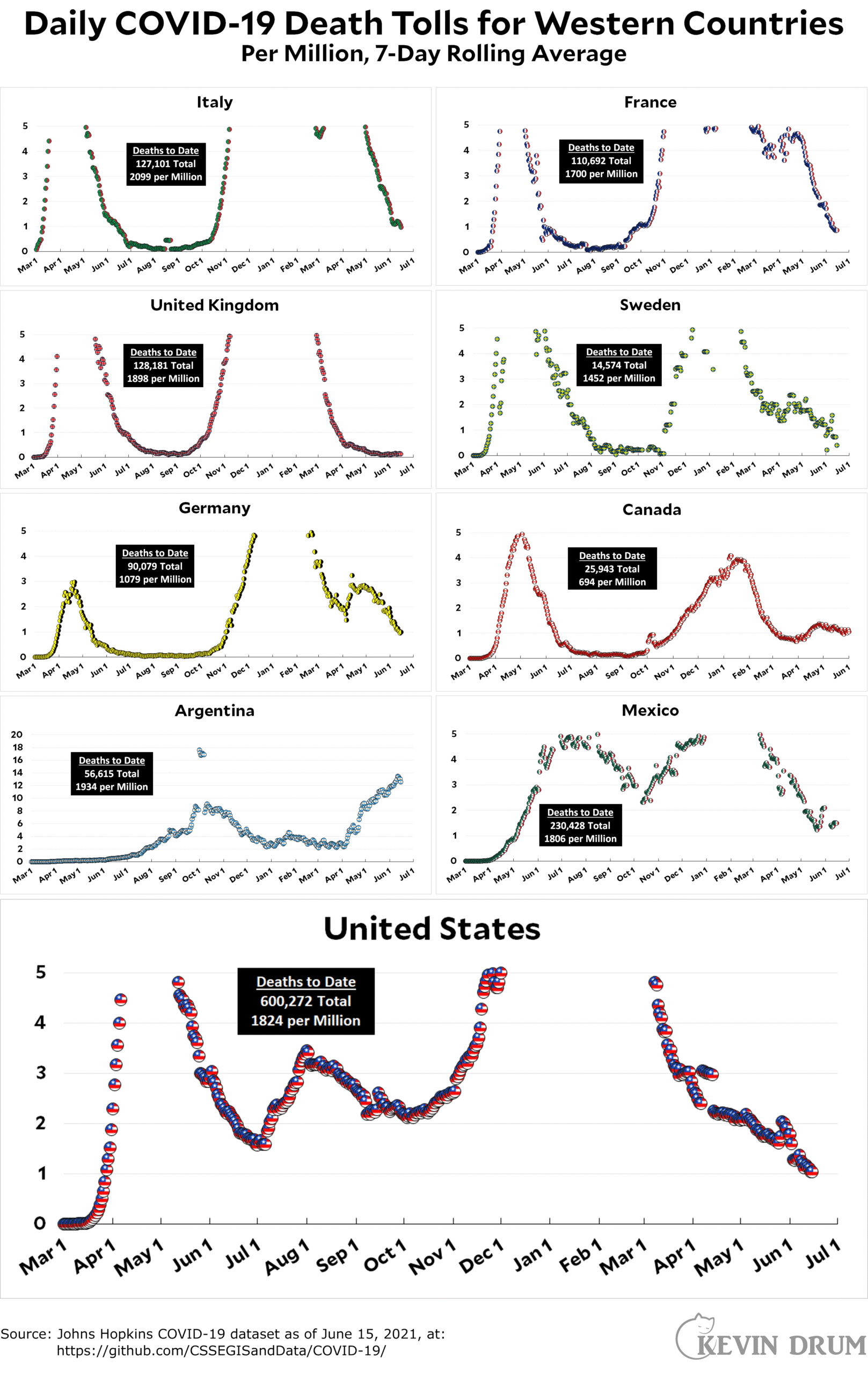
After months of stagnation, I've made a change to our daily charts. With the exception of Argentina, which is still skyrocketing, all the other countries I cover have dropped to very low mortality rates. For that reason, I've changed the vertical scale to 0-5 so that it's easier to see just how low the mortality rate really is. As it happens, it's pretty close to one per million almost everywhere. The US is currently at 1.04 deaths per million.
Here’s the officially reported coronavirus death toll through June 15. The raw data from Johns Hopkins is here.


I might be off on this, but I was perusing vaccination statistics yesterday and my impression is that pretty much all the other high income countries have seen fairly substantial drop-offs in progress in similar fashion to the US, and indeed America's numbers were holding up better than some.
So much for American exceptionalism.
I have made this comment before but it keeps becoming more urgent: Death counts were a good way to follow the pandemic in the early days when testing was sketchy and wildly different in different countries. This problem is not nearly as salient now than it was then.
The big draw back of death counts is that they reflect that situation 3 - 4 weeks ago. For example: Multiple reports say that cases among young people in the UK are on the rise due to the new delta variant. In 3 - 4 weeks we will see in your data set if the impact of this was really big or if someone just exaggerated. We should see this now. And we could.
To see these kinds of developments in an usefully timely manner we need to see case counts: the most timely data points we have. Death counts, regardless of the scale of your graphs, are no longer the most useful data set and haven't been for a while now.
Those are fair points. But case counts have problems of their own, especially for international comparisons. Case ascertainment is very variable: the US even today does not have much of a testing system in place, and even within the US there is considerable variation in testing, whereas, got example, the UK and Germany have a lot of case surveillance going on and getting tested if you're symptomatic is very easy.
And if I recall correctly, Johns Hopkins also tracks case counts and provides the data. Simply fire-up your favorite spreadsheet program and import.
Just to give highlights from the cases spreadsheet, the four countries of southern South America have cases declining in the past couple weeks. Cases are still going up in Brazil and Colombia, however.
Cases are really shooting up in Great Britain, for four weeks now. That's surprising, given how far ahead of everyone else they were on vaccination. Their death numbers are going to get up off the canvas, I expect.
Other countries with rising case counts are South Africa, Tunisia, Spain, Iran, Iraq, and Russia.
Apparently what happened in the UK is that vaccines protect well against the Indian/Delta variant if you have are fully vaccinated. So the strategy of waiting 12 weeks between doses has come back to bite them.
Also UKs main vaccines are AZ and Pfizer. AZ was never as good and Pfizer only got good after dose 2.
That might be it. I just looked at the Our World In Data graphs, and it shows that when you look at the fraction of people who are fully vaccinated, the United Kingdom has lagged behind the United States until a week ago. I didn't realize that.
WorldoMeter does this, but you have to check each nation individually to get averages:
https://www.worldometers.info/coronavirus/country/india/
I disagree. I'm most interested in learning how many people are dying. I'm well aware there's a time lag between initial infection and death. Still doesn't make it a less important statistic. Also, case counts are entirely dependent on testing capacity or activity. A dropping case count could be entirely misleading if what we're in fact seeing is a drop off in testing. (Positivity rate is a better metric).
If one removes the vaccinated from the equation, the case rate for the unvaccinated is a lot higher. I think that would be a more useful figure at this point. Among other things, it would show to the unvaccinated just how much more likely they are to get covid and die (if they care to pay attention).
Tme to switch to a log scale?
The assumption is we can’t handle a log scale…
https://www.youtube.com/watch?v=a4fwrdr_bZo
MS finally broke through--more than 35% of it's people are now vaccinated (first dose, total population).
Still have 5 states below 40%...MS, LA, AL, WY and ID.
WY only state above 10 new cases/day/100K (at 11.3), CO dropped down to 9.6
VT dropped all the way to 1!
And 11 states below 2.
Six states with infection rates above 1, with AR leading the charge (1.1, but cases only 7.8)
from CovidActNow and CDC covid tracker
Delta. A variant gift which keeps giving: https://news.google.com/articles/CAIiEMwp7FVukkItxjQUsDufip8qGQgEKhAIACoHCAow2Nb3CjDivdcCMJ_d7gU?hl=en-US&gl=US&ceid=US%3Aen
Article includes a new gift, Lambda.
Hmm, twice now I’ve tried to post a link concerning virus timeline and twice it hasn’t appeared nor given any indication of error…