
Here are average weekly earnings for full-time workers:
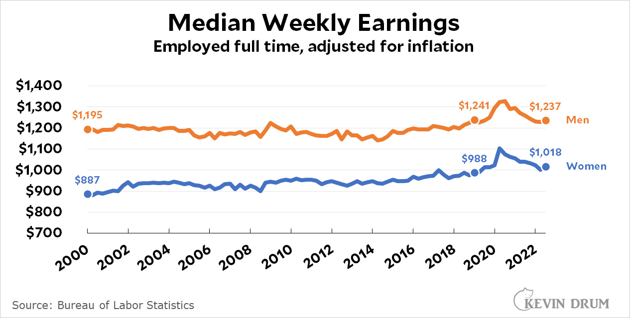
Since 2000, men's earnings have gone up 0.16% ($2) per year in real terms. Since 2019, men's earnings have gone down 0.08% ($1) per year.
Since 2000, women's earnings have gone up 0.67% ($6) per year in real terms . Since 2019, women's earnings have gone up 0.76% ($7.50) per year.
NOTE: This is the median for full-time workers and does not include those who don't work or work only part-time. Thus, it doesn't account for the fact that fewer people are working than in 2000. Compared to 2000 levels, about 300,000 more women are working and 2 million fewer men.
Start making more money weekly. This is valuable part time work for everyone. The best part ,work from the comfort of your house and get paid from $10k-$20k each week . Start today and have your first cash at the end of this week.
Visit this article for more details.. https://Peopleperhours.pages.dev/
Why do the 8’s in the chart look upside down? The top loop appears to be bigger than the bottom one.
the bottom circle is being compressed by the weight of the top circle.
😉
I see that on the y-axis, not so much on the x-axis
Because many font designers are too clever for our own good.
I work in a manufacturing plant, but I’m a salaried engineer. In my “field” there are plenty of hourly overtime eligible “operators” who make pretty good cash. They put in a lot of hours to get that OT. That’s how they increase their take home pay. Work OT. As near as I can tell, they think it’s a pretty good deal, but it’s not for everyone. Also… we’re a 3 shift operation so the shift differential is significant.
They make decent money when they are in the plant at 3 am Sunday morning. I don’t know that these stats imagine such options are available to those willing to do the work.
I take it the spike in the median income was because the shutdowns really affected low wage workers much more so than higher wage workers.
Correct.
This particular statistic is a bit misleading in that low wage workers are the first to go during recessions and make up a significant amount of the new jobs when the economy is at full employment.
Note the jump in earnings during the 2001, 2008/9 and 2020 recessions.
It's possible and clearly evident in the chart that workers at all income levels can be seeing earnings improvements while this chart shows reductions due to the changing composition of the workforce.
This chart should be viewed with much skepticism. It isn't wrong....but it might not be very informative.
I think the chart is what it is: it shows median earnings over a longish, multi-decade period. And, while we do see median earnings spikes, we also see how those spikes are reduced when the economy normalizes. Thus, by 2022 median wages had come down a bit from their "artificial" highs in 2020. This is clearly apparent from the chart (although for women, this effect still leaves their wages higher than they were before the pandemic).
To me the takeaway is just how pathetic wage growth has been in the USA since the year 2000. The "median" statistic doesn't tell us the whole picture, obviously (mean earnings will show higher growth, as more highly educated workers have done considerably better). But median does give us a better look (than mean) at what has ben typical on the earnings front for most workers.
Your statement that the chart shows what it shows is obviously correct, that's true of any and every chart.
It is worth considering what exactly the chart is telling us. Boiling two hundred million stories down to one simple chart is necessary sometimes....but it's important to understand the data and how the chart is depicting all those various stories.
What does it mean if the chart goes up while the economy adds millions of jobs and gets younger, vs what is it telling us if the chart goes up while the economy loses tens of millions of jobs.
My point was to consider that large changes in the composition of the workforce can cause the median to present a very misleading image of the economy. While I agree that median is a better picture than mean, it's not at all clear that it gives a good picture of what is going on for workers across the economy. There is no median worker even if you draw a graph to show how he's doing.
...what is it telling us if the chart goes up while the economy loses tens of millions of jobs.
I think we both know the answer to that: in down times lower paid workers are shed in greater numbers than managers and professionals, thus frequently yielding an increase in the median figure (also, wages are sticky). Surely it's no great mystery. I think your objection would be on firmer ground if a claim were being made that a spike in median earnings is a good thing. But I see no such claim being made. This is in contrast, of course, to a steady increase in median earnings over the long term, which is unambiguously a desirable development.
While I agree that median is a better picture than mean, it's not at all clear that it gives a good picture of what is going on for workers across the economy
No single statistic could possibly tell us all we want to know. But the change in real earnings at the median yields valuable insight into overall economic strength, and whether any gains are being widely shared*. Which is why the anemic growth in median earnings in the US over the last two decades is a worrying sign for American men. Women's gains have thankfully been stronger.
*Obviously the more context the better, so ideally such numbers are presented with longer time horizons—so we can see how this datapoint look for the time period in question compared to earlier eras—or vis a vis other nations, so we can gain some insight into how the US is performing compared to other countries.
Don't suppose you could do a GDP corrected plot?
Robert Reich has an editorial in The Guardian saying there really isn't a shortage of workers in the US--it's just that jobs staying empty aren't will to pay enough.
https://www.theguardian.com/commentisfree/2023/jan/15/there-is-no-us-labor-shortage-thats-a-myth
When does fighting inflation become maintaining the wealth gap?
"Robert Reich has an editorial in The Guardian saying there really isn't a shortage of workers in the US--it's just that jobs staying empty aren't will to pay enough."
This is only partially true. There have been **on the whole** more jobs created then there were workers coming into the workforce for years. People leaving the workforce have outnumbered people entering the workforce for at least a decade as the boomers retire.
The birthrate now is only 1/3 of what it was in 1950, the peak of the population boom. It's an ugly fact that we have to get used to fewer workers producing less "stuff" for more people.
Until the boomers die off recessions and immigration reform are the only ways to balance this out - jobs wise.
You're right. But we also have falling labor force participation. Raising salaries will pull more workers off the sidelines, esp. at the lower end of the scale. We'll still need immigration too.
If women decide to raise a family, can they make money if they go to work? The cost of day care for kids is expensive, and dropping kids off at Grandma's is not always an option as Grandma needs to work too.
I wonder how well the data capture folks who work in the app economy: especially, for example, someone who's work combines for 40 plus hours but its made up of say Uber, Lyft, DoorDash etc.