Our nation's statistical agencies were busy today, so instead of writing half a dozen posts with half a dozen charts, how about if we just collect them all in one big post? Starting us off today is the Census Bureau with its advance retail sales report for July:
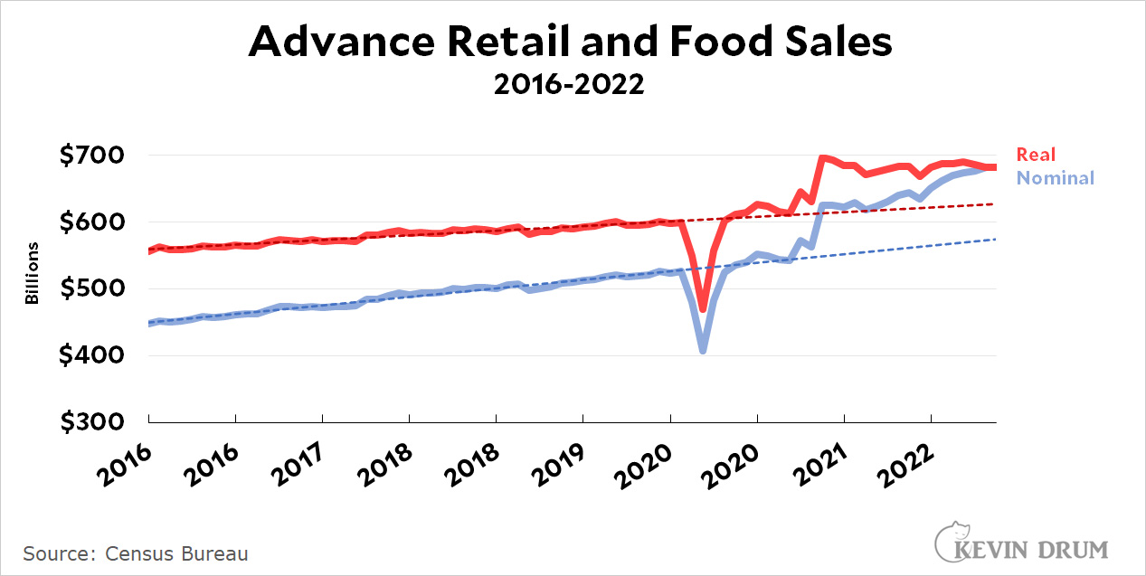 Normally I would chastise everyone reporting about this in nominal terms, since it's a classic example of a series that only makes sense if you adjust it for inflation. But it so happens that inflation last month was roughly zero—actually down slightly—so everyone gets a reprieve from my usual chewing out.
In nominal terms, retail sales were up 0.03% from June to July. In real terms they were up 0.05%. In other words, basically flat no matter how you measure it, but still well above the pre-pandemic trendline.
But that's not all from the busy nerds at the Census Bureau. They also have the latest figures for the inventory-to-sales ratio:
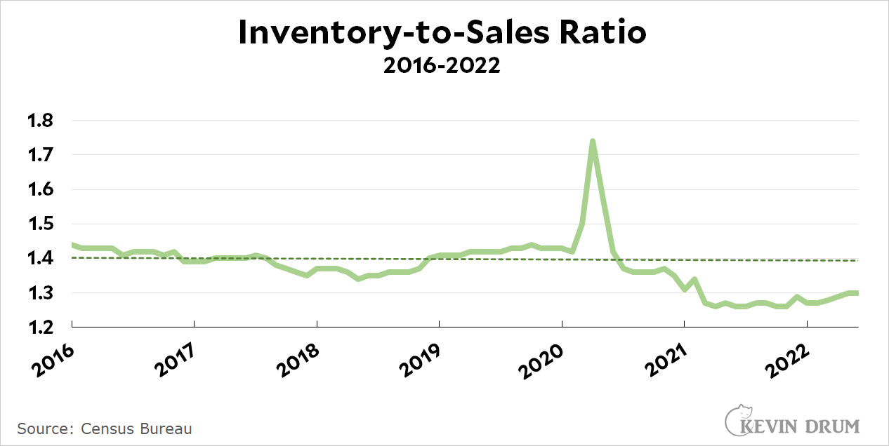 This is a ratio of $/$, so once again inflation doesn't matter. Huzzah! In any case, the IS ratio stayed flat at 1.3 in June, which is well below the pre-pandemic trendline. This means that despite some anecdotal reports of bulging warehouses, inventory levels remain historically low. Generally speaking, that's likely to produce higher inflation rather than lower.
Next up is the ever-busy Bureau of Labor Statistics. Today they have JOLTS data by state, which you can see here. Here's the national map for hiring rates:
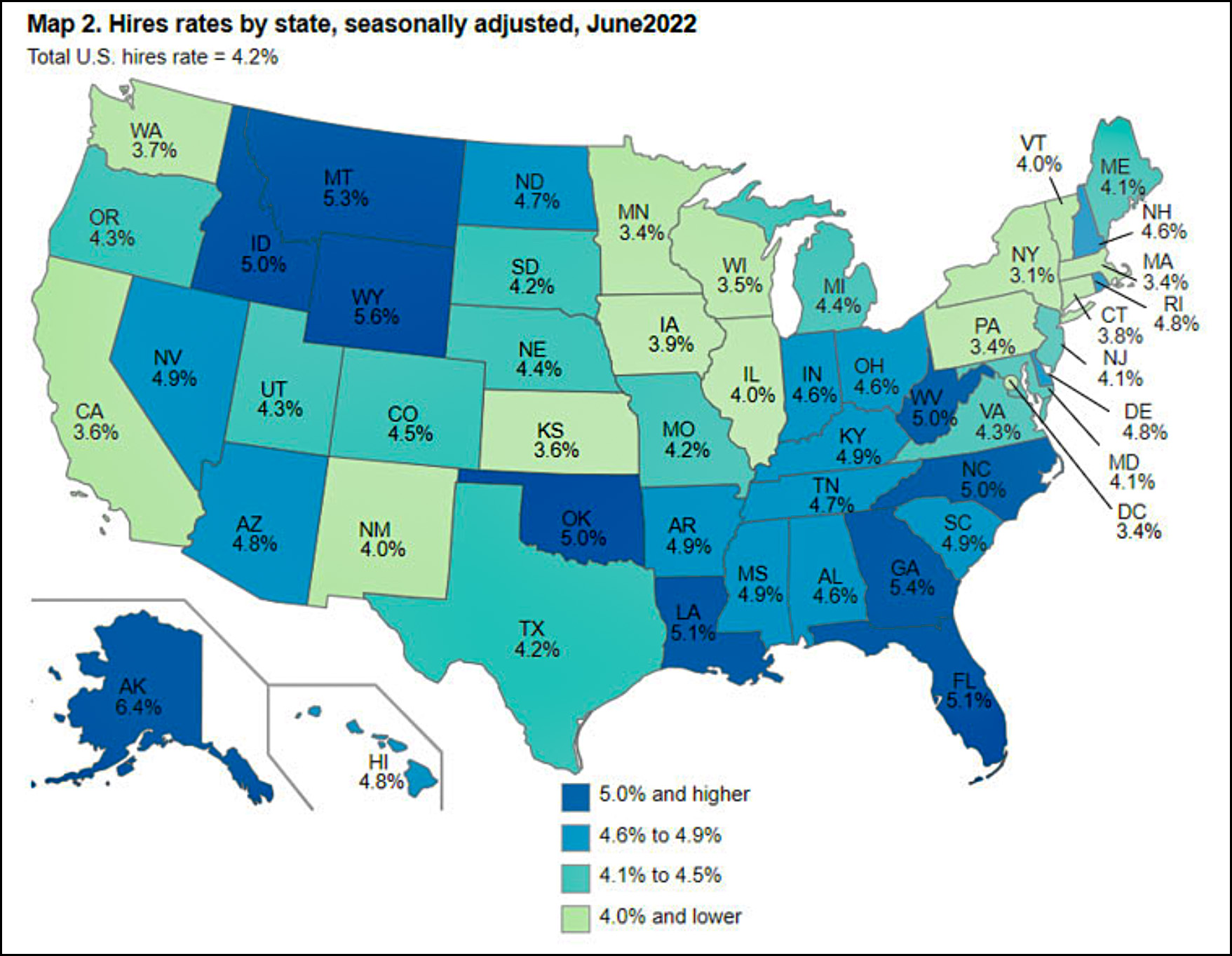 Alaska and Wyoming have the strongest hiring rates right now. New York, Massachusetts, Washington DC, and Minnesota have the weakest.
Not to be outdone, the BLS also has two releases today. The second one is about the state of youth employment, and it shows total employment, the unemployment rate, etc. Here's the chart for the labor force participation rate over the past few summers:
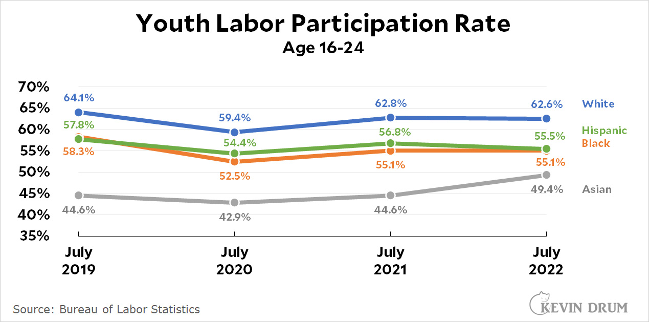 Every racial group has seen its youth participation in the labor force decline since before the pandemic. The only exception is among Asian youths, who have increased their participation very strikingly from 44% to 49%.
The USDA is pleased to offer us the latest annual figures for production of feed grains. Here's the chart for price increases:
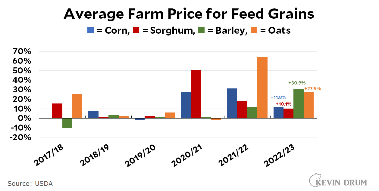 Corn is by far the biggest component of feed grain, and its price was up 31% last year and another 12% this year. In addition, total corn production was down 5% during the 2022/23 season.
That's bad, but on the bright side you will once again be spared a lecture on inflation adjustment because feed grain is itself an important input into the food inflation rate, so you need to see the raw nominal figures. The basic takeaway here is that for the past two years feed grain prices have skyrocketed, which is one of the reasons that food prices are going up so much (the other reasons are fertilizer prices and bad weather that affected the production of corn and sorghum).
Finally, here's some airline news. It turns out this is a few days old, but here is passenger airline employment over the past few years:
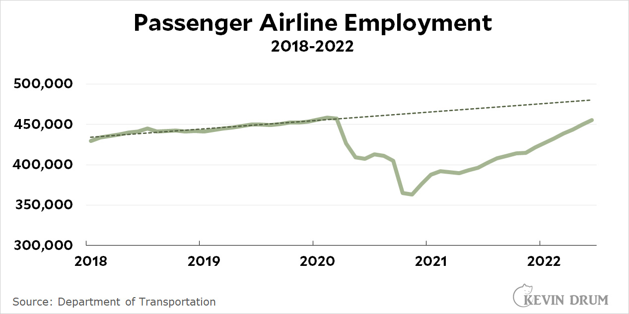 Despite receiving billions of dollars in federal funds to help them maintain employment during the pandemic, airlines shed nearly 100,000 jobs over that period. In May they finally caught up to their pre-pandemic employment level, but they're still well below their pre-pandemic trendline. However, there's also this:
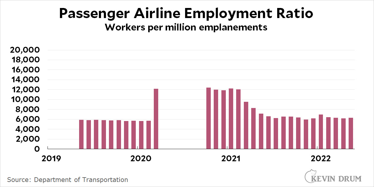 In terms of workers per million passengers, for the past year it's hovered around 6,400 compared to 5,800 before the pandemic. That's because even now, despite everything you hear about chaos in the airports, the monthly flow of passengers is still down 11% compared to the last month before the pandemic started.
But this only goes through May, so it doesn't tell us anything about summer travel. For that you'll have to wait a few months.
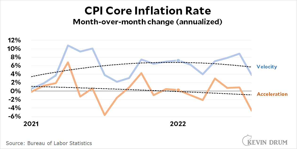 The monthly change in CPI (i.e., velocity) peaked in January and has been easing off ever since. Likewise, although the monthly acceleration of CPI has been declining for nearly two years, the trendline crossed into negative territory in January.