
The American economy gained 943,000 jobs last month. The unemployment rate declined substantially to 5.4%.
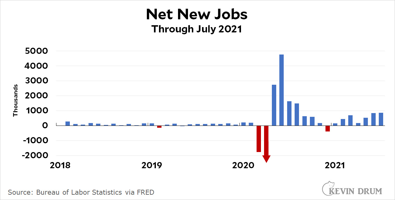
The number of employed people went up by a million while the number of unemployed dropped by about 800,000. Black unemployment remained high, but dropped a full percentage point to 8.2%.
The biggest increases in employment came in the leisure industry and in government. Hourly earnings were up 5.3% on an annualized basis, but that's roughly zero after you account for inflation.
The way jobs reports are covered make it very difficult to get a sense of where we are in the recovery. I think Bill McBride's charts are actually more useful.
https://www.calculatedriskblog.com/2021/08/comments-on-july-employment-report.html
Other things we could use better charts for:
--Infrastructure weeks
--Tan suit days
Tan suit days are black swan events. There's nothing meaningful you can do to predict or analyze them.
Thumbs up for Calculated Risk