
Just because I continue to think that a lot of people still don't get this, here are two charts showing wages and inflation. The first starts in 2019:
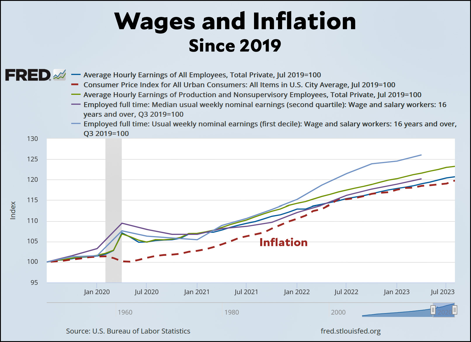 As you can see, every measure of wages has risen more than inflation. Now here it is over just the past year:
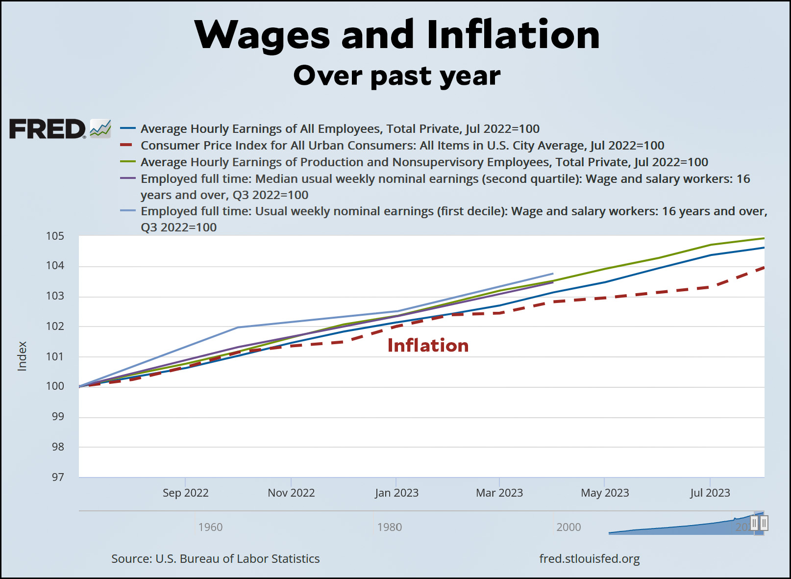 Once again, wages have outpaced inflation. The poor (light blue) and blue-collar workers (green) have done the best. But everyone has made gains.
You can cherry pick all you want. If you run this chart for 17.5 months or 26.3 months, it might show something slightly different. But the most obvious and natural measures both show the same thing: worker income has beaten inflation consistently. Not by a vast amount, which is probably all for the best with inflation at the top of the Fed's mind, but still up. Purchasing power has not suffered over the course of the pandemic to now.
POSTSCRIPT: I copied these charts straight off FRED just to make absolutely sure that nobody thought I was fiddling with things in my own charts.
In anticipation of the inevitable accusations that Kevin is wearing rose-colored glasses while he spreads fake news: these are broad averages (and medians). National ones at that. Maybe you happen to live in a city where rents have been rising especially fast. Or maybe you got laid off due to the pandemic, and the new job you founds pays less than the old job. Or maybe your commute's a brute, and gas prices impact you much worse than the typical American. Outliers exist. I think the point is, the inflation situation hasn't been a disaster for the country, because wages have kept up.
I'll add: what these numbers don't show is a rise in living standards. Real wages at the median tend to increase over time. But we've seen them stagnate for several years. I have no idea how typical it is for real wages—and thus the typical material standard of living—to stagnate several years in a row. But that may partly explain why a lot of people report negative sentiment with respect to the economy and greater concern about inflation. I'd also guess (strictly a guess) that stagnating real wages are more noticeable when there's an inflation component (as opposed to merely a lack of increase in nominal wages).
Finally, because these are only averages—and again, outliers exist—it seems probable that it's more common for some people to be experiencing an outright decline in real wages than would be the case during a period of broadly rising median real wages.
Perhaps i misunderstand your post, but this doesnt seem to be true. We have not seen several years of stagnant real earnings.
In fact, the opposite appears to be the case. The expansion of ACA subsidies, the large stimulus payments and the large monthly savings from all of the mortgage refinancing that occurred in 2020-2021 are not reflected in this chart.
What info is driving the narrative you have created about current or recent changes in living standards? These charts dont appear to support that narrative.
https://fred.stlouisfed.org/graph/fredgraph.png?g=19JkP
My bad. Not sure where I got that. Should have stopped with my initial comment. It's possible I read a headline somewhere claiming slippage in real wages (and that was at the back of my mind). Or maybe I simply scanned too rapidly and misread Kevin's post as saying wages have kept pace with inflation (in fact, as you rightly point out, they've exceeded them).
There's some further comment on all of this in this post:
https://jabberwocking.com/living-on-a-single-income-in-modern-america/
Yes, I agree here, and with the piece in your original comment about rent. Clearly, wages have risen, but I wonder if the inflation calculation itself (which is an estimation by its very nature - it's a basket of prices with weights assigned to each) is too far out of touch with the reality of household expenses, particularly on necessities.
There's lots of evidence that people are beginning to fall behind - highest-ever percentage of renters are housing burdened and credit card debt is rising (https://www.cnn.com/2023/08/08/economy/us-household-credit-card-debt/index.html).
Obviously, the CC debt is an aggregate and maybe that's all concentrated among a minority of people who are doing worse for any reason. But inflation is still part of that problem.
FTR, I don't think inflation in aggregate is a problem for the macro economy - it's mostly gone, and evidence points towards it being transitory (over a period of a year or two), although the housing price shock is real and ongoing (for its own structural reasons as well as choices by those with price-setting power within metro markets).
For all that we say "inflation has been a disaster for the country", inflation averaged four percent during Reagan's administration.
Some perspective really needs to take root here. The fact is the primary damage inflation has done is emotional because for a large portion of the public -- pretty much anyone in their 40s or younger -- they've never experienced high inflation in their working lives. This was a shock more than an actual disaster.
As I mentioned before* real wages declined severely through the Reagan and Bush I administrations:
https://fred.stlouisfed.org/graph/?g=19K4v
Of course inflation and wage decline were even worse in previous administrations (Nixon, Ford, Carter) so there was relative improvement - or at least things weren't getting worse as fast.
*This shows that declining real wages do not explain the recent life expectancy decline. Real wages were much lower in 1992 than they are now. Health care for poor people may actually be better now than in the 80's for both technological and political reasons.
these facts are not part of the popular narrative.
It’s the distribution, stupid.
Averages are notorious for ignoring the effects of distribution. If one percent of the people got all the wage increases, “average” is perfectly happy reporting that wages increased, even as 99% got nothing. It’s entirely possible that wages increased on average but the median household didn’t see much or any of it. And if that’s true, then prices going up will have exceeded wage increases for whatever percentage of the population is non-average.
“It’s entirely possible that wages increased on average but the median household didn’t see much or any of it.”
Except one of the lines in the chart is median earnings.
Ok. So the median means half of people fell below the line. Still a problem if the line they’re on is flatter than prices or actually going downhill. A world in which 49% of the population is getting no wage increases and 51% are getting them will show up as a median of wages increasing.
It’s still the distribution, stupid.
My point is that you are not making very good arguments, something you continue to demonstrate yourself.
You said "It’s entirely possible that wages increased on average but the median household didn’t see much or any of it." But in fact that isn't possible, because the data shows the median household's earnings went up.
I agree with you that 49% of income staying flat is consistent with median income growth, but is there any reason to think that is happening?
Make a real argument; don't posit silly scenarios and pass that off as wisdom - especially when you say things that are demonstrably false.
Just a note.....
One of the lines is median weekly earnings for the 2nd quartile, another is usual weekly earnings if the 1st decile.
Somewhat narrow groups of people looking only at a quartile or decile....but I imagine these were exactly the groups you were concerned with. And they seem to be doing well.
As a commenter noted on the prior post, this is not a mystery. Losses are felt more acutely than gains. This is a core finding of psychology and economics. People hate inflation because it's a generalized set of losses over multiple areas of everyday life. Increased wages are localized gains and thus swamped in affect by the inflation losses (psychologically).
And the largest piece of inflation (housing) has increased by much more than the headline rate of inflation. It's also the largest single expense for nearly all households.
Well, if housing has increased more than average that means that other major expenses, especially food and gasoline, have increased less. Yet people constantly complain about those other things.
Sure, and people like to complain about things. It's certainly true that the real price of gasoline has been steady/declining slightly, but food and gas don't really cause the same amount of stress as housing payments when you're living paycheck to paycheck as housing is often the entirety of one paycheck if not more.
By golly, it's my God given right as an American to never spend over $2/gal for GAS!!!
The "correct" price of things. like tastes in music, seems to get fixed when one is in their early twenties.
Everything your saying is true, Kevin, and I agree with it, but most people don’t think this way.
Is it cherry-picking to look at April 2020 when wages spiked and earnings dropped? Absolutely. It is cherry-picking. And if you asked people “would you want to go back to conditions as they were in April 2020, very few people would say “yes.”
But the human mind is known to anchor to high points. People never want to sell their house for less than what it was worth a few years ago. The same is true for stocks. As a species, we have a hard time seeing trends and recognizing that the highest point is a series is not necessarily where the series ought to be. Is that cherry-picking? Yes. It’s also human.
Which is not to say you are wrong. You’re not wrong! But you seem almost not to believe that people struggle with this. Things are much more expensive than they were in April 2020 relative to people’s incomes, and that’s what they remember.
If purchasing power hasn't been hurt by inflation, it's also supposed to be true that inflation is good for people holding debt.
So how are those numbers looking from July 2020 to today?
I still think the numbers that matter most in the current economy are wages versus expenses. Is the average American worker putting away a nice sum of money? Or purchasing more goods or services which aren't staple items? Or are their expenses still too high when compared with their income? Percentage increases hide absolute values, and if a family's costs are still higher than its total wages, the absolute gap in dollars needed to go from being in the red to being in the black is going to increase even if the relative value of every one of those dollars has dropped.
CC debt declined at the start of the pandemic and has since exploded: https://www.cnn.com/2023/08/08/economy/us-household-credit-card-debt/index.html
Inflation is good for people in debt (owing money). A lot of house owners have profited not only by the decline in real value of their mortgages by also by the run-up in prices.
Housing costs are complicated for several other reasons. As Kevin has discussed the BLS measure of rents doesn't agree with other measures.
Of course if your earnings have not increased the mortgage payments are still the same fraction of your income.
On thing I'll note: inflation measures are notoriously poor at incorporating housing costs, and those have increased dramatically over the past 3 years.
I'm really curious how much "rent" has gone up in the inflation measures. Even in the abundant-housing small cities I know best, rents have nearly doubled over the last 5 years.
Yep! Housing is only 1/3 of inflation, which is underweighted given the current housing price environment.
This is probably not true.
Most Americans either own their home outright or have a fixed rate mortgage.
Many people are paying a large portion of their income towards housing, but many are not.
Housing costs in the inflation stats overstate the degree to which housing cost increases impact the average American.
49% of renter households (~34% of all households) are housing cost burdened - that's ~17% of the entire household count.
21.5% of owner-occupied households are housing cost burdened. If that's 66% of all households, that's a further >14% of the entire household count. That means that essentially 1/3 of all American households pay >30% of their gross income towards housing, which is about 50% of take-home pay. One entire paycheck in a two-paycheck month has to be dedicated to housing.
Both of those numbers have been growing - the change is the point, not that "many are, many are not" housing cost burdened.
https://www.federalreserve.gov/publications/2023-economic-well-being-of-us-households-in-2022-housing.htm
It's not all bad numbers, note the median mortgage to income ratio is sub-0.20, but the rental numbers are bad. It's also not exactly news that homeowners have an advantage due to the fixed payment over a long period of time. There's a reason why so many renters would prefer to buy, but can't afford to. And with the rate of housing cost inflation, we're increasingly just creating two economic classes with less upward mobility (but still plenty of downward mobility) with homeowners and renters.
I'm typing all this while I'm in meetings, but all of this information is easily found with simple googles for official data sources on homeowners, renters, income, etc.
Yes....but your stats appear to prove my point. Housing cost increases are not only not understated in inflation stats, they are overstated.
I am not saying that housing is not expensive and it certainly does affect people at lower income disproportionately.