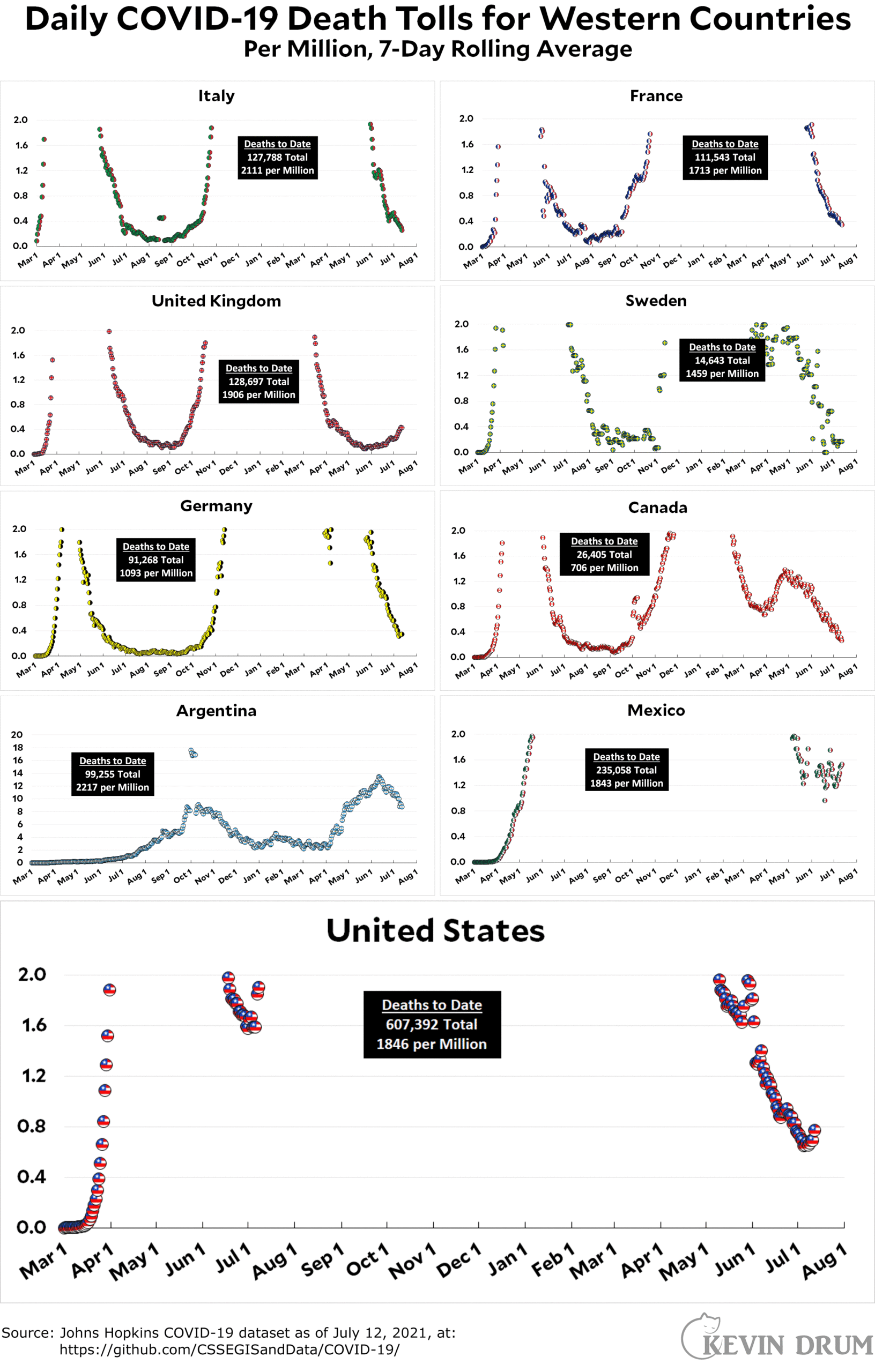
Here’s the officially reported coronavirus death toll through July 12. The raw data from Johns Hopkins is here.

Cats, charts, and politics

Here’s the officially reported coronavirus death toll through July 12. The raw data from Johns Hopkins is here.

Comments are closed.
The headlines and teasers about Guillian-Barre Syndrome with the J&J vaccine were a bit overblown, and will play into the hands of the anti-vaxxers.
I just hope the charts don't have to be re-scaled in a few weeks.
That little upturn at the rightmost end continues to rise, which is really troubling.
I tend to look at worldometers and they seem to show a small uptick in cases but does not look to be as much of a percentage change as what kevin shows from john Hopkins figures.
In the past, when they looked different, it was some sort of dump of a backlog which worldometers correctly tried to redistribute backwards while Hopkins did not. So worldometers seemed a better data source. And the distortion eventually resolved itself for Kevin's posts.
But then I usually was aware of some sort of distortion that worldometers was adjusting for while Hopkins did not. Now I am not. Does anyone know if there is anything.
Or maybe I am not seeing worldometers right and they do match. The series there is getting so long and the current tail so low it is hard to see easy.
But just by eyeball, looking at worldometers and adjusting for the holiday distortion by guess, it seems like maybe we really only just flattened out a little while ago ( and not still declining around the 4th) and now are either still flat or maybe just barely starting to go up.
Eyeballing kevin's chart and same sort of holiday adjustments, it would look more like maybe there is an increase now.
From past experience, I think you need to wait three weeks past a holiday to really know.
But no way we are not having some increase in cases. Those have a lesser holiday distortion.