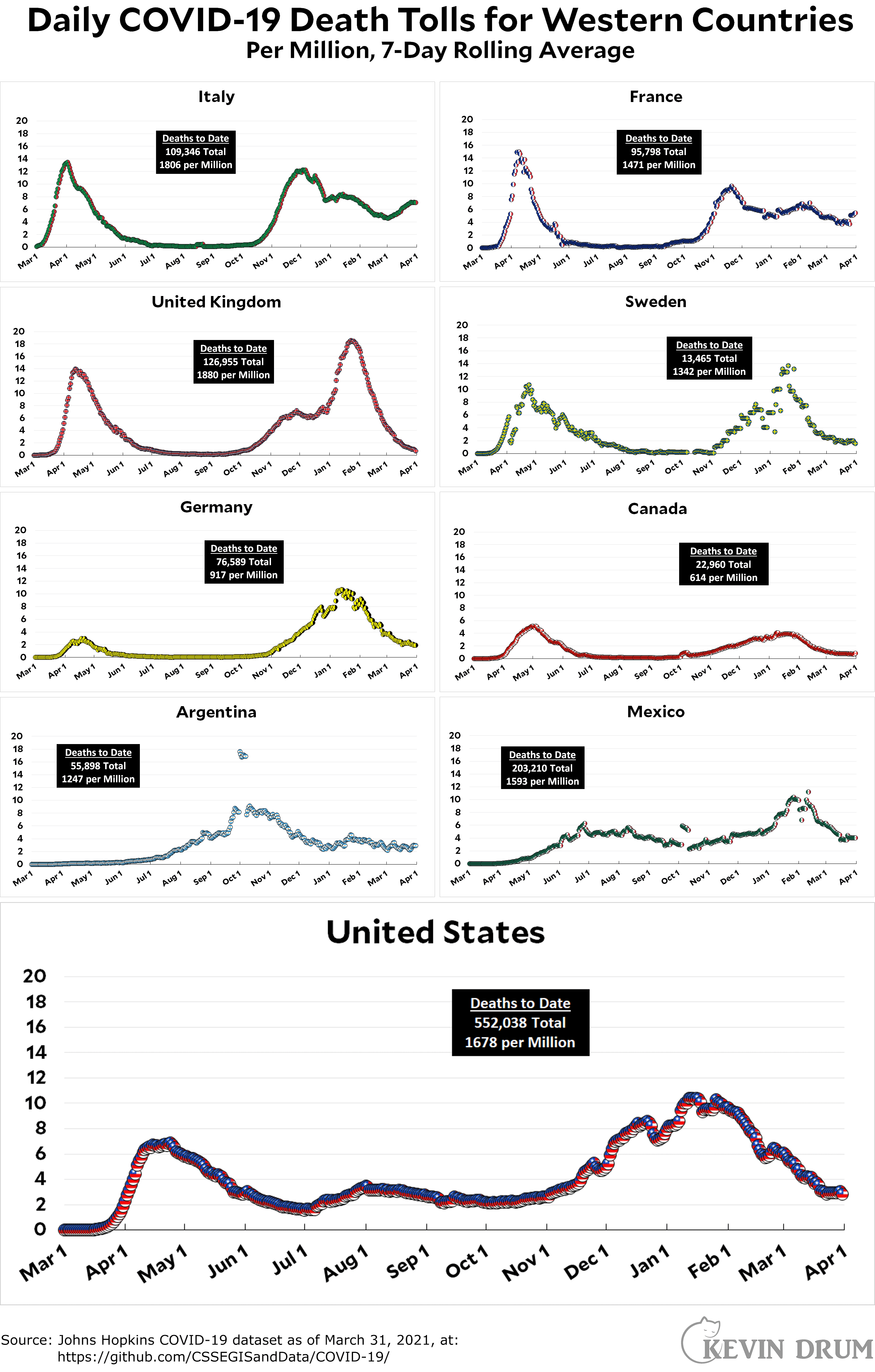
Here’s the officially reported coronavirus death toll through March 31. The raw data from Johns Hopkins is here.
Cats, charts, and politics

Here’s the officially reported coronavirus death toll through March 31. The raw data from Johns Hopkins is here.
Comments are closed.
Italy at least seems to have stopped the rise in deaths. That's good news, and France aside most of the rest still have declining or level death counts.
Are you going to update Mexico's death total to reflect the government's recent admission that a lot more people died than they've admitted to before? It was pretty harrowing stuff - if true, Mexico's death rate from Covid is nearly 1 in 400 people - that might be the highest death rate of any country from it.
A couple of weeks ago, someone asked about a time-series visualization of the spread of COVID-19 across the U.S. I put something together: https://covid-timeline.donacobi.us/
Click the "About" button in the upper right for info.
thanks!
This is really nice. I wish the total option used a darker scale; there seems to be almost nothing showing up when I run it that way.
I do appreciate having "total" as on option, because I don't want a bin somewhere like rural Iowa to have just as much visual impact as a bin over New York City, when it represents a much smaller number of cases.
This was a reply to Steve_OH, of course. I'm not sure I posted it that way.
That's why you need to use the log scale when viewing total cases. Los Angeles County had over 10,000 new cases per day in early December. No matter the color choice, that's going to completely swamp everything else on a linear scale.
Yes, the log option made a pretty good representation, I noticed that after commenting before. Thanks for the good work!
We have a winner, and it's the UK.
Single shot strategy worked.