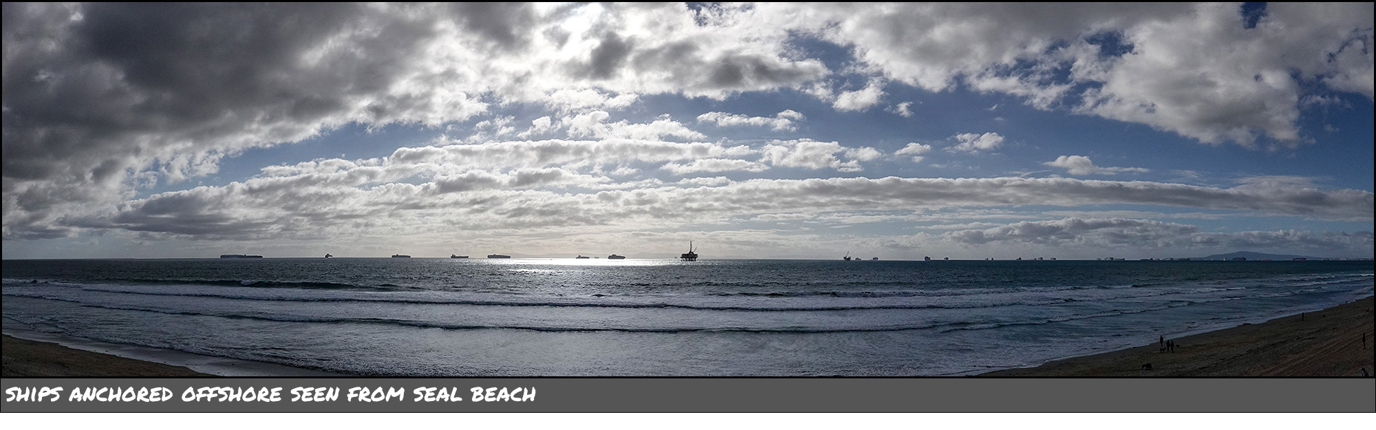
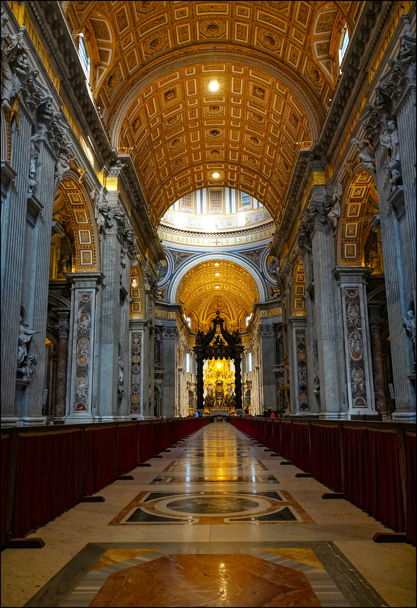
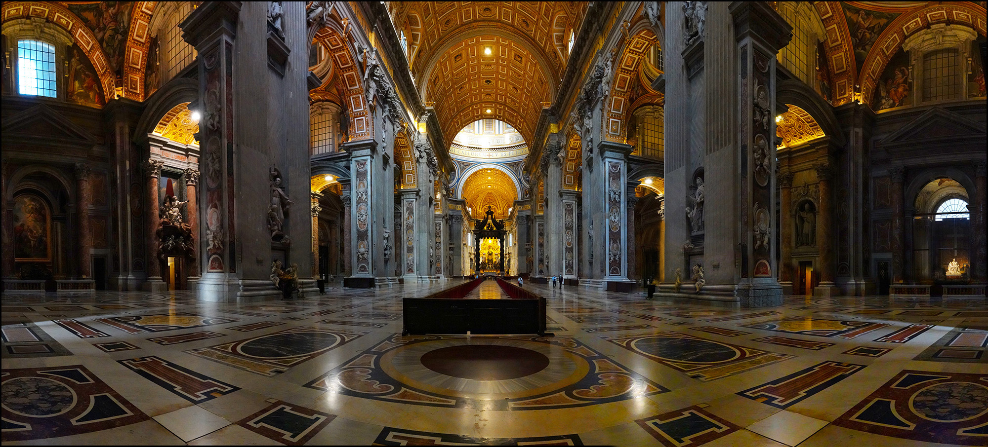
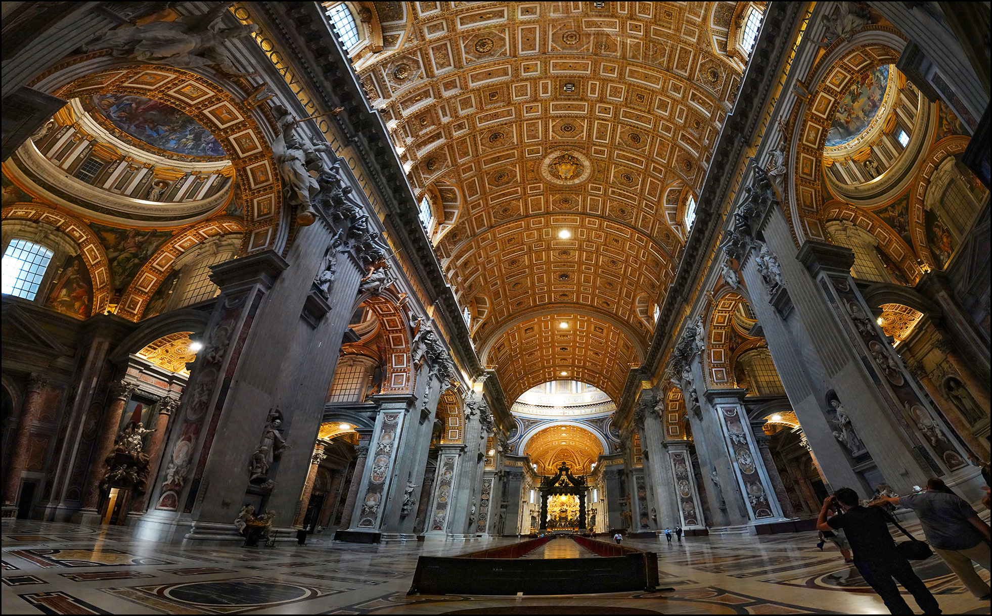
Today we have four different photos showing the interior of St. Peter's Basilica. From the top:
- A single frame with the camera turned to portrait mode in order to show more of the floor and ceiling.
- Multiple frames taken from farther back that are stitched together to show a little more floor and ceiling, but considerably more from side to side.
- A cropped version of #2.
- Even more frames stitched together, showing much more ceiling and much more from side to side, but at the expense of additional distortion.
Which one do you like the best?
Very difficult! Each photo has a lot to commend it and highlights different aspects of that magnificent building. If I had to pick one, it would be #3 (maybe). It seems like a happy medium between #1 and #2. #4 definitely has the "Wow!" factor, however.
Can't go wrong with any of them, and the lighting and exposures are simply stunning. Fantastic work, Kevin!
Portrait mode. Seems like more how you'd see it if you were there.
I'll take #2, since I like seeing the big picture.
#1 liked cid I prefer seeing what I would see in person.
I'll pick #3 Alex
It's #1 or #3 for me. What did you do with the people?
I'm in for #1. Just like seeing it in person. Great shot!
Definitely #2
#3 > #1 > (#2, #4)
IMHO for what it is worth, #2 is a far more interesting image than the more conventional #1. I like #3 (the crop of #2) but the impact of the prospective distortion of the walls bending backwards is disturbing to the eye and was not as apparent in the uncropped version. The prospective distortion of #4 is similar to a fisheye lens and is not to my taste. Also, there are too many people in that image (and people sort of ruin everything). I would try to fix the perspective distortion of #3 in LR, PS or whatever processor you use.
#1. The framing matches the symmetry. #2 looks like a ride at Disneyland.
#1. I like the detail.
It depends on the story you want to tell with each picture. I've seen things similar to 1-3 (about different places or scenes but with similar problems - lots to show) and they all work with the story behind them.
I don't like #4. I don't know why. I feel disoriented like I'm in a huge spaceship.
Late to this, but I love #3.