To the cool and pragmatic engineering mind that dominates modern society, today's image poses no threat. It's just another crooked, poorly composed snapshot of nothing in particular. There are millions like it stored on cell phones and digital cameras in every state.
But this very surface mediocrity—because it so effectively limns the artist's true intent—makes this image almost performatively transgressive. Just a hair's breadth below the surface, but no less obfuscated to the engineer for that, is a biting commentary on man's relationship to nature—signified by the unseen dog that we are advised in italicized, underlined, capitalized type to "BEWARE OF."
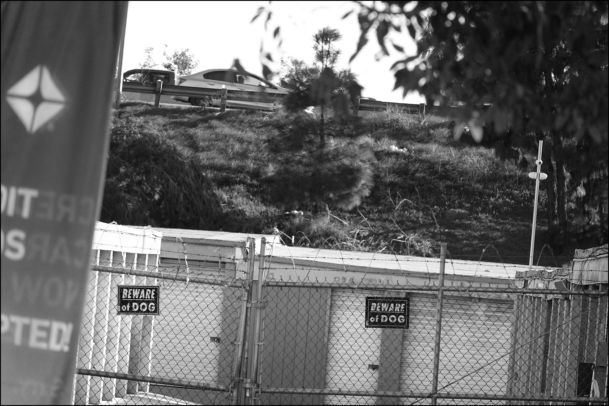
Beware of nature! Everything in this picture privileges human choices: straight lines, sharp focus, fossil fuels, private property protected by barbed wire.
But the photographer playfully—and bravely—lets us in on the joke by maintaining the "accidental" crookedness of the composition, even though we all know how easily it could have been corrected by the engineer's own software, which deconstructs the entire scene into millions of mimetically identical pixels. So why wasn't it?
And how should we react to all this? The unpretentiousness of the surveillance camera on the right reminds us to be careful: it's not art itself that's important, but our socioemotional reaction to art. And we are always being watched—not by the engineer, who doesn't really care, but by those few who have both the sophistication and the polysemous aesthetic sensibility to disdain the engineer's discursive worldview. So never betray yourself to them by letting on that you think this image is anything other than a crooked, poorly composed snapshot of nothing in particular.
LOL. 😀
I would weep but for the anomie.
Oh please! Look at the geometric interplay of the horizontal, vertical, and diagonal elements of the structure and the fence, and their juxtaposition -- nearly equally half-and-half -- with the organic forms of the plants and, yes, even the vehicles. Look the sneaky introduction of the incomprehensible and almost robotically industrial spray-painted fence at the left, which occupies nearly a quarter of the image and yet is all but ignored unless one deliberately pays attention to it. And above all, the image is in black-and-white!
The deliberate, and bitingly critical, composition is simply obvious.
This is why I hate art. One must never appreciate, much less "enjoy" it; one must talk it to death with pretentious and unending blather.
Glorious. Kevin, you are a national treasure. Let no one tell you otherwise.
The image drained of color, bitingly argues for the draining of the soul.
The picture and Kevin's writing remind me of a wonderful review of a photography book that John Waters wrote for Aperture. The book was filled with extraordinarily banal images of airports by the Swiss artists Peter Fischli and David Weiss, which perplexes Waters at first, but then he sees the light:
What an exhilarating feeling to realize that purposeful mediocrity is the only subtle way left to be new.
I read the hilarious essay when it came out in print thirty (!) years ago, but Aperture generously has it available online, with the possibility to click and enlarge a scanned image of the original article. It's definitely an enjoyable read.
https://issues.aperture.org/article/1992/2/2/delayed
Thank you.
And thus we have a workable definition of art (or perhaps arte): the elevation of something orders of magnitude beyond its actual importance. Preferably utilizing copious quantities of impactful polysyllabic verbiage…
My interpretation is that it's throwing shade at dogs.
It's obvious that Kevin is preparing to sell this as an NFT.
The juxtaposition of the corporate logo OVER the fence of the closed doors with unseen guardians while the only thing to do to escape is to drive out, over them all.
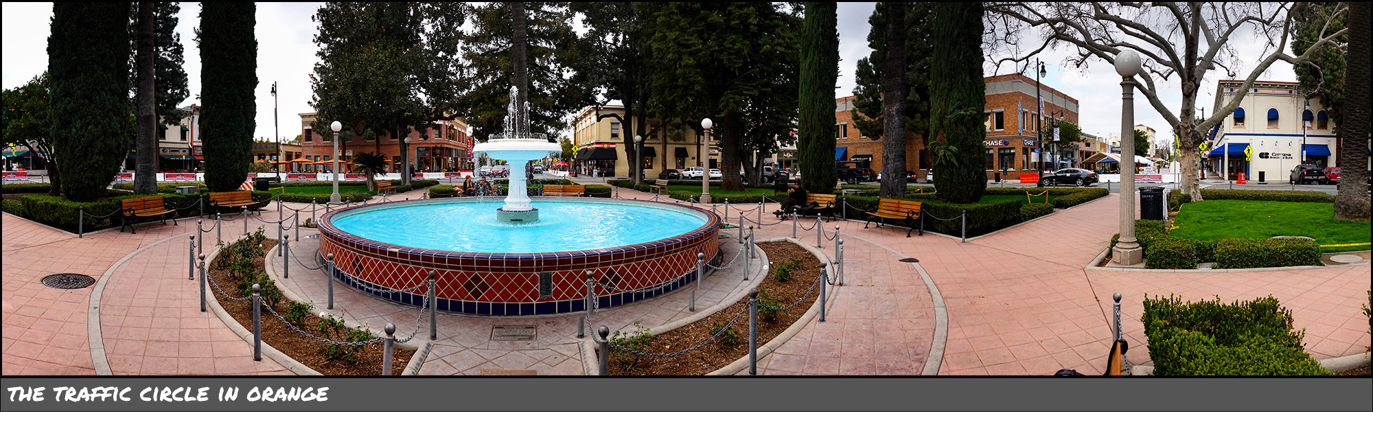
Crooked, off-center, badly-composed pictures are de rigeur now, even in major media. Do all those pictures gain significance by their amateurishness?
Deliberately amateurish videos have long been used in advertising and TV programs to give a (false) sense of reality - if it's an amateur video it must be real life.
A pox on all of your houses. That's what this photo says. What else?
When someone realizes they have no talent they start making "shit" paintings and photographs.
Critics who have no talent phrase them to the skies.
Quite so, Mr. Drum. You're hired.
I’m still looking for the cat in that picture
Like+5
I come here for the laughs...mission accomplished. Okay, and for the enlightenment.
All right, speaking of photos that are "off" (and why not?), take a look at the right sidebar on the main blog, the photos of the cats.
Hilbert doesn't have the spiffy "click and expand" feature.
Charlie does -- but it expands into his older, kittenly photo instead of what you clicked on.
Then again, perhaps that, too, is "art."
"Performatively transgressive"? Nay, I must object. The careless composition, the sloppy disregard for either focus or nuance, the complete inattention paid to any form of movement or evolution, reveals to even the casual viewer the hubris of the photographer. This image betrays no more interest in either subject matter or message than a bored toddler distracted by a dripping ice cream cone. Or perhaps they were distracted by an intense need for an open, clean restroom. In any event, the final result mocks us - MOCKS US, I SAY! One need no more proof of this than the careless inclusion of the gas station banner on the left side, which cruelly compresses the scene, squeezing out the last rare vestiges of breath and life and vitality. The inclusion of the automobile at the top of the image nails the coffin lid shut. More's the pity that worthier works are so often despoiled by association with such jejeune effluvium, not unlike that arugula in my refrigerator vegetable crisper that has somehow gone off in three days. Sic temper artifices! Oh Death - where is thy sting?!