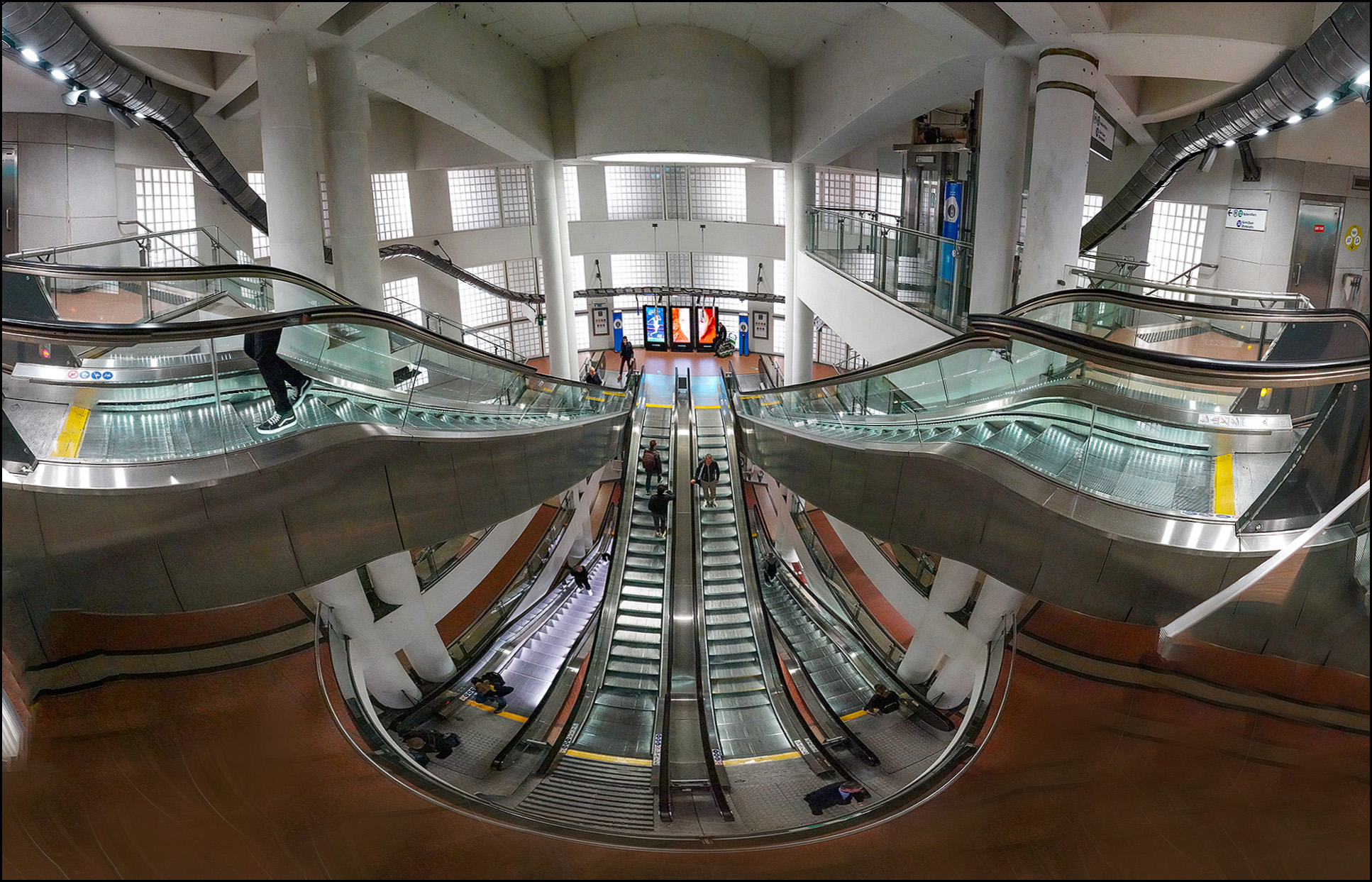
This is one of the entrances to the Madeleine metro stop in Paris. I was fascinated by the three-tier escalator and tried over and over to get a picture of it. The problem is that it had to be a panorama, and Photoshop continually refused to stitch all the individual shots together. Eventually, on about my fifth try, I finally took a series of photos that Photoshop was able to figure out.
The stitch is far from perfect, though. On the left you can see half a person walking up the escalator. On the right, the handrail goes off to nowhere. I could probably fix this stuff if I really had a mind to, but I don't. Not tonight, anyway.
I haven’t been to Paris in about 35 years but I don’t remember ANY métro stations being works of art like that. They were only slightly less industrial grunge than NYC’s, with maybe an attractive Art Nouveau entrance on street level. I don’t remember La Madeleine in particular but it must have undergone a major modernization.
Thanks for the photo, Kevin!
Most impressive! The lower half person is a nice touch. However, is Paris really so monochrome? Excluding those little touches of yellow. Is this in keeping with the Eurocentric view of colors as somehow gauche and tasteless?
Is there any country on Earth with less attractive subways than than the US?
And you keep saying AI is poised to conquer the world.
And start cutting people in half.
Two ideas.
- Instead of screwing around with Photoshop, get a wide angle lens.
- That photo would look as good or better if it _wasn't_ so wide. Nothing interesting is happening on either side. How about cutting it at the two double pillars? (I.e. Just inside the half-guy)?
You mean something like this? https://www.flickr.com/photos/m43photos/14674732064