Next week there's a NATO summit in Vilnius and naturally Ukraine is on the agenda. Today, a group of 46 foreign policy experts signed a letter recommending membership for Ukraine as soon as possible:
In Vilnius, the alliance should launch a roadmap that will lead clearly to Ukraine’s membership in NATO at the earliest achievable date. As with Finland and Sweden, the process can bypass the Membership Action Plan in light of the close and ongoing interactions between NATO and Ukraine.
Is this really the mainstream view of the US foreign policy community these days? I know it's been on the table for years, and obviously Ukraine itself is eager to join NATO, but that open letter is missing something pretty important.
It goes on and on about the various kinds of military assistance we should offer Ukraine, but there's not so much as a peep about NATO Article 5. You know the one: "An attack on one is an attack on all." This is the part of the treaty that obligates the US to go to war if any other member is attacked.
In other words, joining NATO is not a game. It's not a way to "show strength." It's a guarantee that if, say, Russia attacks Ukraine or Moldova attacks Romania, the US will send troops and planes and ships in defense.
Is that what we want? A tripwire that automatically demands our entrance into a distant war if Ukraine is attacked? To ask the question is to answer it: We could have troops there right now but we've very deliberately chosen not to. Like it or not, we obviously don't consider Ukraine a longtime close ally—neither militarily, culturally, nor diplomatically—that we'd defend without hesitation.
NATO is not just a club of vaguely likeminded states that we feel sympathetic toward. It's a deadly serious mutual defense organization. Everyone should keep that top of mind.
On Wednesday Meta launched Threads, a new social media app designed to compete with Twitter. It's already signed up 30 million users, and you'd think this would be broadly welcomed since Twitter users have been bitching forever that Twitter is a cesspool that's only gotten worse since it was purchased last year and subjected to increasingly ham-handed mutilations by its new owner, Elon Musk.
Logging onto Threads is like logging on to the internet roughly a decade ago. I have now seen two strangers share their “hot take” that actually, pineapple on pizza is good, a sentiment copied and pasted from all the world’s most boring Hinge profiles....Threads is Twitter for people who are scared of Twitter.
....Twitter is a platform that attracts a certain type of person....The best Twitter users aren’t people who are looking for sponsorship deals or mugging in front of a camera; by replicating your follower list from Instagram to Threads, you’re not necessarily seeing posts by interesting or funny people. Instead you’re seeing posts from acquaintances, brands, and influencers, and these are not the people who are going to invent the internet’s next best posting format or a new genre of humor. There is nothing revelatory or novel about what’s happening on Threads....For now it’s simply a much less interesting version of Twitter.
Tough crowd! I mean, Threads is two days old. Give it time. A year or two from now I'm sure it will be every bit the cesspool Twitter is today.
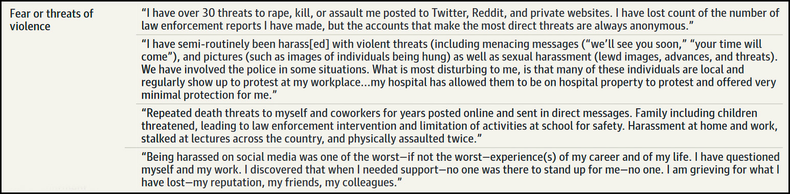
Do you think that all the MAGA vaccine denial and mask vitriol is basically harmless? Hell, let 'em do whatever they want to their own bodies and then vent about it on Facebook. There's one group that would disagree:
A new survey of physicians and biomedical scientists in the U.S. found that nearly two-thirds experienced harassment on social media during the COVID-19 pandemic. Pro-vaccine messages were a common target of online vitriol. So were posts that endorsed the use of face masks or promoted public health in general
....The harassment came in many forms. In addition to violent threats, the doctors and scientists said, their medical practices were slammed with bogus patient reviews, their attackers campaigned to get them fired, their personal information was shared online, and their faces were pasted onto photos of porn models.
Over at New York, John Herrman pulls no punches describing the American news business:
American news is a smoldering wasteland....Cable news is in trouble, the twin threats of streaming and social-media video having sapped it of relevance....Print media is simply disappearing in much of the country, and where it still exists, it is in barely controlled decline.....Digital news is suffering a brutal downturn of its own....Publications savvy or lucky enough to have built subscription businesses — most notable among them the New York Times — have effectively traded broad influence and participation in the public discourse for survival behind ever taller paywalls, where smaller numbers of devoted subscribers consume news that they effectively cannot share. News organizations still vying for pure scale must contend with a Facebook that has thoroughly deprioritized news in its feeds, a chaotic Twitter owned by an ideologue, and a Google that’s threatening to replace its top results with content generated by AI.
I'd like to offer two different perspectives on this. The first is from the perspective of journalists themselves, where Herrman is 100% correct:
This is carnage. Since 2000 jobs in newspapers have plummeted 80%. Total journalism jobs have declined 63%. "Smoldering wasteland" is not too harsh a description.
But there's another perspective: that of the reader of news. Just for lulz, suppose you get your news from the following sources:
New York Times
Wall Street Journal
A network nightly news broadcast
The Economist
Reuters/AP websites
Daily Mail (for the gossip)
BBC
Politico
Whatever you think of these news sources individually, they're basically all healthy and reliable. Some are free, some are partially free, and some are behind strict paywalls. But that's still better than pre-internet, when you would have been required to pay for nearly all of them and couldn't easily share any of them since there was no sharing medium available.
You don't have to rely on CNN or BuzzFeed or Facebook or Vice. If you want, you can get your news from much the same places as you did 20 years ago, except more cheaply and more conveniently.
A hundred years ago, my great-grandfather had access to one news source (he ran the only newspaper in town). Twenty or 30 years ago, most of us effectively had access to three or four. Today we have effective—not just theoretical—access to far more than that.
Herrman's broadside against the news biz was motivated by his belief that its current parlous state will have terrible impacts on politics:
It seems not only possible but likely that this will be the first modern election in the United States without a minimum viable media: a placeless race, in which voters and candidates can and will, despite or maybe because of a glut of fragmented content, ignore the news.
This isn't an entirely pretty picture. Two of the most popular news sources are, at best, semi-reliable, although it's worth noting that social media news feeds mostly point to conventional news sources, not TikTok videos or Twitter disinformation.
There's no question that the news industry has problems. In particular, local news, no matter how you spin it, is all but gone. Small digital outlets, especially those without a niche, struggle constantly. Jobs in journalism have cratered. And yet, through all that, readers have more good options today than ever in history, and the evidence shows that they largely take advantage of that. There's plenty of crap around the edges that demands constant vigilance, but core news continues to putter along smoothly, providing excellent coverage at a reasonable price. It's hard to see how we could ask for much more.
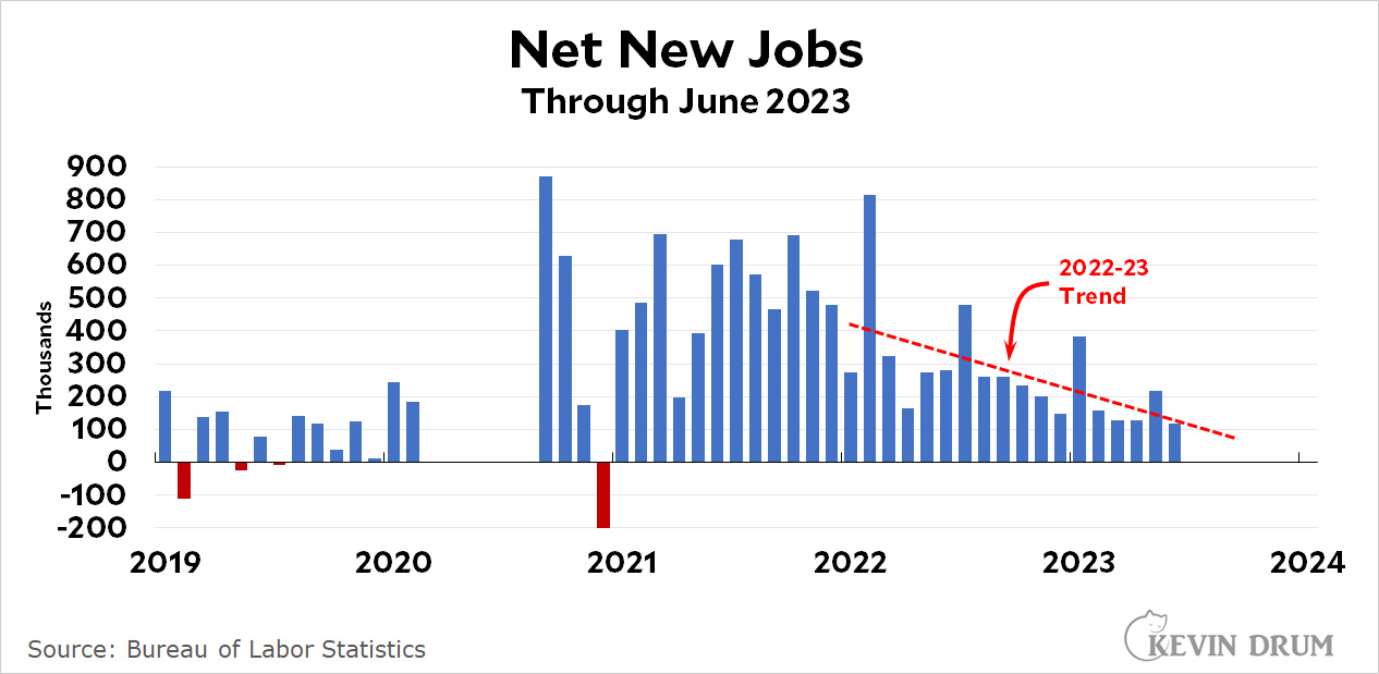
The American economy gained a meager 209,000 jobs last month. We need 90,000 new jobs just to keep up with population growth, which means that net job growth clocked in at an even more meager 119,000 jobs. The headline unemployment rate ticked down slightly to 3.6%.
This is a bad report, but at least there are no gotchas. The increase was solely because more people got jobs, not because workers dropped out of the labor force or anything like that.
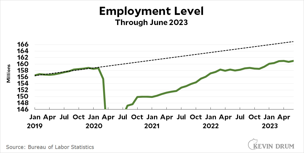
As usual, the employment level was weak.
Since the start of the year the employment level has shown a gain of less than 150,000 jobs per month.
On the moderately good news side of things, average weekly wages increased at an annualized rate of 8.1% since last month. That's due to both higher hourly wages and an uptick in the number of hours worked. Adjusted for inflation, it comes to an increase of 6.6%, quite a nice bump even if it is likely to throw the fear of God into the Fed.
I don't have any special reason for writing this post. There's no hook. It's just something that bears knowing about.
The failure of Democrats to maintain support among the white working class is a frequent topic of concern. But the truth is that it's not really a thing. Not nationally, anyway. Democrats have lost a huge amount of support among white voters in the South:
Starting in the mid-90s, Democrats began shedding support in the South to Republicans in massive numbers. In 1992 there was little difference between the parties. Today, white voters in the South prefer Republicans by 27 points on a "warmth" scale of 1-100.
But that's the South. Here's what it looks like everywhere else:
White voter preferences have tracked almost identically between Democrats and Republicans all the way to the present day. Outside the South, Democrats are mostly appealing to white voters just fine.
Now, it's true that these charts are averages for voters of all education levels, and education is a big factor among voters these days. But this doesn't change the picture much. White high school and college grads have almost identical party sentiments in the South; it's only elsewhere they diverge. It's not a non-factor outside the South, but it's not an overwhelming issue either.
The moral of this story is that in American politics you always need to break apart the South and non-South. It is the great dividing line. Looking at national averages will almost always mislead you.
How tight is the labor market? I've long been mildly skeptical that it's as tight as people seem to think, and today Jason Furman tweets the following chart:
If this is correct, the labor market was equivocal around 2021, with two measures suggesting looseness and three measures suggesting tightness. Since then, the measures showing tightness have come down and are now only slightly above normal.
So where does that leave us? My take is straightforward: after you've charted and analyzed every possible measure of tightness in the world, you're left with one thing: wages. If the labor market is tight, wages go up. If wages aren't going up, then the labor market isn't tight. This is an iron law. So how have we been doing on this score?
Since 2019 real wages have barely budged, and since 2021 every single wage measure is down. I don't understand it, but this just isn't consistent with a tight labor market. In the early days of inflation you could explain it by saying employers were simply behind the curve and didn't realize they needed to increase pay substantially. But it's been over two years now, and there's plenty of evidence that employers have raised prices well beyond inflation levels and reaped higher profits as a result. They know exactly what's going on and they can afford to pay more if they want to. But they still haven't raised wages to attract supposedly scarce workers.
So tell me again how this can possibly represent a tight labor market?
Here's a pigeon hanging out on a traditional French chimney. But where? I can't quite remember. It's just across one of the bridges on the right bank of the Seine, but I can't put my finger on exactly where I was.
Here's a little something not to take too seriously. Today the Institute for Supply Management released its latest indexes, one of which is a price index for services. This is a number worth following since services continue to be the component of inflation that's staying stubbornly high.
However, ISM doesn't report a specific price increase or decrease. It surveys its members to find out how many say prices are going up and how many say prices are going down. Any index above 50 means prices, on average, are going up.
But how much? This is the sketchy part. ISM doesn't say, but you can make a reasonable assumption that the more people who are reporting price rises, the higher those rises are. Then you can do a bit of curve fitting to extract something that looks reasonable. Here it is:
This is dodgy. And it's probably more comparable to PPI than CPI, since it's based on a survey of corporate purchasing managers. However, one advantage of this is that it doesn't include housing prices, so that's not skewing their results. In the end, it suggests that services inflation is coming down faster than CPI indicates, which jibes with other market signals.
By itself this doesn't mean much. But combined with other trends it's yet another weakish indicator that inflation is already coming down significantly.