Hobbs is winning in the two biggest counties, while Lake is winning in 10 of the 13 smaller counties. And some counties have more votes already counted than others. How will that net out? I created a simple spreadsheet that assumed both candidates kept their current percentages in each county after all the votes had been counted. The result was a victory for Katie Hobbs by 51.1% to 48.9%.
That's a respectable two-point difference, though it's certainly possible that late votes are systematically different from earlier votes in one direction or another. Still, at this point it looks like Hobbs will expand her current lead slightly and cut the knees off Kari Lake's oft-proclaimed "rising star" designation. Keep your fingers crossed.
Everyone agrees that Donald Trump was the big loser last night. The candidates he endorsed lost. The candidates he attacked won. The secretaries of states who were big election deniers mostly lost. As early as midnight, a tsunami was building among Republicans who were demanding that the party move on from Trump, pronto.
But you know who else lost big? Betting markets. Here is Rick Maese of the Washington Postjust a couple of days ago:
With control of Congress at stake in next week’s midterm elections, political observers and polling data both suggest Republicans have a strong chance of retaking the House, while the fight for the Senate is considered extremely competitive. The election betting markets, however, see less ambiguity, already essentially handing the House speaker’s gavel to Rep. Kevin McCarthy (R-Calif.) and giving Republicans about a two-thirds chance of controlling the Senate.
....Political observers study the ever-changing markets to assess candidates’ chances of winning. While traditional polling data might gauge voter sentiment from a specific period in the recent past, researchers say the betting markets offer more of a real-time snapshot as bettors react to events, endorsements and gaffes.
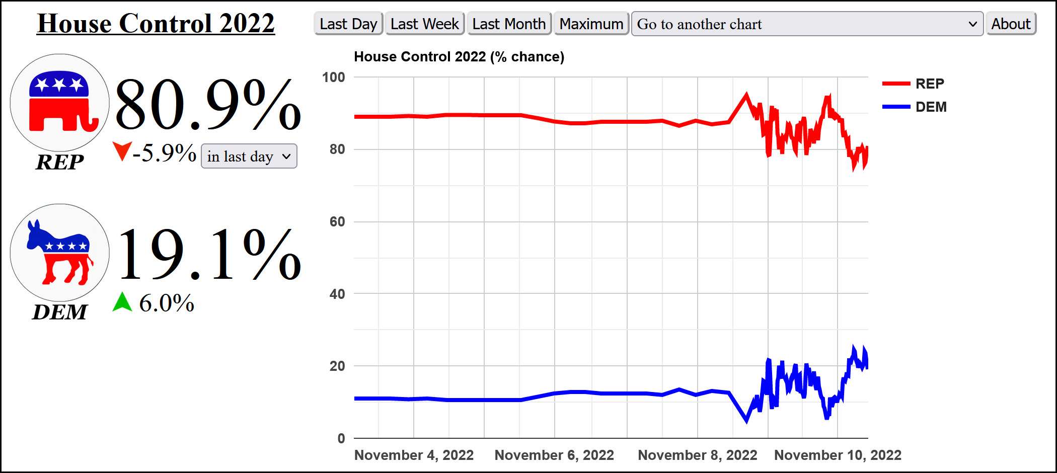
That sure changed on a dime within a day of the election! Here's the House:
That looks a little better on first glance, but it doubled between November 8th and 9th. Not so great! Here's another one:
Ordinary pollsters were a whole lot closer than this.
You can find a bunch more like these if you feel like googling for a few minutes. Nate Silver obviously has a personal interest in all this, but nonetheless here's his explanation for why betting markets aren't really that great:
One weakness of these markets is that they tend to follow the media narrative about the race more so than they do the underlying evidence. The source for this claim: yours truly, because I’ve been doing this for a very long time.
....The other weakness in these prediction markets is that the traders don’t have a lot of technical sophistication about election forecasting....There are some questions for which actually going through the process of building a model helps a lot, such as in determining how much an election forecast should shift in response to a modest but noisy shift in the polls.
I agree. Say what you will about betting markets, but the bettors themselves are mostly just talking to their friends and reading the same stuff everyone else does. Even aggregating several thousand of them doesn't average out their systemic bias toward whatever their favorite call-in show is saying.
Twitter is full of people talking about a huge uptick in youth turnout in Tuesday's midterm election. This is typical:
The story about last night's unusually high under-30 turnout is not "young people showed up to save democracy." It's "young people were treated as a constituency with valid needs, so they finally had a reason to show up."
This would be wonderful if it were true, but unfortunately it ain't true. Read all the way to the bottom for more, but here's the basic data we have so far:
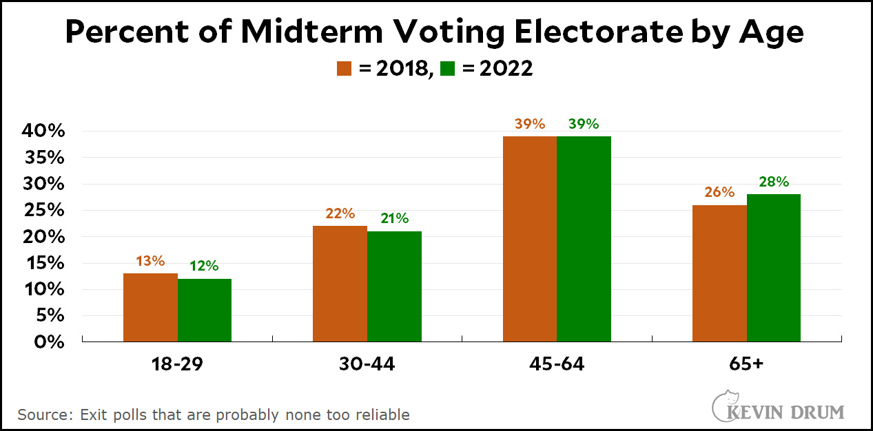
The share of young voters is lower than it was in 2018 while the share of old voters is up. For those of you who scoff at simple-minded analysis like this, here is David Shor with something so sophisticated it's almost impenetrable:
There was no "Youthquake" - turnout relative to 2018 was strongly associated with age, with turnout increasing starkly in older counties and decreasing the most in younger counties. pic.twitter.com/uElbXisUkI
Shor's scatterplots show that as the ratio of 2022 voters to 2018 voters gets larger, the percentage of young voters gets smaller while the percentage of older voters gets larger. In other words, more old voters and fewer young voters.
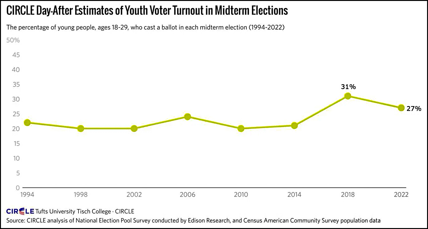
Even CIRCLE, which never misses a chance to hype the youth vote, admits it's way down from 2018. I have helpfully added the 2018 number to their chart:
It's true that 2018 was a huge year for liberals, but that's still a pretty big decline.
One other thing to note is that news reports say that Republican turnout increased more than Democratic turnout. The big difference, apparently, was in middle-aged independents, who are associated with neither youth nor progressives.
Now for the big caveat: I don't know what the source is for all these charts, but it's probably exit polls, which is just about all we have right now. Unfortunately, exit polls are notoriously unreliable, especially the initial releases. What's more, I imagine that exit polls are getting worse over time as in-person voting declines.
What I'm saying is this: the evidence suggests that the youth vote was down, and that's all we have right now. Nobody should be claiming otherwise unless they have some solid data to back themselves up.
At the same time, the picture may change over the next few months. So don't say that youth turnout is up, since there's zero evidence for that, but be careful about saying it's down since there's only unreliable data available right now. In fact, it's probably best not to say anything at all.
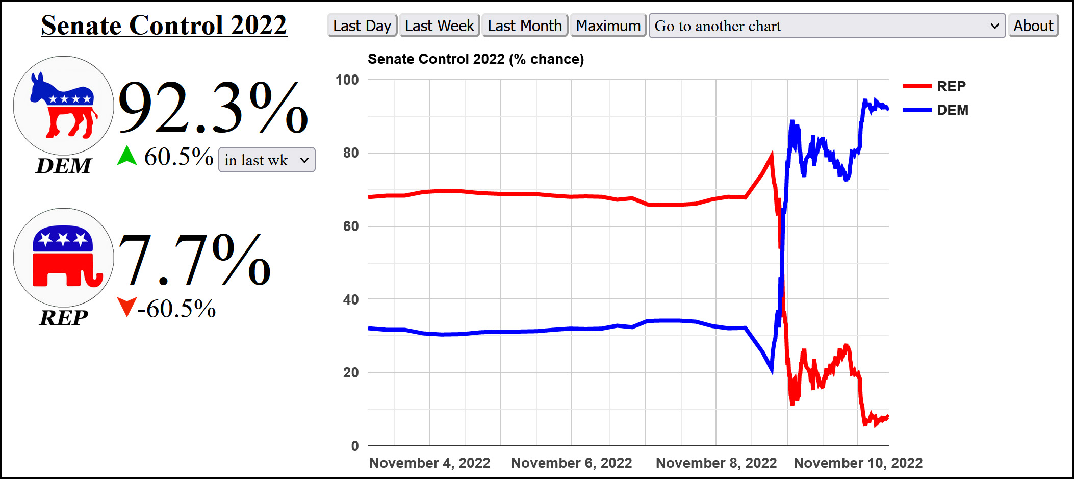
The Senate race in Nevada is tightening while they're not even bothering to count votes in Arizona. I guess the old image of vote counters toiling through the night has been relegated to the ash bin of history. In any case, the latest numbers have improved the odds of Democrats winning the Senate even without the Georgia runoff.
What really gets me, though, is that the election is so close that even after a day of counting Republicans remain stuck at about 207 seats in the House. The odds are still in their favor, but this is sure the mother of all non-landslides. Instead, it's turned into a historic nailbiter. I guess that nominating a bunch of election-denying nutters didn't work as well as they hoped. Long live the median voter theory.
*Maybe. They're inching toward something not so great, anyway. And in a midterm!
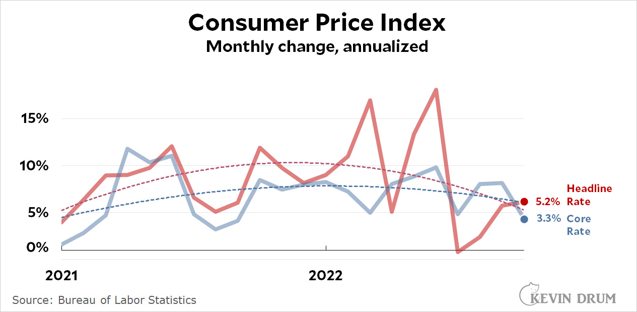
On a year-over-year basis, headline inflation came in at 7.7%, half a point lower than last month. Core CPI rang in at 6.3%, a little lower than last month.
As always, though, the monthly figures are the ones to watch. In particular, you should follow the trendlines, which continue to drop for both headline and core inflation.
The big newspapers all reported that inflation was "easing," which is the right take. But they underestimated just how much it was easing because reporters focus on headline inflation and on the useless annual figures. That's precisely the opposite of what they should do. The meaningful data is core inflation measured monthly, and in October it plummeted to 3.3% on an annualized basis. That's noisy data, so don't take it too seriously, but at the same time it's very good news. Headline inflation may still be elevated, but that's mostly because of food and energy, something that neither the Fed nor the government can do anything about. By contrast, core inflation measures the bedrock economy, and this month's figures say the economy is in pretty good shape.
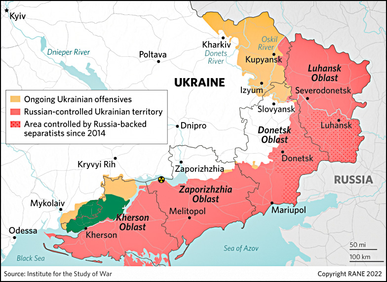
Is this a big area or a small one? Where is it, really? The tiny little detail map in the bottom right kinda sorta tells you, but not really. Unless you're a Ukraine junkie who's been following the war obsessively, this map doesn't really tell you much. Here's a different approach from the Institute for the Study of War:
This shows the entire area of eastern Ukraine and outlines the area Russia is abandoning in red. I've redrawn it in green to make it even more readable. As it turns out, it's a middling-smallish area north of the Dnipro river. The entire area south of the river is Russia's land route to Crimea, and their retreat makes it obvious that this is really their key concern. The ISW map would be even better if it were expanded to show Crimea to the south.
My point here is this: maps are good. I love maps. But why does the Times waste our time with a map that zooms in so much that it doesn't really tell us what's going on? If you're going to publish maps—and you should!—why not publish good ones?
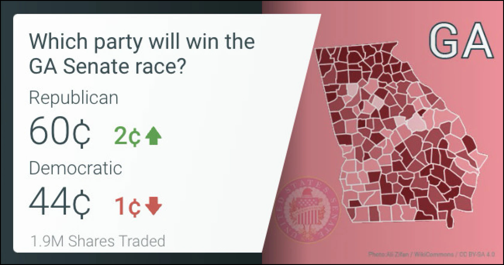
Just to make things simple, I figure Republicans have already won a Senate seat in Alaska and Democrats have won in Arizona. That makes the Senate 49-49. All that's left, then, is Nevada plus a runoff in Georgia. Right now it's looking like Republicans will win Nevada, so that leaves only the Georgia runoff on December 6. Whoever wins it controls the Senate.
Again! Two Georgia runoffs decided things in 2020 and one Georgia runoff will decide things this year. We should thank the stars that Donald Trump decided to endorse a moron and hand him a primary win. Any ordinary Republican probably would have won already, but with Trump's acolyte in the race we still have a fighting chance. I guess it all depends on which way the libertarians jump.
Last night, as we were watching the election returns, I was given a homework assignment: How many utility-scale solar plants in California are built with battery storage so they can provide power after the sun goes down?
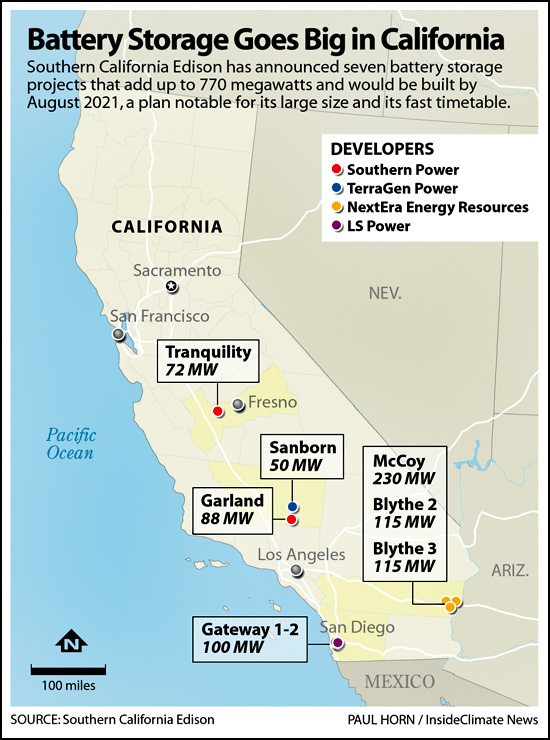
Next up, here's a map of some recent solar/battery hybrids that were brought online in 2021:
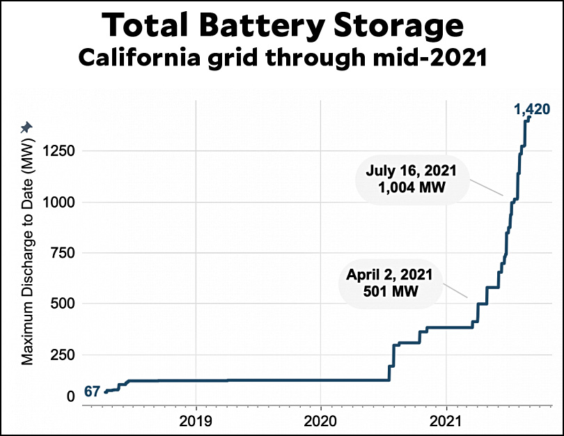
But the interesting part is that while it makes sense to co-locate solar and batteries, there's no real reason to. You can just build a standalone battery farm and connect it to the grid. So the critical metric isn't 58%, it's the raw capacity to supply power to the grid regardless of where it comes from. Here it is:
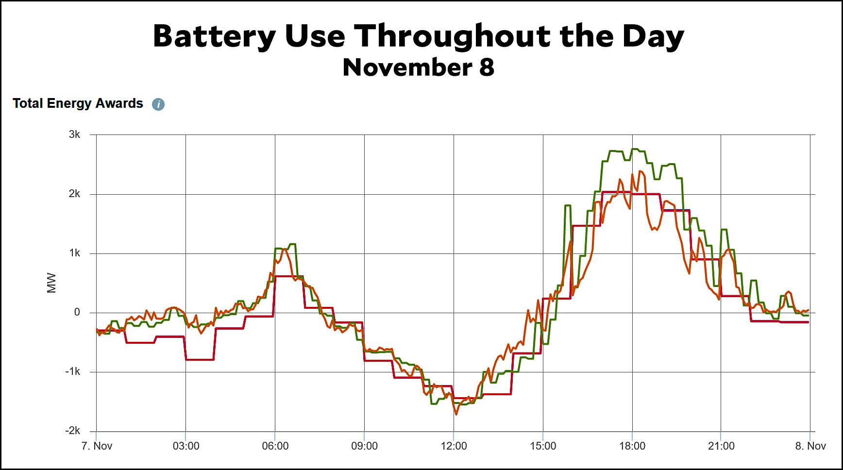
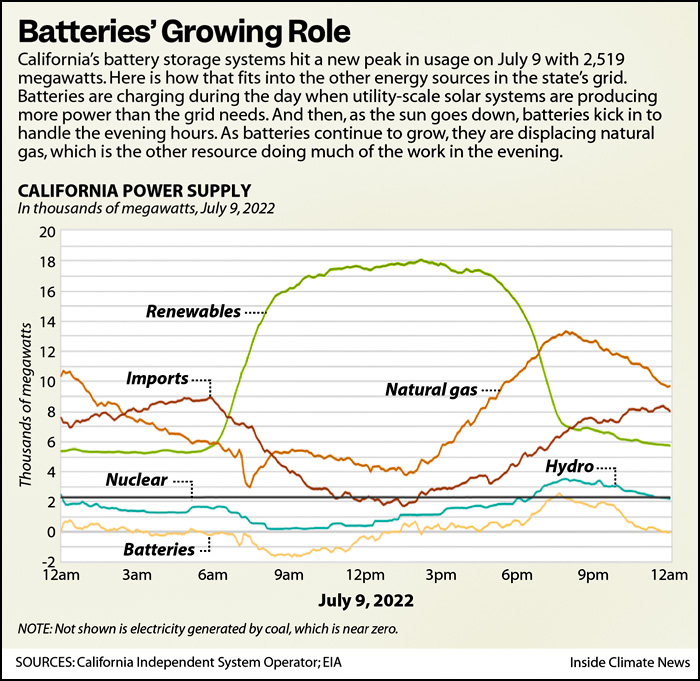
This number has skyrocketed over the past couple of years and continues to rise. In mid-2021 batteries provided 1,420 megawatts of power to the grid. Today it's over 2,000. Here is yesterday's battery usage throughout the day:
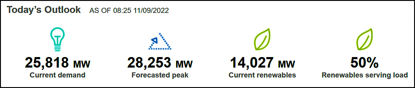
This is a little complicated, but it shows the sources of California electricity throughout the day. During daylight hours, solar and wind ("renewables") provide about 18,000 megawatts of power, far more than any other source. From dawn to midafternoon excess solar power is stored in the battery network. When it gets dark, the wind keeps blowing but we lose 12,000 megawatts of solar power. This is currently replaced by 8,000 megawatts of natural gas, 5,000 megawatts of imports from other states, and 2,000 megawatts of battery storage in order to meet peak demand during the hours of 7pm-10pm. Meanwhile, nuclear baseload chugs along at a constant 2,000 megawatts all day.
Today, battery storage provides about 7% of peak demand, but the plan is to keep building massive battery capacity so we can reduce the use of natural gas plants during the evening.
NOTE: California is by far the biggest user of battery storage in the country. It has about twice the capacity of the #2 state, Texas, and five times as much as #3, Illinois.
I have avoided jumping aboard the "Elon Musk is an idiot" train mainly because he is, plainly, not an idiot. Beyond that, it's obvious that he recognizes Twitter was a dumb, impulsive purchase. He's only running it because a court wouldn't let him wriggle out of it.
But counsel for the prosecution begs to disagree and offers Exhibit A: Twitter blue checks. What a wild-ass clusterfuck. Here's a brief, approximate timeline of the infamous blue check:
In the early days of Twitter, shitposters and other assorted smart alecks started appropriating famous names for their accounts. George Clooney. Emperor of Japan. Donald Trump. Anyone who hadn't yet joined Twitter was fair game.
The victims of this duplicity—movie stars, baseball players, news anchors—were forced to use made-up screen names when they joined up. For example, @realDonaldTrump. The imposters fought back. War ensued.
Twitter, realizing it had a problem on its hands, created the blue check as a signal that an account was genuine. For example, Mother Jones procured blue checks for everyone on staff in 2010 so that readers would know for sure if a tweet came from a real MoJo reporter.
Time passed. The origin of the blue check became shrouded in the mists of internet lore and people began to vaguely associate it with being some kind of VIP. Twitter had only itself to blame for this misconception since, in fact, it didn't hand out blue checks to just anybody who could prove their identity. They worked on the assumption that impersonation was only a problem for certain kinds of people, so they approved checks only for journalists, politicians, public figures, and a few assorted others.
Time passed. Elon Musk bought Twitter.
Musk appears to be one of the people who misconstrued the blue check as a mark of VIP status. He vowed to get rid of this elitist nonsense.
After a bit of fumbling, Musk announced that the blue check would be available to anyone for $8 per month. This prompted widespread guffaws, but Musk stuck to his guns.
Various smartasses started impersonating the famously thin-skinned Musk, who got pissed off and announced that impersonation will get you tossed off Twitter. .
The value of the old-school blue check—the one that merely verified you were who you said you were—suddenly became clear. Musk's answer was to give gray "Official" markings to anyone whose identity is verified by Twitter.
But within a few hours of appearing, the gray marks were abruptly gone. There was no comment from Musk.
And that brings us to the current day. Old blue checks still exist. Elon Musk has one! They are verifications of identity. New blue checks will exist someday for anyone willing to pony up $8. They are verifications to scam artists that you're a sucker. And then there will be the great unwashed masses, who presumably will get downgraded service or something and will have no idea why.

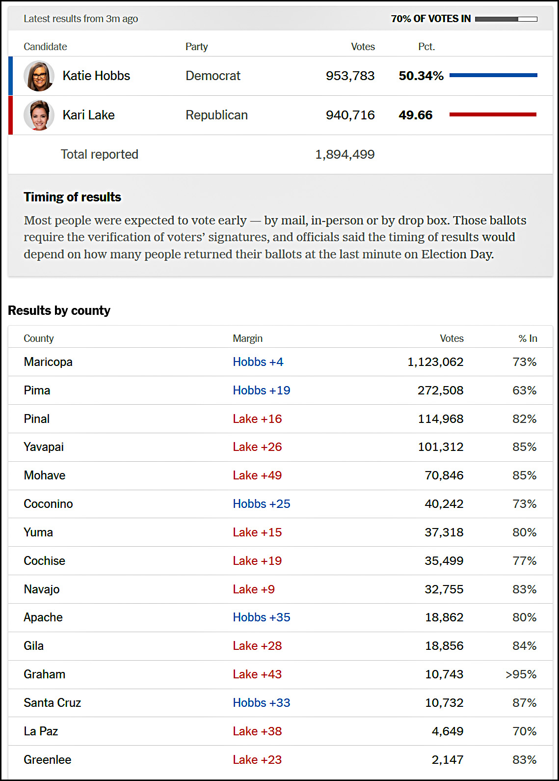 Hobbs is winning in the two biggest counties, while Lake is winning in 10 of the 13 smaller counties. And some counties have more votes already counted than others. How will that net out? I created a simple spreadsheet that assumed both candidates kept their current percentages in each county after all the votes had been counted. The result was a victory for Katie Hobbs by 51.1% to 48.9%.