Skip to content

I'm a little late to this, but George W. Bush gave a speech on 9/11:

This is all very fine, and I'm glad to see Bush denounce the violent Trumpist wing of the Republican Party even if he didn't actually name them. Unfortunately, this is nowhere near enough.

The actual Trumpistas themselves I can almost feel some empathy for. They are largely old, poorly educated, and feel like they have genuine grievances. They are wide open to being conned, and Trump, Fox News, and the rest of the right-wing media machine is happy oblige them. To a large extent, these folks oppose vaccines and believe the election was stolen because that's what they're being told—over and over and over.

The people I have a real problem with are the non-insane Republicans. These are the ones who don't like Trump and understand that he's dangerous. But they aren't willing to do the only thing that might rid the party of Trumpism: vote for Democrats.

Not forever. Just temporarily until their party gets the message that it needs to purge Trump and his influence if they want to win elections.

I don't expect anyone to become a liberal. Or to like Democrats. I just want them to hold their noses and vote D for a little while on the grounds that a few years of liberal governance is better than allowing the Republican Party to permanently become a party of Trumpism. The old notion that Trumpism is bad but fundamentally harmless was never really justified, but after "Stop the Steal" and January 6 and now the season of vaccine madness, it should be obvious that it's not harmless at all. It's dangerous and will likely get more dangerous over time.

But there's no way to clean up the Republican Party by words alone. As long as they're winning elections, they'll keep doing what they're doing. So vote D. Just for a little while.

The Census Bureau released poverty figures for 2020 today, and depending on how you look at things poverty was either up or down:

The "official" poverty measure, which no one likes, is based solely on wage income. Naturally, then, it went up last year since lots of people lost their jobs and their incomes went down.

But the Supplemental Poverty Measure, which takes into account government benefits, among other things, was down substantially. This makes sense since Congress allocated a vast amount of money to people, with a focus on the poor and the unemployed.

So which one is right? The SPM does a better job of estimating real-life resources available to families, and it's the one you should probably trust. This is, once again, evidence that social welfare programs do exactly what they're supposed to do. They make people better off.

Today is election day here in California, where we all get to vote on whether to recall our governor. But why are we doing this? The LA Times dives deep into this baffling question:

When 1.6 million voters signed a petition to recall Gov. Gavin Newsom, they signaled their indebtedness not just to century-old political reforms but also to a spirit of restless reinvention that took root 170 years ago.“

Californians,” said historian H.W. Brands with the University of Texas at Austin, “have learned to be impatient with patience. The idea of sticking to an unsatisfactory status quo doesn’t stick.”

....Filter out the static and a bipartisan picture emerges of an electorate struggling to address the most challenging issues California has had to face. Climate change and catastrophic wildfires, a housing crisis and a homelessness crisis, income inequality and racial inequities have reached a point where any proposal that doesn’t lead to a fix is reason to mobilize.

....Former Assembly Speaker John A. Pérez sees a struggle taking place in the conscience of Democrats and Californians who are trying to understand what it means to be “the most multiracial, diverse and forward-looking state.”

For chrissake. I've rarely seen such a stream of pseudo-analytic bafflegab in service of avoiding the simple and obvious answer. Here's the deal: The recall is solely the work of "Stop the Steal" Trumpistas who took advantage of the fact that California requires only 1.5 million signatures to certify a recall. Even in their current moldering condition Republicans still make up about a third of all voters, so all the nutbags needed was signatures from the 20-30% of their compatriots in the nutbag wing of the party. Easy peasy, especially if you're gathering signatures at the same time that Trump and Fox News are firing up the nation about corrupt Democrats trying to take the presidency away from him.

That's it. Forget the crap about Californians being any more impatient or unhappy than anyone else. We aren't. Nutbags got the recall on the ballot, and once that happened Republicans were all perfectly happy to go along with putting one of their own in office. That's it. That's all there is.

Activists gathering recall signatures in Huntington Beach at a rally of "Stop the Steal" nutbags.

The headline CPI index in August clocked in 0.27% higher than the previous month, an annualized rate of 3.3%. This is quite a bit lower than the 9%, 7%, 10%, and 5% rates of April through July.

Core CPI, which excludes food and energy, came in at 1.2%. Since the headline number usually follows the core number, this suggests that inflation is likely to head even lower over the next few months.

Compared to 12 months ago, the inflation rate for food was up a bit to 2.9%. That's not outrageous, but it's been rising for the past three months and is starting to get a little peaky. The inflation rate for used cars softened a bit but is still running at an astonishing 32%.

NOTE: Normally I focus on CPI as measured compared to the previous year. However, right now we're in a volatile period and are interested in how inflation is doing right this moment. For that, it's best to look at the increase from the previous month and then multiply by 12 (more or less) to get an annualized rate.

My Twitter feed has been full of people who are confused by the chart in the previous post showing rising incomes for everyone. Here's the explanation.

First off, here's data from the Census Bureau showing earnings growth since 2000 broken out by race and sex:

This is probably the most common income chart you'll see, and it shows that incomes have risen for men and women of all races since 2000. The only exception is Black men, who are stuck at their 2000 level.

There's nothing wrong with this data. However, it includes only wage income, and many households have other sources of income. For that reason, every year the Congressional Budget Office estimates total income, including wages, Social Security, business income, capital gains, and other market income.

It also estimates how much income is lost to taxes. In general, rich households lose more to taxes than poor households, and some households actually gain income from net tax refunds.

Finally, the CBO estimates income from government benefits. When you put this all together, you get this:

Since I was mostly interested in the period from 2000-2020, I took the CBO data and renormed it so that 2000 = 0. I also chose to show nominal numbers with a separate line for the inflation rate, instead of showing inflation-adjusted numbers. I didn't have any special reason for that. Just keeping everyone on their toes. In any case, when you do this, here's what you get in the more familiar form of inflation-adjusted numbers:

This is probably the most accurate assessment we have of actual disposable income across income classes. The chart in the previous post is exactly the same as this one except it shows nominal income compared to the inflation rate. They both mean the same thing.

Ladies and gentlemen, I would like to present to you the State of America over the past 20-40 years. This is focused strictly on long-term trends, not on specific good or bad things that have happened recently, and solely on trends that have a broad impact.

Please note that no trend is perfect. It's fine to note that poverty remains too high, for example, but it remains true that the trend has been steadily down. That said, first up in medium-term trends is:

The Good

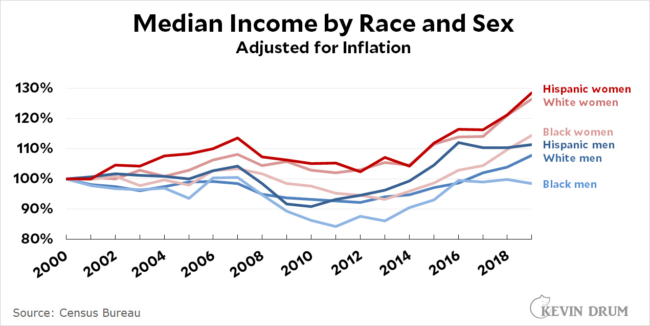
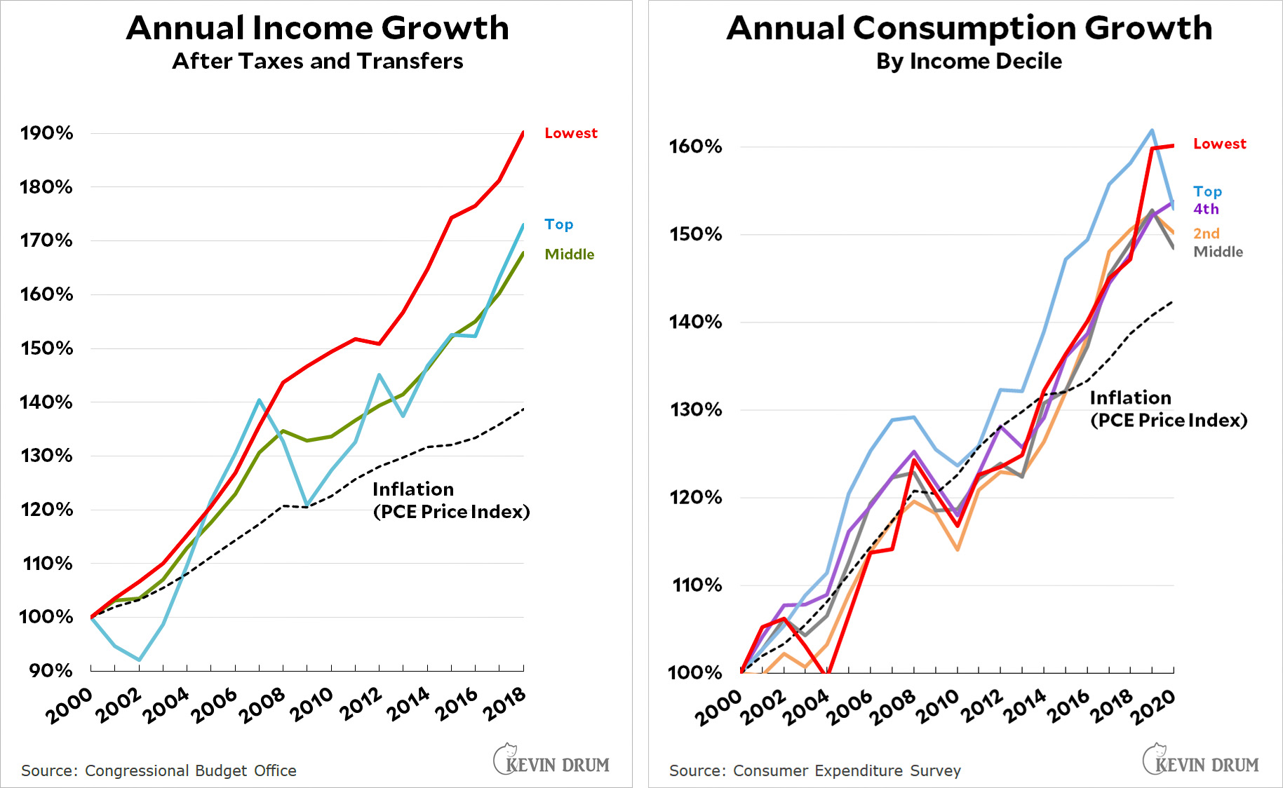
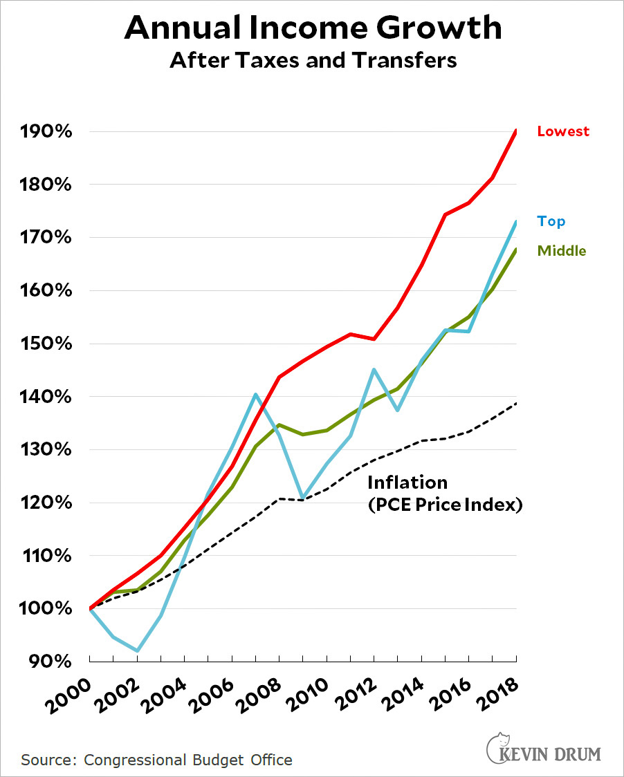
  1. Income is up for everyone: men, women, Black, white, Hispanic, rich, poor, and middle class. Data from the CBO is here. UPDATE: Confused by this chart? Explanation here.
  2. Poverty is down by five percentage points since the '70s.
  3. Federal income taxes are lower for practically everyone.
  4. Contrary to popular opinion, the state of retirement hasn't changed much. Unbiased projections—which is to say, projections that aren't from the retirement industry—show that retiree income and wealth is in good shape and will continue to be in good shape over the next 40 years.
  5. Smartphones are cheap and ubiquitous.
  6. The divorce rate is down substantially.
  7. Nearly everyone has access to the internet, the greatest tool for entertainment and information gathering ever created.
  8. Vaccine development is entering a golden age.
  9. Among large countries, we have both the highest GDP per capita and the highest growth rate of GDP per capita.
  10. We have by far the greatest number of startup companies in the world, both in absolute terms and relative to population.
  11. Violent crime has dropped in half since 1990.
  12. Survey evidence suggests that overall happiness has been steady for decades.
  13. Ditto for life satisfaction.
  14. Assistance to the poor has increased more than 3x and currently amounts to about $1 trillion per year.
  15. In almost all ways, overt expressions of racism have dropped steadily for decades and are continuing to drop.
  16. Ditto for LGBT+ issues, especially same-sex marriage.
  17. The air is far cleaner than it was 50 years ago.
  18. Ditto for water.
  19. The disabled have far better access to public spaces.
  20. Police killings of unarmed civilians have decreased by more than half in the past five years. The declines have been especially noticeable among Black and Hispanic suspects, both down by 68%.
  21. The spiraling cost of medical care has been brought under control. Over the past 20 years, medical inflation has been only slightly higher than overall inflation.
  22. At the same time, the mortality rate from cancer has dropped by a third since 1990.
  23. Thanks to CHIP and Obamacare, more people have health insurance than ever before.
  24. Teen pregnancy rates are way down. Ditto for abortion rates.
  25. High school graduation rates are up and, contrary to popular perception, test scores for graduating seniors have remained steady.
  26. Lead levels in young children have plummeted.
  27. Entertainment options have blossomed, especially videogames and quality TV.
  28. A revolution in depression meds has made life better for millions.

The Bad

  1. The worst trend of the past couple of decades has been a steady deterioration in average health outside of the upper middle class. Life expectancy has stopped increasing; obesity is up; opioid addiction is up; and deaths of despair are up.
  2. The labor force participation rate has been steadily dropping.
  3. The Black-white education gap has been stubbornly resistant to improvement.
  4. Climate change continues unabated.
  5. Political polarization has gotten worse, thanks mostly to Fox News and, more recently, the rise of Trumpism.

The Ugly

  1. Social media. Some good, some bad, nobody knows for sure.

This is Via della Conciliazione, the boulevard that leads from St. Peter's Basilica to the Tiber river. I like this picture a lot for its 1930s vibe—which is appropriate since that's when Mussolini built this road.

August 1, 2021 — Vatican City, Italy

The US death rate from COVID-19 is no longer skyrocketing, but it's still going up. Our mortality rate is 150% above Britain and more than 1000% higher than Germany.

The LA Times reports on the latest outbreak of COVID-19 in California:

The Delta variant surge reached critical levels in parts of the Central Valley this week, with some hospitals overwhelmed by a crush of COVID-19 patients and Fresno County officials warning they might take drastic action if conditions continue to deteriorate.

....In a sign of how severe the crisis has become, Fresno County‘s health officer said Friday that hospitals may be forced to ration healthcare — choosing who receives lifesaving measures — because of dwindling resources.

I assume no one is in doubt about what's going on here, right? But just in case, here's a map of vaccination rates:

In Silicon Valley, 73% of residents have been vaccinated. In Tulare County it's 41%. To steal James Carville's old saw about Pennsylvania, California is San Francisco on one end, Los Angeles on the other, and Alabama everywhere else.

One of the consistent themes on this blog is that life is improving faster and for more people than we generally acknowledge. Usually I defend this by showing rising trends in big-picture subjects like crime, poverty, income, happiness, and so forth.

But this is kind of bloodless, so I'm glad to welcome the fine folks at Reason to the "Cheer up!" caucus. No charts here, just "40 Ways Things Are Getting Better."

This is a more eclectic list than mine, ranging from lower crime rates to better pot quality and tolerable non-alcoholic beer. Oddly, they don't include some obvious candidates like smartphones and fast vaccine development, but I suppose you're always bound to miss a few things.

Now, there are some bad trends too. CO2 concentrations in the atmosphere. The Black-white education gap. The conservative descent into Trumpism. What's more, I understand that we're all totally frazzled by 18 months of COVID-19, which makes this an inopportune moment to persuade people that things are better than they think.

But they are! Not every single thing, of course, but almost all of us are generally better off today than we were 20 years ago. Why, according to Reason, even those of you who live in weather-challenged states can get avocados these days. What more do you want?