
Sometimes I like to highlight deceitful charts. Other times I highlight misleading ones. It's rare to find a chart that's completely useless, but that's what the Wall Street Journal has on its front page today:
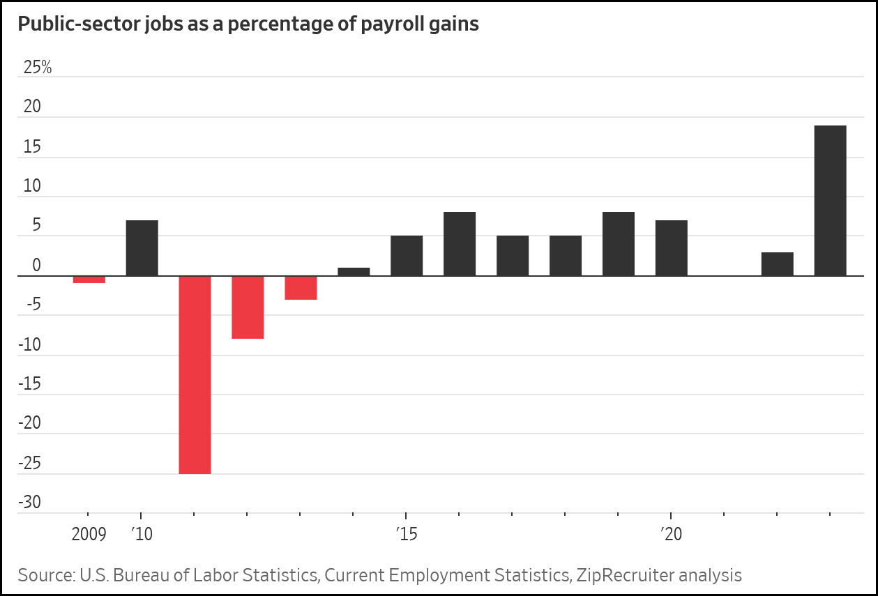 What is this even supposed to mean? How can you interpret it unless you know what percentage of jobs come from the government in the first place? And why does it include data from ZipRecruiter when it's all available from the BLS?
The point of the piece is that government hiring is growing faster than private hiring so far in 2023, which isn't even really true—there was a tiny jump in government hiring in January, but growth since then has been 0.9% for both. In any case, why not just use a simple chart like this in the first place?
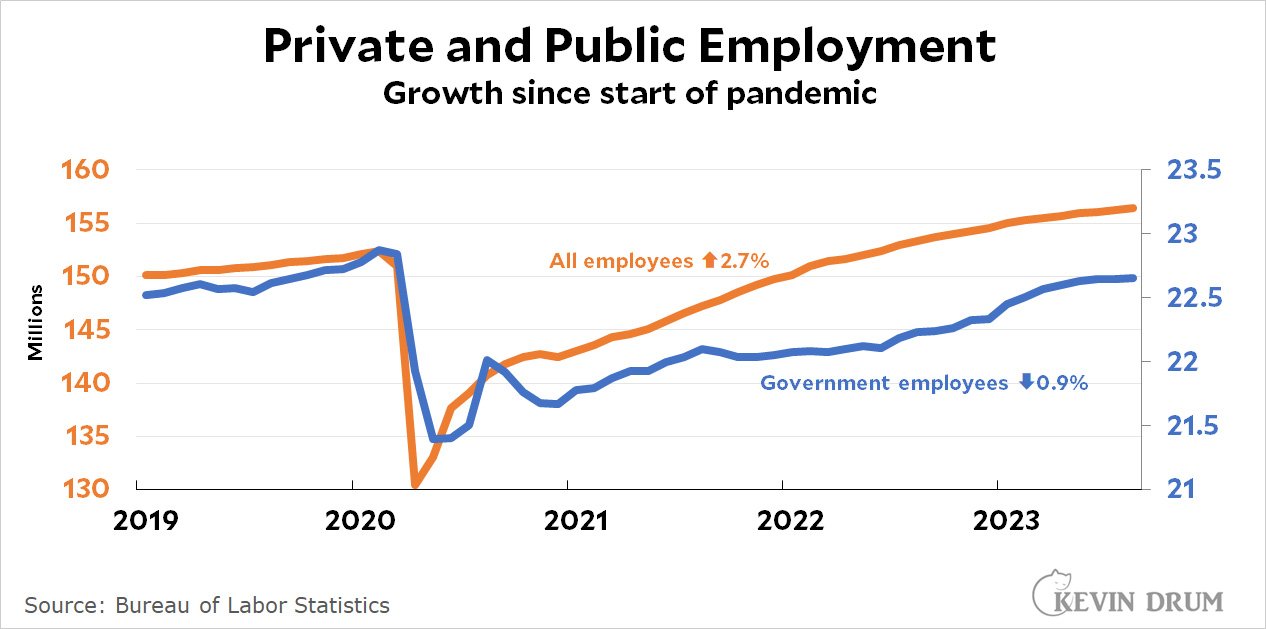 It's pretty easy to see that, generally, government growth has been slower than private-sector growth. If you go back and compare to the last month before the pandemic, the difference is pretty substantial. Government employment went down and has never come close to catching up.¹
Of course, tracking government employees is almost pointless anyway since so much government work is done by contractors. Even growth is hard to measure since you have to know how much is actual growth and how much is simply the result of firing contractors and giving their jobs to government workers. Good luck trying to figure that out.
¹In fairness, the Journal article does mention this. But only barely.
It is perfectly clear, you dummocrats are just confusing things.
If the WSJ editorial page didn't carefully cherry pick the first derivative of this ratio nobody cares about over a specially selected time period, how would their bovine readership know the gubmit is spending all their money? And you should know that sort of cherry-picking takes effort. The things they do for you, and do you appreciate it?
This is the part where you start hating on big government.
Well, the point of the chart pretty obviously, is to make it look like Trump was restraining the growth of the federal government, and then under Biden it has exploded and then very recently become a crisis. "Public sector jobs as a percentage of payroll gains" meaning a bunch of money being given to the "administrative state" under Biden, if you have a certain cast of mind. The WSJ edit page is nothing if not the greatest champ ever at supporting motivated reasoning.
Should we assume that "government" in this context means all levels of government: federal, state, and local?
I am probably setting myself up for some abuse. But I have to ask the question. Should government hiring and private sector hiring be growing at the same pace?