How's the infrastructure bill coming along? It passed in late 2021 and allocated $550 billion in new spending over eight years. That's about $70 billion per year. Here's actual spending:
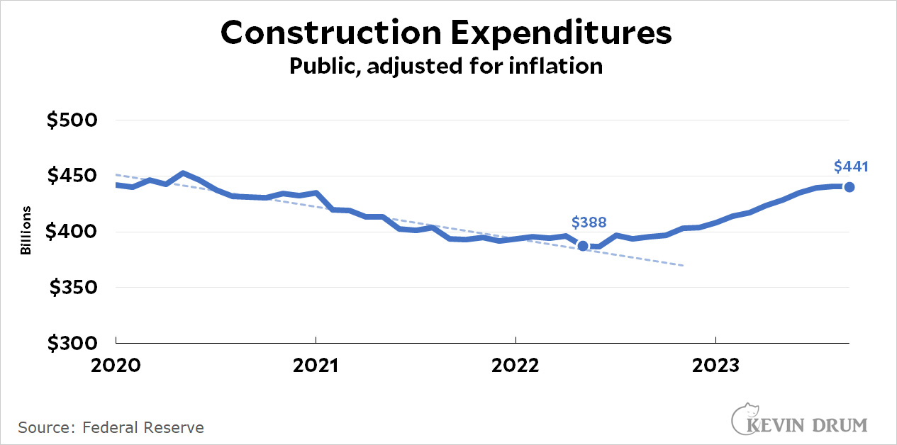 Adjusted for inflation, public construction spending had been trending downward when the infrastructure bill was passed. A few months later spending ticked up and is already a little more $50 billion above its low point on an annualized basis. Relative to trend it's $100 billion higher. Either way, it's right on target.
POSTSCRIPT: The Economist this week says infrastructure spending has been weak, but they're guilty of chart crimes. First, they squeezed their chart to make the downward trend look super steep. Second, they drew a line at the point the bill passed, but obviously spending isn't going to turn up instantly. You have to wait a few months for the money to flow.
They also use numbers I'm not familiar with. Mine are straightforward public construction numbers from the Census Bureau.
For a while The Economist seemed to be drifting toward neutrality but the past few years they're increasingly putting their thumb on the scale. I generally don't bother with them any more.
The Economist never met a large sclerotic public bureaucracy it liked. And it never met a large sclerotic private bureaucracy It didn't like.
It may as well be titled The Capitalist.
So true.
This, I'm convinced, has been Biden's big gamble from Day 1. Infrastructure spending happens everywhere and as the handy chart shows has been rising. Inflation Reduction Act spending has been in the planning this year and the floodgates open with the next building season. He's betting that the spending and visible construction will shift the country's mood generally, and more particularly the vast areas outside major metro areas that have been declining for 30 or 40 years and are reservoirs and nurseries of bitterness among the people still there. I hope the hell he's right.
One can hope.
Deferred maintenance is a great way to "save" money. "Look--I cut your taxes!!!" It can take years before things fall apart--then it's "Gov't is the problem!!!".
The news headlines are "construction causing traffic jams" or "a bridge fell down". They are never, "things have been operating smoothly"--especially since there will always be one counter example somewhere.
There will be ribbon cutting ceremonies that might make the local news for these projects. Maybe that will hit home.
Well, you got your lies, your damned lies, and charts.
😉
Is that "your" possessive or a generic you folks? I'm sure Kevin would never be guilty of chart crimes. ????
Thank you, Kevin, you're the best! The "chart crime" you point out is absolutely a crime in the real sense, because it affects people's lives. Why? Because it proliferates false impressions about vital political issues. And there's no doubt in my mind that it's deliberate. Anyone who has any relevant life experience knows that it takes a long time for big ventures or projects to get off the ground, and the same applies in spades to government-funded infrastructure spending. So The Economist obviously wants to create an impression that Biden's infrastructure bill is either a failure or a fraud. I wish we had an army of Kevins to help people see the bullshit.
It should be possible for you to read the article in its entirety rather than see just the chart - turns-out one can use one's Google/Facebook/whatnot account to gain access. If you've not read the article already, you may find that your conclusion, based solely on the chart, may not have been so obvious after all.
I cannot see the chart in its full context - ie on the page where it was being used - just the reference you've provided, but where you say they squeezed their chart, I would say they included useful, long-term results. And the figures they use appear to be from BLS and Census Bureau, two sources you use frequently. So, Mr. Pot, thank you for bringing Mr. Kettle's chromatic characteristics to our attention.
I found I was able to use my Google ID to access the full article. I still think the long-term data in that chart is useful and important context.
Also, I believe https://www.whitehouse.gov/briefing-room/statements-releases/2021/11/06/fact-sheet-the-bipartisan-infrastructure-deal/ was what the Administration put-out upon the bill's passage. I will give it credit for avoiding the worn phase "shovel ready" which appeared in what they put-out when touting what I believe was their initial version: https://www.whitehouse.gov/briefing-room/statements-releases/2021/03/31/fact-sheet-the-american-jobs-plan/
Of course, as pointed-out in the article at The Economist:
Though such things don't seem to be getting highlighted in the press releases.