
I got bored, so I made a chart:
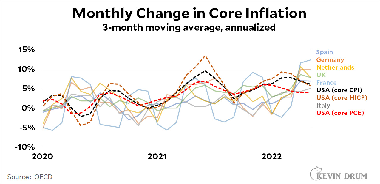 I was curious about how core inflation was doing here vs. other big countries in Europe. Unfortunately, the Europeans don't seem to produce seasonally adjusted figures, which means the raw monthly numbers are so volatile that you can't make any sense of them. It's just a bunch of huge spikes up and down. So I took a 3-month moving average instead, in order to produce lines that are more readable and show medium-term trends a little better.
UPDATE: The chart originally had two measures of US inflation, but I was badgered into adding a third. It's a rough¹ estimate of core HICP, which is the European measure of inflation. This is the one to use if you want to apply a similar methodology to all countries. It doesn't change our story much, though.
¹It's rough because the BLS doesn't publish its real estimate of core HICP. Instead I'm using an approximation suggested by Jason Furman: core CPI minus housing.
As you can see, there was a period earlier this year in which the US had higher core inflation than any of these other countries. But that's no longer the case. Our core inflation rate is cooling off while the core inflation rate in Europe is skyrocketing. Right now we have just about the lowest core inflation rate around and it's declining.
I used the core inflation rate because European countries might be more sensitive to increases in food and fuel, and I wanted the comparison to be fair. Also, core inflation says more about the underlying health of a country's economy than headline inflation.
POSTSCRIPT: Going a little beyond just raw data, my interpretation of these figures is that the US inflation rate is going down because the boost from the stimulus bill has worn off. That isn't happening in Europe because there was no stimulus to begin with.
Kevin Drum mentioned in this story that their was no stimulus in Europe. This simply is not true. The EU adopted the European Union Recovery Instrument on 14 december 2020. It was quite a big deal because it meant joined borrowing for the union, for the first time in it's history. The fund consists of 750 billion euro's: a combination of cheap loans and grants (390 billion). Memberstates can spend this money between 2021 en 2026.
(There are quite strong criteria for EU countries on how they spend this money (partially on green investements, for example).
750 billion over 6 years? Much of which is committed to green infrastructure projects? The actual stimulus part of this plan appears to be very small if it exists at all.
I'm not keyed into EU politics, but was this a long term infrastructure plan that capitalized on the pandemic and labeled a stimulus plan to sell it to the public? Nothing wrong with that approach.
We need a big tax increase in the rich and on business. That will cool off spending and investment. It’s better than raising mortgage interest rates yet again. Of course, we won’t get that thanks to the Republican senators… all 51 of them.
Kevin - respectfully you are avoiding the OECD countries in Asia: they are also impacted by global supply chains, price of oil etc.
Inflation
South Korea 4.5%
Australia 5.1%
Japan 2.5%
As I have said before, what about Canada, its economy is more related to the US and it had more direct Covid stimulus than European countries but less than US. Here is the data from Stats Canada (seasonally adjusted and with sector breakdowns):
https://www150.statcan.gc.ca/t1/tbl1/en/tv.action?pid=1810000601&cubeTimeFrame.startMonth=05&cubeTimeFrame.startYear=2020&cubeTimeFrame.endMonth=05&cubeTimeFrame.endYear=2022&referencePeriods=20200501%2C20220501