
This chart shows total household financial assets through the end of 2022:
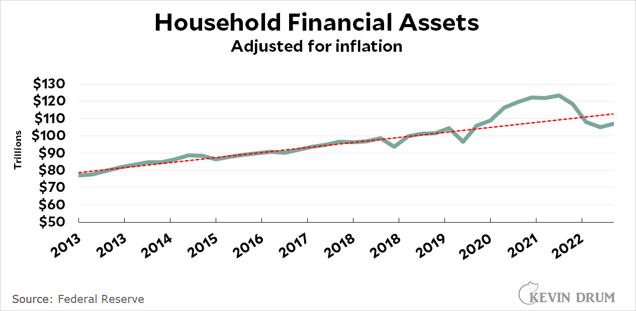 The basic story is easy to see. In 2020 assets grew above normal as spending slowed and the COVID rescue bill started putting money in people's pockets. This peaked in late 2021 at about $13 trillion above the pre-pandemic trend. Then, as the government bennies faded out, people spent down their savings and assets declined. At the end of 2022 assets stabilized, but at a level about $5 trillion below the pre-pandemic trendline.
Now here's income:
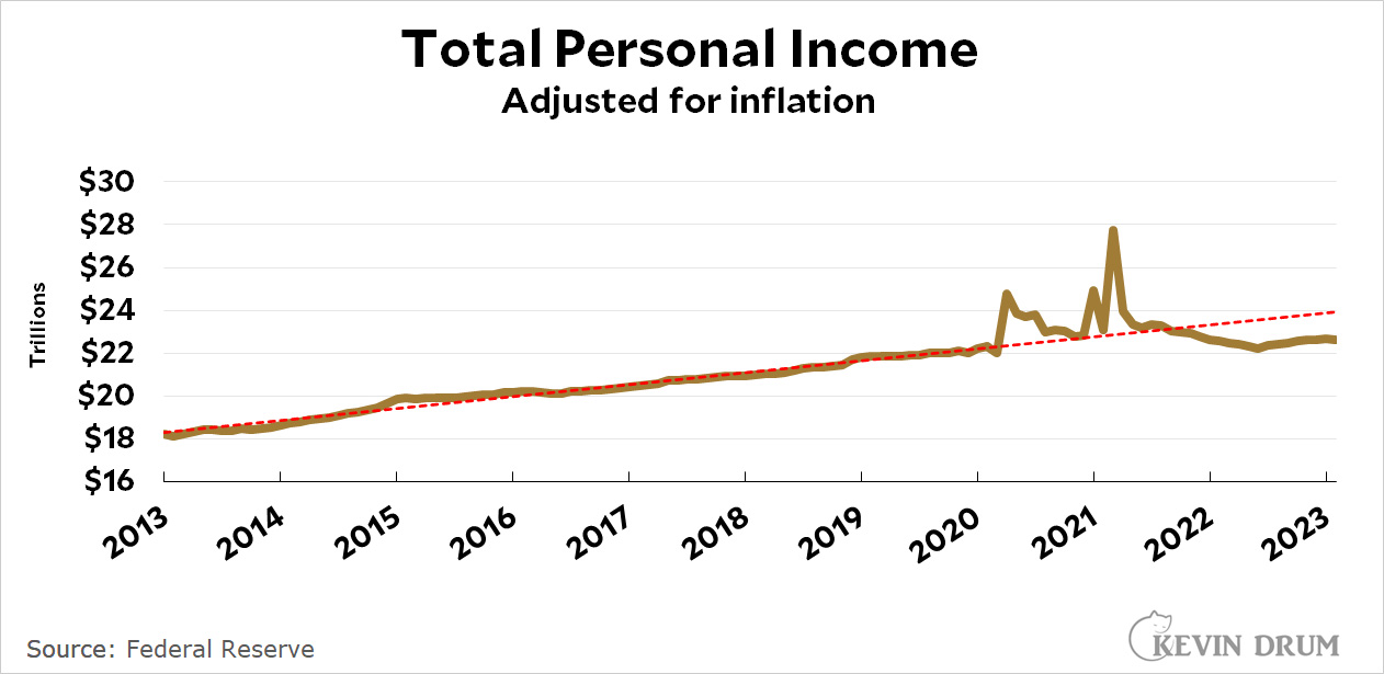 Income has been falling since mid-2021. It is now at a rate about $1.5 trillion below the pre-pandemic trend.
Now spending:
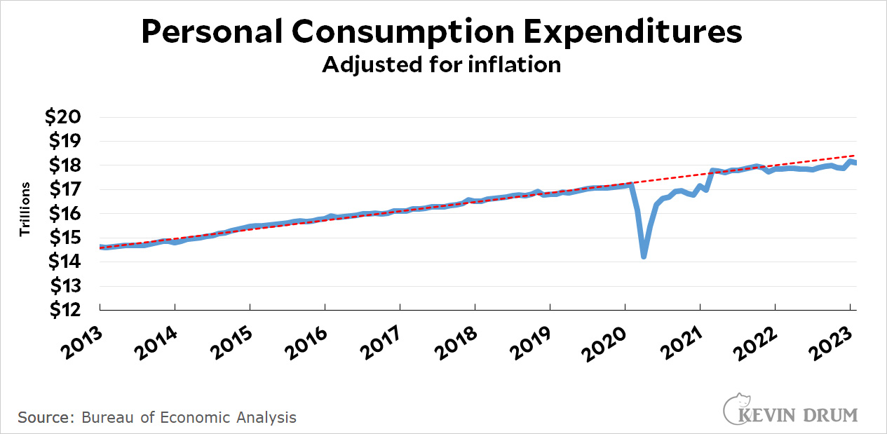 Spending cratered when the pandemic hit but then grew sharply as government programs kicked in. It flattened out in 2021 and has settled in at a rate about $0.3 trillion below the pre-pandemic trendline.
So income is down about $1.5 trillion but spending is down only $0.3 trillion. This can be made up by draining assets (primarily household savings), but assets are already well below their trendline. At this point, the only way spending can remain at its current level is if income makes a miraculous recovery, which is pretty unlikely. By the middle of this year we should start to see consistent declines in personal expenditures.
I always find these persuasive, but after reading them for 18 months and inflation is still #1 on people's minds....
(Gas prices up = Biden's approval down)
So what?
How much of household financial assets consists of the house?
Wealth effect plays a major role in spending.
$100 trillion in total financial assets is a mean of about $800,000 per American household. That tells me that the rise and then fall in household financial assets has a lot more to do with the rise and fall of rich people’s stock portfolios than the COVID relief checks sent out during the pandemic.
Kevin didn’t do even the simplest sanity check before writing nonsense like: “In 2020 assets grew above normal as spending slowed and the COVID rescue bill started putting money in people's pockets. This peaked in late 2021 at about $13 trillion above the pre-pandemic trend. Then, as the government bennies faded out, people spent down their savings and assets declined.”
To see the type of thing Kevin is talking about, you’d have to use medians, not totals or means. Otherwise the assets of very rich totally swamp the assets of people who actually needed COVID relief checks.
Treeeetop is right, Kevins charts are highly misleading and do not present facts that support his chosen narrative.
Asset chart - Almost all of the change is due to the rise and fall of stock prices. The changing value of unrealized gains in mostly wealthy peoples investment accounts has literally nothing to do with expenditures and personal income (the following charts).
Personal income- This does not include capital gains income. Ignoring all gains made by individual sales of stocks or houses presents a very misleading picture of income over the course of the last few years. Even more misleading is that Kevins chart excludes capital gains as an increase to income while including the related capital gains taxes as a decrease in income.
Taken together, the data is not at all what Kevin claims it to be. I dont know if accurate data would prove or disprove Kevins chosen narrative, but what he has given us in this post should be ignored. Its completely inaccurate data. Kevin should know better.
Those graphs are my life in a nutshell.
In a larger sense, it looks like we are past Peak (Resources minus Pollution) per Person (in other words, it looks like the waste products we generate in productive living are starting to overwhelm our productivity gains), so I would expect average income per person to fall.
A strange place to be when you consider that human minds are the most valuable thing in the universe, but there you are.