
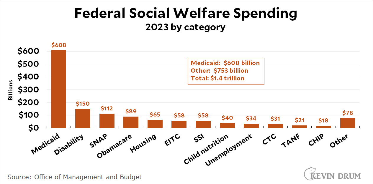
The top chart shows total federal social welfare spending (adjusted for inflation) since 1960. The bottom chart breaks out the categories for 2023 so you can see exactly what I'm including.
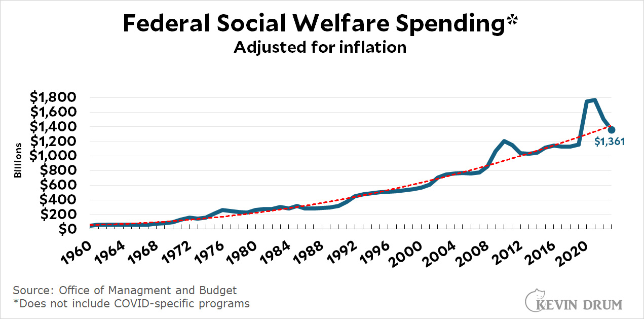
 The trendline in the top chart is for 1960-2019, extended through 2023. Social welfare spending surged during the pandemic for obvious reasons, and is now back on its pre-pandemic trend.
NOTE: All data comes from OMB Table 11.3 except for recent SNAP figures, which come from the USDA. All figures are adjusted for inflation using the PCE index.
If this chart was per person, or per GDP, or showed the rate of change instead of the raw dollar figure......it would likely paint a very different picture of the last 20+ years.
How much is the trend being driven by the cost of health care (Medicaid)?
As the second chart shows, a lot of it. Medicaid pays for most nursing home care in the US. That's what a lot of this is. Some of it is no doubt Medicaid expansion in a number of states as part of the ACA, and it would be interesting to see the Medicaid spending broken out in a bit more detail. But my bet is that's it's mostly elder care.
Kevin: What percentage is the trendline going up by annually? What are the relevant overall inflation figures for the same period? I assume you'll want to give us the PCE figure. Yes, I've been paying attention!
As noted in one of the above comments, it would be nice to see that trend line adjusted for population and for GDP. This might be a nice example to use for the different picture you get with different denominators-- that is, nominal, adjusted for inflation, adjusted for inflation and population, and adjusted for size of the economy. I want see all the lines! Each one tells you something important.
To the GOP just more proof "we" need to cut taxes. And those moochers on Medicaid and SDI and SSI should get jobs and buy their own insurance.
It would be fun to have someone run the numbers on privately insuring an 85 year-old Alzheimer's patient. Good times.
Love the folks who complain the data are not presented in the way they'd like. Give me % of GDP! What's the trendline look like annually?
Folks: you've got calculators and you've got google. And you can find free chart-making apps. Start a blog!
What are comments for if not for commenting on the post/article?
that's a joke, correct?
Kevin always tries to present the most accurate way to read data and is not shy when criticizing poor display of data.
In that case he presented only half of the information. Without relative info , the data is worth its weight of .....
A lot of us on the general left have a bit of a reflex position that social spending can't really be all that much because every expansion of the safety net has faced scorched earth opposition leading to, at best, contingent and watered down "victories". That said, it is important to realize that yes, we really do spend a LOT more money today than in the past on the mission of protecting our fellows from hunger, illness and homelessness.
I share that impulse, which I think is why my first instinct was also to suggest a per capita adjustment, which, in my mind, would be expected to show that we haven't really made all that much progress. However, when I made a very rough estimate of the actual numbers, the data basically indicates that my pessimistic impulse was incorrect. Essentially, the data in the OP represents a growth rate in federal social spending outlays of more or less Inflation Plus 7%/year. The per capita adjustment only reduced the rate of increase to something close to Inflation Plus 6%/year. (I'd welcome a double-check of my math).
Yes, there is a lot of work yet to do, but our movement really has had some real and consequential victories over the years. None of them are perfect, but we really do offer a lot more assistance today than we did when Joe Biden was in High School.