Skip to content

Here are the headlines today about Ukraine:

  • LAT: Russia orders troops into eastern Ukraine as fear of war grows
  • NYT: Putin’s Order Sending Forces to Separatist Enclaves Is Condemned at U.N.
  • WaPo: Putin orders troops to eastern Ukraine
  • WSJ: Putin Orders Deployment of Troops to Breakaway Regions in Ukraine
  • Guardian: Russia strongly condemned at UN after Putin orders troops into eastern Ukraine
  • BBC: Ukraine crisis: Russia orders troops into eastern Ukraine
  • CNN: Putin orders troops into eastern Ukraine
  • FT: Putin orders troops into eastern Ukraine

Why has everyone converged on the "orders troops into" phrasing? When you order troops across a border, that's usually called an invasion, isn't it? The fact that Ukraine is unable to put up a fight surely doesn't change that.

It's possible that President Biden and other NATO leaders don't want to call it an invasion because they don't want to trigger a full set of sanctions yet. Fine. But why should journalists go along with this?

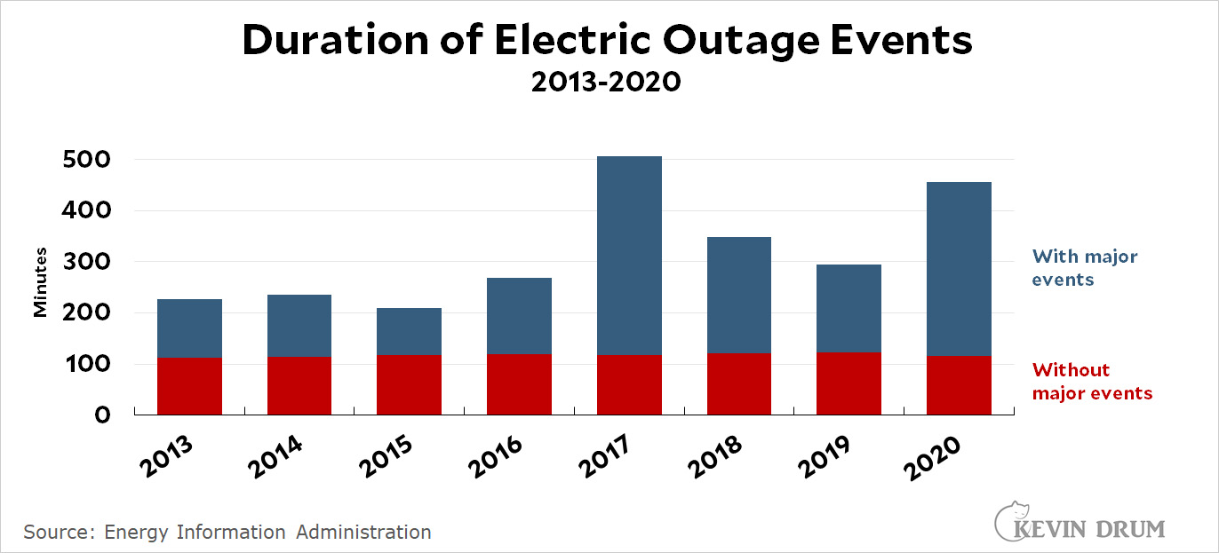
Is our electricity distribution system getting less reliable? Yes and no:

If you look just at day-to-day operations, nothing much has changed. Power outages are slightly worse, but only by a little bit.

But when you count "major events," the duration of power outages has nearly doubled over the past decade or so. Why? Is it because:

  • Major events have become more common?
  • Major events have become worse?
  • Our power grid is less able to handle major events?

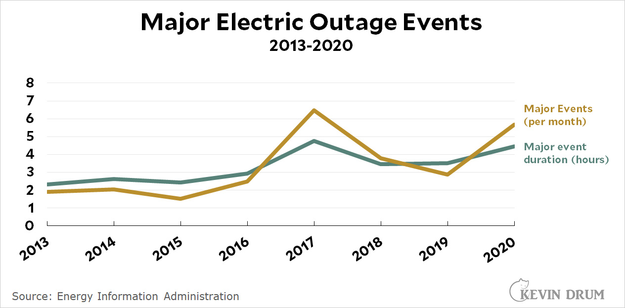
Here's some more data:

Major events have indeed become more common. They've also gotten worse, but again, it's unclear if the events themselves are worse or if the electric grid is less able to handle them.

We need more data.

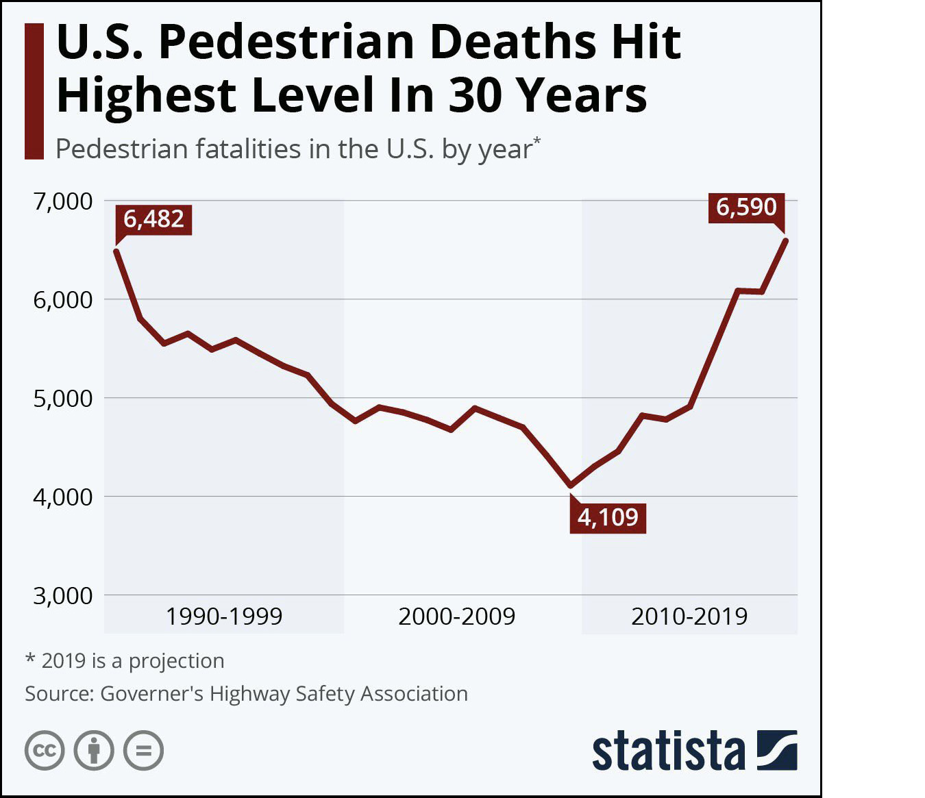
For some reason a chart of pedestrian deaths has been making the rounds in my Twitter feed:

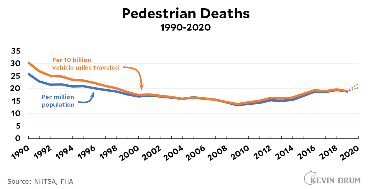
I replotted the chart to show pedestrian deaths per capita, which looks like this:

This is very peculiar. Whether you look at the raw data or whether you adjust for population or vehicle miles driven you get the same result: pedestrian deaths went steadily down for 20 years and then abruptly turned upward starting in 2009.

Nobody knows why. The obvious explanation is cell phones/social media, but that's become the go-to explanation for anything that starts around 2009. I'm skeptical of this because the change in 2009 is so sharp. There's no plateau for a few years and there's not really even much noise. The trend just suddenly turns around and starts increasing at a steady rate for the next five or six years. Besides, the CDC says that distracted driving has gone down since 2010, not up.

Of course, the other possibility is distracted pedestrians, but people get really mad if you suggest this (you're "blaming the victim"). And since there don't seem to be any reliable measures of distracted walking, it's hard to make a case for this anyway.

Anybody got any ideas that don't involve cell phones or social media?

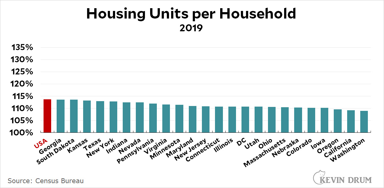
As I semi-promised earlier today, here's a chart showing the housing situation in each state:

States like Maine and Vermont have loads of housing, while the entire West Coast is at the very bottom. Oddly, Texas is well below the average. I would have expected them to have loads of housing.

And with that I'm off the housing beat. I've spent too much time on a subject that's not really a hot button of mine. On the bright side, the original chart showing the steady decline in housing over the past decade was kind of interesting, and I also learned a little bit about using the Census Bureau's data tool. So it was probably worth it.

Remember the great worker shortage? It's why there are so many job openings going begging. But where did all the workers go? Nobody seems to know.

Perhaps the explanation is simpler than we think. Maybe it's just that a whole lot of people retired during the pandemic:

That's from Miguel Faria-e-Castro of the St. Louis Fed. The red line represents how many people "should" have retired and the blue line represents how many people actually did. This was done in August 2021, and by now the excess is probably up to 3 million or so.

Faria-e-Castro speculates the the uptick in retirements is due to (a) fear of infection and death, and (b) assets such as homes and stocks rising in value, which made it more feasible to retire.

I'd add another possibility, There were probably a fair number of people who were maybe 62 or 63 at the start of 2020 and then got furloughed or let go entirely when the pandemic hit. They took a look around and decided that by the time businesses started hiring again they'd be 63 or 64 and would have a really hard time finding a new job. So they reassessed their finances and decided that with a little bit of scrimping they'd be OK. Why not just retire now?

But here's another thing. I decided to take a look at a different measure of retirements, namely the number of people applying for Social Security benefits. Here's what it looks like:

This is not the same thing as total retirees, but you'd still expect to see a significant uptick if more people really are retiring. And yet there's nothing. Literally nothing. If you extend the 2017-19 trendline, it passes perfectly through the 2020-21 datapoints. There's not even a hint of an increase.

I dunno. Faria-e-Castro got his data from the monthly Current Population Survey, which ought to be the best source. So why doesn't anything show up in the monthly Social Security signups? And why does the CPS data show an uptick starting in January 2020? If it's pandemic related it shouldn't start until April at the earliest.

It is a mystery.

Last night I wrote a post about the number of housing units in the United States. It's all correct. Unfortunately, I also talked about about housing units in California. When I went back today to take a more detailed look at California, I realized that I had transposed a couple of numbers in yesterday's post, making it completely wrong.

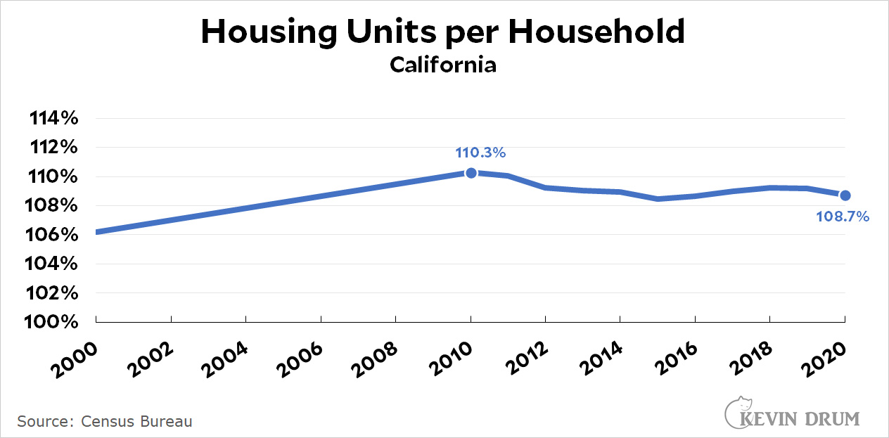
Here's the corrected data for California:

For the nation as a whole, the ratio of housing units to households dropped from 117.8% in 2011 to 111.8% in 2021.

I'm using slightly different years for California (our peak was in 2010 and data is available only through 2020) but it doesn't affect the basic conclusion: California's housing ratio is lower than the national average, but not by a lot.

Maybe later I'll take a look at the current ratios for each state. It all depends on how interested I stay in this topic.

Here is the Census Bureau's definition of a housing unit:

Housing unit is a house, an apartment, a group of rooms, or a single room occupied or intended for occupancy as separate living quarters.... Tents and boats are excluded if vacant.... Living quarters of the following types are excluded from the housing unit inventory: Dormitories, bunkhouses, and barracks; quarters in predominantly transient hotels, motels, and the like, except those occupied by persons who consider the hotel their usual place of residence; quarters in institutions, general hospitals, and military installations except those occupied by staff members or resident employees who have separate living arrangements.

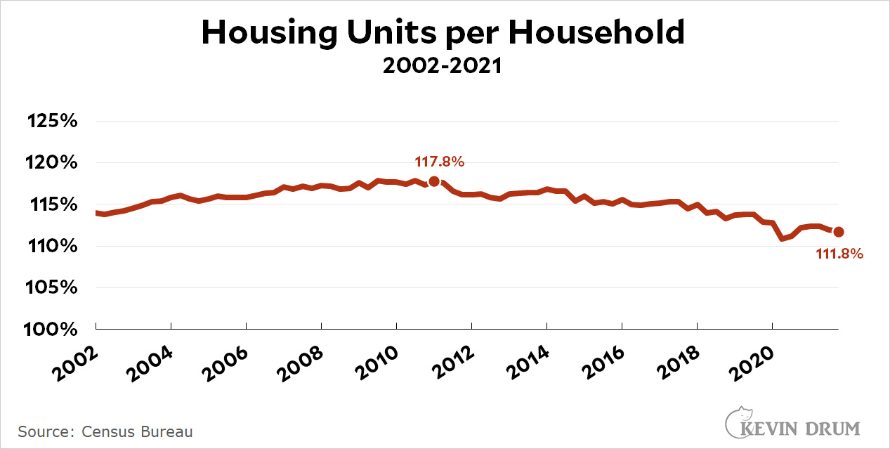
Seems pretty thorough! Now here is the ratio of total housing units to total households:

Starting in 2011, the number of housing units per household began a steady decline. We would need 7 million more housing units to get us back to where we were in 2011.

UPDATE: The original version of this post included a bunch of stuff about California housing, but I transposed a pair of numbers and produced a wildly wrong result. I've deleted the whole thing.

Corrected numbers for California are here.

I continue to believe that Donald Trump will get away with everything, but there's no question that his legal position has deteriorated considerably over the past week or so. Here's a review of recent headlines. Enjoy.

Here is Hilbert relaxing in the garden on a summery day in February. He had just spent some time warming up his fur in a sunny patch and headed off to this nice, shady spot to cool down.