It's been a while since I took a look at the latest COVID-19 numbers, so let's do that. The powers that be have decided that the best metric is no longer cases or deaths, but hospitalizations, so here are hospitalization rates in the US plus the five biggest Western European countries:
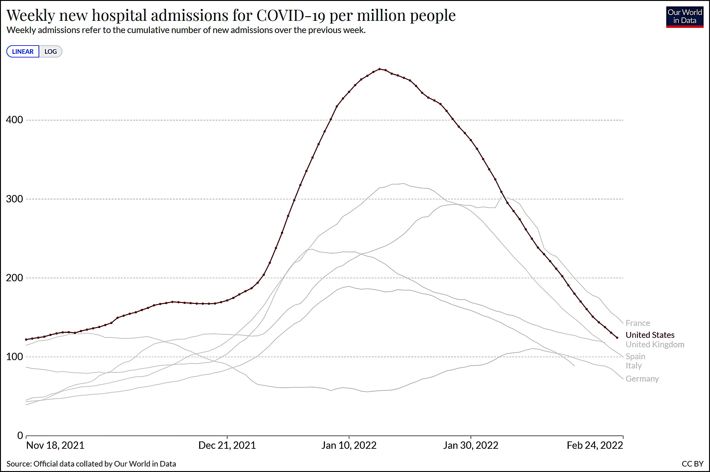 Everybody is way down from the early January peak and hospitalizations are still dropping. So things are looking pretty good.
As an added bonus, here's another chart showing each surge of COVID since the start of the pandemic:
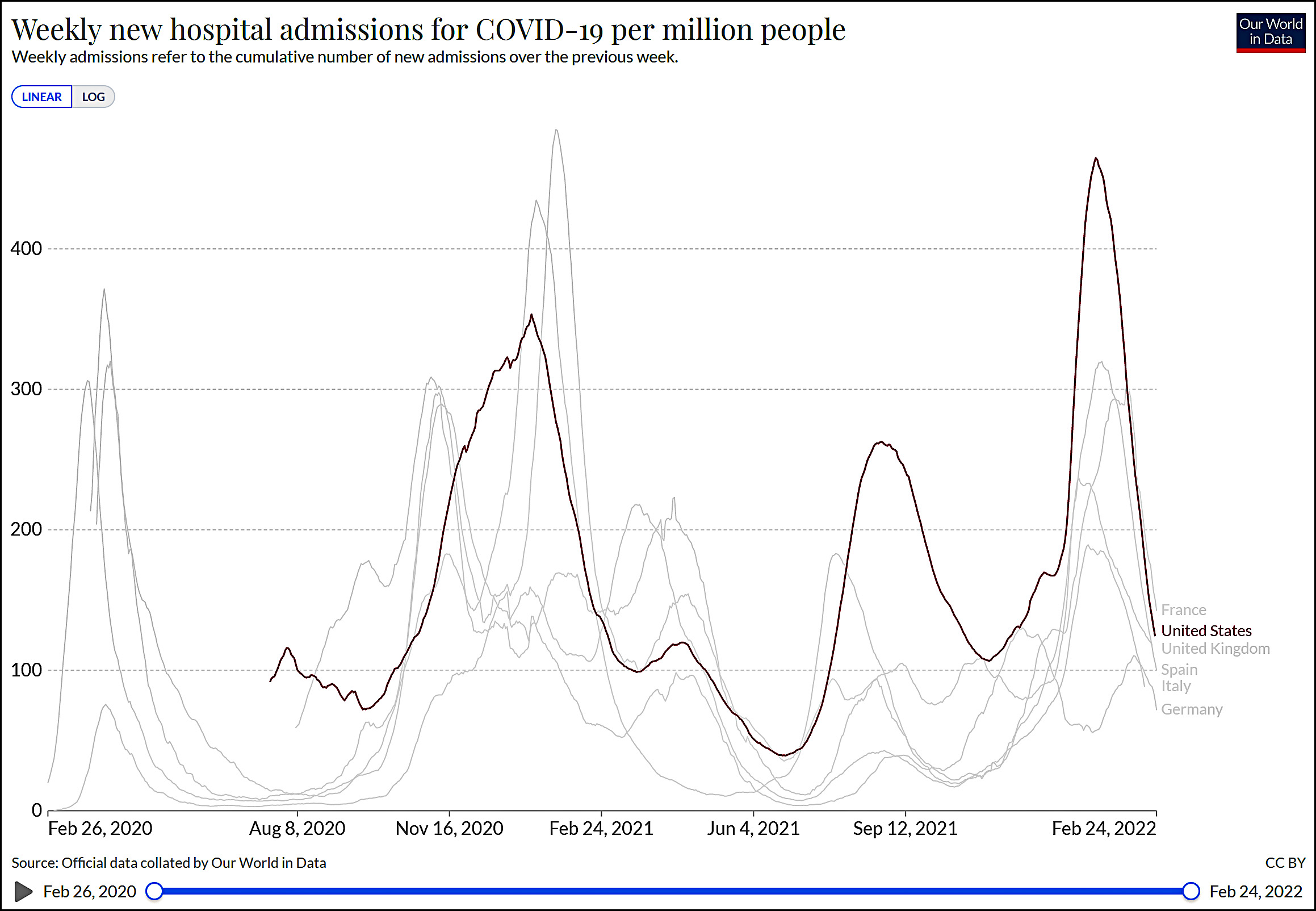 The conventional wisdom at the beginning of the Omicron surge was that it would be severe but short. That's been more or less borne out in the US, where the peak was the highest ever but the curve goes up and down quite sharply. However, it's worth noting that (a) the Omicron surge wasn't way sharper than previous surges, and (b) other countries have had surges that were just as sharp as the US omicron surge.
I don't have anything to make of this aside from thinking that the sharpness of COVID surges varies quite a bit in different countries at different times. I'm not sure our Omicron surge was really anything out of the ordinary.