Skip to content

A reader has pointed me to some additional data on this morning's burning question about American History professors. Out of a total of 245 doctorates awarded in American History, here's the racial breakdown:

Give or take a bit, just under 100 tenure track positions were hired in American History in 2022. The total number of non-white American History doctorates in 2022 was 55. This suggests there's still plenty of opportunity for white folks even if every single non-white PhD stayed in academia and got hired—which is distinctly unlikely. If I had to take a horseback guess, I'd say that roughly 60-70% of American History hires are white people, split about evenly between men and women.

Here's an interesting tidbit I happened to run across today. For the past eight years Pew has been asking people if they believe their side is mostly winning or mostly losing on important issues. Here are the results:

Generally speaking, people think they're losing when the other party is in power. That's natural. But in the Biden era everyone thinks they're losing. Republicans think they're losing, but so do Democrats by a fairly wide margin. Altogether, three-quarters of Americans think their side is losing.

I'm not quite sure what to make of this. Do Democrats think they're losing because of genuine conservative victories like Dobbs or Republicans winning control of the House? Or is it because they think Joe Biden isn't winning enough? This is important. If it's the former, it makes Democrats mad and probably helps turnout. If it's the latter, it makes Democrats discouraged and probably reduces turnout.

So which is it?

POSTSCRIPT: Note that the 2024 figures are from January polling, well before most of the recent Gaza protests.

This is called service journalism, my friends. First off, a Wall Street Journal test of five AI engines on everyday questions picked a surprise winner: Perplexity. So I tried it out. It's pretty good! On a scale of 1-to-10, none of the answers in my short tryout were less than about 7. All were up to date and included links. And it's free for the basic version. Try it out here if you're interested.

Second, do you hate all the cruft in Google searches? That is, the sponsored posts, the Twitter aggregation, the AI summaries, the sidebar definitions, and so forth? If so, you can get rid of them thanks to a new feature rolled out a couple of weeks ago. After you do a search, just click on More and then click Web. You'll get a plain, old-school list of links and nothing more.

If you keep the Google tab open, it will continue to provide Web versions of your searches. Alternatively, if you're up for a bit of techno-tinkering, there's something called the UDM-14 hack that will produce Web versions for all your searches.

Personally, I sometimes find the cruft useful, so I'll probably just manually click the Web link whenever I feel overwhelmed with junk.

You're welcome.

Today is Memorial Day, so here's a picture of the Soviet War Memorial in Vienna, lovingly maintained to this day by the Austrian government. Which is all very fine, but why? And why not a picture of the American War Memorial?

Well, the Soviet Union was one of the occupying powers in Vienna after the end of World War II, and in 1945 they built this memorial to themselves. Then, in 1955, when Austria gained independence, the treaty they signed required them to keep up all Soviet monuments in perpetuity. They've kept to that agreement to the present day. The US never built any memorials in Vienna and therefore never required them to be maintained, which is why Vienna boasts a pristine Soviet War Memorial but nothing for the Americans (or the British or the French).

May 20, 2024 — Vienna, Austria

Today's minor Twitter kerfuffle:

This is frustrating for a person with a numerical brain like mine. I'm curious about this, but I don't think the data exists to decide if there's anything to it. According to the Department of Education, here's the breakdown of assistant professors in 2022:

There are several problems with this:

  • It's a count of all assistant professors, not just newly hired ones. Impact: probably small.
  • I've excluded professors whose racial status is unknown, including nonresidents. Impact: hard to say.
  • This is for all faculty, not 20th century American historians. Impact: could be large.

In other words, it's all but impossible to weigh in on this unless someone, somewhere happens to have collected the relevant data—which I doubt. And I'm not willing to accept anecdotal data because anecdotal data (aka "everyone knows") is routinely inflammatory and wrong.

Also, in case you're interested, slightly less than half of all assistant professors are men.

Anyone have ideas about how we might deduce racial information about the faculty in different academic areas? It wouldn't surprise me at all if the demographics of history departments are way different from, say, physics departments. But do we know?

UPDATE: Further research suggests that about 60-70% of new hires in American History are white. Details here.

There's nothing new about radical Jewish settlers in the West Bank attacking Palestinians, but it's now spread to attacks on aid truck bound for Gaza. And as usual, the Israeli government does nothing about it:

Radical Israeli settlers have expanded their attacks on aid trucks passing through the West Bank this month, blocking food from reaching Gaza as humanitarian groups warn that the enclave is sinking deeper into famine.

....The violence and vandalism, committed with near-total impunity, raises questions about the willingness of Israel’s security forces to restrain extremist settlers and protect Palestinians. It also challenges the Israeli government’s claim that it is doing all it can to ensure that aid flows to Gaza, where the humanitarian situation has deteriorated rapidly since IDF forces moved into the southern city of Rafah.

As bands of teenagers become the arbiters of who can and cannot pass along main roads in the West Bank, any trucks carrying food have become vulnerable to attack.

These "radical settlers" live in outposts that are illegal even by Israeli standards, and they're dedicated to harassing and sometimes killing Palestinian farmers who they decide might have planted an olive tree in the wrong place. Everyone knows this is happening—there are no secrets here—and the IDF responds with a studied indifference. If and when police show up, they are oddly unable to identify anyone who might have been involved in the violence.

This is life in the West Bank under Israeli rule. Now it's spread to aid trucks and, once again, the IDF stands around and watches while the police take a few hours to show up. As for the Netanyahu government, it rarely bothers with even a pretense of caring.

It hardly matters if you're a die-hard supporter of either the Palestinian or the Israeli cause. This is barbaric and malicious no matter whose side you're on. But if you happen to be on Israel's side, you should be loudly denouncing this stuff and begging Netanyahu to put a stop to it. Nobody should want to be associated with this kind of bloody savagery.

I don't suppose it will do much good to point this out yet again, but here's the standard, headline inflation rate over the past six years:

In the years before the pandemic, inflation averaged 2.1%. Over the past year, inflation has averaged 3.3%.

For the Fed, this is a big deal. It means they feel like they have to keep interest rates high in order to wring out that last 1%. But for the average consumer, it's meaningless. For the entire past year, inflation has been barely a percentage point higher than normal. This is hardly noticeable.

And as long as we're at it, it's worth noting that purchasing power has gone up over the past year as average wages have outpaced inflation:

Also, unemployment has been under 4% for 2½ years, its best performance in the past half century. For the record.

I missed this when it first came out, but a few weeks ago David Wallace-Wells wrote a piece in the New York Times taking a look at the evidence that cell phones have been responsible for big increases in teen depression, especially among teen girls. He ends up being skeptical. The whole piece is worth reading, but here are some of the highlights:

  • In 2011 HHS issured guidelines recommending that teen girls be screened annually for depression. In 2015 they mandated coding changes that doubled the reported rate of self-harm for teen girls (and everyone else). A study in New Jersey found that these changes explained nearly all of the state’s apparent upward trend in suicide-related hospital visits.
  • The overall suicide rate for teens has gone up at the same rate as the suicide rate for adults. (Although the suicide rate for teen girls has gone up more than the rate for adult women.) This suggests a primary cause other than cell phones.
    .
  • Teen depression as measured by the annual SAMHSA survey increased by about 50% between 2005 and 2017. But a similar survey from the CDC pegs the increase at only about 10%.
  • Worldwide data varies considerably from country to country, regardless of cell phone usage. In some countries teen mood disorders are up, in others they're down.
  • Different surveys produce different results. A PISA survey question suggests increasing loneliness among teens, but other surveys show life satisfaction among teens flat or improving.
  • This didn't make it into Wallace-Wells' piece, but I'll add a study I recently wrote about showing that internet access seems to be generally associated with better well-being, not worse.
    .

As Wallace-Wells notes, Jonathan Haidt is one of the biggest proponents of the theory that cell phones are damaging teens, but even he thinks that cell phones account for only 10-15% of the variability in teen well-being. That's not nothing, but it's also not an epidemic.

The evidence isn't all in on cell phones, but for now I think it points in the direction of cell phones having a negative impact mainly on a small subset of teen girls who are probably already depressed and end up spending hours on social media. That's a problem worth addressing, but not one that needs to be turned into a panic.

How much food is getting into Gaza these days? I have no idea.

Israel opened the Erez crossing last week and reopened the Kerem Shalom crossing. The Rafah crossing remains closed.

Since then, COGAT claims that nearly 300 trucks a day have been crossing into Gaza. The UN puts the number at about 100 per day, but warns that its count doesn't include commercial trucks.

In other words, there's just no way of knowing how much aid is truly getting into Gaza. It hardly seem plausible that the vast difference between the UN numbers and the Israeli numbers is solely because of commercial trucks, but maybe. At the moment, though, this is the best I can offer given the incomplete and changing data from both sides.

The Wall Street Journal points to a fascinating study today. Three researchers took a look at recent inflation expectations among Democrats and Republicans. Here it is:

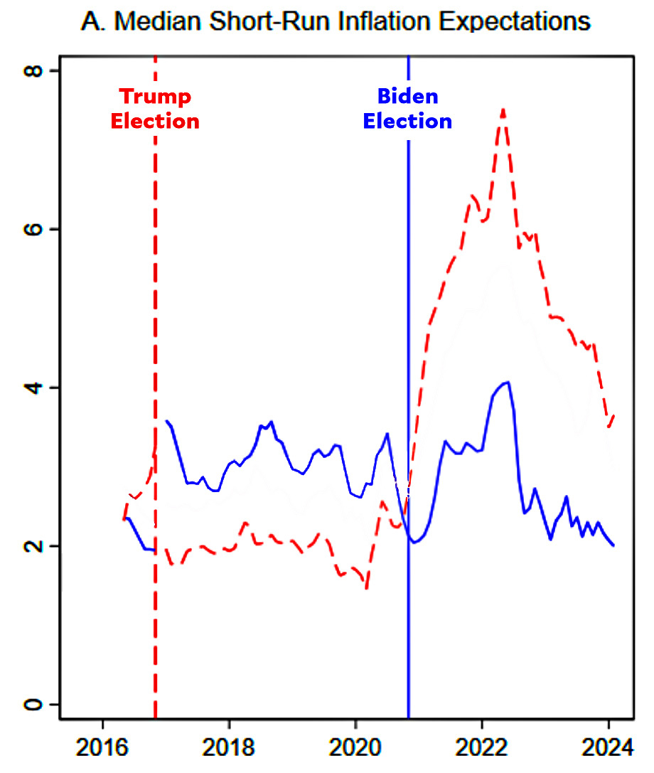
Democrats maintained relatively stable inflation expectations the entire time. By contrast, Republican inflation expectations skyrocketed literally on the day Joe Biden won the 2020 election—long before actual inflation appeared.

But that's not all. The authors say that these inflationary expectations actually turned into inflation:

We find strong positive and significant effects of inflation expectations on inflation itself.... A one percentage-point increase in 1-year or 5-year inflation expectations lead to a 1.3 or 2.3 percentage point increase in inflation, respectively.

The Journal decided to check this out, and their conclusion is that it seems to be true:

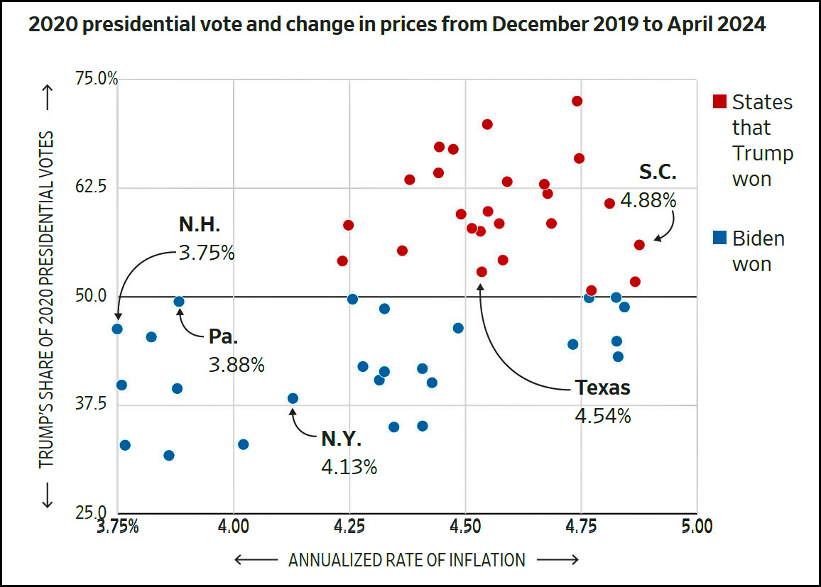
Every state that voted Republican has high inflation. That's fairly remarkable—though I'd feel more confident in the result if I could see this same analysis for previous elections.

If this study is correct, it means that a great deal of our recent inflationary surge was literally due to Republican hysteria over the election of Joe Biden. In fact, the authors calculate what actual inflation would have been if everyone had instead acted like Democrats:

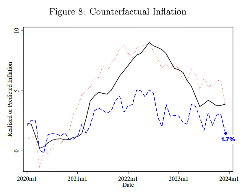
They figure that inflation would have topped out around 5% and would currently be at 1.7%.

I'm not sure what to think about this. The results seem too big to be true, and the authors take some shortcuts that might be iffy. That said, I don't have the econometric chops to evaluate the paper properly. I'd sure like someone else to do it, though. If the paper is right, we're paying a huge price for the Trump/Fox-induced economic panic that continues to infest Republican voters.