
The Wall Street Journal sure is a strange newspaper. Today they printed this chart:

Despite the fact that the Journal has a sophisticated readership, they didn't bother to adjust these numbers for inflation. They do this all the time, and it's perplexing. The chart as it stands tells us almost nothing.
Here's the same chart adjusted for inflation:
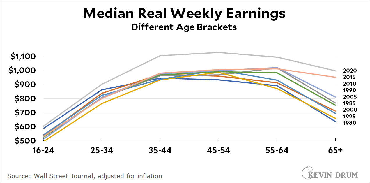
The obvious things to see now are (a) earnings are higher across the board in 2020, and (b) seniors in 2015 and 2020 continued to work and earn money at a higher rate than before.
The Journal is focused on the fact that millennials are starting to enter the peak earning years of 35-44 and wonders how they're doing. On income alone, they're doing great: the 2020 cohort of 35-44 year-olds is averaging about 15% higher than previous cohorts.
But what about debt? The current cohort of 35-44 year-olds appears to have average debt of $60-70,000. But what about the 2015 cohort of that age group? And the 2010 cohort? I need some help with that. I'm sure the data is available somewhere, maybe in the Fed's national accounts or perhaps in the Census Bureau's microdata. But I'm not able to extract it from either place.
Still, debt aside, today's 30-somethings have been earning as much or more than their predecessors ever since they entered the job market. On average, that is. Needless to say, there are unlucky ones who didn't.
Despite the fact that the Journal has a sophisticated readership
Not judging from the comments section. They're wild-eyed conspiracy theorists just like the rest of MAGA.
It's the managerial MAGA class.
They are globalist stooges of the elite. Enough of the maga line. It's boring and old.
The 35-44 bracket is at least half made up of Gen X. The earliest start to Gen Y is 1981 (age 39/40 right now), but the most appropriate start date is 1982 or 1983.
Remember that the average and median wages went up instantly in early 2020 when huge numbers of the lowest-wage workers were laid off. Few individuals actually had their wages raised although there were some temporary bonuses for essential workers. Then during re-opening there were some real raises in a temporary labor shortage. Unemployment is still over 5%, so there is no real overall shortage. A true picture of whether workers have gained much may not emerge until the pandemic is over. Yearly numbers are not fine enough to see what has happened.
Unemployment is going below 5% soon dude.
Not to mention that chart uses 4 different shades of blue and 5 brownish/greyish shades. There is an entire spectrum of colors available, folks!
The WSJ graphic is better. The point is not that earnings have risen, it's that the age-pay curve has a shape, and the shape has changed a bit over the years. I have a pretty hard time seeing how those curves have changed over time if you make them all overlap by factoring out inflation.
Also it is much better to have the curves appear in order by year, which the nominal earnings numbers naturally give us. Kevin's version is terrible for showing the sequence.
Yes, but not plotting in constant dollars, the years separate out better. But it's also misleading. The jump in earnings per age group at the start looks much steeper in later years than earlier ones--but that's mainly an artifact of not correcting for inflation.
Maybe that is an issue for the slope-sensitive reader. I would not try to read much from the apparent slope myself. The more basic facts are which age ranges are earning more, and how things generally vary over worker age.
Of course, if we put the pay on a log scale, …
China's zero infection policy is going to war with Delta. Shutdowns of factories and ports for a single infection means that there are a lot of hiccups to the recovery, further destabilizing supply chains.
Just, you know, maybe pay some attention to this.
Also, maybe after the pandemic is all over, diversifying manufacturing ought to take precedence over short-term profits.
Kevin? You don't know that the WSJ is a Murdoch paper?
WSJ is a right-wing propaganda rag. Fox "News" for the well heeled.
Why are we expecting actual Journalism out of that lot?
The WSJ is pretty good on business news, comparable to Bloomberg, but you know the saying: "The way to make small fortune is to follow the advice on the WSJ editorial page, that is, if you are starting out with a large fortune."
> Despite the fact that the Journal has a sophisticated readership
But do they really?