There are at least two or three people out there who crave a detailed explanation of every aspect of my blog design. Right? I aim to please, so here it is.
First off, longtime readers will note that the design is very old school: two-columns, with miscellaneous stuff in the right-hand column like RSS feeds, a blogroll (!), and other things. This is very deliberate. I figured that if I was circling back to my roots, I should do a full job of it.
But if I'm so old-school, why didn't I revive the Calpundit name? There were two reasons. First, even back in the day I thought it was a dumb name and was annoyed that I had foolishly chosen it before I knew what I was doing. Second, the calpundit.com URL has long since been purchased by someone else, so I couldn't register it.
The body font for blog posts is Palatino 17 pt. I have literally been using Palatino as my go-to body font since 1985, and I wanted to use something different this time around. I found several I liked, and they all had four versions: regular, italic, bold, and bold italic, each of which is necessary for decent looking bolds and italics. However, for some reason, when I actually tested them on the blog only the regular font displayed properly. I don't know why. I finally gave up trying to figure this out and went back to Palatino, which displays properly in all its versions.
The title font is Hammersmith One 28 pt. I wanted something that was basically pretty normal but with a little bit of a different and recognizable look. Hammersmith fit the bill.
The main page title and the sans serif font in the right column are Noto Sans. It's a nice font, and I just felt like using something besides the usual Helvetica.
The header images are all pictures of Orange County that I've taken over the years. They change every time you load the blog, allegedly at random—though I have some doubts about the quality of WordPress's random number generator. Soon I will have at least one picture from every city in Orange County.
The main column is a little narrower than the one I had at Mother Jones. This means that charts and pictures are a little bit smaller than they used to be.
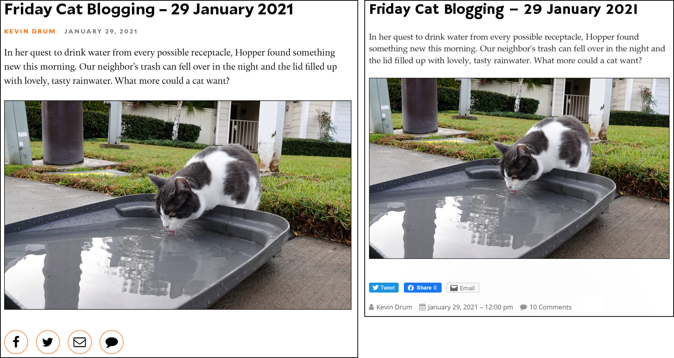
There is no header picture for every post, as there was at MoJo. This was never something I was thrilled with, so I've gone back to my old habit of using inline pictures when I need them and leaving it at that.
There's a menu bar at the top of the blog, so I decided to make use of it. One menu contains some of my favorite photos; another contains some of my favorite magazine pieces; and the third one answers a question I get frequently: what are the data sources I use most often?
Blog posts are now timestamped as they should be, using Pacific time. Perhaps the only time I was disappointed with MoJo was when they caved in to New York elites and switched their timestamps to Eastern time.
Commenting is done via the stock WordPress comment system, with Akismet handling anti-spam duties. This finally abolishes the much-loathed Coral comment system, and we'll see how it goes. Akismet does have an algorithm that will hold comments on occasion, or block them entirely on others, but this shouldn't come into play very often.
Why didn't I follow the crowd and move to Substack instead of creating my own blog? There were two reasons. First, Substack is primarily useful because it allows writers to charge readers on a monthly basis without a lot of hassle. However, I'm now semi-retired and I don't need money from my readers. Second, I like the blog format and I don't especially like the newsletter format, where you feel obligated to come up with a specific amount of content on specific days.
What's with the jabberwocking.com URL? Well, it turns out that pretty much every URL you can think of is already taken. Eventually I decided it was best just to choose a nonsense word, but even lots of those were already taken. Finally I thought of jabberwocky, which of course was taken, and then tried out a few variations. It turned out that jabberwocking was available, so I took it. It seemed appropriate because blogs are all about jabbering, but that's all. There's nothing more to read into it.
What about bugs and requests? I don't have an IT department anymore, so I'm responsible for handling all this. Leave a comment or (better yet) send me an email if you notice something. One thing to note is that early on I browsed through the various WordPress themes available for free and chose one I liked. It turns out this theme is no longer actively managed, which means it's possible that future updates of WordPress will bollix it. I sure hope not, though, since I doubt I'd know how to fix it.
In fact, I'll note for the record that modifying things in WordPress is a huge pain in the ass. I'm not afraid to dive into code and get my hands dirty, but at the very least I need some idea of the basic structure of the code elements and the names of the variables that control things like font type, colors, footer elements, and so forth. The best advice I've found for this is "start looking through every file in the theme until you find what you want." Thanks. Anyway, I eventually cobbled together nearly everything I wanted, but anything even remotely complicated is likely to be beyond my WordPress skills. Keep that in mind.
Any other questions?
I've got a blog on WordPress too; I chose it for the low price and ease of use for basic blogging.
Write the post in a basic word processor, copy it into WordPress, check for typos, tweak formatting if needed, and you're good.
I HATE their new "Block Editor", though. I have no idea how to do anything - link to a video, insert an image... And every time I make even a teeny edit, the whole post gets messed up. I've resorted to saving a post as a draft, and then going back to do the editing in the Classic Editor.
I can only echo your comments on the Word Press block editor. It stinks. For inconvenience and trouble it rates right up there with the Coral commenting system on Mother Jones. I have an opinion blog and a travel blog on Word Press. I use the travel blog it to keep my family and a few friends up to date on where I am, what I’m doing, the things I see.
Each post is around 300-400 words; sometimes I draft it Microsoft Word, then copy and paste; other times I draft directly into WordPress. Usually there are couple of photos. On the road, I use the WordPress app for my iPad. I ALWAYS switch back to the classic editor right then and there.
I can understand how a “feature” might work differently on different platforms, and might not work at all well on one or two. So help me, that block editor is a monumental fail on EVERY PLATFORM. WordPress app on my iPad; the WordPress app for Windows; directly into WordPress via both Safari and Firefox on my iPad; and directly into WordPress via Firefox and the Microsoft web browser which shall not be named.
It stinks in every single mode. I’ve figured out how to find (mostly) and insert things like “more,” links, and photos. The worst problem is when I go back and try to break a too-long paragraph into smaller chunks. The system (and my screen) then goes crazy, flipping between where I was and a blank screen interminably.
I invariably have to go into the “settings” and switch back to the Classic Editor.
On a ratings scale in which MoJo’s Coral system ranks pretty high in the list of personally identified stinkers, WordPress’s Block Editor may be worse.
Thanks for the explainer. I really like the clean aesthetic and easy to read fonts. I've turned off ad blocker for your site as well as it is not needed.
The Genesis Framework can isolate you from the internals of WordPress. It costs $60, but may be worth it for reducing the hassle factor of working directly on WordPress. https://my.studiopress.com/themes/genesis/
https://www.nutsandboltsmedia.com/things-you-should-know-before-you-purchase-the-genesis-framework/
It’s all good, except of course for Hammersmith and Marginal Revolution 😉
In real life I've supported normal WordPress site owners for the better part of a decade. I don't know where people get the idea that to use WordPress you have to "start looking through every file in the theme until you find what you want."
That's like saying if you want to drive across town you have to pop the hood and learn about every part of the engine and transmission. Maybe our dads and moms had to know how to do that with their old Fords and Chevrolets, and maybe 10 years ago you had to hand code things to get WordPress to work. Nowadays not so much.
You've got a very basic theme. You're doing very basic things with it, except maybe for the random photo picker in the header. There are somewhere between dozens and thousands of other themes just like this one in the free WordPress directory. You can preview them from the dashboard and activate one without having to manually download or edit a thing. Definitely without ever looking at a line of code.
In the unlikely event this theme finally runs off the update rails you can go to the theme directory (Appearance -> Themes) in the dashboard sidebar) and preview different themes to your hearts content. Almost all your settings (menus, sidebar, widgets, etc.) will show up where you expect them. If you try something and don't like it you can switch back to Tiny Framework.
Bottom line is that once your site is setup the way you like it you can just... use it. Run updates once a month. Make a permanent backup every month or so too. Maybe an hour a month. If your blog starts getting too much traffic for BlueHost to handle spend a day moving it to a server with more horsepower (which may, incidentally, cost less and run better than Bluehost.) Otherwise spend your time, you know, blogging.
As I tell almost all my clients "you know more than you think you do." In your case (Calpundit, Washington Monthly, the different blogging platforms Mother Jones ran through) you *really* know more than you think you do!
What explains the orange font in the comment reply box?
Good question!
It seems to be black now, thank goodness. The orange is hard for my old eyes to see.
There’s only a couple of things I miss regarding the comment section on your blog. That would be the ability to upvote comments and a notification system for when my own comments have been answered. Otherwise, I like your new blog a lot.
One suggestion regarding your photos. As I recall it you had some nice pictures of the Yosemite Firefalls. You should upload those in your Yosemite section of the photos tab.
Not being able to upvote comments is a huge letdown for me. That lets you view comments by rank and see the top-rated comments first. It's not a complete deal breaker for me, but it's close.
Yeah, upvote and sort by votes is a big sell, especially when I'm low on time.
"the ability to upvote comments and a notification system for when my own comments have been answered. Otherwise,"
AMEN!! Particularly for the notification system. Not having that means anything a commenter posts goes immediately into the deep blue sea and there's essentially no chance for discussion or dialogue. BOOOOO!
I can (grumpily) live with not being able to "like" something or see other "likes," but the lack of notifications is a real killer.
Also—ability to edit comments.
Disqus (which was used by Mother Jones before the abysmal Coral) was a near perfect commenting system for several years -- until whatever happened to it happened. It ticked all of your boxes and more:
1) Excellent notification system
2) Upvoting (and downvoting if allowed by the moderator)
3) Easy access to own recent comments and replies
4) Ability to follow other users' comments
5) A dedicated app (well, at least on Windows Phone, which I had at the time)
6) Possibly the best feature, an RSS-like news feed of the topics on all followed sites
Since it was so good, lots of blogs and sites used it, which made it that much more attractive. I pretty much used Disqus as the portal to access many of my favorite sites on the internet.
But then MJ and several other sites suddenly dropped it. (I'm guessing because of changes to the Disqus usage agreement.) Even worse, some features just stopped working without ever being fixed -- it's almost like it was abandoned by whatever development team was behind it.
It's a little baffling to me, given the great technical and design achievements apparent in so many aspects of the internet, that the creation of a good, universal commenting system appears so unattainable.
Interesting discussion of Disqus. I don't know the details so well, but I was also impressed with the features it had that other systems don't.
I like Kevin's blog just fine. I'm thankful he has continued to write post-MoJo, and it's very nice indeed I don't have to spring for another subscription. I also really dig the OC photos! But yeah, the comments feature isn't great. Disqus isn't perfect, but I've yet to come across a commenting technology I like better.
You'll always be the political animal to me. The blog format is great. Clean, easy to use.
Regarding fonts: Palatino is one of my favorites for hardcopy, but I don't think it's the best choice for on-screen use. I would recommend something that's designed for the screen, like Merriweather 400 (from Google Fonts). It has a greater x-height, which makes lowercase letters a little clearer and less jaggy. It also has slightly better hinting, so that the uprights, in particular, are better aligned with the pixel grid, which makes the letters a little less fuzzy.
One other minor issue with Palatino is that you're relying on the user having a Palatino font on their system, which may or may not be the case. If they don't have it, they'll see something else.
My guess as to why you weren't able to get your other font to work is that you need to include (or link to) all four font files to get the four different styles, and for whatever reason you ended up only including/linking one of them. (You're only including the "normal" styles of Hammersmith One 400 and Noto Sans, for example.)
One last thing: You're using Palatino 17px, not Palatino 17pt (which would be one-third larger).
Excellent suggestion for a different font. I love Palatino on paper, but that Merriweather 400 really does look better on screen.
Will you consider linking your photos to higher-resolution versions, for those of us who admire such? Especially the astronomy photos, in my particular hobbyist case.
I'd always assumed the lack of hi-res photos was a bandwidth issue, at WaMo and then MoJo, but bandwidth is pretty cheap these days (he said, after a pandemic's worth of nationwide Netflix-binging). But I'd be interested to hear if there's some other reason, instead, even if it's just some banal workflow issue (yes, there's probably something wrong with me).
Many of the photos do have higher-resolution versions available. Just right-click on the photo and select Open image in new tab.
Many of the photos do have higher-resolution versions available. Just right-click on the photo and select Open image in new tab.
Now here's an interesting "feature" of WordPress: I did not explicitly write the second copy of the preceding comment, I just accidentally hit Post Comment twice.
Yet when it too so long for a comment to post that when I pressed it again & was informed that it had already posted, this didn't occur.
The fact that your second post wasn't aligned with the first reminds me of my having clicked on "comment" under one previous post, only to find that it had dropped down past that one when it did show up. Maybe a slow reply is the cause!
This ORANGE has got to go; it's good only for sending me to an ophthalmologist.
"Second, the calpundit.com URL has long since been purchased by someone else, so I couldn't register it."
But it's not too late if you act NOW!
CalPundit.com is for sale
$7,695 24 payments of $320.63
Buy now or Start Payment Plan
"Akismet does have an algorithm that will hold comments on occasion, or block them entirely on others, but this shouldn't come into play very often."
At first I registered using my real name but my first couple of comments were lost in the ether. For the heck of it I tried registering with a fake name and now my comments are posting all right. I haven't used an anonymous handle in probably a decade, but that's the one that works.
(Not the guy in Harry Lime's grave.)
If this is cybersquatting knowing that Drum would eventually retire from magazine blogging & go independent again, where do the True Progs of the left come down on it? In favor (using endstage kapitalism against itself) or opposed (because if purchased by Drum it enables renewed Neoliberal paens to the belligerence on in Iraq in response to 9/11)?
Some prog blogs have gone for paywalls where readers pay bloggers to read. I would like to find blogs where bloggers pay the readers to be read. It's an overdue development. Meanwhile, I think Kevin has hit the sweet spot -- it's free for all.
Best to all the Mongooses ... or is it Mongeese?
Yup.
Where's the bandcamp for bloggers, & why isn't Andrew Sullivan relegated to it?
I'm using a feed reader to stay on top of all my blog reading (Go go Feedly!) so I rarely see the blog setup. This post got me to do that - very nice and functional.
Love the side tab for data sources, much easier to find stuff when I'm posting to my feeds. Well done!
Palatino?? OMG, I'm having Apple Laserprinter flashbacks...
Kind of surprised you didn’t come up with “jabberwonkery.com.”
Jabberewok - dot - com.
Jabberewhonk.
Now, see, I can't edit that.
I meant,
Jabberehwonk.
Much better.
My view shows only one column. No symbol for comments that others mentioned. And entering a comment using a different source, then pasting into WP, is a hassle I'd like to avoid.
Due to poor bbd reception in laptops where I live, seldom use them, but I'll obviously have to try that with library's wifi to prevent buffering.
Odd thing is, my friend's blog works OK now PM my phone after photos/ videos were initially jumbled.
Prefer using cell for everything other than D/L items T/B printed due to unlimited data account.
The phone view only shows the comment symbol if (a) you're logged into the site with WordPress, and (b) you rotate your phone to landscape mode.
The above is true if you're here via web browser. Your mileage may vary if you're using the WordPress app.
I can always count on you, Steve-OH!
Have been logged in through WP all along, but this is so different from the one other person I follow, & I prefer the portrait view for much reading, so it didn't occur to me that the landscape appearance would be any different.
Glad I returned, & thank you - now can you turn this orange font to a nice green, the way some car dashboards changed years ago?
I can do that, but it requires some minor surgery, so I'll send over the waiver documentation, and once it's signed we'll get you prepped.
I'm only having issues with the comment button on the toolbar at the upper right not working. It's possibly because I'm only logged on with a username and password instead of using a WordPress account, but I'd really prefer to keep things simple and NOT have an additional account.
"There is no header picture for every post, as there was at MoJo. This was never something I was thrilled with"
You mean there doesn't have to be a picture, ANY picture, for every posting?!? Inconceivable!...
People are asking about the typography? I'm going to have to up my commenting game.
But thanks for the walkthrough. As an old school blogger myself I spent a couple of years moaning about how stoopid Facebook was and how stoopid it was making everyone. Of course I did my moaning on Facebook, because that's where all my readers went. Eventually I tried to make Facebook work for me, but it really never did. Any cat picture (no offense - at least you have cute captions) gets literally ten times the hits of a well-researched, carefully thought out and well-written essay, and the "Like" button basically removes the need for readers ever to engage their brains enough to say what they like about something or why. It really isn't "feedback" at all. It is the cheapest online currency.
I kept my blog, but over the years I find I have 20 drafts for every published post. At some point during the writing I realize no one will read it, much less tell me what they think about the topic. But since you, Mr. Drum, have reactivated your blog, I have decided to do the same with mine. I'm all grown up now, and I don't need constant reassurances (in the form of blog comments) about my worth.
I've drifted away from what I wanted to say here, which is that nothing is ever perfect, and that includes blog designs. There is nothing you could do to quiet the complaints about the orange stuff, or the mobile layout, or the lack of comment notifications, or the hassle of "registering." But what you have done here is nice, indeed. Readable, interesting, friendly. I would only repeat what I told you earlier (for your own good), and has been brought up in this thread, which is that you probably should not be using a WordPress theme that appears to have been abandoned by its developer. Changing themes is not as trouble-free as some have suggested, but it's way better to do it in your own time than to be forced to do it while your site is down. And if you didn't know, the current version of WordPress will give you a reasonable preview of what your actual site will look like in a new theme before you activate it.
All that said, I'm a loyal reader, and who cares about all the technical stuff?
Https any time soon?
To reiterate, thank you for not moving to substack.
As for WordPress, well, it's not the easiest to use to set up.
I find Wix to be the easiest, and Mobirise to be the best. I suppose, anything that makes heavy use of Bootstrap is what counts. Bootstrap basically enables apps in the background to make website creation a matter of dragging and dropping modules. Try it, just for kicks.
It takes a special breed of usually east coast origin to substack.
Kevin, you are a treasure. May I make a suggestion? You may not need money from your readers, but many of us are delighted to pay for content. Perhaps you could have a “tip jar” or subscription that directs contributions to one or more worthy causes?
Seconded. On all points.
Because you laid it out in two columns of defined width, with narrow gutters, your main column actually displays larger for me.