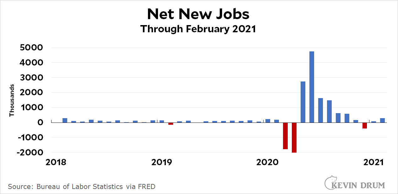
The American economy gained 379,000 jobs last month. The unemployment rate declined slightly to 6.2 percent. As usual, I’d caution everyone about interpreting these figures since they say more about the COVID-19 pandemic than the actual jobs situation.


March or April should be -20000, should it not? This chart makes it look like we're plus millions of jobs. Which seems...wrong. Or is "new jobs" jobs that didn't exist before or something?
Came here to say this. If this chart is accurate, we are way above pre-pandemic employment.
What is not shown is jobs lost. Are the "new" jobs completely new or just rehiring? The excess rate of new jobs may be indicating a shift which may or may not be permanent, for example more new warehousing jobs at Amazon, but fewer jobs in restaurants and out-of-home entertainment (which doesn't show up in this chart). But new jobs is still less than jobs lost, so employment is still down.
It's "net new" so should only show new jobs greater than those lost. So it has to be wrong.