
The American economy gained 336,000 jobs last month. We need 90,000 new jobs just to keep up with population growth, which means that net job growth clocked in at 246,000 jobs. The headline unemployment rate stayed the same at 3.8%.
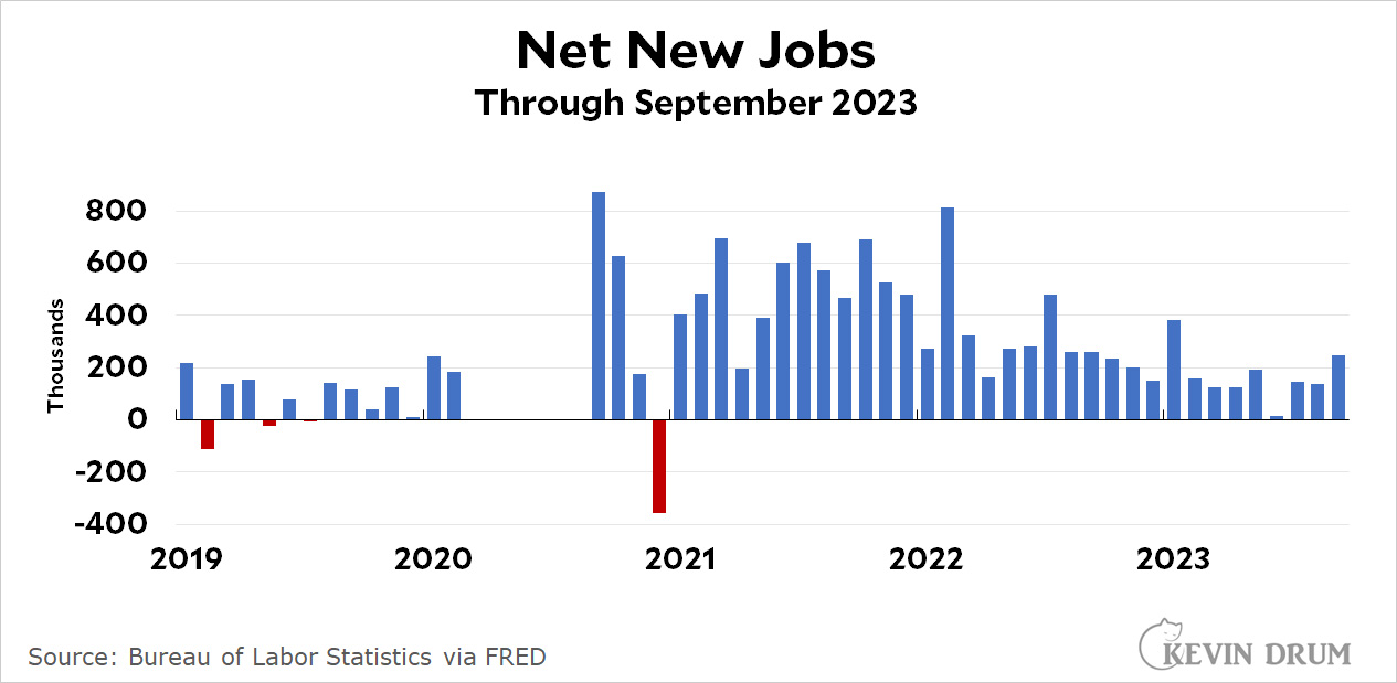 This is a nice, strong jobs report. It's not world beating, and job growth remains fairly subdued in general, but it's well above average for the year.
The household employment data was curiously out of sync with the headline data, showing virtually no growth in anything. It's not usually quite so different, but there's a reason we don't use it as the primary source of jobs data: it's not as reliable as the establishment survey that forms the basis of the headline numbers.
We are still down jobs due to the pandemic. We lost 9.3 million jobs in 2020, and added back 7.3, 4.8 and so far this year 2.3 million jobs. So, 14.4-9.3=5.1 jobs over 3.7 years. We been averaging over 2 million a year, so would expected to have added 7.4 million over this time frame.
Ok, so I'm spitballing from altitude...but there is still slack in the system, so great jobs reports yet little movement in unemployment numbers. That should keep happening for another year or so before we're back to normal--barring the Fed driving us into a recession.
We averaged 2.7 million jobs per year during Obama’s last three years, and 2.2 million under Trump’s first three years.
https://www.cnn.com/2020/02/06/economy/trump-obama-jobs-comparison/index.html
From 2020-22 we were more likely to average approximately 1.7 million jobs per year than your 2 million figure, which would be 5.1 million expected jobs for that time frame. Another slowdown for job growth in 2023, would put us short of a little over 1 million jobs at this point three quarters into the year from what we would expect without the covid interruption.
So, I think we have more like 6-8 months slack compared to your year time frame.
In addition, Drum has been stating the 90,000 number for at least a decade it seems. I think he needs to update it and lower it as Boomers in and out of the workforce are roughly equal to the 20-29 age group. The group of Boomers in the workforce is roughly equal to the amount of workers in the 20-29 age group. However, the number of Boomers out of the workforce is also equal to the 20-29 age group. That was not the case in 2014.
https://www.washingtonpost.com/technology/interactive/2023/aging-america-retirees-workforce-economy/
Also, according to Kevin undocumented workers are down or stagnant from a decade ago. If they are stagnant, then they make up a smaller percentage of the overall workforce from a decade ago which was approximately 9 million less than it is today.
The working age population has increased by about 2.2 million since the beginning of the pandemic.
Adding 3.7M jobs seems pretty good.
Without larger population growth, its nearly impossible to keep adding 2 million jobs a year indefinitely.
It is remarkable how so few people talk about the decoupling of inflation and employment growth.
Quoting Brad DeLong (added emphasis):
It's almost like the economy has done really well for the past three years.
The CNN headline on the jobs report is comical:
"Why the shockingly good jobs report is going to cost you"
Good lord.
A question. Where is all the missing data from March - Sept. 2020 (these appear to be the missing months)? The chart as a whole can't be completely understood with a big chunk of data missing.
Those values are off scale - first low then high. They were essentially artificial, due to covid shutdown and re-opening.
Kevin could show the whole scale if he didn't insist on scrunching everything down vertically.
Thanks for the info.