
Why, a reader wonders, did my Friday chart about job gains have a big chunk of it blanked out? That's easy to explain with a quick comparison of three different ways of presenting the data.
Here is Chart #1, which is what you'd think of as the default presentation. Just set the y-axis to fit all the data and go:
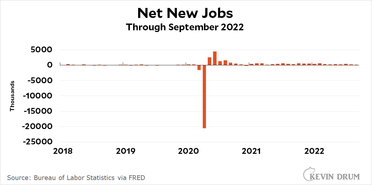 The problem is obvious: we had a huge surge of job losses and gains at the beginning of the pandemic. If you set the y-axis to fit those outliers, the rest of the data is useless. You can barely tell if the numbers are up or down in recent months.
So here is Chart #2. We'll reset the y-axis so that it does a better job of presenting all the normal data:
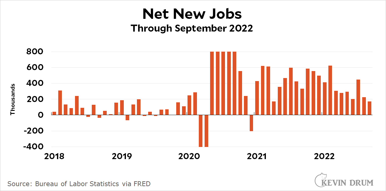 This is better, especially since we don't really care that much about the pandemic data that spills off the top and bottom of the chart. However, since those bars don't provide any information, why even bother to show them?
So here is Chart #3. It's same as #2 except that the pandemic bars are removed:
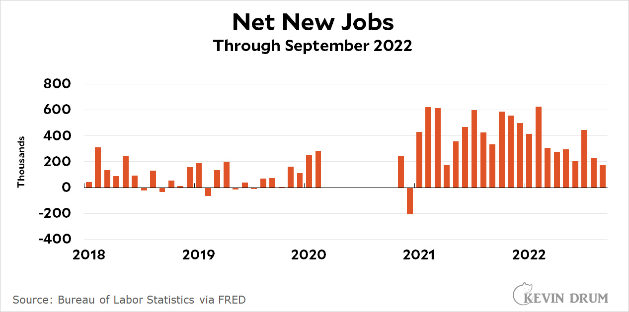 There aren't really any other options. A log chart would work except for two things: (a) most people don't understand log charts, and (b) log charts don't work if you have negative data—which we do.
In some cases you could use little slashes to show, say, a jump from 1000 to 5000. That wouldn't work here because there are too many outlier values at different levels. Also, my charting software doesn't do this automatically and it's a pain in the ass to do it manually. I would never bother with this unless it were really important.
So that's that. You can decide for yourself which presentation is best, but I've chosen to use #3 routinely when I have to deal with enormous data outliers from the start of the pandemic.
Another way to do it is a combination of charts 1 and 2. Have #1, showing the full range, and then a dashed-line box or something else indicating that #2 is a zoomed-in version of the first. That's how I usually present data where there's useful information at multiple scales and for whatever reason a log plot isn't appropriate.
Yes. Charting software need to have the capability of presenting Chart 2 with an inset or blurb that captures the narrow, dramatic part of Chart 1. Charts need to tell a story, and tell it accurately.
My first thought
Here's a quick proof-of-concept:
https://i.imgur.com/u7gQtUh.png
You could use chart #2 and add labels -- the values -- of those that exceeded the limits of your Y-axis values.
Kevin's choices make sense given that he has only a couple of inches of vertical space for each graph. But why are his graphs so restricted vertically? Is he charged by the square inch? I can't think of any way that devices would restrict he height/width ratio.
Taller graphs might show both the extent of the big spikes and differences in the more ordinary values, although this particular example is extreme.
I was wondering the same thing, why not just make the chart more vertical to include all the data visually… I dislike the two slashes solution though.
Of course all this depends on what the main reason for showing the chart is.
If you want the entire chart to (1) fit on a single screen with no scrolling required to see it all and (2) have labels that are legible with no zooming required to read them all, your vertical (and horizontal) axis will need to be limited to some maximum length.
Scrolling and/or zooming to read an entire chart is REALLY annoying for most news readers.
For example, charts #2 and #3 have a range of 1200 on the y axis. Chart #1 has a range of 30000. So chart #2 would need to be about 25x as tall as it currently is to show +5000 to -25000 on the y-axis. (30000/1200 = 25)
I don’t know how big your phone’s screen is, but mine would require about 6 vertical screen-lengths to display such an elongated chart. That would be ridiculous IMHO.
The big loss of jobs in 2020 is not irrelevant overall. Obviously the surge in later months will have to balance that to get back to normal.
Sometimes columns of the data relay the information better than charts.