
Excess mortality is generally considered a better guide to COVID deaths than actual counts of COVID deaths themselves, which are subject to considerable interpretation and dispute. Here are the excess mortality rates for Scandinavia, the US, and a bunch of large European countries:
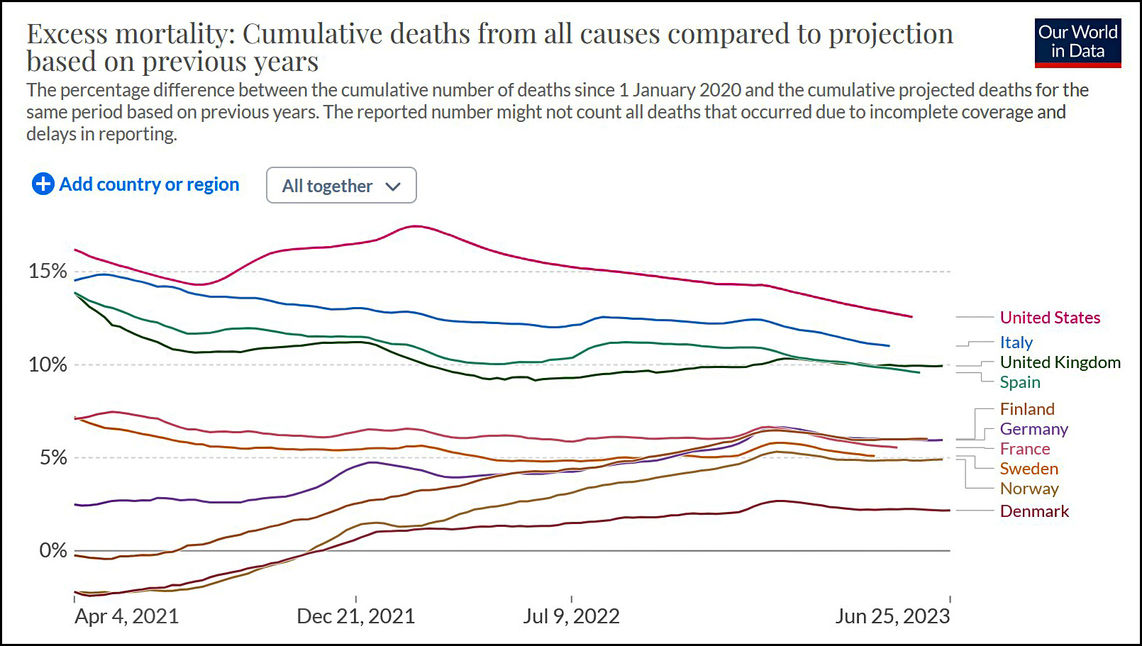 Sweden is at the very bottom. There's only one country that's noticeably lower. Whatever Sweden did, it seems to have worked tolerably well.
I’m pretty sure COVID deaths correlate with connection to the world. Ie how globalized you are…and oh look that plays out perfectly here.
At another level, the difference is marginal, so maybe there just wasn’t a response that worked better than others and sad first worlders like KD should shut the f** up.
It's long after the point where these things matter: the anti-vaxx/mask-ers are gonna do what they wanna do, and the rest of us will do what we gotta do. I continue to wear my P100 mask anyplace that it isn't worth it to me to doff it. That is to say, today I visited my dentist, and took off my mask. Last time (in a foreign building) was 2mos ago when I met a former co-worker in a hotel bar.
These large-grain measurements are great, but omit issues of the quality of the country's health-care system and social safety-net generally. Sweden is a country with an excellent social safety-net, where people can stay home if they feel sick. The US is not that.
One might think that that matters. OTOH, fuck if I care. As far as I care, let the anti-maskers go around unmasked, unvaxxed, etc. I hear that COVID deaths are correlated with MAGAtry, and hey, far be it from me to express concern for their lives: they don't care for themselves, why should I do it for them.
And I never wear a mask unless someone makes me.
Easily 99% of the people around me in public are not wearing masks.
We enjoy life. You cower in fear.
What a fucking stupid response.
"We enjoy life. You cower in fear."
Why do you morons always assume that when someone talks about things that may reduce risk they are "cowering in fear" and not "enjoying life"?
Because they're a sub-average thinker?
Whatever Denmark did looks like it worked better, but the trick seems to have been be a Scandinavian country.
I believe climate has something to do with this.
Am I reading the graph wrong? It looks like sweden's death rate is much higher than other Scandinavian countries through 21 and the months of highest death rate were left off.
What's the deal, Kevin? The same damn graph you posted but extended back into 2020 shows enormous mortality in Sweden, especially relative to every other Scandinavian country.
https://tinyurl.com/2fctmn6f
Why such a short timeframe? The graph can show the whole pandemic,if you want to.
Sweden did fairly well in 2021, but that is after they had a particularly bad 2020. Norway, Sweden, and Denmark also had a bump in deaths in December 2022 that the US didn't have.
I think the deal with Sweden is that they had a lot of early spread in nursing homes. Sweden's policies for the general public were largely misrepresented in outside media, and ultimately mattered less than many think, largely because covid deaths are so heavily concentrated in the elderly. For example, Sweden limited large gatherings and closed high schools. It wasn't anything goes. But poor nursing home protections really make your death rate spike (the US and UK also had similar issues).
The countries that did best tended to be small and rich. Sweden is twice the size of the other Scandinavian countries, so you'd expect it to be somewhat worse than places like Norway and Denmark. Sweden had significantly lower covid deaths per 100,000 than similarly sized Belgium, a country whose covid record we never talk about. Belgium suffered from some very large spikes in death early on, making them one of the worst in Europe.
Some of the covid death rates were about luck. Some places had very early outbreaks: Belgium and Sweden were hit with this more than several other European countries. Germany got lucky, for example, with early test availability. Some places had eldercare practices that were dangerous (especially having low-paid staff with multiple jobs). That hit Sweden particularly hard, but many other countries as well. Some places had higher levels of social distrust or connection to right-wing anti-vaxx movements. Germany's good early showing went to crap because of this, as did many former Soviet bloc states. And we saw that in the US as well.
Interestingly, for much of the pandemic, Minnesota (full of former Swedes) and Sweden had very similar death rates. Toward the end of the pandemic Minnesota started to have a lot more death than Sweden. Rural MN went anti-vaxx and anti-restriction like other rural areas (the My Pillowguy is in MN, after all) and that made a huge difference.
+1
Quality comment.
Denmark and Sweden split their ways when Omicron hit.
1) Sweden shows very poorly on this chart if the timeline is pushed back to 2020.
2) Kevin excluded 2020 (the first year+ of the pandemic) for reasons unstated.
3) Its not clear what is to be learned from Sweden's initial approach and subsequent policy changes throughout the pandemic, but the misinformation attempt is clear.
Kevin excluded 2020 (the first year+ of the pandemic) for reasons unstated.
No he didn't. The numbers show cumulative deaths starting with the year before (so 2020 in the case of 2021).
It still a poor attempt at gaslighting on Kevin.
The cumulative deaths are compared against the expected deaths from the prior year numbers, so, by Sweden having a huge spike early on, their actual vs expected deaths in the subsequent years don't look as bad, matching the numbers of the other countries. It still doesn't mean that Sweden had a comparable or better outcome to the rest, which is what Kevin is trying to pretend.
I realize these are cumulative numbers, but you are wrong, 2020 is clearly excluded.
He chose not to show the first year of the pandemic, instead starting the cumulative count over a year into the pandemic.
The narrative looks different if 2020 is included and theres no good reason to make the extra effort to clip out the first year.
A lot of people are missing that the death rates in this graph are cumulative. The right end shows how all the countries have done as totaled over the whole pandemic and postpandemic period. Those values at the right end count everything from 2020 onward. That's where you want to look for the final scores (up until now).
Sweden did chart higher in 2020 and 2021, because they took their pain early. They end up better off because the combination of high exposure early and lots of vaccination meant they didn't suffer as many deaths since 2022. That's when some other countries' cumulative excess deaths caught up and passed Sweden's.
The graphic is meaningless. "Excess mortality: Cumulative deaths from all causes compared to projection based on previous years". If the "previous years" means 2021 is based on projections derived from 2020, etc, then the fact that Sweden's 2021 does better than Sweden's relatively worse 2020 by more than other countries would yield a deceptively lower percentage for them. The same if it is based on a moving average of the previous N years if it includes the previous year. If it means relative to the average of, say, 2010-2019 then it would imply more like what Kevin claims. But it doesn't say how the projection was made.
Another potential confounder is the age distribution of death rates. If the people most susceptible to death from COVID -- the olds -- died at a higher rate in Sweden, then one would expect the subsequent death rate to be lower since there are fewer people left who are likely to die. If that's you're definition of "taking the pain early" I hardly think it reflects well on Sweden.
Furthermore, if Kevin's point is the endpoint of these statistics show that Sweden is now ahead in this race against death then a table or bar graph presenting the current value makes more sense then showing the truncated graph he presented. But first, a clear description of just how the numbers were derived.
I believe the description in the graphic is clear that "previous years" means a period of several years before the pandemic. Not "the previous year's," as in 2021 versus 2020, etc., which would not be sensible for a cumulative value.
Like I said, that right edge of the graph is summing up all the excess mortality for the pandemic and post-pandemic years, as measured against pre-pandemic times. Where Sweden ends up at the right edge of the chart reflects their whole pandemic experience, including a higher death rate in the first year than in some other European countries.
You're making a zero noise assumption on excess deaths. It's clear in 2020 that Sweden's excess death rate is due to bad Covid policies. It's not clear what fraction of the relatively lower excess death across all of Scandinavia in 2022-2023 is caused by Covid, other causes, or some other effect. Maybe Sweden had particularly high death rates in previous years, for example.
Sweden's cumulative rate is still high for Scandinavia, but if we just add a few more years of low covid death rate overall, they'll fall right in line with everyone else.
"Better off" is a bit much as I'm sure that the 2.5% of Denmark's population that did not die of COVID appreciated that they were not in Sweden.
What the graph might show is that there is a subset of the population that will die from COVID regardless of when they are exposed. Or it might also show that there is an underlying genetic x lifestyle component that is reflected in each country's population.
Pingback: Right, without a lockdown | Zingy Skyway Lunch
We're number one! USA! USA!! USA!!!
Aren’t there two countries below Sweden on that graph? Why are your short changing Norway?