A swamp near Morgan City, Louisiana.

Cats, charts, and politics

A swamp near Morgan City, Louisiana.
According to WeCount—not to be confused with WeCount! or We Count or Wecount—abortions declined in the five months following the Dobbs decision but then started rising. The abortion rate today is higher than it was before Dobbs:
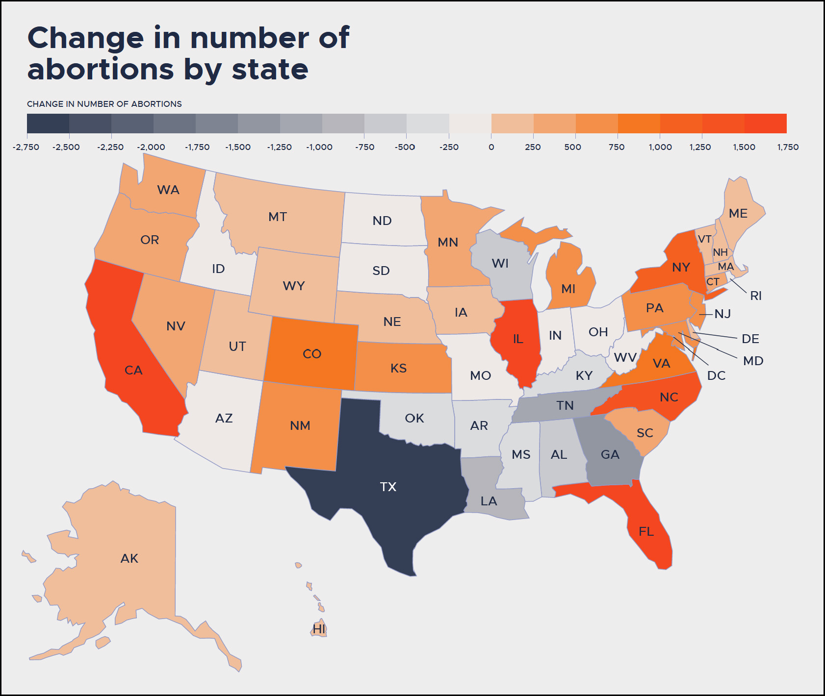
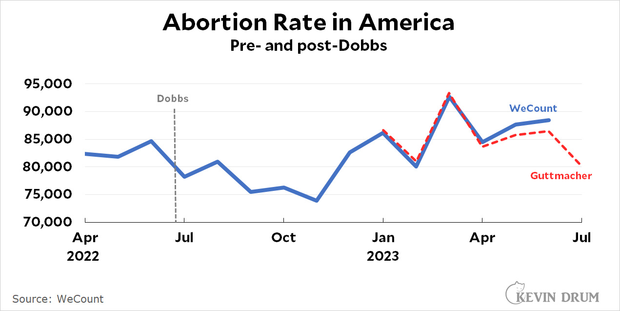 The reason for this is obvious: abortions went down in states that banned them but went up in other states as women traveled out of state to obtain abortions:
 The WeCount numbers include all abortions provided via the formal health care system, including telehealth and medication abortions.
The WeCount project is sponsored by the Society for Family Planning, which doesn't have a long track record of counting abortions. So I don't know how accurate it is. Their numbers match fairly well through June with those from Guttmacher, which has more experience in the counting business, but note that Guttmacher doesn't show any overall increase in 2023. So take this all with a grain of salt.
Republicans first chose their majority leader to be Speaker of the House. Then they kicked him out and chose the new majority leader. Then they chose the founder of the House Freedom Caucus. Now they've chosen Tom Emmer, the majority whip.
They're just going down the leadership list. In case you're wondering, next up is the conference chair, Elise Stefanik.
Trump lawyer Jenna Ellis has pleaded guilty for conspiring to overturn the 2020 election. That's the fourth plea deal in the Georgia case. Only 15 more to go.
The New York Times presents us with a chart today showing that rich kids are far more likely to get high SAT scores than poor kids:
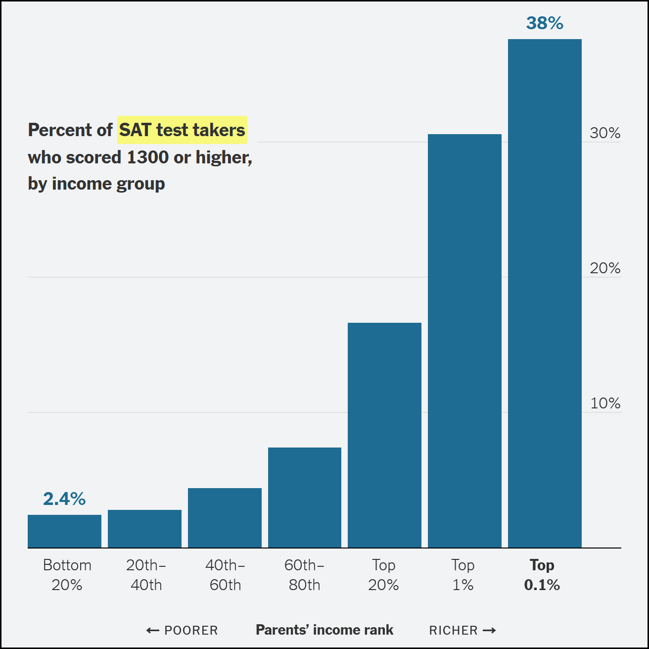 What's the cause of this huge inequality?
Children from rich and poor families receive vastly different educations, in and out of school, driven by differences in the amount of money and time their parents are able to invest.... private schools, summers traveling the world.... test prep.... tutors.... neighborhoods of concentrated poverty or affluence.... time and connections.... volunteering in classrooms, lobbying on behalf of the school and raising money through school foundations.... friendships.... segregated neighborhoods.... what children do in the evenings and on summer breaks, their parents’ vocabularies, and the level of stress in their home lives.... private extracurriculars, counseling, tutoring, coaching, therapy, health management.... high-quality preschools.... intensive parenting.... bedtime reading, museum visits and science summer camps.
There's truth to all this. But out of 2,000 words, there is only one passing suggestion that there's any other cause of this disparity in SAT scores:
Although the heritability of cognitive ability appears to play some role on an individual level....
"Some" role. Research suggests that by first grade there's an IQ difference of 11 points between children of affluent and poor families. That's a lot! This might very well be partially explained by home life and neighborhoods, but it's long before private schools, world travel, and test prep classes have any impact.
There's nothing controversial about how this happens, either. Smart people tend to make lots of money; marry other smart people ("associative mating"); and then produce smart babies who go on to get high SAT scores. Some of this is indeed due to environment, but most of it is up to heritability and genes. We're all just afraid to say so for fear of accidentally brushing up against forbidden race-IQ topics.
In any case, the most interesting aspect of the chart isn't the SAT differences between rich and poor. It's the difference between the top 1% and the top 0.1%. No one thinks there's any cognitive difference between these two groups, but then again, there's probably not much difference in preschools and test prep either. These are both very wealthy cohorts. So what causes the difference? Further empirical research on this score might be illuminating.
The Border Patrol released its September numbers today, and once again they're up:
 Border encounters in September were up 19% from last year and up 16% (to 270,000) compared to last month. About 50,000 of these were legal asylum requests while the rest were illegal crossings between ports of entry.
Last month CBP said it had "removed or returned" 250,000 individuals since May. This month the number is 300,000, which means they removed about 50,000 individuals in September. Probably another 30,000 or so were deported via court proceedings. This suggests that the unauthorized immigrant population in the US increased by about 190,000 in September.
 Tyler Cowen has written a new book called GOAT: Who is the Greatest Economist of all Time? It's deliberately written from a fanboy perspective and it's available free here. It's a fun read and I recommend it.
GOAT is a regular old book, but it's combined with a GPT engine that allows you to engage with its arguments. I'm not sure how well this device works, but it's something you can play around with. Oddly, when I asked it to get down to cases and tell me who Tyler eventually picks, I got two different answers. Last night it told me Adam Smith and John Maynard Keynes. This morning, my prompts all produced some version of "they're all great!" In the book itself, Tyler clearly awards a three-way tie between Smith, Milton Friedman, and John Stuart Mill, with Mill edging out the other two.
But I know you're wondering who I think the GOAT is. I'll tell you:
How about the other four economists on Tyler's short list? They're all great. But not the greatest of all time:
My selections are based on a narrower definition of economics than Tyler's. I'm mostly considering key contributions to pure economics, while Tyler gives a lot of credit to ideas (and writing) that are mainly social science but show evidence of economic thinking. This is the only way that he can justify rating Mill so highly. I agree that it's unfortunate Mill is largely ignored these days, but that's mainly because he had so many sharp and enduring insights in philosophy and social science, not economics.
UPDATE: I should probably have mentioned that Tyler also nominates five runners-up: Alfred Marshall, Gary Becker, Joseph Schumpeter, Paul Samuelson, and Kenneth Arrow.
There are two surprising omissions in the book. The first and most obvious is David Ricardo, who had a short but highly influential career. He is most famous for his elucidation of comparative advantage in trade and his consistently anti-mercantile views, both of which became conventional wisdom in short order.
The other omission is Karl Marx. There are lots of good reasons to omit him—namely that he was wrong about so much—but just for his sheer influence he seems like he ought to at least be a topic of discussion.
Last Friday was the final moonless night of the month, so I trekked out to Palomar Mountain to try out my new narrowband filter for a second time. I originally planned to photograph the Ghost Nebula, a smallish object with interesting colors. But at the last minute I discovered that narrowband filters don't work on reflection nebulas—that is, collections of dust and gas that are visible due to an external star reflecting light off them. The Ghost is a reflection nebula, so it was out.
With little time to choose a new target, I settled on the Heart Nebula, a well known object that's currently high in the sky. Unlike the Ghost it's an emission nebula—that is, a collection of dust and gas surrounding a star. It's visible thanks to starlight being emitted through it.
The picture turned out OK, but I made a fatal mistake: I didn't realize how big the Heart Nebula is. It turns out to be far too big for my 900 mm scope, which matters because it's supposed to look like a heart. But it doesn't if you cut off the top half. I was also a little disappointed that I got lots of reds but no blues.
Aside from that it's a fairly good image. It's a five-hour exposure (90 frames x 200 seconds each), and it looks sort of like a heart if you fill in the top half using your imagination.¹
¹Or a different picture that captures the whole thing.

This is a remarkable chart:
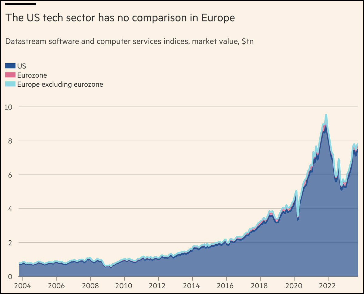 The title is a little unclear. It refers to the software and computer services indexes tracked by the Datastream database.
I've seen plenty of stories about the sad state of Europe's tech sector, but this chart sure brings it home. It might as well not exist for all the impact it has.
What should I call the site originally named Twitter? The people have spoken:
 I'll keep on calling it Twitter for now. Maybe for another few months. Sorry, Elon.