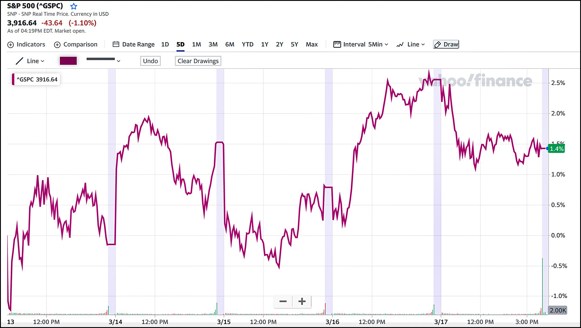
If you want to project the state of the economy, one of the key metrics is personal saving. But this is harder to estimate than it seems. Here's one crack at it:
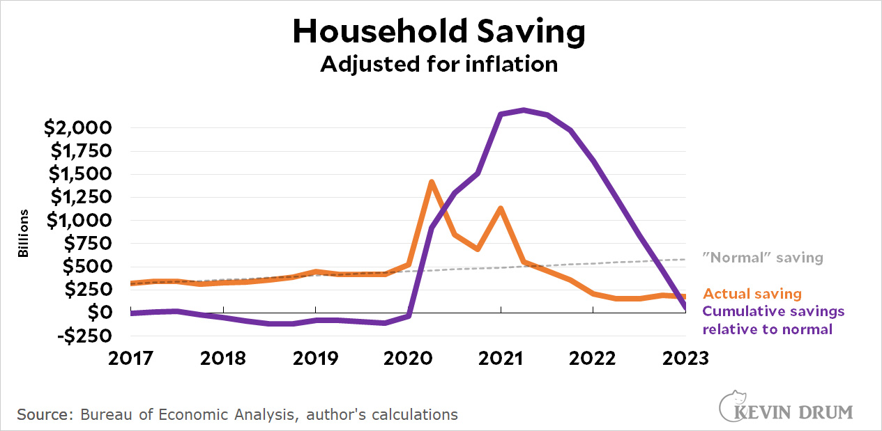 The dashed line is the "normal" quarterly saving rate and the orange line is the actual saving rate. As you can see, it spiked when the government mailed out checks at the start of the pandemic and then again when Joe Biden's rescue plan passed. Then it went down as the government programs ended and consumers started drawing down their savings accounts. Around mid-2021, actual quarterly saving dropped below the historical trend.
The purple line is just arithmetic: it shows the total amount of savings above normal. This peaks after Biden's bill, and then declines as people spend their savings. All this extra government money is now gone.
Or is it? Here's the same chart, but this time it suggests that total savings are still above normal by about $700 billion. Can you tell what the difference is?
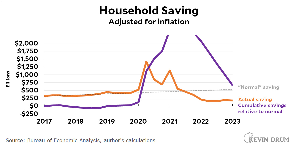 In the bottom chart I changed the normal saving line slightly. That's all. But that slight change was enough to change the amount of excess saving by quite a bit.
The top chart is my best guess because I didn't mess around with the trendline. It's just a simple least-squares fit of the pre-pandemic trend. But "normal" is nonetheless a guess, and the amount of savings still left to be spent is extremely sensitive to this guess.
This is why predictions are hard, especially about the future. I think savings are essentially gone now and this is going to start hitting the economy very soon. But I could easily be wrong enough to put off the day of reckoning for another six months.
And so could anyone else. No matter how sophisticated your technique, you're still stuck trying to predict human behavior based on a projection of "normal" over the course of three years. There's an inherent lack of precision to that, and therefore to your overall economic predictions as well.
We'll know the answer before too much longer. But only in hindsight.