Skip to content

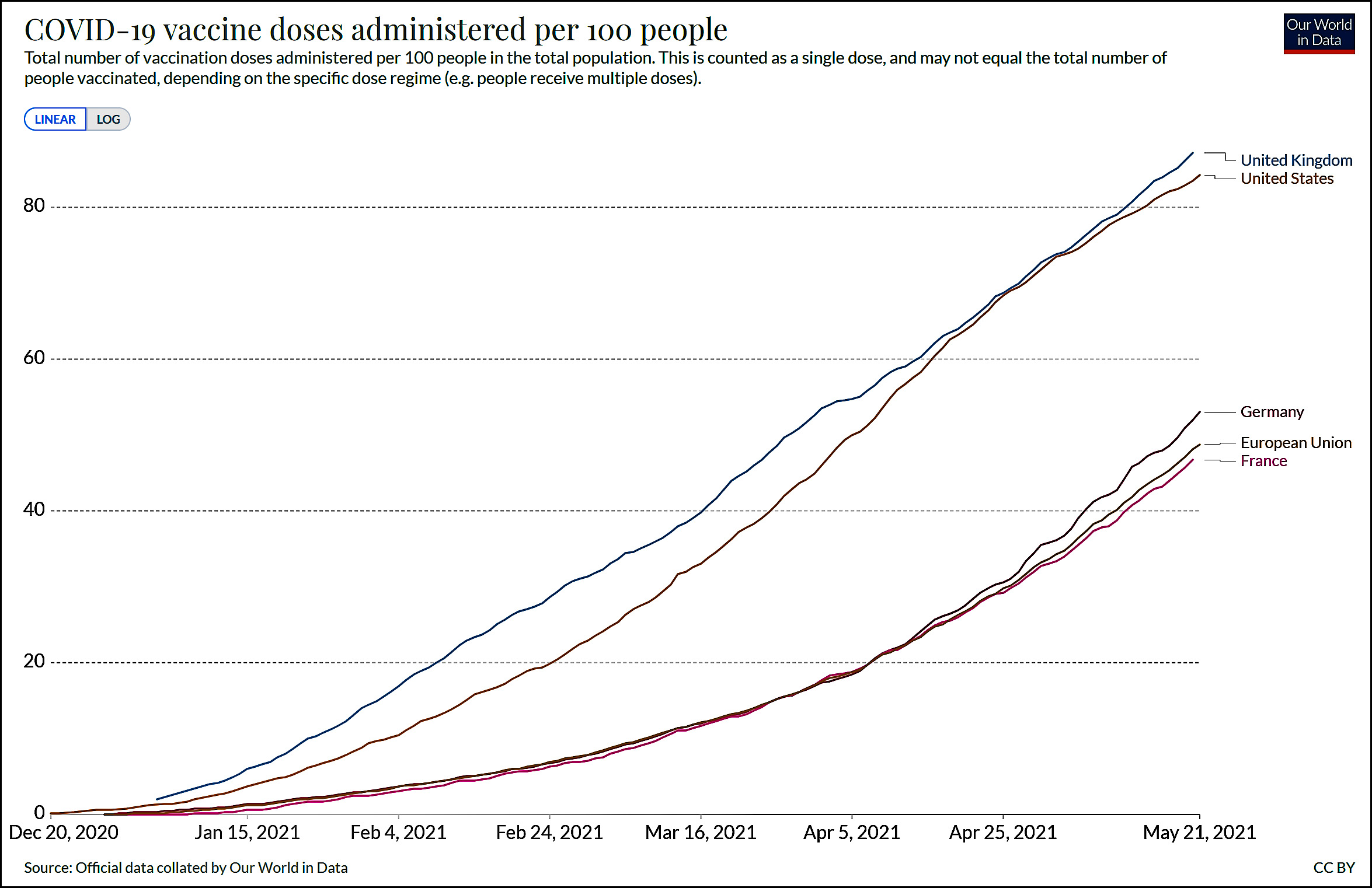
The New York Times published an interesting essay today that includes a chart showing support for Black Lives Matter in the wake of the George Floyd murder. But it's even more interesting if you put some dates on the chart:

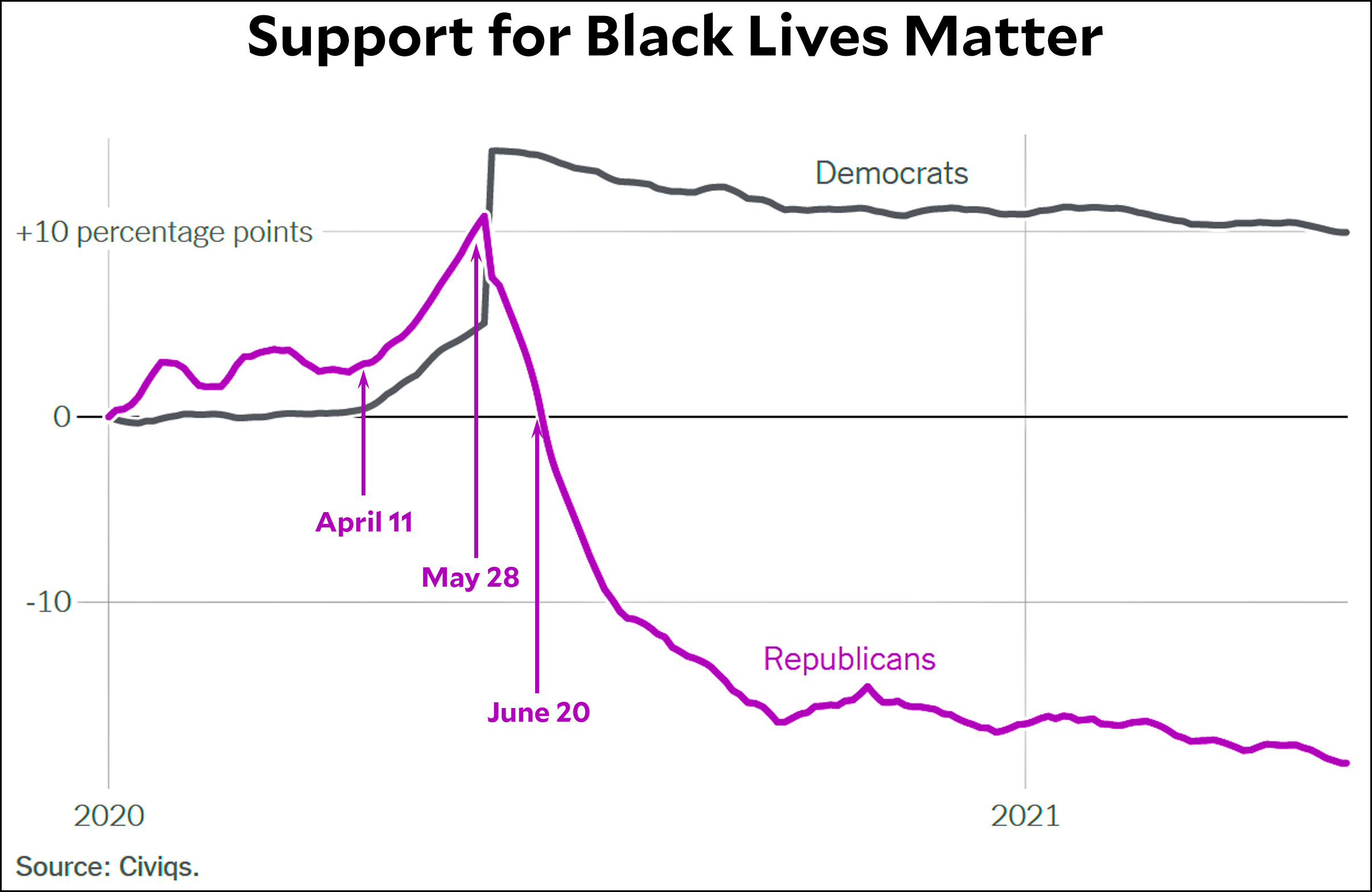
Support for BLM starts to increase within both parties at the beginning of April, following a couple of lower-profile police killings. George Floyd was killed on May 25, and that's when support for BLM hits its peak.

But within three weeks, Republican support has plummeted to its level at the beginning of the year, and by autumn it's another 15 points lower. Democratic support also wanes, but only a little bit.

As you'd expect, since Republicans are mostly white while Democrats have a large Black contingent, white support for BLM went down sharply after the George Floyd murder while Black support went down only a little. Without further crosstabs, it's hard to say whether race or party ID is the most important factor here.

I remember writing something a couple of months after the George Floyd murder about BLM having a "moment." I got some editorial pushback on that and revised it. But compared to support for BLM right before the George Floyd murder, the BLM protests of last summer produced:

  • A huge decline in BLM support among white people.
  • A big decline in support among Hispanics.
  • A modest decline among "Other."
  • A modest increase in support among Black people.

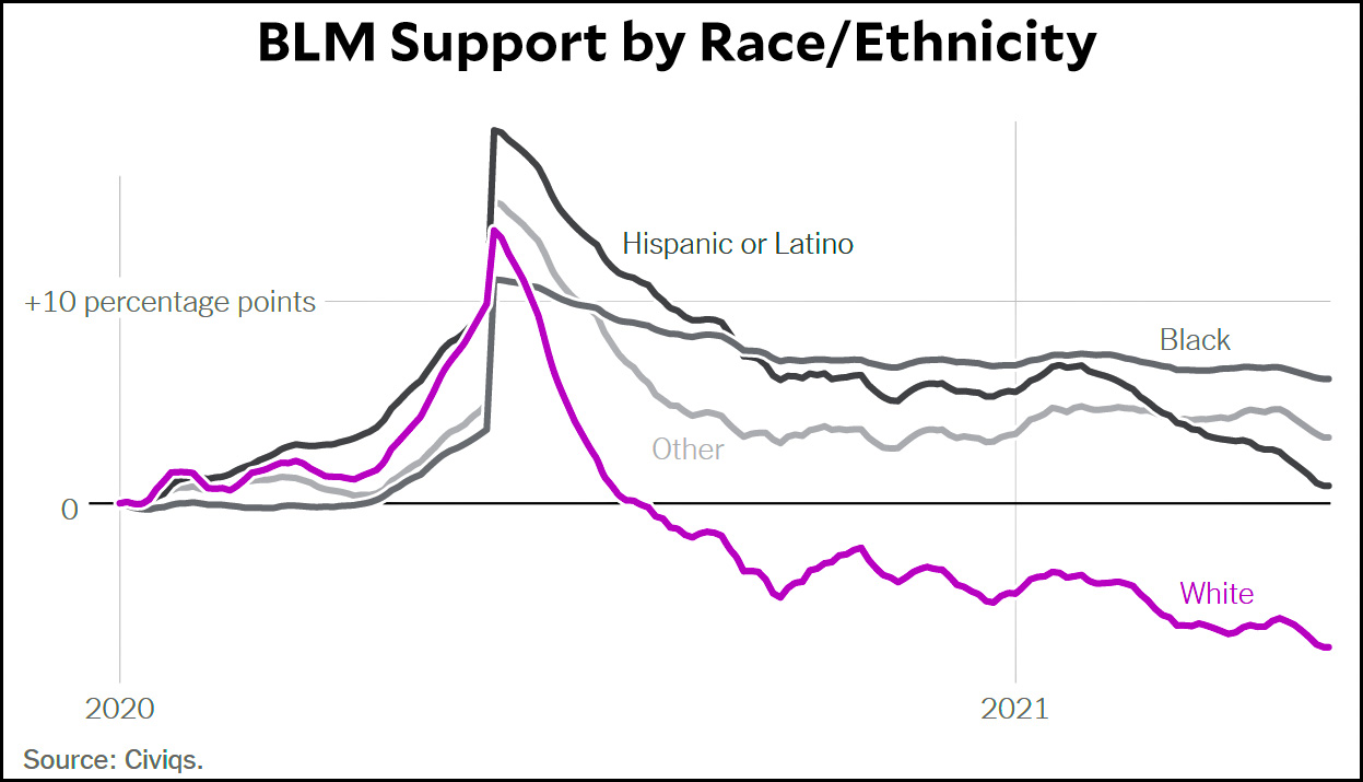
Even among Black respondents, who registered an eight-point spike immediately after the George Floyd murder, support for BLM by the end of the year was only about two points higher than it was just before the George Floyd murder.

It's pretty obvious that the massive downturn among Republicans is due largely to Fox News and its cronies. But every other group also ended the year with less support for BLM than it had before the protests. The only exception is among Black people, and even that's a close call.

So a moment it was. The question now is how to turn it into more than that.

As of a couple of months ago, here is the latest Gallup poll on American attitudes toward Israel and the Palestinians:

There was an uptick in favorable feelings toward the Palestinian Authority over the past year, but there's no way to know if that's just a blip (like 2005) or a more permanent change. Oddly, the spike was due to a large improvement in Republican attitudes toward the PA.

Also worth noting: since 2000, favorable feelings toward Israel have increased by about 15 percentage points. Favorable feelings toward the PA have increased by nine points. On a different question that explicitly asks where your sympathies lie, Israel is ahead 58-25%. Since 2000, sympathy toward Israel has increased by seven points while sympathy toward the Palestinians has increased by nine points.

The reason for posting this is to provide a baseline for comparison. I would strongly recommend ignoring poll results on this subject while feelings are still high following the latest Gaza war. Just wait a while. Only then will we know for sure how the war truly affected American feelings toward Israel.

A few days ago I wrote a post about the American aversion to vaccines going back to World War II. Over at Science News, Tara Haelle has an excellent piece that goes back further and explains vaccine hesitancy from its very beginnings with Edward Jenner.

I highly recommend reading it. In fact, I recommend reading it first and then reading my piece for a closer focus on recent history. We need to treat vaccine hesitancy for what it is: a longstanding problem with multiple roots that has very little to do with the poisonous partisan politics of the current day.

Haelle's piece is here.

My piece is here.

You have probably heard that the murder rate spiked massively in 2020, and according to preliminary FBI data this is true. But take a look at this chart:

Generally speaking, homicide and violent crime move in sync. The two exceptions are 2015 and 2020. Does this give us any clues about what the cause of the increased murder rate is?

The 2015 spike coincided with the aftermath of Ferguson. The 2020 spike coincided with both the aftermath of George Floyd and the start of the COVID-19 pandemic. If I had to guess, I'd say that anger over police brutality was the primary cause of the murder spike, with the pandemic providing an extra push.

And there's (maybe) more bad news. The 2015 spike lasted two years, so again, if I had to guess, I'd say that our current spike will last through 2021.

And yet more bad news: The 2015 spike started to ebb in 2017, but it ebbed slowly. It probably would have been five years before it reverted to its past level. If the same is true this time, it will be 2026 or so before the murder rate goes back down to its pre-Ferguson level.

These are all just guesses, however. The mystery here is that, in general, crime hasn't increased over the past year. Violent crime is basically flat and property crime continues to go down. We are as safe as we've ever been. It's only murder that's up, but it's up a lot. What's going on?

NOTE: The effect of lead poisoning on crime was strong only from ~1965-2010, so none of this has anything to do with lead.

A few nights ago Hilbert decided he wanted to relax in the hamper, but Hopper heard odd noises in the closet and had to investigate. Eventually she found her quarry. We're just lucky she didn't decide to jump in after him.

I've mentioned this before, but I remain puzzled by the repeated claim that India is facing an unprecedented surge of COVID-19 cases and deaths. Unless India is massively undercounting things, neither is true:

India's case load peaked at about the same level as Europe's recent peak, and well below the previous peaks of both Europe and the United States. The same is true for deaths, but even more dramatically. India is nowhere near the December peaks of either Europe or the United States.

India's problem is not that its surge of COVID-19 cases is exceptionally high or that its variant is exceptionally deadly. India's problem is that its health care system is nowhere near as good as that of the US or Europe. This is a tragedy in and of itself, but it's a different tragedy than the one that keeps getting reported.

Via Tyler Cowen, here's an interesting chart that suggests the amount of regulation in a state depends a lot on its population:

The authors use a metric for regulation that they say is more reliable than ones used in previous studies. They also say that they tried controlling for a whole bunch of different variables and none of them made much of a difference. Population is the only one that does. What's more they get similar results comparing Canadian provinces.

So why do bigger polities have more regulation? I can take a few guesses:

  • A bigger population means more interest groups, thus more pressure to pass various regulations.
  • A bigger population means more industry, which makes the cost of non-regulation more obvious.
  • Likewise, a bigger population means bigger individual industries. It might not be worthwhile for Utah to have extensive regulations on oil drilling, but it definitely is worthwhile in Texas. It's worth noting that the three biggest outliers all have at least one gigantic industry (tech for California, energy for Texas, finance for New York).
  • Bigger states are more impersonal. This is a little hard to quantify, but people in smaller states might feel like they "know" their state well and don't need lots of regulation to make people do the right thing.
  • The cost-benefit of regulation might depend mostly on absolute numbers. That is, it's only worth regulating an industry if it employs more than, say, a thousand people. Obviously big states have a lot more industries that clear this barrier than small states.

Feel free to add your guesses in comments. I would be interested in a similar study applied to corporation size. Big corporations generally have more red tape in the way of getting things done compared to small corporations, right?

Consider the map below:

Suppose you are the grand poobah of Democratic Party election strategy for the Senate. You are a sensible person, so you understand that nothing is going to change about Senate representation. Each state on this map gets two senators, and that's that.

Clearly, the gray and pink states are your main targets. Some of them (Colorado, Arizona) already have two Democratic senators while others are split (Wisconsin, Pennsylvania). Then there are the states controlled entirely by Republicans: Florida, North Carolina, Nebraska, Iowa, Kentucky, and Texas.

There are a few seats that can be picked up in the split states, and sometimes you can get lucky in red states, as Democrats did this year in Georgia. Then again, sometimes you'll get unlucky in blue states, so luck is hardly something to be relied on.

In the end, there's only one way to build any kind of long-term majority: you need to pick up seats in the states that are on the edge but have no Democratic senators: Florida, North Carolina, Nebraska, Iowa, Kentucky, and Texas. These states need to be persuaded to start electing Democrats.

So how do you do it?