In a few hours the Commerce Department will release inflation figures for March, something that we're all waiting for with bated breath.
While we await this momentous event, here's an inflation chart inspired by Brad Polumbo. However, unlike his, which shows year-over-year inflation, mine is based on the inflation rate from month to month. Why? I don't usually do this, but if you want to look at the impetus produced by events, you need to look solely at inflation levels following the event. The spending from the American Rescue Plan, for example, might be responsible for higher inflation, but it's certainly not responsible for all the inflation that happened in the 11 months before it was passed. However, that inflation is baked into the year-over-year figures.
So without further ado, here it is:¹
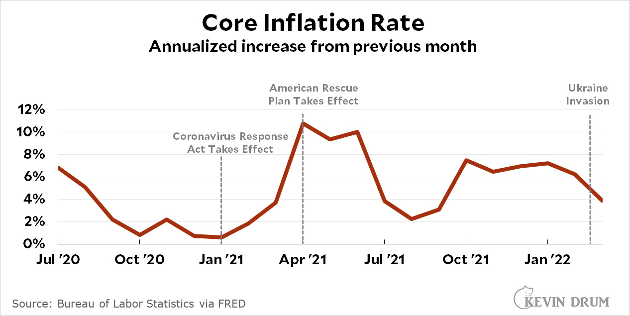 I'm using core inflation, which doesn't include food or energy, because the Fed believes this is a better measure of underlying inflationary pressure. And I drew the line for the American Rescue Plan at April 1, since that's the earliest date the spending could plausibly have had an effect.
Oddly, this chart shows inflation levels rising after the passage of the $900 billion Coronavirus Response Act but declining after the passage of the $1.9 trillion American Rescue Act. Is that possible?
Sure, because there's a lag between spending and inflation. Normally a spending impetus takes a few months to have a significant effect and then produces temporary high inflation before fading out. CRA fits that model through August 2021 but never fades fully out because then ARP takes over. On a full year basis, CRA produced three months of very high inflation but much lower levels for the other nine months. ARP appears to produce steadily high inflation rates starting in October.
Here's a different way of looking at it. We can roughly say that CRA is responsible for the months January through August. On an annualized basis that's an inflation rate of 5.1%
Likewise, ARP is responsible for the months September though March (so far). On an annualized basis that's an inflation rate of 5.4%. That's not a big difference, which is odd since ARP was more than twice the size of CRA.
But of course spending isn't the entire cause of inflation increases. Supply chain problems are also part of it, and it may be that supply chain problems started to ease in the second half of 2021. Consumer spending also plays a role, and that also slowed considerably in the second half of 2021 as savings accumulated from the various rescue acts were spent down.
In other words, it's hard to pin down just how much ARP affected the inflation rate. I think this chart is consistent with other evidence that it's around 2-3%, which should fade away by late spring. This will leave us with a core inflation rate of around 3% or so. It could even be less if supply chain problems continue to improve.
Or I could be completely wrong. For one thing, I harbor a deep fear that COVID might finally explode in China, which would decimate supply chains beyond anything we've seen before. I sure hope this is just a fantastical fear on my part and it never happens. Somehow, though, it seems like every country eventually has its turn in the barrel.
¹Now that the latest CPI figures are out, I've updated the chart to show core inflation through March.


 We call on you to settle this dispute. Is this a deliberate design or not? You may register your opinion in the poll below. If you have something more to say about this, comments are open as usual.