Skip to content

This tweet piqued my interest:

This is true according to the World Bank, although 2021 was sort of a special year. But even in other years the Los Angeles/Long Beach complex has ranked pretty low, and US ports in general have usually brought up the bottom of the pack.

But why? David links to a great interview with Rebecca Schlarb, an automation coordinator who works at the fully automated Long Beach Container Terminal at the Port of Long Beach. Just generally, her main criticism is that the automation is unreliable, and when it fails it slows things down more than a similar failure does at a traditional terminal. But the terminal is still fairly newish and it's probably going through the usual shakedowns. Presumably it will get more reliable with time.

The LBCT definitely runs with less labor than traditional terminals, but when you add in the failure rate is it more efficient on net? Schlarb had this to say:

Nothing moves better than actual hands-on interaction. The only positive argument for automation is it saves labor costs for shipping companies and terminal operators to rake in billions of dollars in profit that does not stay here in the United States.

Hold on. If automation allows the owners to make billions of dollars in extra profits, then it must be pretty damn efficient, right? And there's some other evidence on that front:

  • The World Bank report examines overall port operations, which are only about 15% automated at LA/LB. If the ports are ranked poorly, it's almost certainly the non-automated part that's responsible.
  • Much of the port's lack of efficiency is likely because it doesn't operate 24/7. This is due to the port's union contract, which mandates that anything beyond two shifts requires premium pay. That's why there's no third shift.
  • The LA Times reports that truck drivers hate traditional terminals for two reasons. First, they're mostly Hispanic and they claim that ILWU workers are rude to them. Second, they have to wait a lot longer at traditional terminals. The two automated terminals at LA/LB have the shortest cargo turn times at the ports, less than half those of traditional terminals.
  • The Pacific Maritime Association, which represents carriers and owners, issued a report claiming that automation improves throughput and, because this means more business, actually increases ILWU employment. They have figures to back this up, but who knows?
  • On the other hand, a McKinsey report from a few years back was bearish on automated ports:

    Our survey indicates that operating expenses at automated ports do indeed fall, but only by 15 to 35 percent. Worse, productivity actually falls, by 7 to 15 percent. An executive of a global port operator told us, for example, that at fully automated terminals, the average number of gross moves per hour for quay cranes—a key indicator of productivity—is in the low 20s. At many conventional terminals, it is in the high 30s.

    This isn't enough to justify the capital investment in automation. But there's always this:

    In the long run, these investments will lead the way toward a new paradigm—call it Port 4.0—the shift from asset operator to service orchestrator, part of a larger transition to Industry 4.0.

    I couldn't resist including this. Don't you love the smell of consultants in the morning?

Still, if everything McKinsey says is true, why are other terminals already in the process of automating? There must be something to it.

There's an odd story in the LA Times today:

In the last eight months, the rate of change in annual rental costs for new tenants has more than doubled, reaching its highest level on record, according to data from the Bureau of Labor Statistics reviewed by The Times. The data, which are not in the public domain, show a starkly different picture for existing tenants — those who are renewing their leases instead of moving into a new apartment — suggesting that the cost of housing may continue to climb, despite some indicators to the contrary.

....The non-public data behind the topline number show a gulf between the prevailing conditions affecting those who moved residences and those who didn’t . Annual rental costs for new tenants jumped from 4.3% in July 2021 to 11.1% in March 2022.

The author points out that if you stay in an apartment, your rent rises gradually. But if you move to a new apartment, it spikes upward. This is true. So far so good.

But then there's the weird implication that the BLS is trying to hide this, despite the fact that they've calculated rent inflation the same way for decades. Before now, there's simply been no need to break out old and new rents for purposes of headline inflation calculations.

Besides which, there's nothing hidden about this anyway. The Census Bureau, not the BLS, is the main source for housing surveys, with much more complete and frequent data collection.¹ Among other things, they have an ongoing series that shows the median asking rent for vacant apartments, which is a much better look at how much new rents are increasing. Here are three ways of looking at that:

All three charts highlight a pre-pandemic figure followed by another for the first quarter of 2022. And rents have gone up. As the top chart shows, average new rents have gone up from $1,146 to $1,255 (adjusted for inflation) over the course of two years.

As a percentage of income, rents have gone up from 26% to 29%.

And then there's the annual growth rate (using inflation-adjusted rents). This was 1.3% just before the pandemic, then spiked in 2020, and came down in 2021. That's just the opposite of the Times figures, which show a low growth rate in 2020 and a big spike starting in 2021.

I usually use Census figures for rents if I can, since they're generally more reliable and up-to-date.² BLS figures, if I remember correctly, lag well behind reality due to their survey methodology. I believe that Larry Summers pointed this out once, claiming that official inflation figures for housing were likely to go up this year because they were measuring year-old rents that had already gone up. It was just taking a while for the lump to go through the python.

The odd thing is that Summers used this as a reason to be afraid of high inflation. I'd take it as just the opposite. Rent is a big part of the inflation calculation, but this year's rent inflation isn't real: it's merely telling us that rents went up last year. To me, that's a reason to discount it. It looks bad, but we should grit our teeth and resist a panicked response because we know that it's already gone away.

¹HUD also has rental figures, as well as annual projections. And of course there are private sources too. There are lots of places that can give you rent information that's sliced and diced in different ways.

²If you really want detailed data, you can use IPUMS data from the Census Bureau's Current Population Survey. The problem with this is not that it's hidden from the public. It isn't. The problem is that it takes a lot of expertise to use it.

Those of you who read this blog on weekends already know about my latest night sky photography adventures. But there's more going on. For quite some time I've been mulling the idea of getting more serious about astrophotography, and lately I've been mulling it more actively.

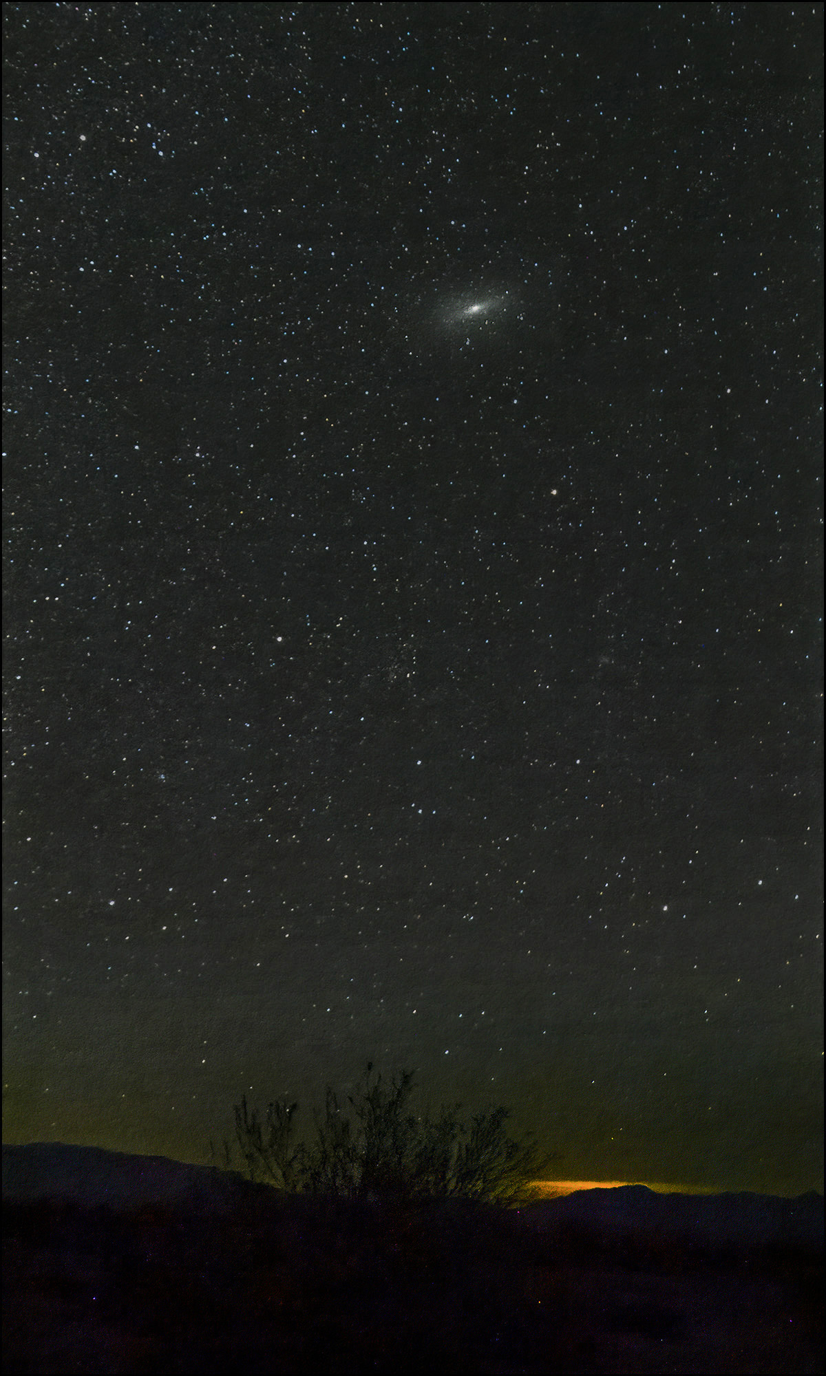
I haven't pulled any triggers yet, but all this mulling means that I have deep sky objects on my mind. Of those, there's only one big enough to see with the naked eye: the Andromeda Galaxy.

And it occurred to me that since I photographed half the night sky during my Milky Way imaging last weekend, maybe I got a view of Andromeda in there. And I did! It's not much of one, mind you, but it's officially my first DSO.

July 5, 2022 — Desert Center, California

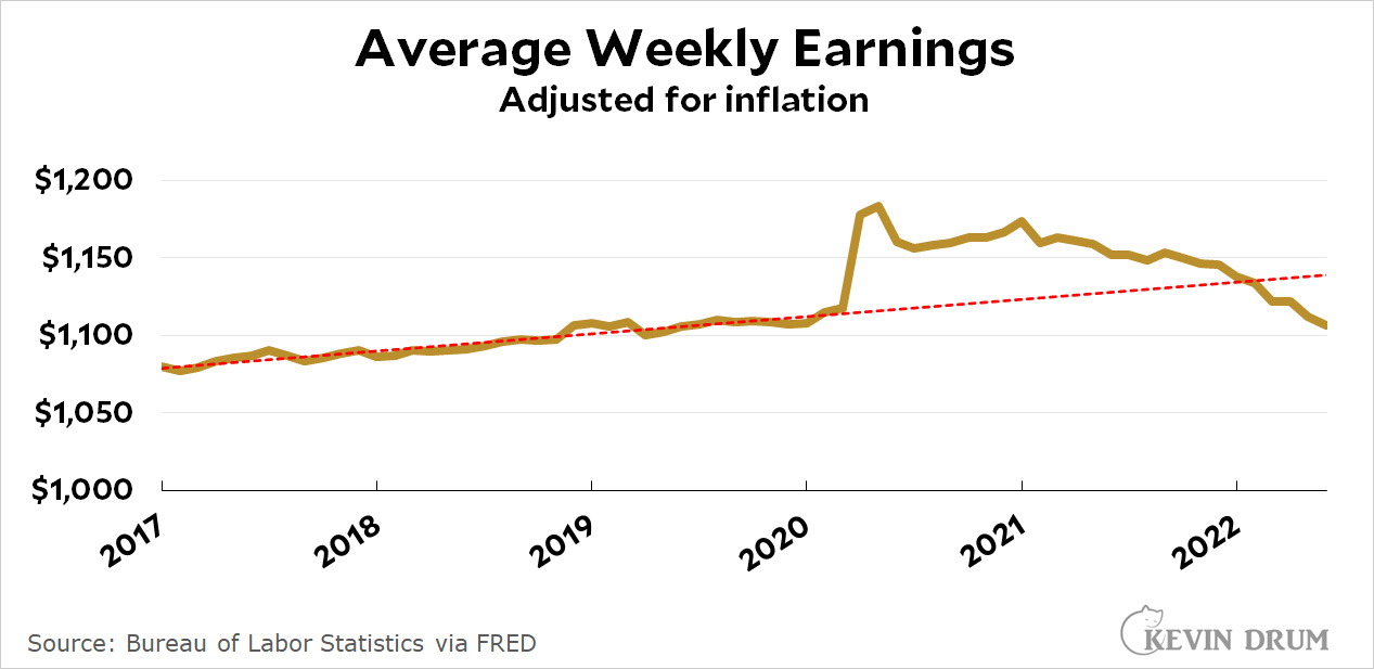
A bunch of people have put up complicated charts today showing that wage growth is cooling down. Here's my simple chart:

Well, maybe mine isn't really any simpler. But as you can see, wages have been running behind inflation for the past 18 months, and even nominal wage growth (shown quarterly by the cute blue arrows) has been slowing down recently.

Now, this is mostly making up for the big wage spike during the pandemic. But not all of it:

Maybe it's natural that wages should revert to their trendline after a big spike, but we've obviously overshot. On average, workers are now making less than they did before the pandemic. Anybody who's worried about a wage-price spiral—or who thinks employers are serious about a worker shortage—is crazy.

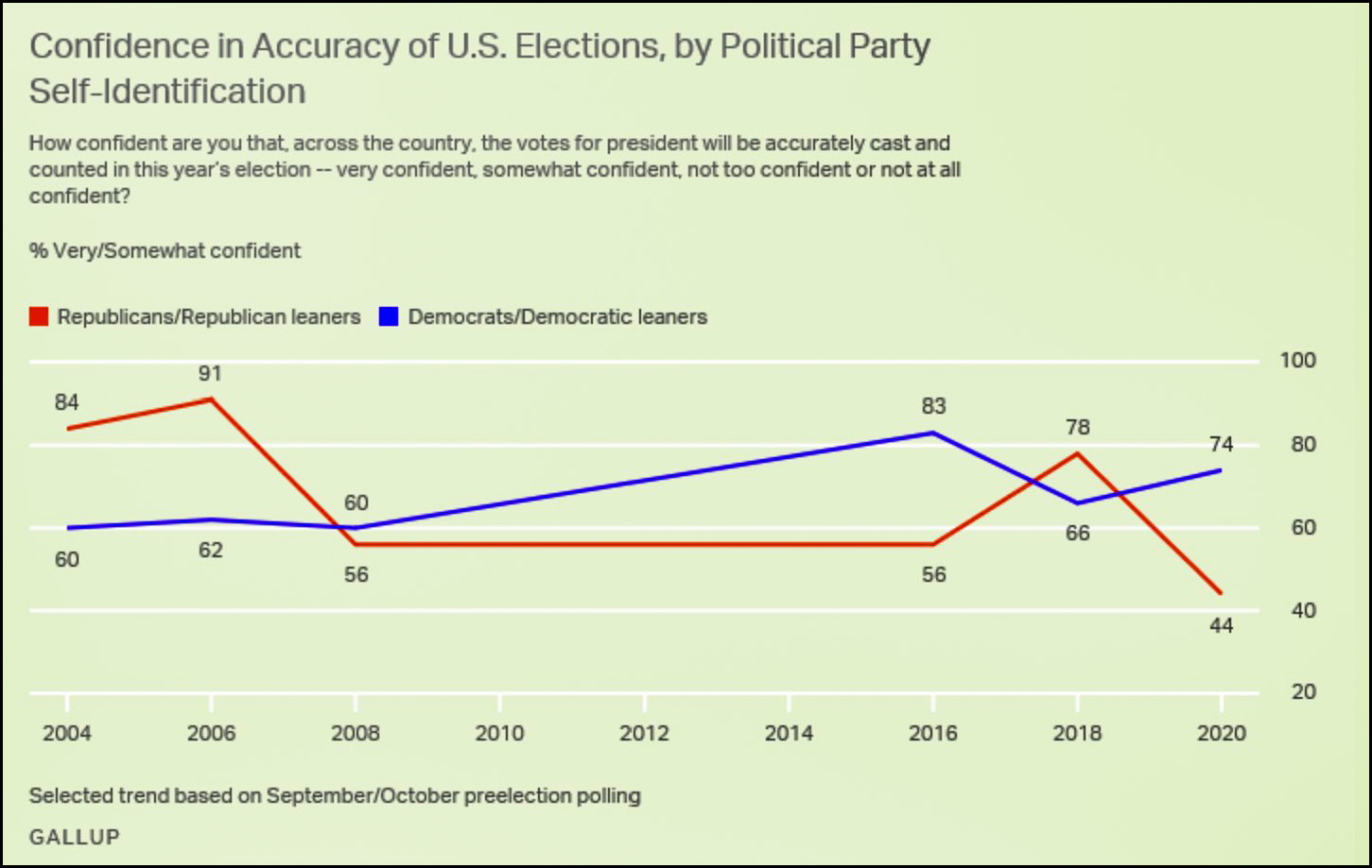
Are Republicans bound and determined to make Donald Trump's dream come true of routinely stealing elections they've lost? It sure looks that way. Are they the only ones who think think that elections are rigged by their opponents? Um...

The trend here is so obvious that I hardly need to point it out. When Bush was president, Democrats didn't trust the presidential vote. When Obama was president they were more satisfied. When Trump won they became suspicious again. When he lost they relaxed.

The exact opposite happened among Republicans. When your guy wins you think elections are probably fair. When the other guy wins, you don't.

And the overall rate of suspicion over the past couple of decades? On average, 32% of Republicans haven't trusted the election count. Among Democrats, the number is . . . 32%.

Don't get me wrong here. Polls don't measure strength of feeling, and it's obvious that the recent conservative fervor for guaranteeing Republican victories everywhere and at all times has mutated into a depraved monstrosity that's a genuine threat to democracy.

Still and all, they aren't the only ones suspicious of poll results. Democrats are right up there with them. The big difference isn't in our common fears, but in the fact that we're not ready to wreck democracy in service of ours while Republicans are.

The Los Angeles Times reports today on the strange tale of methotrexate:

Methotrexate is a cheap, common drug prescribed to millions of Americans.... Many have rheumatic illnesses. Others take it to treat inflammatory bowel disease, psoriasis or cancer.... In low doses, it has proved to be one of the safest, least expensive and most effective treatments for roughly a dozen autoimmune conditions, from juvenile idiopathic arthritis to Crohn’s disease.

“It’s one of the most common medications that I prescribe,” said Dr. Grant Schulert, a pediatric rheumatology specialist at Cincinnati Children’s Hospital. “It’s really a mainstay of our practice.”

Sounds great. So what's the problem?

Methotrexate is a folate antagonist, which can cause miscarriage at high doses. Although it is not used in medication abortion, it is the preferred treatment for ectopic pregnancy, a rapidly fatal complication that affects about 100,000 patients per year in the U.S.

....Those patients represent about 2% of the 5 million Americans who take methotrexate. Yet this uncommon, off-label use is the basis for tight new restrictions on a medication that is disproportionately prescribed to women and girls of reproductive age.

In states that have banned abortion, methotrexate is also banned. Even in some states that haven't banned abortion, methotrexate is either banned or extremely difficult to get.

This is thanks to a few lunatics who think that somehow it's possible to treat an ectopic pregnancy instead of ending it. All because there have been something like four or five cases of a fetus surviving an ectopic pregnancy out of 3 billion pregnancies over the past couple of decades.

For that, millions of women will be denied methotrexate for a wide range of autoimmune diseases. Fucking idiots.

Caleb Williams is USC's quarterback of the future. But when he was still in high school, his father was already thinking about the imminent arrival of an endorsement-fueled college game:

So Carl and his business partners, who together own a D.C. area gym, sketched out their own plans with Caleb’s help while he was still a junior in high school. They compiled lists of brands, built pitch decks and wrote mission statements, all geared toward not only maximizing Caleb’s marketability but keeping him “above the chaos” they expected was inevitable when pay restrictions finally lifted.

Pitch decks? Mission statements?

Mind you, Caleb played a grand total of seven regular season college games while he was a freshman at Oklahoma last year and compiled a 5-2 record. He hasn't so much as taken a single snap as USC's quarterback.

It's been a month or two since I've done this, so here, once again, is a chart showing the average monthly mortgage payment for houses sold in the US. This time I'm showing it as a percentage of income:

As you can see, mortgage payments for newly purchased houses were pretty steady from the end of the Great Recession up through the start of the pandemic. Then they dipped, recovered, and in January of this year suddenly went through the roof. This was due to a combination of (a) rising home prices, (b) rising interest rates, and (c) flattening income growth.

This chart goes through May. We won't have data for June for another few weeks.

I feel like writing a big ol' post about my latest adventures with night sky photography. This will be of interest to only a few, so don't say you weren't warned.

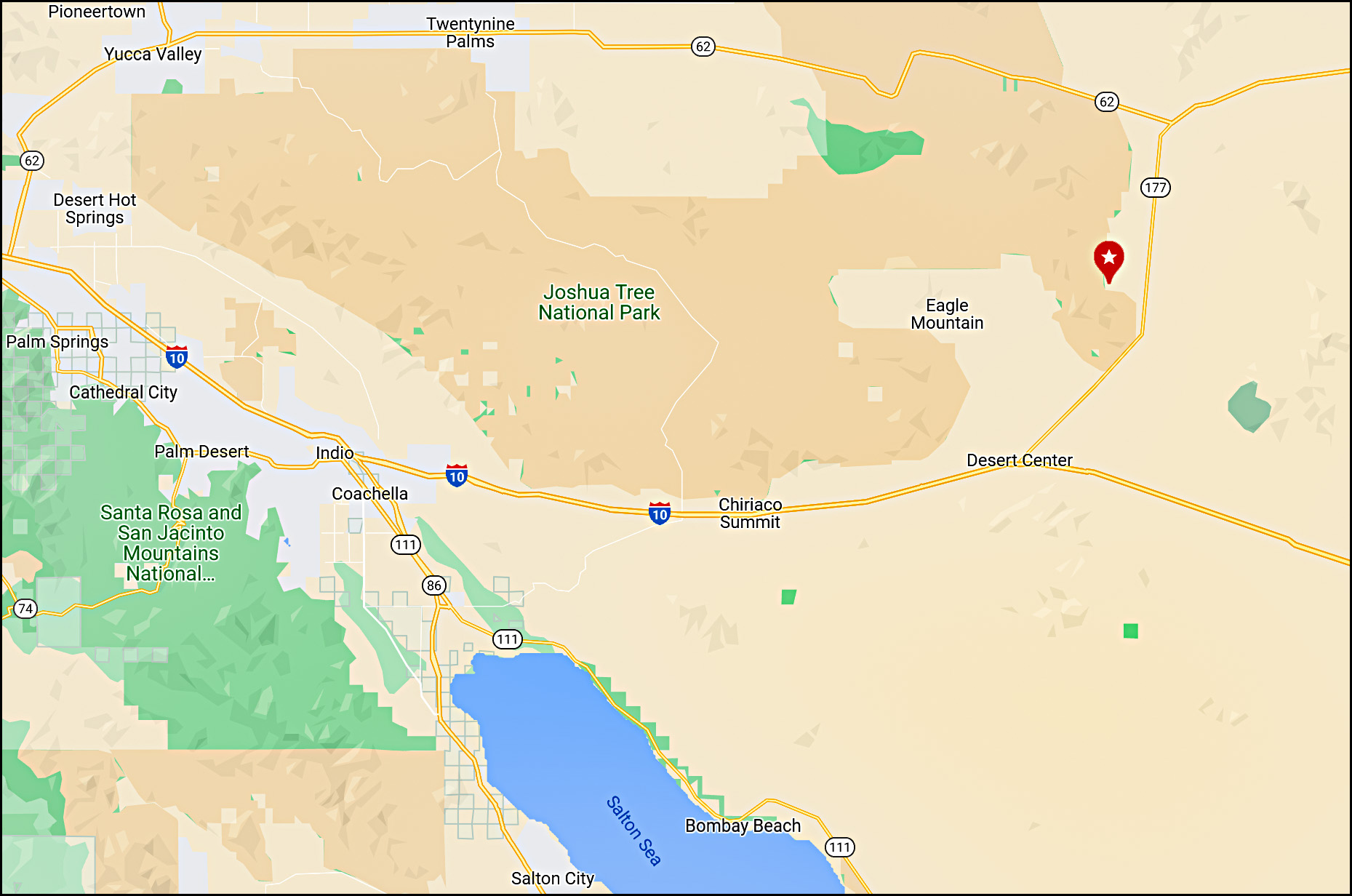
June is a good month for photographing the Milky Way, so after we got back from Paris I decided to give this another go on my next moonless dex night. That was the evening of June 27. I also figured I might as well find the darkest site I possibly could, which turned out to be this one a few miles north of Desert Center:

According to my dark sky map, this is just about the darkest spot in all of Southern California. So off I went.

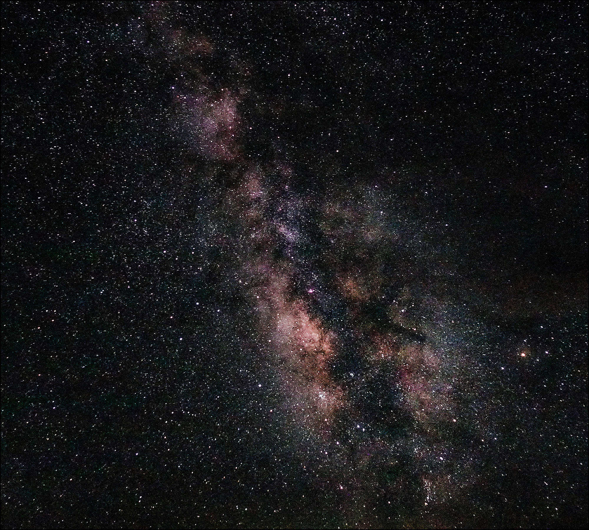
When I got there, the sky was great. It was clear and dark and beautiful. So I pointed my camera at the core of the Milky Way, took a dozen shots, and then stacked them when I got home. It came out pretty well:

June 28, 2022 — Desert Center, California

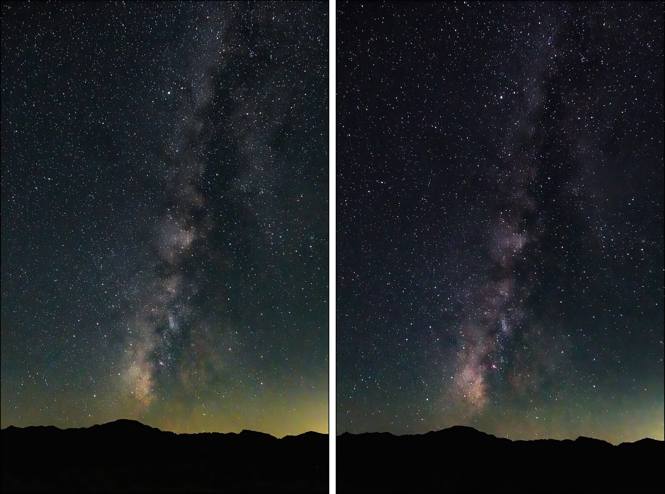
This is about as good as I'll ever get given the limitations of my camera. However, there was also an experiment I wanted to try: I have a filter that allegedly filters out light pollution and I wanted to see how well it works. Here's a side-by-side comparison:

The filtered image is on the right. Toward the horizon it really does filter out some of the crap and add a bit of definition. On the other hand, it also adds a magenta tint and blocks a bit of light. It's something of a wash, I think.

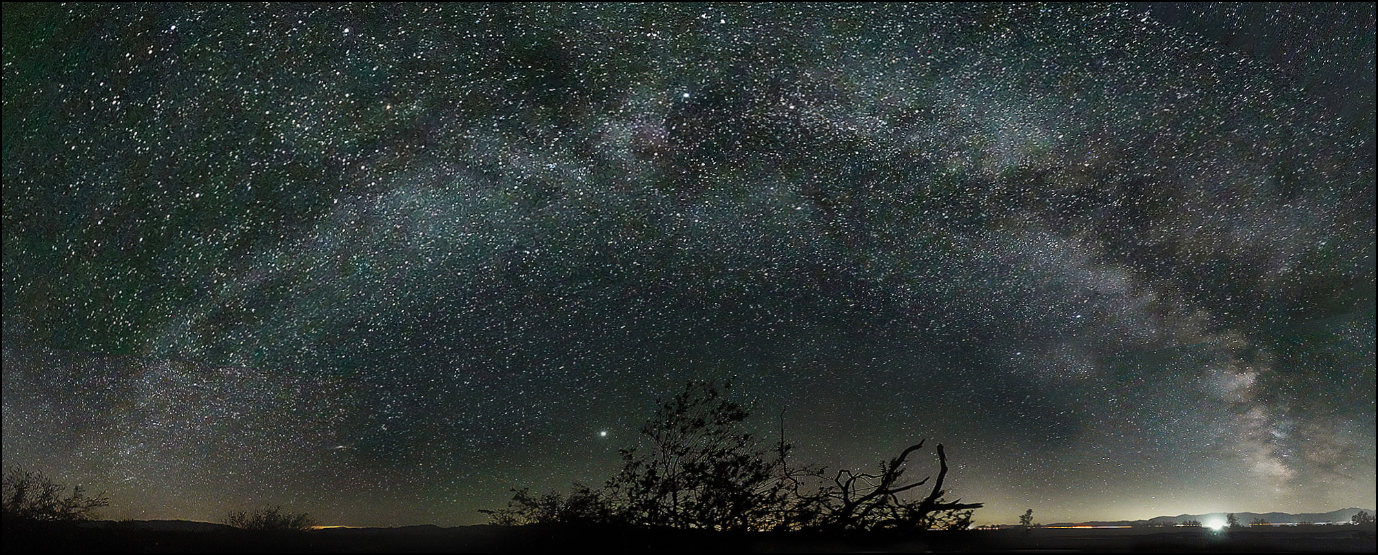
But this is only the beginning of my story. What really drew my attention at the Desert Center site was something else: I could see the entire arch of the Milky Way with my bare eyes. That had never happened before, so naturally I set everything up and started shooting a vast panorama that would capture the entire arch.

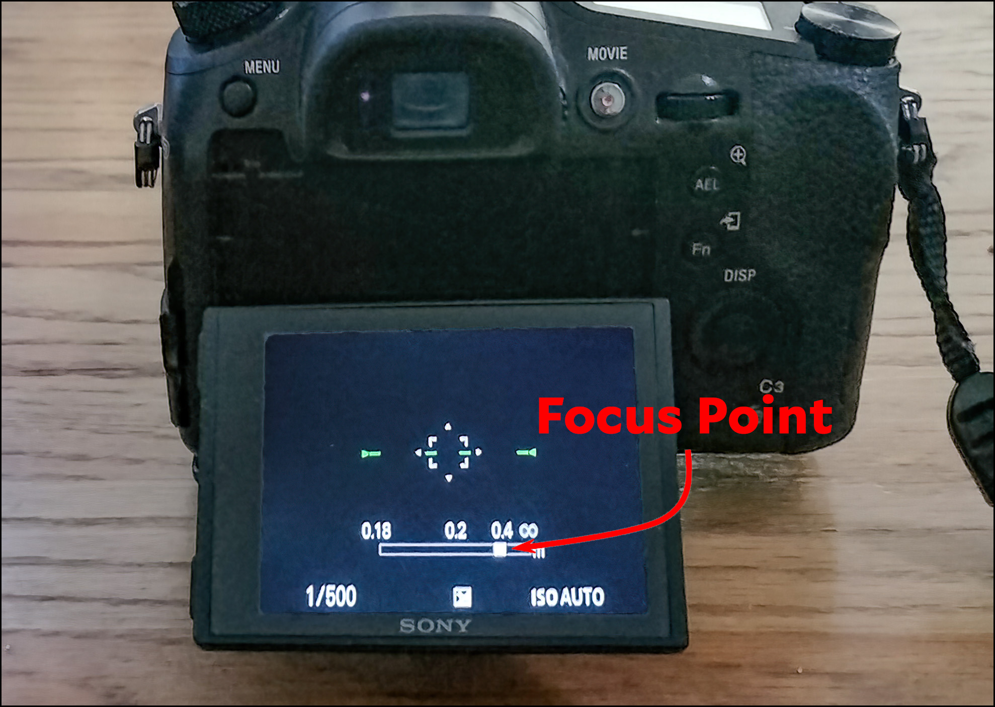
It was a disaster. The biggest problem was focusing on infinity. Unlike a fixed length lens where you just set the focus at maximum and snap away, the zoom lens on my camera has a different infinity point at every zoom setting. What's worse, the night sky is too dark for autofocus to work and it's also too dark to see anything. So you have to guess at the correct focus. Here's what that looks like:

Over the years, I have eventually figured out that at 24mm I'm focused at infinity when the right side of the focus point lines up with the decimal point in 0.4. So I snapped away.

But then I tilted the camera up to begin taking the second row of the panorama—and suddenly everything was out of focus. Unfortunately, the only way to find the correct focus point is to (a) blindly adjust the focus, (b) take a picture, and (c) examine it. So that's what I did until I eventually found the sharpest focus point.

But when I panned the camera on the tripod, it went out of focus again. Other times the camera just lost focus for no apparent reason. Long story short, this happened over and over, and then happened again when I tilted the camera up for the third row of the panorama.

When I got home I discovered that most of my frames were poorly focused despite my best efforts, though the frames from the bottom row were OK. But it didn't matter: Photoshop refused to stitch any of them together. This was disaster #2. I tried other stitching software, but no dice. I got nothing for my six hour drive and evening's work.

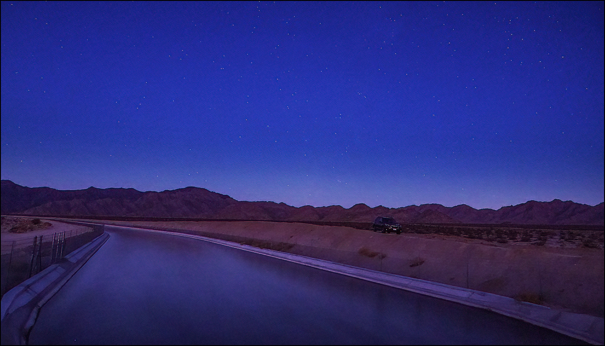
Well, not nothing. This whole episode took so long that the darkness was fading away by the time I finished up and drove off to take some different pictures. As a result, I took a bunch of pictures at dawn and sunrise that were pretty nice. Here's one of them:

June 28, 2022 — Desert Center, California

That's the Colorado River Aqueduct underneath a lightening morning sky. The stars are barely visible and the Milky Way is entirely gone.

So did I give up on the whole idea? Of course not! I thought I had figured out the whole focus thing, so a week later I went out again.

It turned out, however, that I hadn't figured out the focus problem. But now I have. It turns out that my camera is nuts: if you tilt it upward the infinity point changes. I can't even begin to make sense of this. But it really seems to be true, and eventually I was able to get sharp images for my entire arch panorama.

But when I got home, I discovered that most of my images exhibited disastrous amounts of motion blur. wtf? I was, of course, using a long exposure time, and 20 seconds is about the longest you can keep the shutter open at 24mm before the rotation of the earth starts to introduce some blur. But I had used 20 seconds the week before with no problem and I was using 20 seconds again. So why the blur? I still don't know the answer.

In any case, this meant that my pictures of the Milky Way core were no good. However, my panorama of the arch was mostly OK and Photoshop even stitched together the bottom row for me. Hooray! Things didn't go so well for the top row, however, since Photoshop had only a bare star field to work with. I eventually coaxed it to do a stitch, which came out wildly warped. So I wildly unwarped it.

I had high hopes that once I had the two rows created, Photoshop would at least stitch those together. But no. So eventually I did it by hand, which is a lousy way to do it. Here's the final image:

July 5, 2022 — Desert Center, California

All things considered, that's not bad if I'm grading on a curve. But it's not very good either.

Aside from the craziness with focus, the problem is that my camera is just ill-suited for night-sky shooting. It has a small sensor, which means lots of noise. Its sensitivity is mediocre. And it has a minimum zoom of 24mm, which isn't really wide enough for Milky Way photography.¹

It would be fun to try this again with a better camera, but that would cost a fortune to rent and probably wouldn't be worth it. In the meantime, here's a picture of Venus rising above a tree in the Desert Lily Sanctuary.

July 5, 2002 — Desert Center, California

¹Aside from the focusing problems, a 24mm lens has to be tilted at a very steep angle to get the entire Milky Way arch. At that angle, it's almost impossible to get software to stitch the images together properly.

As we all know by now, the US added 372,000 jobs in June. Is that good? Bad? Neither? Just for fun, I'd like to show you why it's wise not to pay too much attention to any single instance of this number.

Background first: The monthly jobs number comes from the payroll survey done by the Bureau of Labor Statistics. Basically, they survey companies and then add up all the jobs they report. After a bit of arithmetic, they come up with a total number for the country.

But the BLS also has a household survey. In this one, they survey households and then add up all the people who say that they're employed. After some arithmetic, they come up with a total number for the country.

These two surveys provide substantially different numbers. Here's a list of the differences:

Payroll Survey
Household Survey
Large, reliable Small, volatile
No farm workers Includes farm workers
Employees only Includes self-employed
No nannies, housekeepers, etc. Includes household workers
Counts jobs Counts employed people
Total for June 2022 151.98 million
158.11 million

This is mostly self-explanatory except for the last line. The household survey asks people if they're employed, but some employed people have two or more jobs. This means that even if the two surveys counted exactly the same kinds of jobs, they'd still differ.

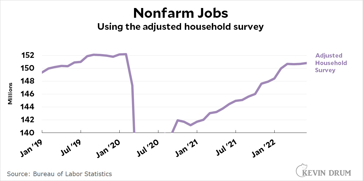
To take care of all this, the BLS also calculates an adjusted household series that mimics the payroll survey. That is, they remove farm workers, the self-employed, and household workers, and then account for people with multiple jobs. Here's what it looks like over the past few years:

After adjustment, both the payroll and household surveys are pretty close, and they move in sync pretty closely too. But take a look at the past three months: the household survey has flattened out, showing a paltry gain of only 37,000 jobs per month.

(For June alone, the payroll survey says we added 372,000 jobs. The adjusted household survey says we added 131,000. The raw household survey says we lost 315,000 jobs.)

So what's my point? Just this: the payroll survey really is more reliable. It's much larger than the household survey and therefore has less error. Still, the household survey is perfectly valid, and in a different universe it might well be the one that gets headlines every month. If it did, the labor market would look a lot less bright right now.

And who knows? Maybe the labor market is less bright than we think. Or maybe this is just a statistical artifact. The truth is that it's pretty hard to know if a single month or two of data is reliable in either survey.