Last night I was chatting with some friends about all the recent problems with air travel. This led to someone mentioning the lack of workers to fully staff flights and then to the usual denouement of conversations like this: "No one wants to work anymore. They just want to sit at home and collect unemployment/stimulus checks/etc."
I responded, of course, for all the good it did me. (1) The unemployment rate is currently 3.6%, which is as low as it's been since before I was born. (2) The Labor Force Participation Rate among prime age workers is 82.6%, the best it's been in a decade aside from a few months at the end of 2019. (3) Real wages have been declining for the past year, which suggests there is not really a huge demand for more workers. (4) The raw employment level is just above 158 million, the same as it was before the pandemic. All of these things point in the same direction: we are at or near full employment. People are not sitting at home on their butts (at least, no more than usual).
As for airlines, here are the numbers:
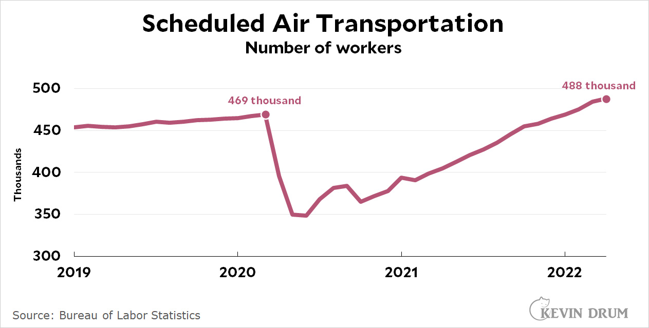 Commercial airlines have more workers today than they did before the pandemic. And just in case you're curious, here are the numbers for restaurants:
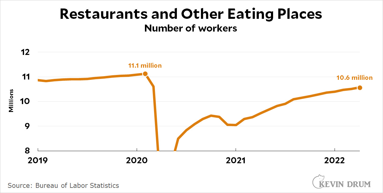 Restaurants are one of the sectors that was hardest hit by the pandemic, and it's also the one that most visibly seems to be short of workers. But even at that employment is only down by 5% compared to the pre-pandemic era. That's not nothing, but it's also not a massive shortage.
Now I want to show you yet another way of looking at the employment level. This chart shows the number of workers required to produce $1 million in GDP:
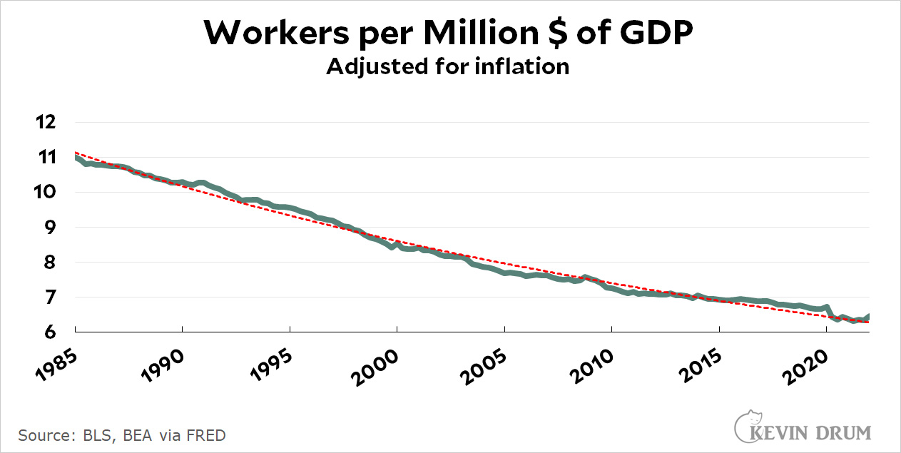 This is my usual favorite way of looking at things: draw a trendline using only data through March 2020, extend it to the current month, and then see how it compares to reality. When reality is above the trendline, the economy is strong (as during the Clinton and Obama years). When it's below the trendline, the economy is in trouble (as during the jobless recovery of the aughts and the Great Recession of 2008-11).
For the past year, however, the number of workers has been right on trend, and at the moment it's a bit above. Given the amount of goods and services we're producing, we have exactly the number of workers you'd expect.
Now, maybe if we had more workers we could produce more and GDP would be higher. Maybe. But GDP is generally demand driven. If demand was there, wages would go up and non-workers would be drawn off the sidelines. But that hasn't been happening and still hasn't.
We're more or less at full employment right now. We can quibble over the last percent or so, but people are working, and they're working at about the level we'd expect. We don't have a "lazy butts on sofas playing video games" problem.
Of course, if the Fed has its way they'll engineer the recession they so desperately want and then we really won't have enough people working. But that will be Jerome Powell's fault, not anyone else's.