Skip to content

Here is an interesting tidbit via Alex Tabarrok. It's a study of low birth weight in babies from Maxim Massenkoff of the Naval Postgraduate School. Here's the most basic US data:

US birth weights peaked in 1985 at about 3,350 grams (7.4 pounds) and then declined over the next 20 years to about 3,290 grams (7.2 pounds) Why? Massenkoff theorized that it might be due to small particle pollutants in the air. Here's how that turned out in several cities with high pollution levels:

No dice. In cities with high levels of PM2.5 particulates there was virtually no difference in low birth weight babies. But maybe US cities aren't bad enough enough to show a strong effect. Here's the same chart for some of the world's most highly polluted cities:

Again, no dice. There's just no systematic difference between particulate air pollution and low birth weight. Massenkoff is perplexed:

In addition to the birth weight estimates in this paper, it is striking that Goldin and Margo find normal birth weights by today’s standards in a 19th century poor house. Are birth weights unusually hard to change? While far from exhaustive, I searched all reviews of randomized trials in the Cochrane Library targeting either birth weight or low birth weight. According to meta-analyses, many treatments come up short, including: zinc, calcium, deworming, vitamin E, vitamin A, vitamin C, iodine, and magnesium

On the other hand, the reviews find either increases in birth weight or decreases in low birth weight for: folic acid, vitamin D, omega-3, and anti-malarial bed nets. Also, birth outcomes within the US still vary substantially across groups: There is a stark income gradient, with mothers in the bottom income quintile more than twice as likely to have a low birth weight infant compared to mothers in the top quintile of income suggesting that access to resources could drive poor birth outcomes

So it's a mystery. The answer, of course may simply be that high levels of small-particle pollutants have lots of ill effects, but low birth weight just isn't one of them. But it's still odd.

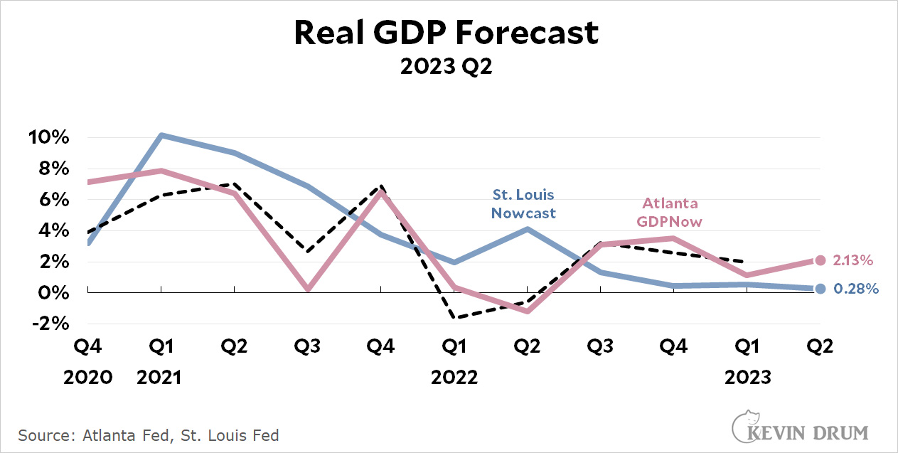
The St. Louis Fed's GDP Nowcast is forecasting that GDP growth in Q2 will be 0.28%. The Atlanta Fed's GDPNow is forecasting growth of 2.1%. Big difference! So who's right?

No offense to the St. Louis folks, but it looks like the Atlanta forecast has a considerably better recent track record. GDP growth in Q2 is likely to be OK.

Over at the Washington Post, Heather Long says, "If we avoid a recession, we can thank Black and Hispanic workers." I was all set to scoff, but she's right. Here's the basic employment pictire:

White workers have only barely recovered their pre-pandemic employment levels while nonwhite workers are all 10-13% higher. But a better metric of work might be the labor force participation rate, which is the percentage of the potential labor force that's actually working. Here it is:

White workers have a lower participation rate than they had before the pandemic. Nonwhite workers have 1-4% higher rates. On an absolute level, whites now have the lowest participation rate of any demographic group.

I don't really know what to make of this. Ideas?

The LA Times has a story today about a couple of fraudulent PACs that scammed both Donald Trump and Hillary Clinton in 2016. The bad guys are now behind bars, but I was intrigued by this brief aside:

The two groups made more than 275 million robocalls over a 16-month period and netted nearly $4 million in small-dollar contributions.

So on average, a single robocall nets one-hundredth of a dollar. If we could just figure out a way to make phone calls cost a penny apiece, it would put the whole robocall industry out of business.

Normally it takes a couple of days to settle payments in the banking system. But no longer. Later this month the Federal Reserve is introducing FedNow, which allows instant payment settlement 24 hours a day. Are you ready for the 20-minute 4 am bank run?

In addition to losing revenue from the time between a payment’s initiation and settlement, banks now have to worry about deposit flight outside of business hours. It comes just months after three major lenders failed in part because of rapid withdrawals and an inability to tap emergency sources of cash that were offline.

The March banking-sector crisis suggests cash can leave far quicker than bankers assumed, said Noor Menai, chief executive of Los Angeles-based lender CTBC Bank USA. Social media and smartphone apps allowed customers to withdraw deposits at a rapid clip, ultimately leading to a series of bank runs.

What could go wrong?

This chart shows total US greenhouse gas emissions—nearly all of it CO2 and methane—for the past two decades by sector:

Emissions peaked in 2007 and have fallen 12% since then, due almost exclusively to the fact that we've cut our use of coal-fired power plants in half.¹ These coal plants have largely been replaced by renewables, which are carbon-free, and combined-cycle gas-fired plants, powered by fracked natural gas, which emit about half as much CO2 per kWh of electricity generation as coal.

¹Industry has also gotten about 10% more energy efficient.

I'm not really sure why I made this chart:

I know that M2 as a measure of money supply isn't taken too seriously these days, and M2 as a cause of inflation even less so. But last night I got curious about the sources of our recent inflation. Is it exclusively a result of reduced supply and increased demand brought on by the pandemic? Or is there also a traditional Friedmanesque monetary component?

As you can see in the chart, M2 surged in the early '70s and was followed a couple of years later by high inflation. Then it surged again in the late '70s and was followed yet again a couple of years later by even higher inflation. For the next 40 years things bounced around a bit, but basically both M2 growth and inflation growth were moderate.

Then, in 2020, M2 skyrocketed at a growth rate far beyond anything in the past. Sure enough, nearly two years later inflation followed.

The big difference between now and the '70s is that past surges lasted a couple of years and then slowly faded away. Our current surge spiked in a single year and then plummeted like a rock. M2 growth has actually been negative for the past year.

If M2 is still tied to inflation, this suggests that inflation is not just headed down, but potentially headed way down as pandemic shortages fully ease and M2 follows a steep downward trajectory. But then again, maybe it isn't. I don't know.

The Wall Street Journal blares:

The Supermarket Aisle Where Prices Are Still Soaring

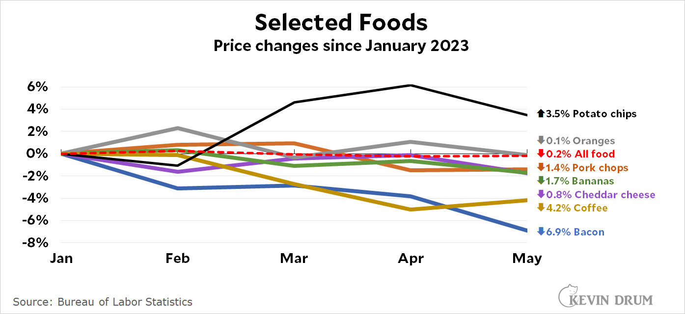
They're talking about highly processed foods like potato chips—which, in fact, are up only 3.5% since January. Not precisely soaring. And they admit that inflation has eased elsewhere.

What they don't admit is that food inflation is gone. Since the start of the year, the overall inflation rate for food at home is below zero. In some cases, prices have very noticeably dropped. So why not a story about the supermarket aisle where inflation hasn't just eased, but prices have declined since the beginning of the year? For example:

Since the start of the year food prices have gone down. Not just flattened. Gone down. Why are there no blaring stories about that?