This morning I went in for a post-op visit for my new eyes, and everything seems fine. They're still a bit blurry, but basically OK, and I have high hopes this time around that they're going to function really nicely after a few days of settling in and letting the swelling go down.
The lens replacement was done at a small outpatient surgery center in Lakewood. To get there from the freeway, you go north on Lakewood Blvd. and then turn west on East South street.
This entire post was just an excuse to get that sentence in.
This is the Place de la Concorde in central Paris. Why not the Place de la Bastille today? Because we didn't go there and I don't have any pictures of it.
Besides, the Bastille was stormed and then destroyed by mobs of woke Frenchmen anyway, so why bother? As the favored place for guillotining kings and queens¹ I think Concorde is a pretty good substitute. Plus it was only a few minutes from our apartment.
¹In particular, King Louis XVI and Queen Marie Antoinette.
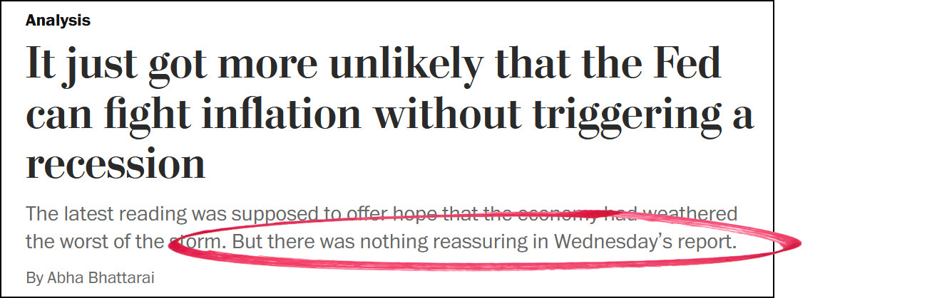
Take a look at the subhead in the Washington Post this morning:
Nothing? Really? How about this?
And there's this, released alongside the inflation report:
This is certainly not good news for workers. But if it's a wage-price spiral you're worried about, it's terrific news.
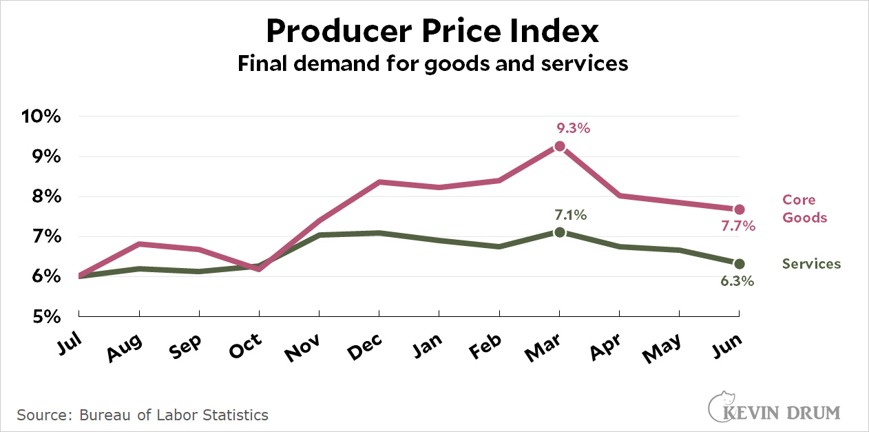
Finally, if you could wait a day, BLS released the June figures for the Producer Price Index this morning:
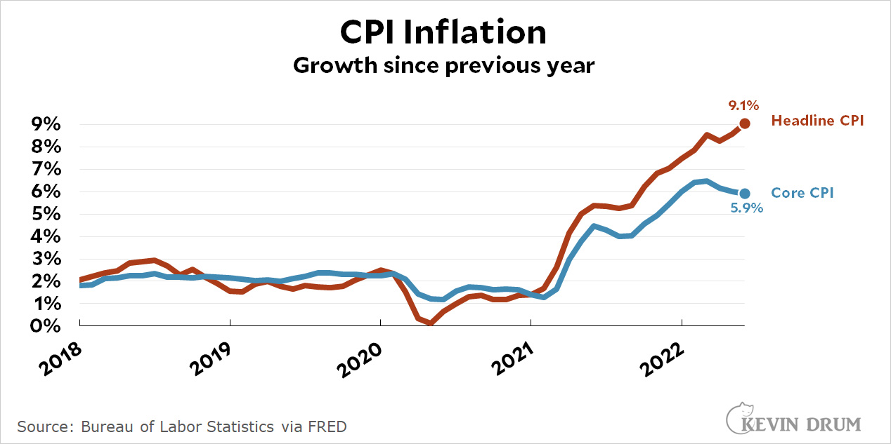
There's no trick here. Inflation is high and headline CPI is especially high. But if you want to understand the underlying inflationary pressures in the economy—not the effects of OPEC and bad weather and a war in Ukraine—you look at core inflation. And that's been going down since February.
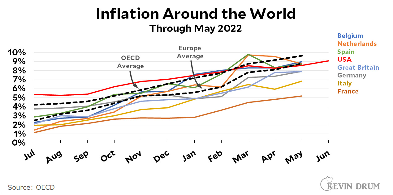
With inflation in the news today, aren't you curious about how the rest of the world is doing? Sure you are:
This only goes through May, since it takes a little while for the OECD to collect everything and put it up. In another week or two we'll see if everyone else joined us in our little June surge. I'll bet they did.
Along with its inflation report, the BLS also released this today:
Real wages continue to go down, down, down. Workers are making less than they did before the pandemic—or will by next month, anyway.
This is yet another reason to be skeptical that inflation is baked into the economy unless we throw ourselves into a recession. Other reasons include: (a) a slowdown in the housing market, (b) the end of the Biden stimulus money, (c) personal savings back to normal, and (d) core inflation abating since the beginning of the year. It's also a reason to be skeptical that employers are really that desperate to fill all those jobs they say are open.
But how long will it take for all this to affect the headline CPI rate? Next month will bring some relief on the gasoline front, but food keeps going up. So who knows?
And that's it for me today. I'm about to go in to the eye surgeon and get my unloved RxSight lenses replaced with Synergy multifocal lenses, which is what I wanted in the first place. Wish me luck.
After that dismal inflation report we could all use a little good news, couldn't we? I forgot to post gasoline prices on Monday, so here they are today:
This time I even adjusted for inflation! I wouldn't normally do that for a four-month series, but since inflation has been running high I figured it might make a small difference.
Anyway, using the inflation-adjusted price, regular gasoline has dropped 43¢ since the middle of June. That's 8.5%. Hooray!
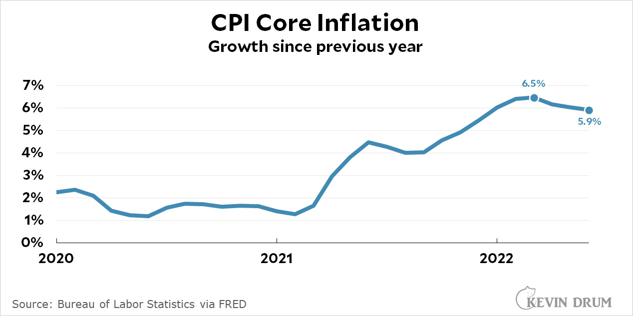
As usual, I'm less interested in the headline number and more interested in core CPI, which dropped another tenth of a point last month, ending at 5.9%. It has now declined 0.6% since February.
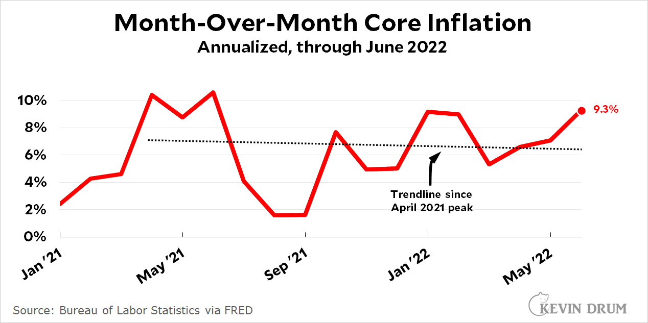
If you want a sense of how inflation is running this month, your best bet is to extract month-over-month figures and then look at the trend. Here's an updated version of my chart from last month, which does exactly that:
Not so good! The trendline is still down, but the current figure is 9.3%, which marks three consecutive months of strong growth. However, note that this is CPI core inflation, not PCE core, because that's all we have available today.
Overall, my conclusion is that inflation is under control, which I base on the fact that core year-over-year CPI is continuing to trend down. However, I expect to see a general freakout when I'm finished here and start looking at media coverage. The headline number is all they care about, and it was pretty scary this month.
It's been a while since I posted one of these. That's because I went a month without chemo while I was in Paris and then figured it was hardly worth doing the test until I had gotten home and restarted the chemo for a month. And the news is good:
I don't like this Empliciti stuff, but at least it's working while I wait to get to the top of the waiting list for the CAR-T treatment. I really, really hope that's soon, and I hope I'm one of the lucky ones who gets a strongly positive result from it. I'm really getting tired of chemo, especially after two recent rounds of being off it for a month and rediscovering what that's like.
In the meantime, would you like to see a 40-year record of my weight? Of course you would!
The first 25 years of this chart I did from memory because I just happened to remember my occasional adventures with dieting over that period. Starting in 2009, however, Kaiser started weighing me every time I went in for an office visit. I got curious about this a few weeks ago and extracted it all.
As you can see, I started losing weight in 2014 before I started chemo. I can only assume that the multiple myeloma affected my appetite during the few months that I had it but didn't know it. Then my weight plummeted during the first round of chemo and the stem cell therapy. However, as soon as the stem cell stuff ended, I started eating like a horse and spiked up to 240 pounds. After that my weight went up and down, and a careful analysis suggests that the culprit was Darzalex, with an assist from dex. Then, a few months ago, after getting a bad A1C result, I gave up sweets and my weight has since dropped from 267 pounds in March to 247 pounds today. Only another 47 to go!
(The A1C problem, it turns out, is largely due to four years of continuous dex. Apparently this is a well-known side effect. It's yet another reason I'm anxious to get the CAR-T treatment. If it works, I'll be off the dex and my A1C will probably get back to semi-normal levels.)
In this chart, the top (orange) line represents the annual earnings of Gen Xers. This age group has been part of Gen X for the entire period shown.
Likewise, the bottom (blue) line represents the annual earnings of Millennials. This age group has been the heart of the Millennials for the entire period shown.
Since Gen Xers are, on average, 15 years older than Millennials, it makes sense that they make more money. But Millennials have been closing the gap. In 2015 they made about 75% as much as Gen X. Today they make 80% as much.
In fact, if you take the person who's right in the middle of each generation and then look at a full generation worth of years (2007-2022) Gen Xers made about $49,000 per year when they were 35 years old in 2007. A 35-year-old Millennial today makes $51,000. (Both numbers are kind of rough, but adjusted for inflation of course.)
These particular wage numbers are solely for full-time workers, but that doesn't matter too much. The unemployment rate of the two generations has been close to identical the entire time.
You can draw your own conclusions from this. But it doesn't really look like Millennials are doing any worse than the generation ahead of them.
POSTSCRIPT: I didn't include Gen Z because none of them were adults during this period. And I didn't include boomers because most of us are now either retired or close to it.