Supply strains, while still afflicting many consumers and businesses, are becoming more mundane than menacing like they were six months ago, especially in the U.S. Snarls have eased since their pandemic peaks and some are already adding less inflationary pressure.
....But the gradual end of the pandemic-driven supply crunch might give way to another potential headache: a slump in consumer demand that throws economic growth into reverse and leads to an ugly inventory pileup.
“Pressures in the global goods sectors, which have been a central driver of inflation, may finally be easing,” Citi economists led by Nathan Sheets wrote in a research note this month. “The bad news is that this looks to be occurring on the back of a slowing in the global consumer’s demand for goods, especially discretionary goods, and thus may also signal rising recession risks.”
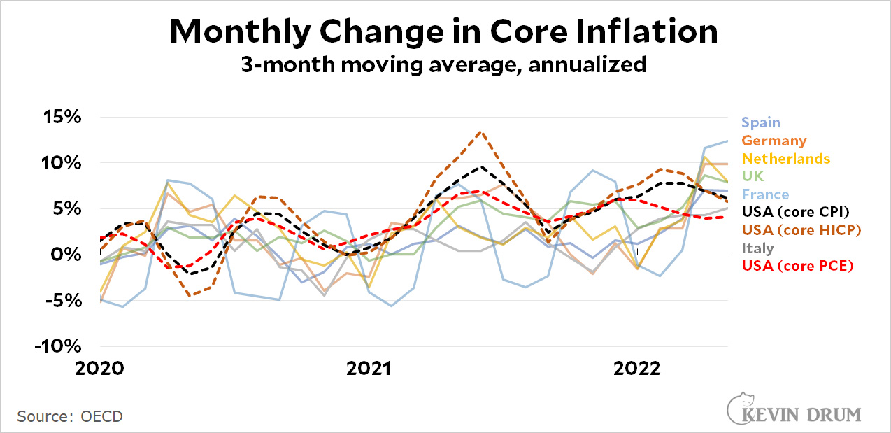
I was curious about how core inflation was doing here vs. other big countries in Europe. Unfortunately, the Europeans don't seem to produce seasonally adjusted figures, which means the raw monthly numbers are so volatile that you can't make any sense of them. It's just a bunch of huge spikes up and down. So I took a 3-month moving average instead, in order to produce lines that are more readable and show medium-term trends a little better.
UPDATE: The chart originally had two measures of US inflation, but I was badgered into adding a third. It's a rough¹ estimate of core HICP, which is the European measure of inflation. This is the one to use if you want to apply a similar methodology to all countries. It doesn't change our story much, though.
¹It's rough because the BLS doesn't publish its real estimate of core HICP. Instead I'm using an approximation suggested by Jason Furman: core CPI minus housing.
As you can see, there was a period earlier this year in which the US had higher core inflation than any of these other countries. But that's no longer the case. Our core inflation rate is cooling off while the core inflation rate in Europe is skyrocketing. Right now we have just about the lowest core inflation rate around and it's declining.
I used the core inflation rate because European countries might be more sensitive to increases in food and fuel, and I wanted the comparison to be fair. Also, core inflation says more about the underlying health of a country's economy than headline inflation.
POSTSCRIPT: Going a little beyond just raw data, my interpretation of these figures is that the US inflation rate is going down because the boost from the stimulus bill has worn off. That isn't happening in Europe because there was no stimulus to begin with.
The US may be suffering through high inflation, but so is everyone else. And our overall economy looks pretty good. The rest of the world sure thinks so, anyway:
That's the exchange rate of the dollar against a broad basket of other currencies, and it's been going nowhere but up for the last year and a half. This is an indication that nearly everyone on the planet is betting that the United States is the best positioned economy in the world right now.
Monkeypox reporting has been atrocious. Alternatively, I've lost the ability to use Google and am now all alone in the universe. I'll let you decide.
The question I have on my mind is whether the CDC has responded to monkeypox with an effective testing regime. According to the bulk of the news media, along with LGBT activists everywhere, the answer is a very loud no. The problem is that testing has been tightly constrained by the CDC's insistence on having it done through federal labs, which bury doctors in stupid paperwork and have limited capacity anyway. Only recently have they begun to authorize commercial labs to perform monkeypox testing, something that should have been done long ago. It's COVID-19 all over again. Has the CDC learned nothing?
I have my doubts about that. Even if you think poorly of the CDC, they aren't full-on morons. If they had a good alternative they wouldn't mindlessly repeat the exact same testing strategy that got them in so much trouble two years ago.
But how do I find out? The first obvious bit of data I'd like is the number of monkeypox tests that have been performed weekly since the first case was discovered. I can find that nowhere.
The second bit of data that would be useful is the number of monkeypox tests performed in Europe, which would provide some clue about whether we're doing significantly worse than our peers. But I can find that nowhere.
The third bit of data is an explanation from the CDC about why they do things the way they do. Is it because they're stupid? Is it because there's value in being super careful in the early testing stages of a disease outbreak? Or is it because there's inherently limited testing capacity for any new disease outbreak and it takes time for commercial labs to ramp up? I can find an answer to this nowhere.
The fourth bit of data I'd like to get—please stay with me here—is how valuable testing is in the first place. After all, monkeypox is not like COVID. If you have a bunch of new lesions on your body, you probably have monkeypox. No test needed, really. Nor is there anything much you can do about it except isolate and wait for it to go away.
I'll acknowledge up front that I'm inclined to think the CDC may have problems but is not literally filled with idiots. But you never know! Answers to these basic questions would help me figure it out, but I did quite a bit of searching last night and literally came up with nothing. AITI?
A few days ago the New York Post reported that the FDA had delayed its inspection of a monkeypox vaccine facility in Denmark. As a result, the US was unable to import vaccine doses made in the new facility, and this in turn was laying waste to an entire generation of Americans. Here's a followup from AP:
Thousands more doses of monkeypox vaccine are expected to soon begin shipping to the U.S. after federal health officials said they had completed an inspection of the overseas plant where they were manufactured.
....The U.S. government has purchased more than 1.1 million completed doses of the vaccine produced by Bavarian Nordic in Denmark....An FDA spokeswoman said late Wednesday that regulators “expedited and completed an inspection of the company’s plant.”
“We do not expect any delay in vaccine availability due to this process,” she said in an emailed statement.
The FDA announced this on Wednesday and the Associated Press shipped its piece on Thursday. The Post, as near as I can tell, has not bothered to take note. In fact, virtually no one seems to have taken note.
This is an all-too-common news cycle. An initial piece generates panic and is shared all over social media. A day later—or maybe two or three—we learn that, in fact, everything is fine, but this barely rates a blip in the news. For the rest of time, then, the entire country vaguely remembers some kind of heinous debacle but has no idea how it actually turned out. Rinse and repeat.
I’m just a social democrat, man. Trying to make the world a better place.
I don't know if Teixeira is right about conditions at the Center for American Progress, where he worked for the past couple of decades, but he has nothing good to say about it:
Like a lot of older and whiter veterans of liberal think-tanks and foundations, he also says he’s exhausted by the internal agita. “It’s just cloud cuckoo land,” he says. “The fact that nobody is willing to call bullshit, it just freaks me out.”
Since neoliberalism is now in such bad odor, how about if we all start up a new think tank that's called The Foundation for Social Democracy, or some such? We could have different groups dedicated to the Swedish model, the French model, the Japanese model, and so forth. Just sign up for the softball team of your choice.
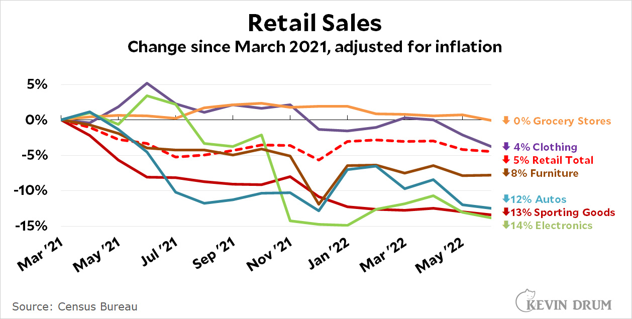
According to the Wall Street Journal, retail sales were up 1% in June. This is, needless to say, incorrect. When you account for inflation retail sales were down -0.3% from May.
(As John Maynard Keynes sort of said, I can whine about correcting for inflation longer than you can stay sane listening to me. You should all just give in and do the right thing.)
Right. Anyway, this month I thought I'd present retail data in a new and exciting way. Here it is:
This chart starts with March 2021, when the stimulus bill passed and retail spending spiked upward. Since then, as you can see, spending has declined overall and in every single category.
In other words, real consumer spending is declining in exactly same way as real wages. Neither spending nor wages are pushing on inflation. Despite this obvious evidence, there's frequently blithe talk about high savings rates and how people are still drawing down the money they got from the stimulus checks, but even a brief look tells you that isn't true:
Stimulus savings have long since been spent and overall personal savings is now a third less than it was before the pandemic. Calculated as a percentage of disposable income it's gone down about a quarter.
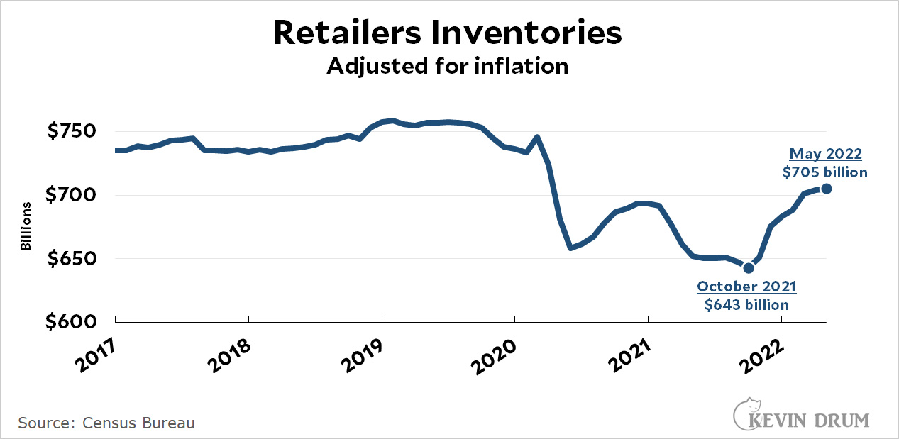
Wages are down. Savings are down. Spending is down. Total personal expenditures have been flat since reaching a peak last October. But retail inventories, which took a huge dive after the pandemic thanks to supply chain problems, have risen 10% from their low point. Warehouses are bulging:
Maybe I'm just an idiot, but for the life of me I can't figure out what's supposedly driving concerns about future inflation. Inventories are growing above the inflation rate while wages and spending are growing below the inflation rate. This ought to be a recipe for price levels to go down. What's going on?
Are you tired of inflation geekery? Me too, actually, but I got curious about something so I'm going to show it to you anyway. Voila:
Let me explain. First I charted the past year of data for four measures of core inflation:
CPI (Consumer Price Index)
PCE (Personal Consumption Expenditures)
PPI Goods (Producer Price Index for goods)
PPI Services (Producer Price Index for services)
This is not the usual year-over-year metric that I've plotted. It's month-over-month (annualized for ease of viewing) so you can see the inflationary impulse in the economy from moment to moment. Then I let Excel draw trendlines for each. I did nothing to affect it: I just clicked the buttons and let Excel choose the best fit.
Of the trendlines, three appear to have already peaked and are now declining:
PPI Services peaked in September
PCE Core peaked in December
PPI Core Goods peaked around May, or maybe June
Only one measure, core CPI, is still rising.
So . . . what does this all mean? To me it suggests that the inflationary impulse in the American economy is already fading out. I don't know for sure how the Fed should respond to this, but it does seem to confirm that we don't really have any need to panic at the moment.