Skip to content

I finished up Parts 2 & 3 of Get Back, Peter Jackson's epic Beatles documentary, a couple of days ago. I have less to say this time around since I already said a lot about Part 1, but here goes anyway:

  • Lennon comes across quite differently than he did in Part 1. I don't know if this was the result of editing or of Lennon just being in a better mood, but he's much more engaged during the later stages of the session and just generally in a friendlier mood.
  • Conversely, George Harrison comes off worse. That's a bid odd since it was in Part 1 that he stormed off, but throughout the rest of the session his mood is mercurial, and quite often grim and argumentative.
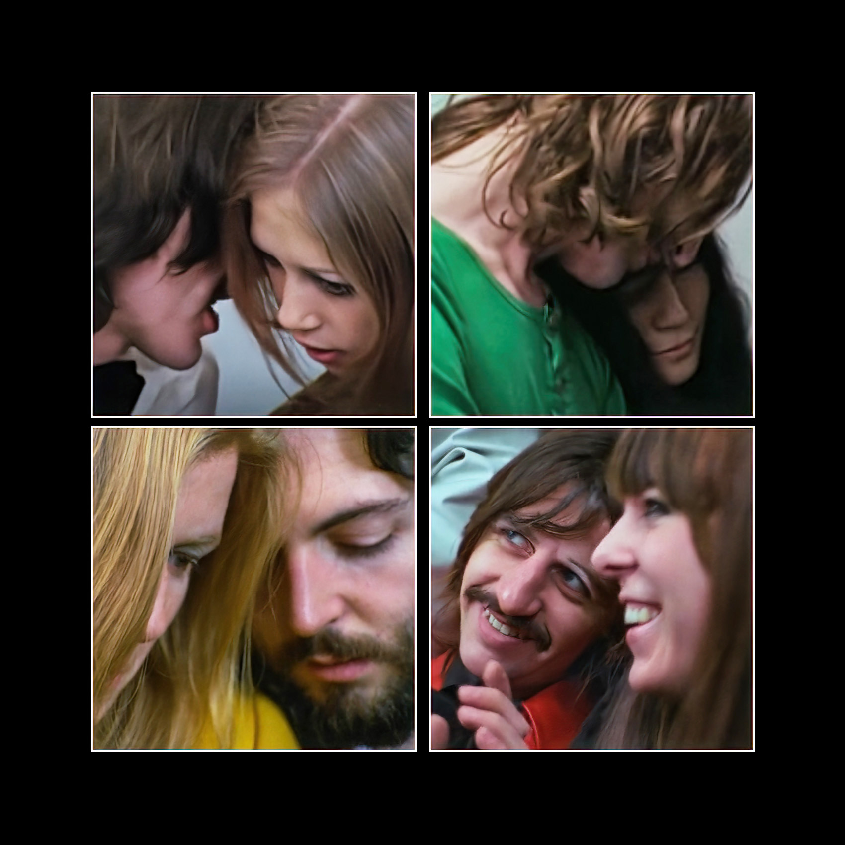
  • Yes, Heather Eastman was adorable.
  • I did not know that McCartney's original idea was for "Get Back" to be a political song condemning Enoch Powell and his band of anti-immigrant zealots. Interesting!
     
  • Every genius has a debacle or three, but watching McCartney's obsession with the execrable "Maxwell's Silver Hammer" was hard to stomach. It was sort of like Picasso painting a bullfighter on black velvet and then spending weeks insisting that it would be great if he just changed that brushstroke over there and this bit of color here.
  • The personality conflict between McCartney and Harrison is famous, so it's fascinating to hear McCartney—in a secretly recorded conversation—telling Lennon that Harrison's songs had improved to a point that they were as good as anything they themselves wrote, and it was high time to acknowledge that. Lennon appeared to be noncommittal about this.
  • It's also famous that Harrison had long been exasperated by McCartney's constant stream of suggestions about how to improve his songs. I get that. At the same time, I kinda feel that when you get criticism from a guy who might be the greatest songwriter of the century, maybe you should just bury your frustration and take it.

And a final note on Part 1. I've read a lot of commenters going on and on about seeing the moment when McCartney first started picking out the melody that would eventually become "Get Back." And sure, from a historical standpoint it's interesting to see it. But to call it a rare private look at an "act of creation" is kind of silly. Nearly all acts of artistic creation come out of nowhere, after all. There's nothing special about this particular one.

For what it's worth, I thought the most interesting "moment" was the one where Lennon first mentioned that he was going to go see this guy Allen Klein. This is arguably the moment that led inexorably to the band's breakup.

Tyler Cowen alerts me today to a blog post by Ben Pearson titled "Here's Why Movie Dialogue Has Gotten More Difficult To Understand." That's right up my alley, and it's one of the reasons I don't see as many movies as I used to. It's also why I always turn on closed captions when I watch movies at home.

Anyway, according to Pearson this isn't because my hearing has deteriorated. It's for a host of other reasons, which I will paraphrase:

  • Christopher Nolan is an asshole
  • Actors are too full of themselves
  • On the set, sound guys are treated like shit.
  • Everyone wants to play with all the new toys, often with crap results.
  • Laziness.
  • Theaters these days are run by bored 22-year-olds.
  • Streaming services compress the sound and have varying standards for decompressing it.
  • Lots of TVs have lousy sound.

Some of these strike me as more credible than others, but read the whole thing if you also find muddy sound in movies an increasing headache.

The news is alive with reports that rent is skyrocketing and will continue to skyrocket next year. Apartment Guide reports that rents are up nearly 20% from last year, and double-digit increases are here to stay for at least the next couple of years. Zillow reports similar numbers.

But Apartment Guide also report that rents in my hometown of Irvine are up 36%, and this made me go hmmm. Irvine is certainly a high-rent kind of city, but that still seemed awfully steep. And the BLS reports that rents nationally were up only 2.7% in October.

What's going on? As usual, it all depends on how you care to interpret the long-term trend. First of all, here's the BLS data for the past few years:

As you can see, rents nationally were increasing at an extremely steady rate of about 4% per year until the pandemic hit. At that point, rent increases slowed way down. So what's happening is that landlords are now trying to make up for their losses during the pandemic, which means a period of high rent growth for a while if the market can sustain it. Which apparently it can.

Nonetheless, this suggests something like 6-7% growth, not double-digit growth. So here's a different look at rents from the Department of Housing and Urban Development. They estimate "fair market rents" for every region in the country, so I went ahead and picked Orange County to look at:

HUD is interested in low-income rentals, so their estimate is for rent at the 40th percentile, a bit below the median. They show that after several years of stagnant rent growth, Orange County rents climbed substantially through 2021. No pandemic slowdown for us! But they also estimate that rents will be flat in 2022. Apparently Orange County landlords have reached the limit of the market's ability to absorb higher rents.

There are a few lessons here:

  • Nationally, rent increases were low during the pandemic and we're now making up for that. This means higher than normal rent increases for a year or two.
  • "Higher than normal" seems like it means 6-7%, not double digits.
  • Every region is different. Your region might well see double digit growth in rents. Or it might show no growth.
  • And this is important: Landlords raise rents more on vacant apartments than they do for occupied apartments, and overall rent figures are an average of the two. HUD estimates that rent increases for new tenants are about a quarter higher than overall rent increases. So for people shopping around for new apartments, rent increases might be on the order of 7-9% nationally. Assuming HUD knows what it's talking about, that is.

Needless to say, none of this is set in stone. They're just estimates from different sources. But my guess is that most regions will see rent increases that are high but not skyrocketing. Maybe it will end up in double digits, but only barely.

Marian does a lot of hand stitching on the giant frame shown below. Charlie loves this frame. Not only does it give him an excuse to jump into Marian's lap, but he can attack the shadows of her fingers as they move across the top of the fabric.

In other news, you will be glad to hear that things are working out well with Hilbert. He is a coward, so he spent most of Charlie's first week cowering. The second week he got over that, but was still wary. Now, in the third week, he's gotten used to having a kitten around and plays with him constantly. Charlie adores leaping onto Hilbert's back, which now always ends with them wrestling around until Hilbert gets bored. Charlie is a very happy kitten.

The American economy gained 210,000 jobs last month. We need 90,000 new jobs just to keep up with population growth, which means that net job growth clocked in at 120,000 jobs. That's not very good, but headline unemployment nonetheless fell dramatically to 4.2%.

I'll be honest: the employment numbers lately are so strange that I've gotten a bit tired of tracking them. Take November. Job growth was lousy. And yet the unemployment number went way down. Why? One clue is that the number of employed people went up by 1.1 million and the number of unemployed people went down by half a million. That's great! As a result of all this, even with a very small number of new jobs, the participation rate went up from 61.6% to 61.8%, which is pretty good.

I don't understand all this, so instead let's take a look at something easy, like earnings. In November, hourly earnings grew at an annualized rate of 3.2% while weekly earnings grew at an annualized rate of 6.8%. If we assume an inflation rate of 6.1%, real hourly earning were down -2.9% while weekly earnings—thanks to an increase in average hours worked—were up 0.7%. Here are the numbers for a bunch of individual categories:

As you can see, hourly wages in retail were flat, but hours were way up, leading to an increase of nearly 20% in weekly wages. The leisure and hospitality category was also up, but nearly everything else was down when adjusted for inflation.

The Washington Post summarizes the results of a new Gallup poll today:

As prices creep higher for food, gasoline and other necessities, nearly half of U.S. households say they are feeling the financial strain, according to a Gallup survey released Thursday.

Roughly 45 percent of households are being hurt by price increases, according to a survey of nearly 1,600 people conducted Nov. 3 to Nov. 16. About 1 in 10 said that hardship was severe enough to affect their standard of living, while 35 percent described the hardship as “moderate.”

I don't want to be in the business of telling other people how to feel, but this is crazy. Here are pay and prices since the beginning of the year:

As a God-fearing liberal, I am always unhappy when pay falls behind inflation. I want to see working and middle-class folks making more money, not less. That said, a net decline in spending power of 2% just isn't enough to cause very much hardship for anyone who wasn't feeling it already. These poll results make no sense.

Now, obviously this is a bell curve, and some people are feeling inflation worse than others. It all depends on what you buy a lot of. But the number of families facing any noticeable hardship has still got to be tiny.

This is the kind of thing that should make us question the role of the media in all this. Please note: I'm not saying that no one would notice higher prices if the media didn't report it. The price of both a pound of hamburger and a gallon of gasoline have gone up 50 cents since May, and that's something people are going to notice. Nevertheless, the media's job should be to put highly visible price increases like this into context—and in this case the context is that there are some outliers, but on average prices have gone up only slightly more than wages.

But it's been just the opposite. If anything, reporting has made inflation look worse than even the outliers suggest. This is why you get people vaguely guessing that prices in the supermarket have gone up 100% or so. And it's why people report serious hardship from inflation even though the vast majority of us are feeling only a tiny effect.

This kind of context setting is, in theory, one of the most important things the media does. And obviously it's a matter of judgment. Is inflation better or worse than it seems? Is the COVID-19 pandemic better or worse than it seems? How about global warming? The demise of democracy? The answers aren't always simple, and this kind of judgment is often one of the hardest parts of journalism.

Then again, sometimes the evidence is clear and these judgments are pretty easy. This is one of the easy ones.

I have received a request to update my old chart showing the number of politically-related criminal convictions per administration. Happy to oblige:

You may think the Trump number looks low, but for some reason all those cabinet members who resigned for dodgy behavior never got criminally convicted of anything. According to Wikipedia, anyway.

Anyway, the score is now 95-1.

This is a picture of Santiago Canyon Road, which I've shown you in various guises over the years. In this case, I wanted to use the drone to hover as close as possible to the electric lines in order to highlight them as they stretched into the distance. It turns out that this doesn't work very well with big power lines, but it was fine here with smaller lines. And the dramatic sky doesn't hurt either.

October 11, 2021 — Orange County, California

Are big corporations using COVID-19 as an excuse to screw consumers? Here are two data points. First up is inflation:

Since the beginning of 2020, the producer price index has gone up far more than the consumer price index. This suggests that corporations are trying hard to keep prices down even though the price of their inputs is going up.

But there's also this:

Corporate profits are up, up up. One way or another, corporations are doing pretty well and could obviously afford to pay workers more and hold down prices more.

I'm too lazy today to draw any firm conclusions from this. For now, it's just raw data to ponder over.