This post has a twist at the end, so bear with me. We start with a piece in the Atlantic by Derek Thompson about the end of the 9-to-5 workday. It's based on a Microsoft study of keyboard strokes on work computers:
Findings from Microsoft and its researchers suggest that the 9-to-5 workday is fading in an age of remote and hybrid work and more flexible hours. That pattern was first spotted early in the pandemic, when Microsoft Teams chats outside the typical workday increased more than in any other time segment, particularly between 6 p.m. and 8 p.m....Microsoft researchers have begun referring to this phenomenon as a “triple peak day.”
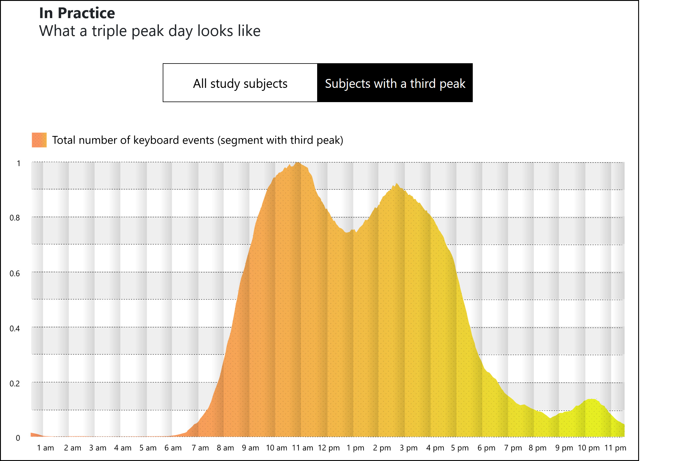
What Microsoft found was a peak before lunch, a peak after lunch, and a brand new peak from 9-10 pm. Here's the obligatory chart:
 Are you with me so far? Let's assume everything is kosher here and that keystrokes on work computers are a good proxy for doing work at home. Do you notice anything odd?
Of course you do. The chart is labeled "Subjects with a third peak." In other words, this chart only counts workers with a third peak and then concludes that a third peak is now widespread.
I have two problems with this. The first is the obvious one: what if we just take a look at everyone in the study? To their credit, Microsoft includes this in their paper:
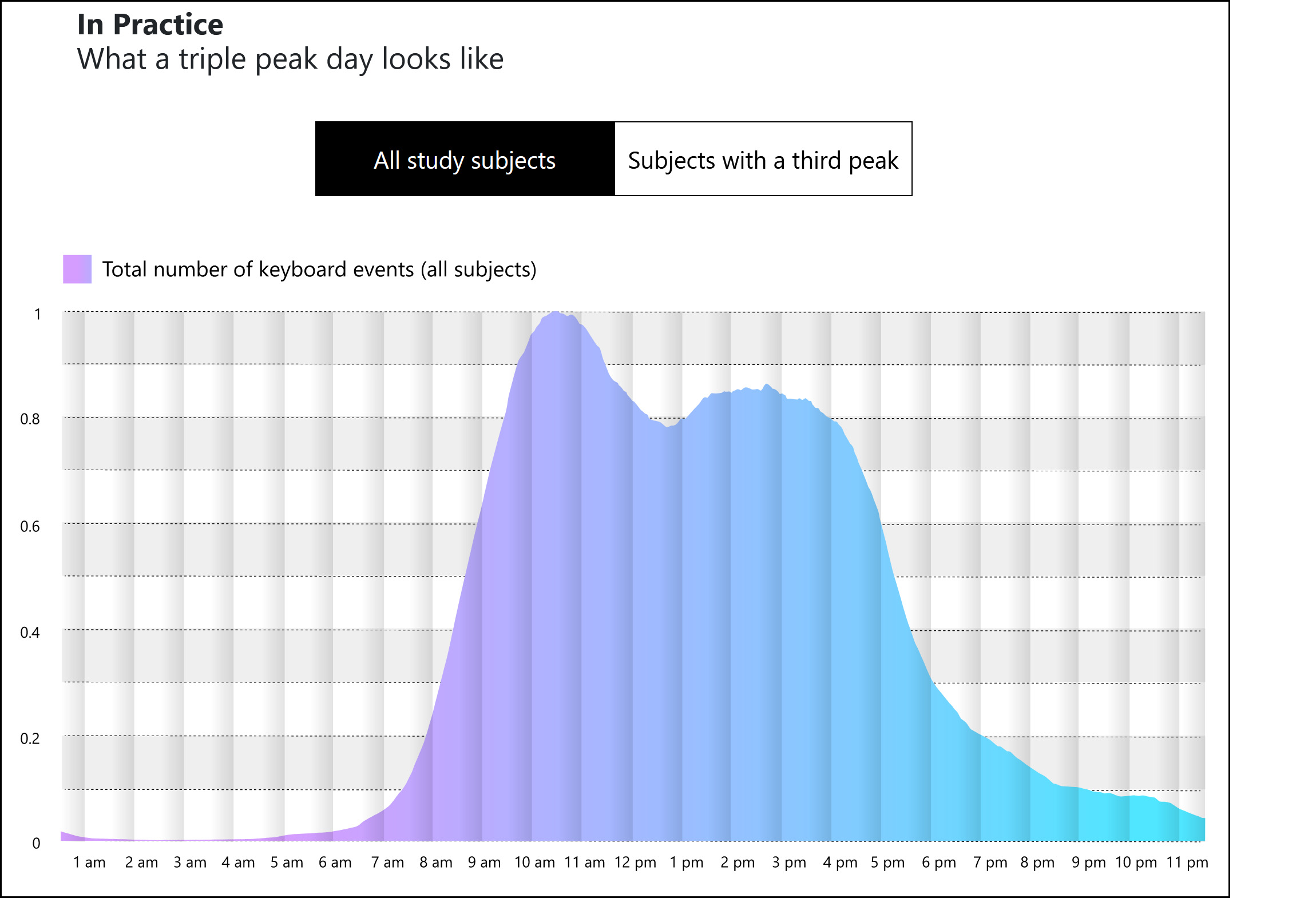 If you look at the full study data, there's nothing there. Keystrokes decline rapidly around 5 pm and fade out gradually after that. The researchers say that 30% of workers had a third peak, but the full chart doesn't show even a hint of one.
This is an obvious problem with the study, but I said I had two problems with it. What's the second? Can you guess?
Here it is: I have been hearing for decades that email and remote connections in general have destroyed the 9-to-5 workday. We are on call constantly. Our bosses expect us to respond 24/7. We work more hours than ever.
But here we have Microsoft claiming that the "third peak" is a brand new thing that took off only during the pandemic. And it's a small effect even though the data was collected from precisely the kind of workers who are most likely to demonstrate workaholic behavior. If we take this seriously, it means that email and Slack and Zoom haven't turned knowledge workers into 24/7 work zombies at all—at least, no more than before.
What's more, there's data that supports this. Among men,¹ Larry Mishel estimates that average hours worked over the past few decades have gone up more among the poor than the rich:
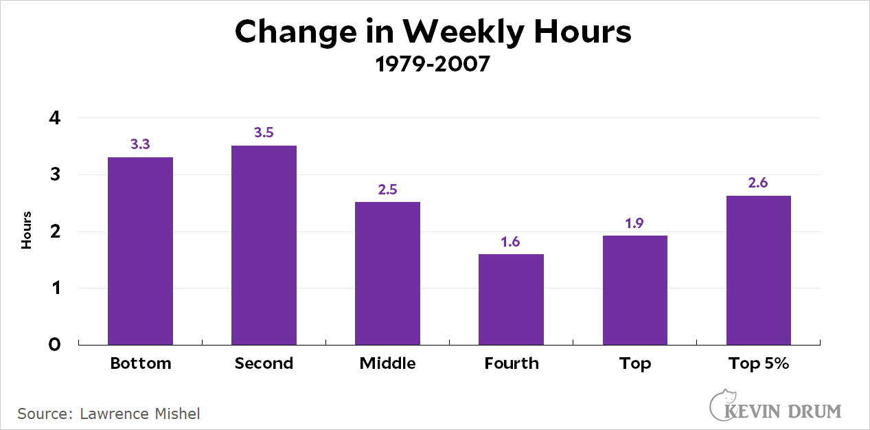 Using a different metric, the number of high-income men working very long hours (more than 50 per week) went up during the '80s but has gone up only modestly since then. And since 2004, the average number of hours worked by high-income men has actually gone down:
 There have always been some men who work long hours: teachers who grade papers at home; coders who are obsessed with their work; executives who read reports in bed; and so forth. But over the last few decades this kind of of workaholism has gone up only a little bit and the average workweek has increased by only about two hours—most of which has been given back in recent years. The bottom line is that contrary to conventional wisdom, the number of high-income men who are workaholics is fairly modest and hasn't gotten a lot bigger over the past decade or two. This fits the Microsoft findings, which show a smallish amount of after-hours work and a smallish hump even among those who do make a habit of working late.
And of course, if you take income out of it and just look at all men, average hours worked hasn't budged a bit since the BLS started its time use survey:
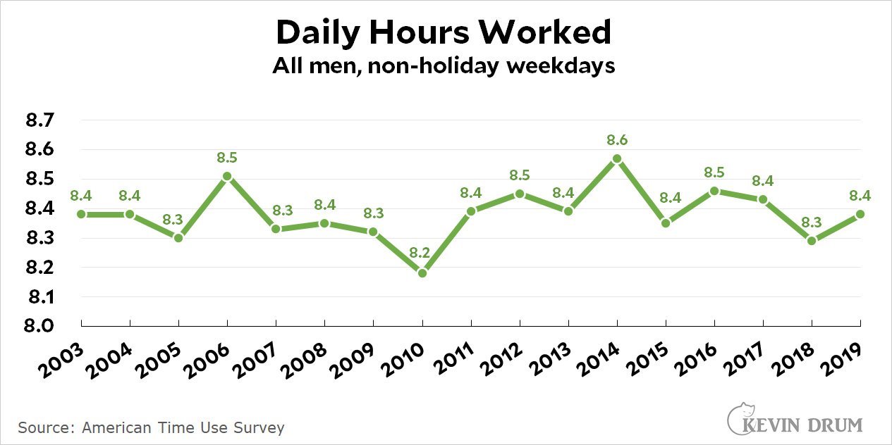 American men do work longer hours than men in most other rich countries, largely because other countries mandate many more vacation hours. But this hasn't changed a lot since computers made it easier to work at home.
I don't doubt that our always-connected lifestyle has made work more stressful in some ways. On the other hand, it's also made it less stressful: A white-collar worker who needs to get another hour of work done no longer has to choose between finishing it and getting home for dinner with the family. The work can simply be done a little later when the kids are in bed and everything has calmed down. I imagine this is a choice that lots of men make. They work the same hours, but are able to choose the least stressful time to do it. That's a nice tradeoff.
¹There are substantial gender differences in hours worked, and for women the numbers depend a lot on the entrance of more women into the workforce. For these reasons, it's best to restrict the analysis to men in order to get a fairly clean look at things.

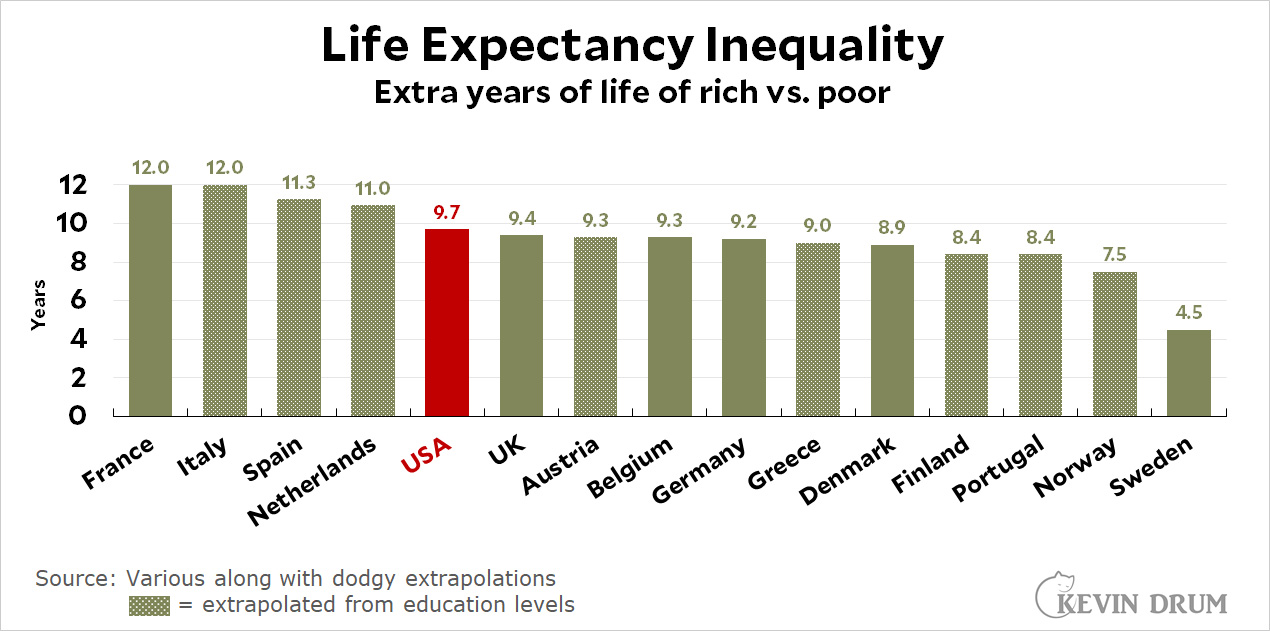 The rich live about ten years longer than the poor in the US. In France it's about 12 years. The UK and Belgium are a little over 9 years. Only Sweden, at around 4 years, does significantly better.