Skip to content

Over and over I hear that the inflation metric preferred by the Fed is the PCE core chained index (the PCE measure of inflation excluding food and energy). Here it is:

I'm not saying this is the inflation measure everyone should put on their front pages. Overall CPI inflation is a good measure of what people see in their daily lives, which is why it's the one that shows up in headlines.

Still, for analytic purposes the Fed claims that PCE core is a better measure of underlying inflationary pressure in the economy. And if that's the case, it's been on a downward trend for the past 12 months. Hell, even CPI core inflation has been going down for the past couple of months.

So why the widespread panic over inflation? Why doesn't anyone pay attention to the PCE core metric? And in particular, why doesn't the Fed seem to pay much attention to the very metric they say is the best?

A friend of mine passed along the latest summer gasoline outlook from the Energy Information Administration:

In spring 2021, refineries sold gasoline for 59¢ more than their crude oil cost. In spring of this year, EIA projects that the difference is $1.13.

That's an increase of 54¢. A few days ago I calculated that the price of gasoline was 61¢ higher than it "should" be based on its historical relationship to the price of oil. Those two numbers are suspiciously close, no?

If you visit Paris and haven't been to the Musée Rodin, I highly recommend it. Not only does it have lots of beautiful Rodin artwork, but the grounds themselves are beautiful too. It's a great place to admire some artwork and to relax while you're doing it.

Another nice thing is that they don't screw around with you. If you go to the Musée Rodin you want to see The Thinker. So they put it front and center instead of making you walk through some Ikea-inspired maze before you finally find it. I appreciate that. So without further ado, here is The Thinker. I'll have more Musée Rodin pictures in the coming months.

POSTSCRIPT: I've never believed that the thinker really looked like he was thinking, and seeing the sculpture in person confirmed this. He looks more like he's sad about something—which I suppose is a type of thinking if you want to stretch things. But he definitely doesn't look like he's contemplating the mysteries of astrophysics or pondering the meaning of life.

May 31, 2022 — Paris, France

The NHTSA reported statistics today on crashes of self-driving cars over the past year. The numbers are all but useless, but here they are anyway:

Tesla leads the pack among Level 2 cars, which have limited self-driving capability. Among cars with higher levels of automation, Waymo is by far the highest.

But in neither case do we know how many miles these cars have driven. Tesla and Waymo have almost certainly driven far more automated miles than anyone else in their respective categories, and I suspect both would have pretty low numbers if you calculated crashes/mile—or, more crudely, even crashes/vehicle.

But we don't have that unless the car companies provide that information for the relevant time period. In the meantime, this is all the NHTSA has.

Now here's a chart:

If Mortgage News Daily is to be believed, the interest rate on a 30-year fixed mortgage has jumped 0.73% over the course of just three business days. Since the start of the year rates have nearly doubled, from 3.29% to 6.28%.

So what happened on Friday to cause mortgage rates to suddenly jump? That was the day inflation numbers were released, so I suppose it was that. Bankers probably figured that continuing high inflation would prompt the Fed to raise rates sharply and this in turn would make their cost of money higher.

Or maybe there's some other three-bank-shot theory at work here. Long-term inflation expectations (5/10/30 year) have been either flat or down over the past few weeks, so that's not the answer.

In any case, this will add yet another $100 or so to the average monthly mortgage payment, and this in turn will depress the housing market. That's bad news for the economy.

This is the Irvine Spectrum shopping center, a vast and growing conglomeration of all the usual mall suspects.

As you can see, the photo was taken at sunrise via drone. After this I have one more drone picture to show you: the one that prompted me to finally buy a drone in the first place. Maybe next week.

October 16, 2021 — Irvine, California

Asking prices in the Southern California housing market are already starting to show some strain:

The share of homes listed for sale that took recent price cuts has more than doubled since last year. During the four weeks that ended June 5, 16.2% of listings in L.A. County had at least one price cut, up from 7.5% during the same period last year, Redfin data show.

In Orange, Riverside and San Bernardino counties the share of price drops rose to more than 20% of listings, up from about 7% a year earlier.

Nationwide, there haven’t been this many price cuts since 2019. Homes for sale in Los Angeles and Orange Counties haven’t seen this number of price reductions since late 2018 — the last time mortgage rates shot up. In the Inland Empire, price reductions are at an all-time high in a dataset that started in 2015.

Realtors are bravely saying that there are still plenty of eager buyers and plenty of bidding wars. And it's true that housing prices continued to rise through March—the latest data available. But this is just the start. I don't expect a housing bust on the order of 2006-2008, but I do expect a sustained moderate drop in house prices. In aggregate, this decline is likely to shave half a point or more off GDP growth—and that's in addition to all the other headwinds facing the economy.

It will also bring down price levels—although judging from our experience during the Great Recession it's hard to say how long it will take for it to work its way through to lower inflation rates:

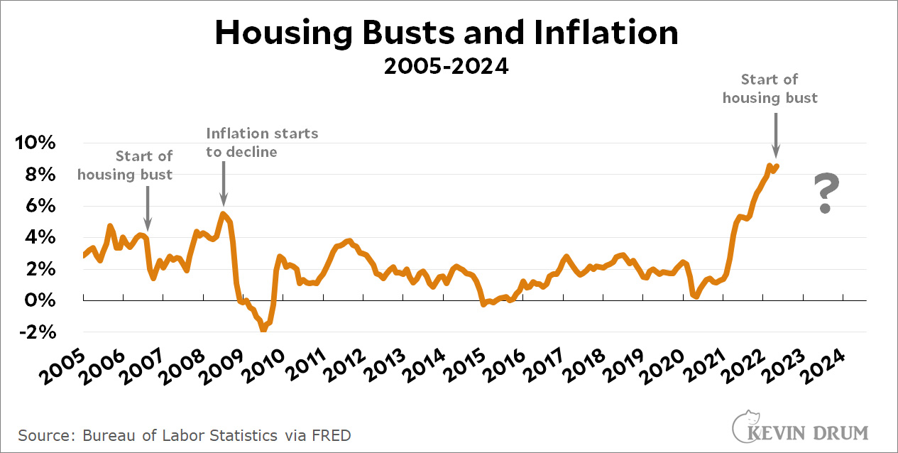
Our last housing bust was followed by a quick decline in inflation, but the decline was small and temporary. It was two years before inflation was seriously affected.

So what will it be this time around, with different circumstances and a smaller fall in housing prices? If I knew, would I still be doing this free blogging thing?
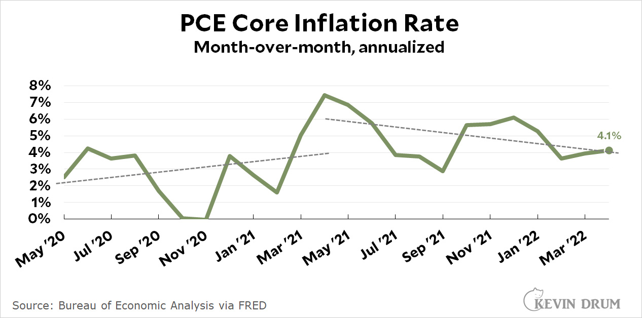
The Washington Post reports today that Republican voters are eager to nominate candidates for office who repeat Donald Trump's big lie about the 2020 election being stolen:

District by district, state by state, voters in places that cast ballots through the end of May have chosen at least 108 candidates for statewide office or Congress who have repeated Trump’s lies. The number jumps to at least 149 winning candidates — out of more than 170 races — when it includes those who have campaigned on a platform of tightening voting rules or more stringently enforcing those already on the books, despite the lack of evidence of widespread fraud.

Here's the chart:

This is obviously a terrible trend. Make no mistake.

But. It's also worth noting that virtually every one of these candidates comes from either a deep red state or a red district within a purplish state. In other words, they come from places where Republicans are likely to win anyway and no elections will even need to be overturned. Congressional races are a little different, but even there very few of these districts would ever nominate someone who wasn't willing to go along with a vote to install Trump as president if the vote ever ended up in the House.

In practical terms, then, these nominations won't change much of anything. It's disheartening that so many Republicans have gone over this cliff edge, but the truth is that they went over it many years ago. This is just the latest manifestation of Gingrichism, Foxism, Tea Partyism, and now, Trumpism.