Skip to content

The Wall Street Journal tells us that the stock market is plummeting:

Dow Closes at a 2022 Low as Growth Fears Roil Markets
Wave of selling sweeps across the globe

But it's actually even worse than that. Here's something you don't usually see:

Adjusted for inflation, the market is down 25% from its peak, not just 20%.

It's a funny thing. In the bond market you can't avoid talk of inflation. The entire premise of the market is to get a return higher than inflation, and that's built into the entire structure of buying and selling.

But that's the premise of any investment, including stocks. And yet no one ever mentions inflation-adjusted stock prices. No one even compares the market indexes to the inflation rate—not often, anyway. Why is that?

In any case, even if you adjust for inflation the stock market has produced returns of 5% per year over the past five years. That's pretty good.¹ Hooray for long-term investing.

¹Assuming you put a bunch of money into the market five years ago, of course.

From the Wall Street Journal:

Business surveys published on Friday indicate that economic activity in Europe declined sharply in September, raising the risk of recession in one of the world’s industrial powerhouses as governments grapple with surging prices and disruptions from Moscow’s attack on Ukraine.

With Asian economies also struggling with rising interest rates and weakening exports, this leaves the U.S. as the only large economy showing a degree of resilience.

Don't worry, though! The Fed is doing its level best to wreck the US economy too. Pretty soon every region in the world will be collapsing.

But at least inflation rates will come down. Maybe we'll even be able to add deflation to our list of economic disasters.

Brad DeLong has a new book out called Slouching Towards Utopia, an economic history of the "long 20th century" from 1870 to 2010.

Why 1870? Because Brad says that despite earlier progress stemming from the Industrial Revolution, it was only in 1870 that growth surged upward enough to affect the incomes of the common man. This created a whole new world. The causes of this surge in growth were globalization, industrial research labs, and modern corporations.

Fine. But why 2010? This is a little less clear, but Brad mostly puts it down to the failure of neoliberalism—made plain by the Great Recession—and the failure of American politics with the election of Donald Trump.

But I have a problem with this. The Industrial Revolution began in Great Britain, so that's the country it's most important to look at. Let's do that. Here is per capita GDP in Great Britain:

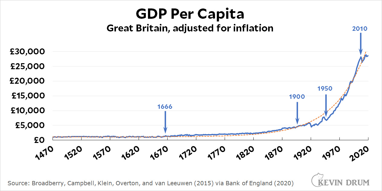
The blue line is actual GDP. The dashed orange line is a simple exponential curve that fits Britain's growth closely for the past 500 years.¹ To my mind, it means this: as long as Great Britain is on the orange curve, it's just being Great Britain. For whatever reason, this is the level of growth they produce just by doing their thing.

Now here's a closer look at the period from 1470-1900:

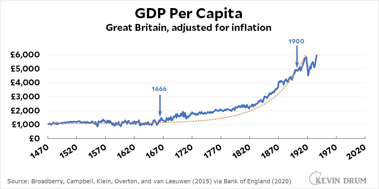
Between about 1666 and 1900, growth was higher than the orange curve. And even within that period, there are two sub-periods that stand out: 1666-1720 and 1820-1870. Then, looking at the top chart, there's another period of strong growth from about 1950-2010. Those were the real periods of super-strong growth.

Here's how I interpret this: Nothing unique happened in 1870. Great Britain was just following its normal growth path year after year—with a few smallish deviations here and there. In the 17th century this produced GDP high enough to support a growing urban craft class but did little for ordinary workers. By the late 19th century GDP finally reached a point where (a) workers started demanding a bigger share of the pie and (b) capitalists were rich enough that they could afford to meet workers' demands without any real hardship.

In any exponential growth curve there's always a knee in the curve where it suddenly seems like things have changed. This is because an absolute increase from £1,000 to £1,100 is not nearly as impressive as an increase from £4,000 to £8,000 even if they represent exactly the same level of growth. And in this case they do: the growth of per capita GDP in Great Britain was largely the same for 500 years with the exception of only a few short periods. There was nothing special about 1870, and without that the thesis of the whole book becomes rickety.

Apologies if I've bored you with this, but it's a necessary technical preface to some more substantial thoughts about the book. I'll have more about that later.

¹In case you're curious, the equation of the curve is 1.018(Year -1440) + 1100. For example, for the year 2000 this comes out to 1.018560 +1100 = £21,815 + 1100 = £22,915. Actual GDP per capita for that year was £24,402.

As you know, I keep asking what it is, precisely, that's causing our current round of inflation. What are the underlying economic pressures that are permanent enough that they won't go away unless the Fed drives us into a recessionary ditch?

A couple of days ago I was looking at the money supply, and today Tyler Cowen mentioned it too. So here it is:

Unsurprisingly, there was a big surge in M2 at the beginning of the pandemic as we spent money to avoid a recession. But this doesn't tell us very much. As Tyler mentioned, you also have to adjust for the velocity of money. If you have more money, but it's changing hands more slowly, then effectively the money supply might be stable.

So let's take a look at M2 adjusted for velocity:

That's right: if you multiply M2 by velocity, you get GDP. So now we're in the territory of the NGDP-level-targeting folks. If you take them seriously, we're now a bit above our target level so the Fed is doing the right thing by reining things in.

But despite lots of PR, the idea of using NGDP level targeting to control the economy has never gotten anywhere. Fine. Then what combination of M2 and velocity should we keep an eye on? I don't know, and that's why I didn't write about this earlier. It seemed like a dead end.

Still, despite all this you might wonder what we see if we look at plain old M2 by itself. Answer: M2 began to surge in March of 2020 while inflation started to surge in February of 2021. That's about a one-year lag.

M2 stopped surging in January of 2022, well before the Fed began raising interest rates. If it's still working on a one-year lag, inflation will respond in January of 2023 without the Fed having to do much of anything.

Speaking for myself, I have no idea whether or not to take this seriously. Even the inflation hawks never talk about money supply these days. But these are the figures. You can decide for yourself if they're meaningful in any way.

Atrios has a question about the rich:

Why do people own 7 houses? Or keep working long after they have more money than they can ever spend?...I guess, to me, money can buy a degree of freedom from hassle, yet so many people who have it choose to not use it that way.

Atrios has asked this so many times, in so many different ways, that I feel like someone should finally answer him. And the answer is simple: these people are not like you and me.

If you're the kind of person who's so obsessed with football that you practice four or five hours a day for your entire life from age 6 forward, and then you finally make it into the NFL, you're not going to quit after five years just because you've already made lots of money.

If you're the kind of person who's so obsessed with politics and power that you're willing to endure the indignities and torture of campaign season every two or four or six years, you're not going to quit just because you're old and it's time to retire.

If you're the kind of person who's so obsessed with money and society that you've spent 30 years of 18-hour days building up your company and becoming a billionaire, you're not going to stop just because a billion dollars is enough for anyone.

People like you and me aren't obsessed enough about anything to keep doing it forever. The kind of people who rule the world are.

Via Keith Humphreys, here's some good news from the Council on Criminal Justice:

For violent crimes other than murder (i.e., rape, robbery, and aggravated assault) Black suspects are being arrested at a lower rate relative to their population than white suspects. I hadn't realized that. The racial disparity in new court commitments for drug and property crimes is also very close to 1.

Racial disparities in other areas are still high, but they're dropping steadily. There's a lot more progress to make, but we are making progress.

The Washington Post writes today about a new robot that can make french fries:

Restaurants have toyed with robotics for years, cropping up as early as 1983 when Two Panda Deli in Pasadena, Calif., used robots to schlep Chinese food from the kitchen to customers....But now — with restaurants facing a protracted labor shortage and robotic technology becoming both better and cheaper — restaurant brands are doing new math. How long before an initial technology investment pays off? How long will it take to train human employees to work alongside robot co-workers? And, ultimately, how many restaurant jobs will be permanently commandeered by robots?

First off, this is not exactly new math. It's what everybody in every industry does when they consider purchasing a piece of automation.

And second, I know that fast food restaurants are all supposedly desperate for workers, but take a look at this:

It looks to me like employment in fast food restaurants has fully recovered and is back to its pre-pandemic trendline. And they sure aren't trying very hard to attract new workers:

Average weekly earnings are lower than they were a year ago. How much of a labor emergency can there be if fast food places figure they can pay less than they used to?

Anyway, there doesn't seem to be much of a labor shortage here. And fast food places are always experimenting with new technology. So why not just write about this cool robotic thing without faking up a bunch of labor nonsense to hang it on?