Skip to content

I'm not an economist with a sophisticated macro model or anything like that, but even before this week I thought that a recession was almost inevitable. Here are the basic reasons why:

  • The economy has been propped up by COVID-19 spending for a while, which is a good thing. But the last stimulus bill passed 15 months ago and is now fading out.
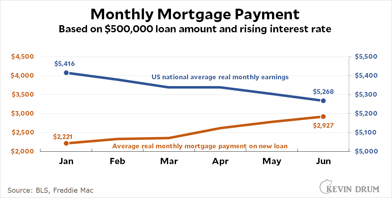
  • Skyrocketing mortgage rates are going to squelch the housing market. This has a big effect on consumer spending (via the wealth effect) and on the residential construction industry—and it's happening at the same time that average earnings have been falling.
    .
  • Consumer spending has slowed down in 2022 and is now nearly flat.
  • Companies that expanded recklessly during the pandemic are now finding that they have to cut back. Amazon is Exhibit A here.
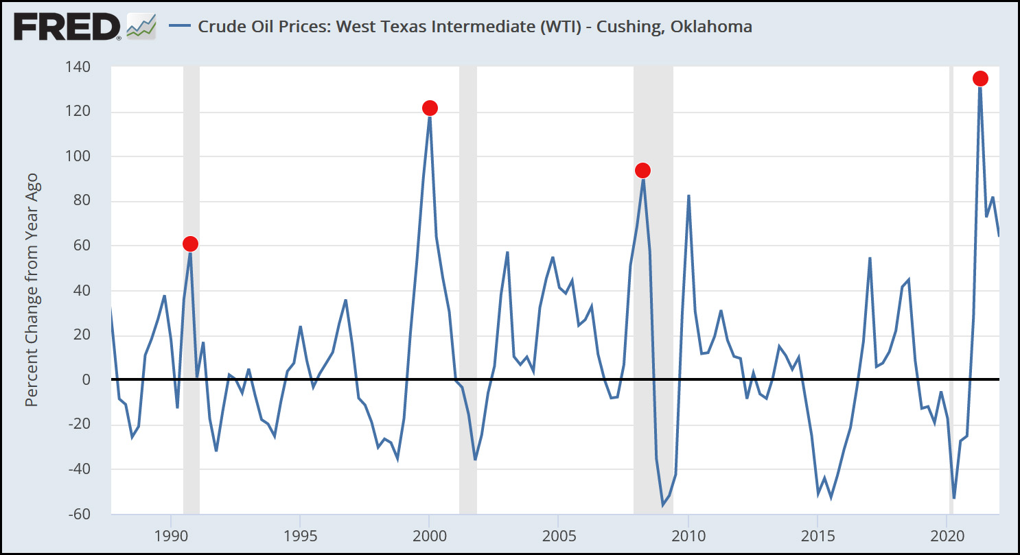
  • In 2021 we had a huge spike in the price of oil. This is usually enough, all on its own, to produce a recession within a year or so.
    .
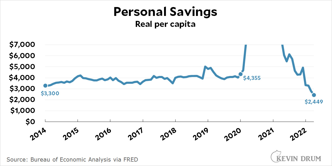
  • Personal saving has dropped below its normal pre-pandemic level and consumer debt has risen above its normal level. Neither one offers any kind of buffer anymore.
    .

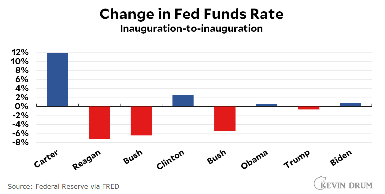
All this was enough to push us into a downturn already, but then the Fed decided on some "shock therapy" that will almost certainly be enough to finish the job. Both the stock and bond markets have delivered their verdicts on this, and it's hard to see what can stop an oncoming recession now.

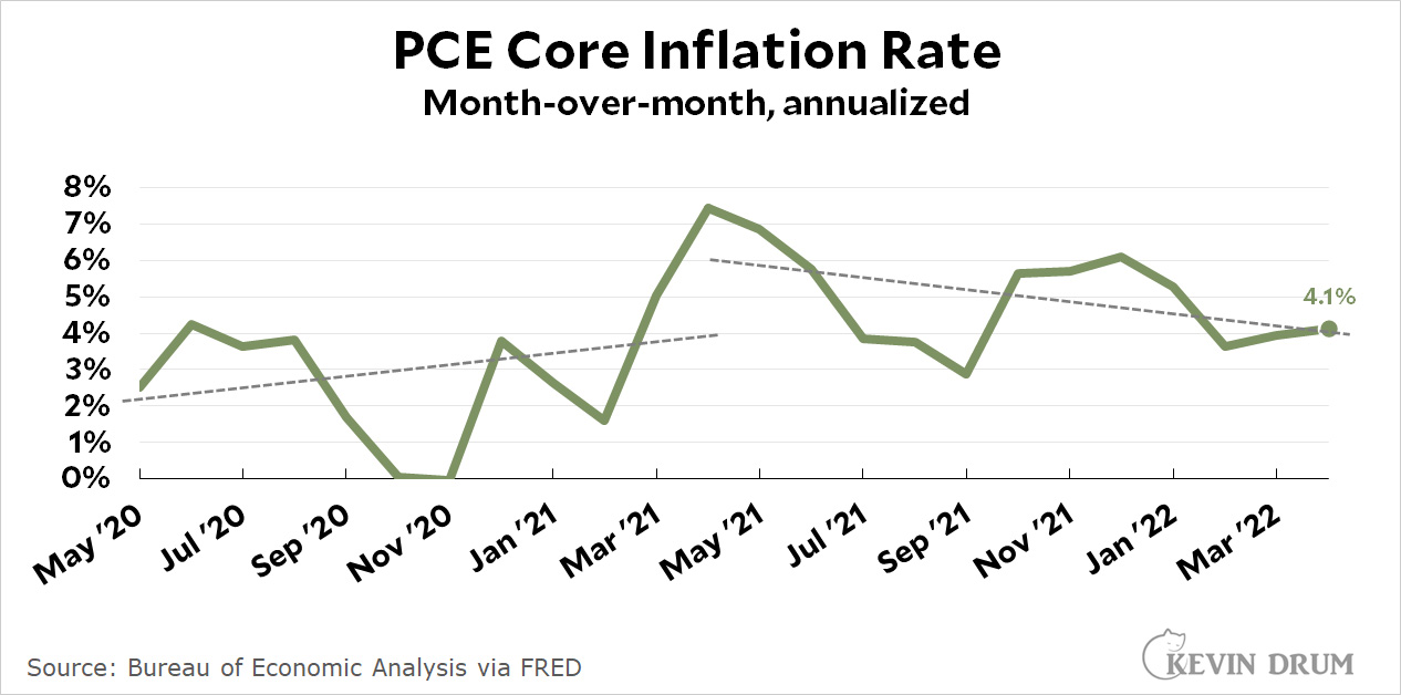
I'm not sure if I'm the last holdout on this or not, but I continue to think that inflation would have subsided on its own as the economy slowed, oil prices dropped back to normal, and supply chains eased. The Fed just needed to stay the course. Instead they panicked and decided a recession was the only way to attack high prices. And all because the May print of an inflation index they don't care about was 0.04% higher than March and therefore a "record."

The only good news here is that, to my eyes anyway, the economy is still in decent shape and we can probably count on a mild recession. Assuming, that is, that we don't panic even further.

Courtesy of the Bureau of Labor Statistics, here's a map showing which states have increased employment the most over the past year:

The biggest states have been the slowest to increase employment, but they're now catching up with very large gains over the past few months. The biggest annual gainer in percentage terms is Nevada, which is up 7.1%. The biggest gainer in absolute terms is California, which added 869,000 jobs over the past twelve months.

I understand that inflation is the issue of the day, which means that employment numbers will probably get no media coverage at all today. But they're still important! High inflation is damaging, but not nearly as damaging as high unemployment. After all, would you rather have a job along with higher prices, or be unemployed with stable prices? The question answers itself.

I've explained in passing the difference between the annual inflation rate and the annualized monthly rate, but based on some feedback it sounds like it might be a good idea to do it a little more clearly. It won't take long.

It all starts with an index of price levels, calculated by whichever agency is measuring inflation. For example, here is the PCE core index over the past year:

It's easy to calculate the change in price level over the past year or the past month:

  • Annual (year-over-year) = 121.804 ÷ 116.100 = 1.049 = 4.9%
  • Monthly (month-over-month) = 121.804 ÷ 121.386 = 1.0034 = 0.34%
  • Annualized month-over-month = 1.003412 = 1.042 = 4.2%

The annual inflation rate, which is the one you commonly see in headlines, is just the rise in the price level between this month and the same month last year. It's generally the best measure, but it has one drawback: it doesn't show you what's happening right now. If the price level jumps in a single month, the annual rate is going to stay high until that month finally drops out of the data—even if the price level has been stable ever since.

The monthly inflation rate is just the opposite. It shows you precisely how much prices rose over the past 30 days, but the downside is that this is pretty volatile. Generally speaking, a single month's change isn't something you should pay much attention to. However, the trend over time of the monthly rate can be useful.

Finally, the annualized monthly rate is just a bit of arithmetic. It shows what the annual inflation rate would be if prices rose at this month's rate for twelve months straight. It's a handy transformation because we're all used to thinking in annual terms.

With that said, here is this morning's chart again:

As you can see, the monthly rate does jump up and down a fair bit, so no single month provides reliable data. However, the fact that the trendline is generally down means that inflationary pressure appears to be easing.

In Southern California right now it's the season of mustard, a horrible invasive species that overruns our hillsides seemingly earlier every year. This year there were only a few weeks of early spring greenery before everything started turning yellow.

Still, like nearly any plant, it can be made to look pretty.

May 1, 2022 — Laguna Beach, California

Over and over I hear that the inflation metric preferred by the Fed is the PCE core chained index (the PCE measure of inflation excluding food and energy). Here it is:

I'm not saying this is the inflation measure everyone should put on their front pages. Overall CPI inflation is a good measure of what people see in their daily lives, which is why it's the one that shows up in headlines.

Still, for analytic purposes the Fed claims that PCE core is a better measure of underlying inflationary pressure in the economy. And if that's the case, it's been on a downward trend for the past 12 months. Hell, even CPI core inflation has been going down for the past couple of months.

So why the widespread panic over inflation? Why doesn't anyone pay attention to the PCE core metric? And in particular, why doesn't the Fed seem to pay much attention to the very metric they say is the best?

A friend of mine passed along the latest summer gasoline outlook from the Energy Information Administration:

In spring 2021, refineries sold gasoline for 59¢ more than their crude oil cost. In spring of this year, EIA projects that the difference is $1.13.

That's an increase of 54¢. A few days ago I calculated that the price of gasoline was 61¢ higher than it "should" be based on its historical relationship to the price of oil. Those two numbers are suspiciously close, no?

If you visit Paris and haven't been to the Musée Rodin, I highly recommend it. Not only does it have lots of beautiful Rodin artwork, but the grounds themselves are beautiful too. It's a great place to admire some artwork and to relax while you're doing it.

Another nice thing is that they don't screw around with you. If you go to the Musée Rodin you want to see The Thinker. So they put it front and center instead of making you walk through some Ikea-inspired maze before you finally find it. I appreciate that. So without further ado, here is The Thinker. I'll have more Musée Rodin pictures in the coming months.

POSTSCRIPT: I've never believed that the thinker really looked like he was thinking, and seeing the sculpture in person confirmed this. He looks more like he's sad about something—which I suppose is a type of thinking if you want to stretch things. But he definitely doesn't look like he's contemplating the mysteries of astrophysics or pondering the meaning of life.

May 31, 2022 — Paris, France