Skip to content

Wednesday was a momentous day: we let Charlie out into the backyard for the first time. And it went great! Charlie swatted bugs and roamed around the ferns and a good time was had by all.

Thursday was . . . not so great. Charlie almost immediately hopped the fence into our neighbor's yard and then went roaming around all the nearby front yards. This was a wee bit more freedom than we were comfortable with, but he did come back when Marian came out for him. (He doesn't come for me. Only for Marian.)

We're not quite sure what to do next. In the meantime, here's Charlie on his first great outdoor expedition.

An awful lot of people still don't seem to get the fact that you have to adjust wages for inflation to see how people are doing. A 5% wage increase is good if the inflation rate is 2% but bad if the inflation rate is 8%.

So here are two charts that show what's been happening to wages over the past two years. First up is a chart showing the growth of wages alongside the growth rate of inflation:

Next is a chart of hourly wages that's been adjusted for inflation:

Either way you look at it, wages are down. Unless you can eat a nominal dollar—and you can't—this is the real state of earnings in the US for the past two years.

The American economy gained 372,000 jobs last month. We need 90,000 new jobs just to keep up with population growth, which means that net job growth clocked in at 282,000 jobs. The headline unemployment rate remained flat at 3.6%.

This month's report is something of a statistical mirage. The size of the civilian labor force declined by 353,000 and the number of employed people declined by 315,000. Not so good! However, the number of unemployed workers declined by 38,000 while the number of underemployed workers (those who had to settle for part-time jobs) declined by 707,000. Not so bad! Meanwhile, more than half a million people dropped out of the labor force, which is . . . something. I'm not sure.

This somehow gets mathified into 372,000 new jobs, but I'm not feeling super happy about it. Both the Labor Force Participation Rate and the Employment-Population Ratio were weaker than last month.

Earnings of blue-collar workers were up at an annualized rate of 5.9% over May, which comes to -5.7% adjusted for inflation. That's a volatile number and probably doesn't mean much. However, the yearly number is more reliable, and for the past year wages were up only 5.4%, which comes to -3.2% adjusted for inflation.

(Note that the New York Times says wages "continued to climb rapidly" last month, which is only true—both for June and for the past year—if you don't account for inflation. Why don't they?)

So . . . the number of employed people was down and blue-collar wages were down. On the bright side, a lot of part-time workers apparently got more work thanks to strong business conditions. I'm not quite sure what to make of all this, but for now I'd call it a fairly so-so jobs report.

Friday is new jobs day. Here's my prediction:

  • If new jobs are higher than expected, it's an indication that the economy is running too hot. This is producing a demand-driven inflationary spiral that needs to be stomped on.
  • If new jobs are lower than expected, it's an indication that workers are holding out for higher wages. We are in danger of another '70s-style wage-price inflationary spiral that needs to be stomped on.
  • If new jobs come in exactly as expected, it's an indication of stagflation. The flation part of that needs to be immediately stomped on.

FYI: The consensus for the June report is 250,000 new jobs.

Buckle up, I've got an exciting post for you today!

As you know, Gross Domestic Product is the size of the economy. It's calculated by adding up the value of all the goods and services produced in the United States.

But you can calculate the same number by adding up all the income needed to produce this stuff. That's called Gross Domestic Income, or GDI.

Here's a table that shows the main components of GDP and GDI:

GDP GDI
Personal consumption expenditures Wages
Fixed residential investment Taxes
Fixed nonresidential investment Subsidies
Inventory change Interest
Exports Net business transfer payments
Imports Proprietors' income
Government expenditure and investment Rental income
Corporate profits
Government surplus
Consumption of fixed capital
Total for Q1 of 2022 $24.4 trillion $25.2 trillion

Hmmm. If these are supposed to be the same thing, why is GDP only $24.4 trillion compared to GDI at $25.2 trillion? As you'd guess, it's impossible to measure all the components of GDP and GDI precisely, so there's always a statistical discrepancy. Here's what that looks like over the past few years:

The statistical discrepancy is usually on the order of 1-2%, but for the past year it's been rising well above its norm. In Q1 of 2022, it hit 3.4%. In other words, GDI was 3.4% bigger than GDP.

So which one is right? GDP is normally considered the more reliable measure because its components are easier to measure. Still, a discrepancy of 3.4% is a lot, and it affects what we think of economic growth. Take a look:

According to GDP, the economy shrank last quarter at an annual rate of 1.6%. According to GDI, it grew at an annual rate of 1.8%.

So why did I go through all this? Just to give you the background to a recent set of remarks from James Bullard, president of the St. Louis Fed. He believes that GDI is more consistent with other economic indicators at the moment, which means the economy isn't slowing down all by itself. It's growing at a normal rate.

And that, in turn, means that we can't count on a slowing economy to rein in inflation. We need to take more aggressive action, like the big rate increase the Fed announced a few weeks ago.

Is he right? That's above my pay grade, and only future revisions of GDI and GDP will tell us which one was actually more accurate. I'm just passing it along to help us all understand some of the thinking that goes on in the Eccles Building these days.

Every week I try to post at least one picture in the categories Animal, Vegetable, and Mineral. I've always wondered if anyone noticed that.

I've already done animals and minerals this week, so that leaves vegetables, which are typically either flowers or gardens. So here's a picture of the Coulée Verte in Paris, an old elevated train line that's been converted into a public park. It's three miles long and was completed in 1993.

Unlike the similar Highline in New York City, the Coulée Verte is indeed verte, full of plants and flowers and ponds and shady benches to enjoy it all. On the day we visited, Marian and I grabbed a couple of sandwiches and some fruit and ate lunch, then walked to the other end and caught a metro home. It's worth a visit.

May 29, 2022 — Paris, France

Well now, here's a fascinating story. In 2017 Donald Trump fired FBI Director James Comey because he was pissed off over Comey's investigation of him. A year later Comey was chosen by the IRS as a lucky recipient of the rectal probe version of a tax audit, an audit so intensive and so rare that the odds of being chosen randomly are astronomical.

But still, stuff happens. Except in this case it happened again. In 2018 Trump fired Comey's assistant, Andrew McCabe, 26 hours before he qualified for his full pension. Two years later, McCabe was also chosen for a rectal probe audit.

What a coincidence! Needless to say, everyone denies everything. But if you believe that, I have a swamp and a bridge and some cryptocurrency you might be interested in. It sure sounds like the good old days of Richard Nixon made a comeback in the Trump era, doesn't it?

POSTSCRIPT: Even if the IRS finds nothing, these kinds of audits are expensive and time consuming. The New York Times reports that Comey had to spend $5,000 on accountants' fees to eventually learn that he had overpaid his taxes by $347. McCabe ended up paying a "small amount" of money.

In comments last night, skeptonomist accused me of rarely being interested in showing income inequality. This cut me to the core, but there's truth to it and it's worth showing you why.

The single best set of numbers for income inequality come from the CBO. There are two reasons: (a) they collect a broad set of income figures, including capital gains and means-tested benefits, and (b) they include figures for the top 1%, which is where inequality has risen the most. So without further ado, here are two charts based on CBO income figures:

The top chart shows the GINI coefficient, which is the most common measure of income inequality. It's much lower (i.e., better) when you include taxes and transfers, which is just what you'd expect, but it's been rising steadily since the Reagan era either way.

GINI is a little abstract for most people, so the bottom chart is a simple comparison of income between the top 1% and the bottom 20%. It shows much the same thing as the GINI chart but with even stronger growth.

But now take a closer look at these charts. They show income inequality growing strongly starting with Reagan and then peaking during the housing boom of the aughts. Then income inequality declines during the Great Recession and hasn't changed much since. In 2010, at the end of the recession, the average top one-percenter had an income 35x higher than the average bottom quintiler. By 2018 that had gone up only to 36x. Likewise, since 2012 GINI hasn't budged.

I'm not here to tell you that growing income inequality is no longer a problem, but it's certainly calmed down over the past decade or so. This is probably why you don't hear as much about it as you did during the Occupy Wall Street days at Zuccotti Park.

This is a surprisingly tricky question, but with a twist at the end. When you talk about earnings you have to account for at least three different things:

  • Mean or median? Mean (aka "average" or "per capita") income is usually not a great measure because the ultra-wealthy skew it. If you have ten people making $50,000 and one person making $1 million, the mean income is a very misleading $136,000. Median is better: it records the halfway point of income and isn't heavily skewed by high incomes.
  • Personal, family, or household? Personal is a single individual. A family is a group related by birth and marriage. A household includes everyone who lives in a particular housing unit.
  • What income? There are lots of kinds of income. Cash income vs. benefits (like employer health care). Wages vs. investment income. Taxes (negative income) vs. government transfer payments. And capital gains are usually an entirely separate category.

Needless to say, there's also the distinction between nominal income and real income. Real income is adjusted for inflation and it's almost always what you should use. All of the charts in this post show real income.

First off, the most commonly used set of earnings figures come from the Census Bureau:

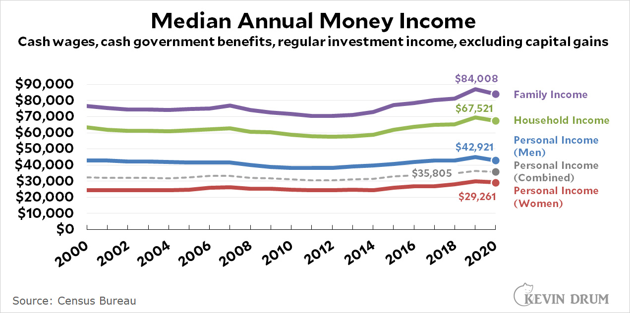
These figures are basically fine and are widely cited. They're really all you need for most purposes and they contain a wealth of breakdowns (gender, race, education, etc.). But if you want more, here's the personal income series from the Bureau of Economic Analysis:

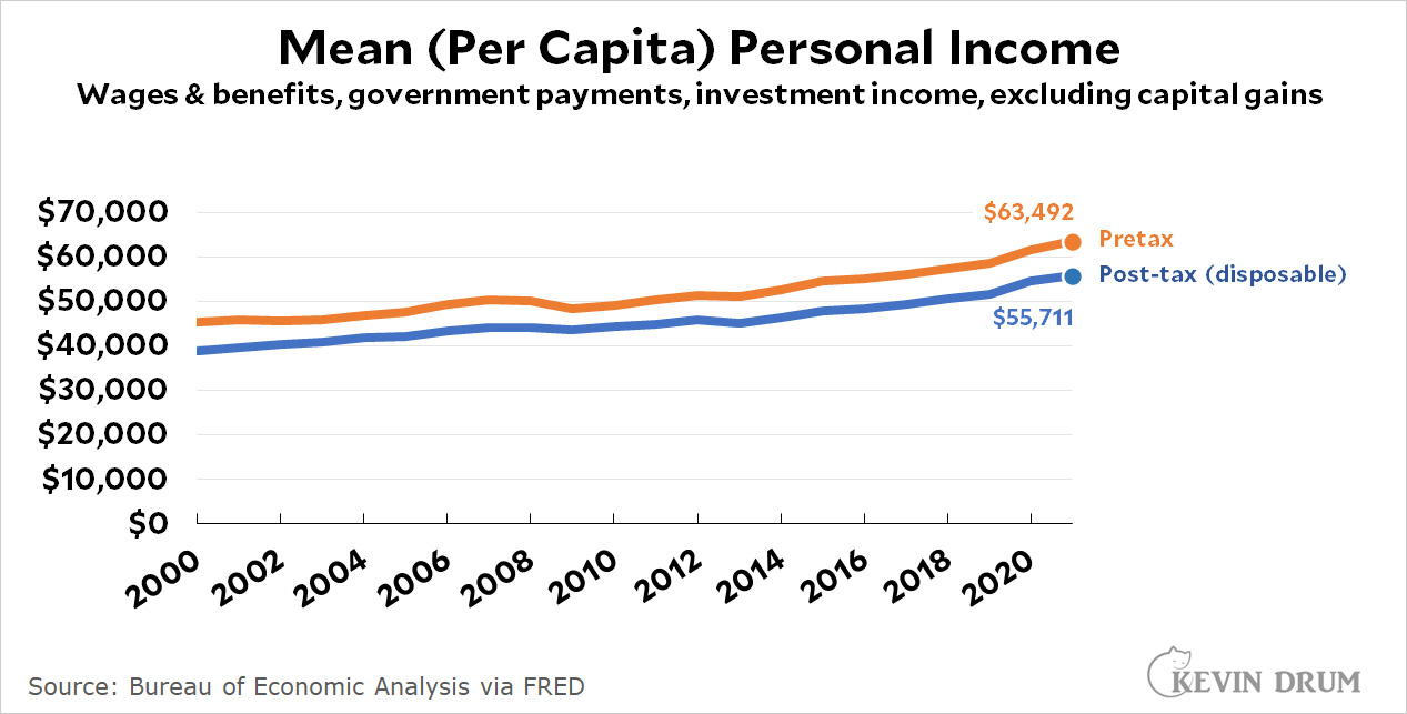
BEA income includes more items than the Census Bureau, and the BEA also provides a figure for disposable (after tax) income. But its big difference with the Census Bureau is that BEA uses mean instead of median income, which makes it much less valuable. The huge difference between the two is almost entirely due to this.

Next up we have an attempt by the Congressional Budget Office to account for everything, including means-tested government benefits and capital gains:

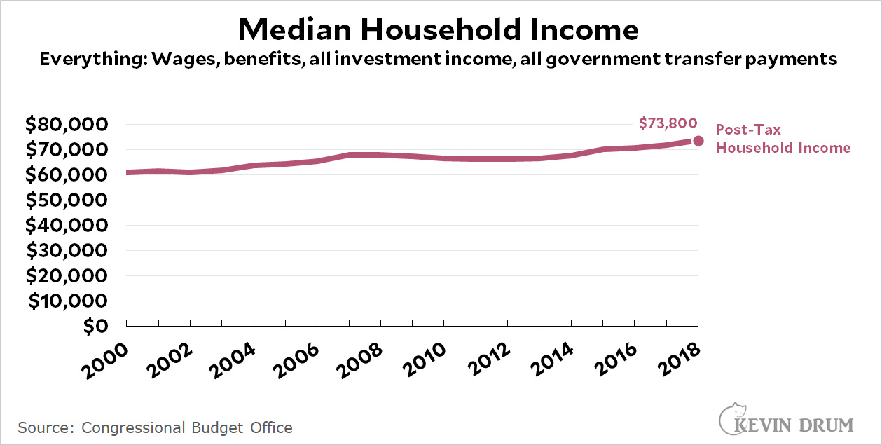
This is a good estimate of honest-to-God total income and taxes, and it's available as a median, so it's not skewed by the rich. Its big drawback is that it's not a regularly updated series. The last report to publish this information is from 2018 and there's no telling when they'll do it again.

Finally, here's a dark horse entry from the Bureau of Labor Statistics:

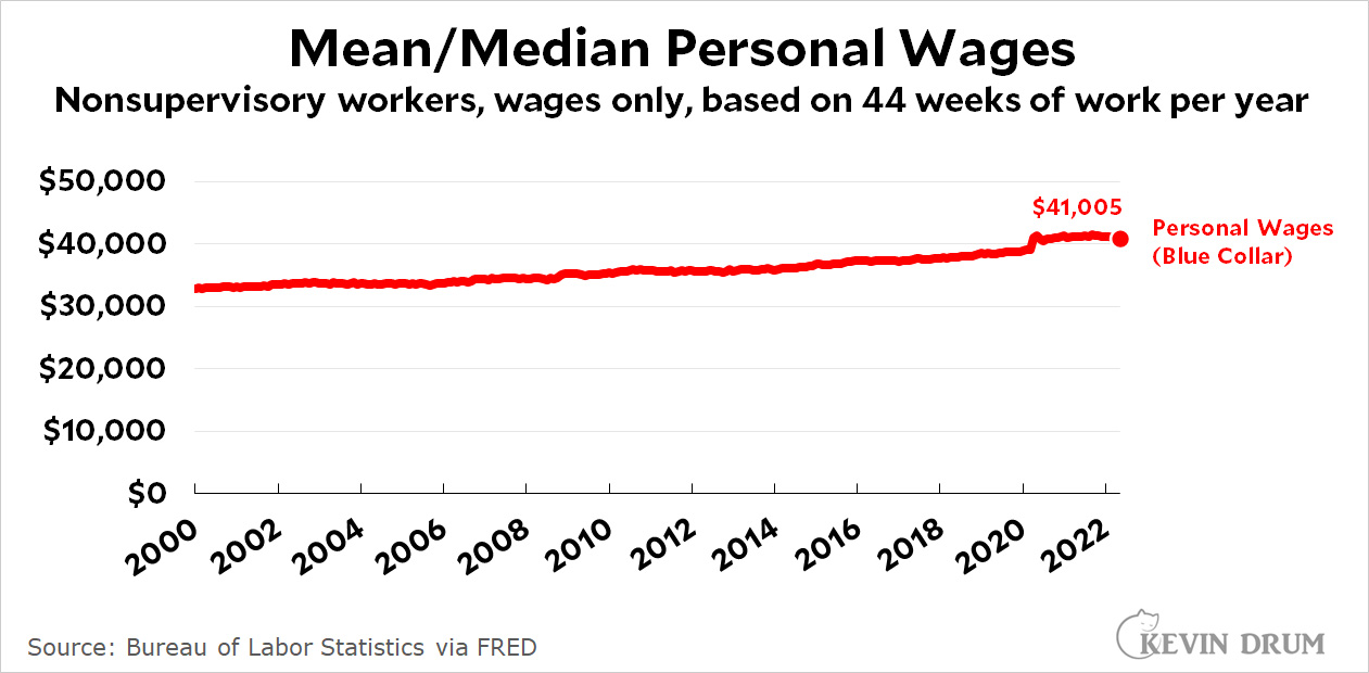
This chart shows wages solely for production and nonsupervisory workers, and it's extracted by multiplying average weekly wages with average weeks worked per year. No managers or CEOs or Elon Musks are in here. Just blue-collar, salt-of-the-earth American workers.

The downside of this series is that it includes only regular cash wages and nothing else. The upside is that it's updated monthly for you impatient types. And while it's technically a mean, the fact that it lops off the top 20% means that it's effectively a median. The meh-side—could be good, could be bad, depending on what you're interested in—is that it measures income solely for the 80% of the country that's nonsupervisory.

And now for the twist: there's really not much difference between all these measures. If you compare the BEA's mean income to the Census Bureau's mean income, they're pretty close. If you compare Census personal income to nonsupervisory personal income, they're pretty close. If you compare Census household income to CBO household income, the difference is noticeable but not huge.

In other words, all of these estimates use a slightly different combination of income and taxes but they mostly wash out at the end. Roughly speaking, I usually stick with simple Census figures. If you want post-tax income, use the BEA figures to figure out tax payments and then subtract them from the Census figures.

NOTE: Some of these figures are available in both nominal and real versions. Some aren't, and you'll have to do the inflation adjustment yourself.